
Bar chart vs candlestick is a smaller decision than it looks. Both plot exactly the same four numbers for each period: open, high, low and close. Neither adds or hides information. What changes is how quickly your eye extracts that information, and that difference is enough to matter. This guide covers how each one is drawn, where each is clearer, and which to pick for the way you actually trade.
How an OHLC bar is drawn
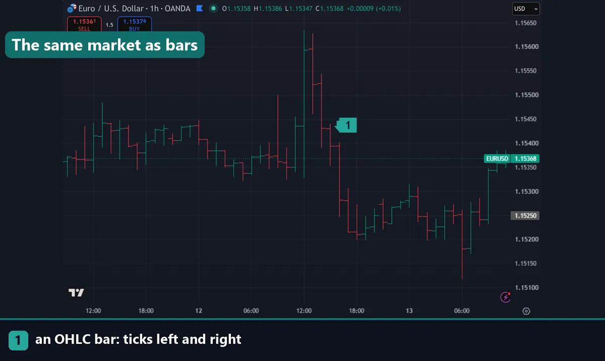
A bar chart draws one thin vertical line per period, running from the low to the high. Two small horizontal ticks stick out from it. The tick on the left marks the open. The tick on the right marks the close.
That is the whole construction. Reading direction means comparing the height of the two ticks, so you check whether the right tick sits above or below the left one. Many platforms colour the bar to help, though the traditional format uses a single colour throughout.
The result is visually light. Bars occupy little screen space and leave the background largely clear, which is why they suit charts carrying several overlays.
How a candlestick is drawn
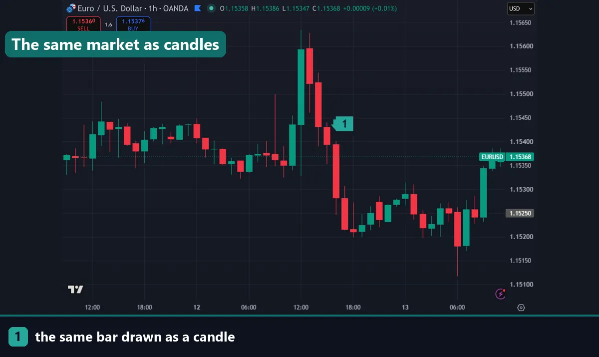
A candlestick uses the same four numbers and arranges them differently. The distance between the open and close is drawn as a filled rectangle, called the body. The remaining travel to the high and low is drawn as thin lines, called wicks or shadows.
Colour then carries the direction. A body filled with the up colour means the close finished above the open. The down colour means the opposite. Direction registers instantly because you are reading a block of colour rather than comparing two small ticks.
The format came from Japanese rice traders in the eighteenth century and reached Western markets through Steve Nison’s work in the 1990s. Our guide on how to read candlestick charts covers the anatomy in depth.
Bar chart vs candlestick side by side
The practical differences fall out of the drawing method.
| Aspect | Bar chart | Candlestick |
|---|---|---|
| Data shown | Open, high, low, close | Open, high, low, close |
| Direction read | Compare left and right ticks | Body colour, instant |
| Open-to-close range | Implied by tick positions | Drawn as a solid body |
| Screen space | Thin, uncluttered | Wider, more visual weight |
| Pattern vocabulary | Limited and less used | Large and widely documented |
| Dense charts | Stays readable when zoomed out | Bodies merge when compressed |
| Common in | Futures, longer-term analysis | Forex, crypto, retail platforms |
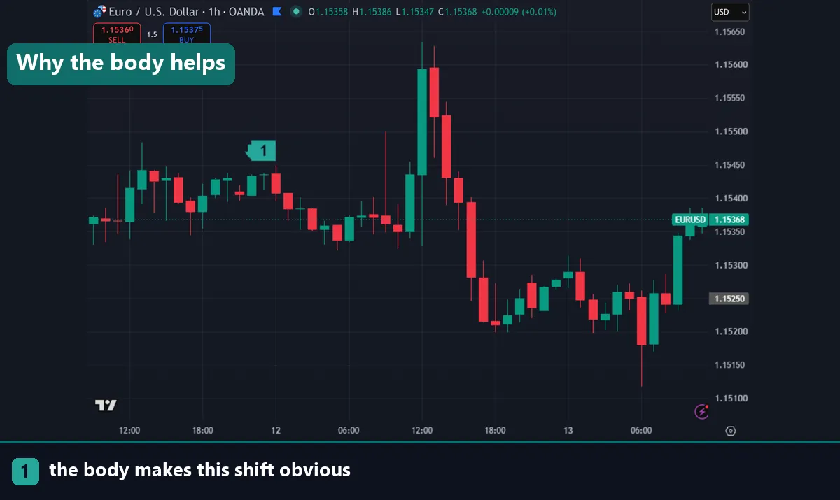
The row that matters most is the third. A candlestick body makes the open-to-close distance a physical shape, so conviction becomes something you see rather than calculate. A long body says price travelled far and finished near its extreme. On a bar chart the same information sits in the gap between two ticks, and your eye has to do the work.
Where bar charts are genuinely better
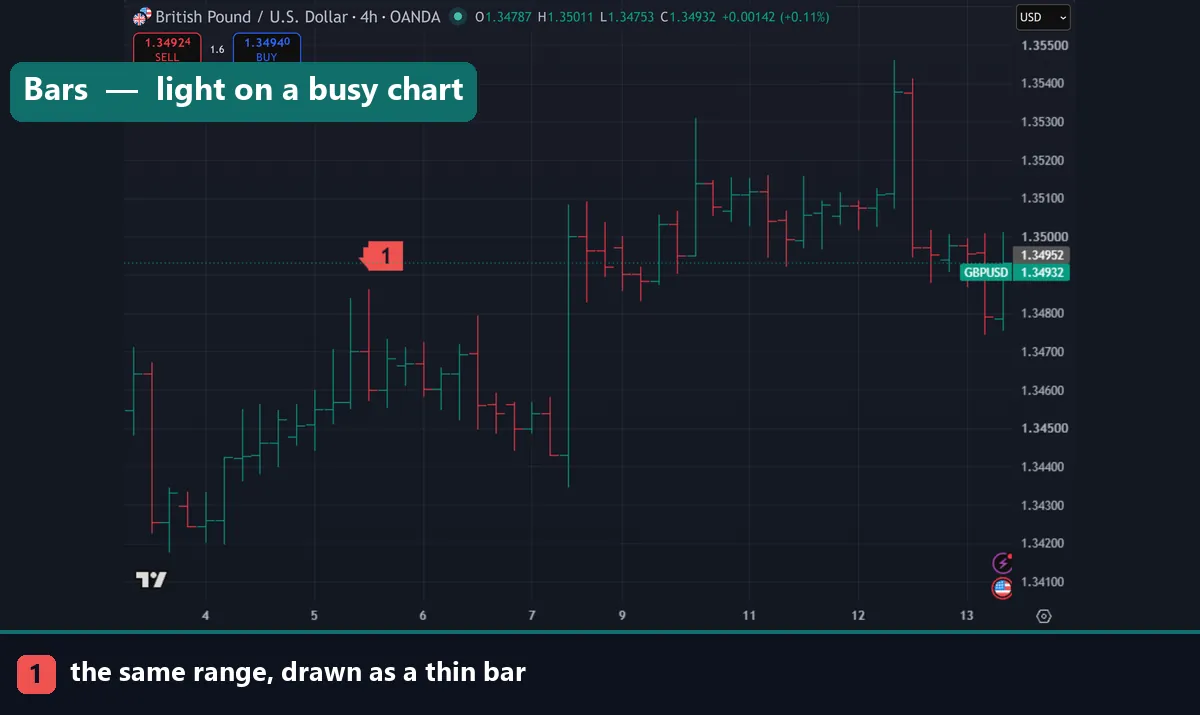
Three situations favour bars, and experienced traders switch for exactly these reasons.
The first is a crowded chart. If you run several moving averages, a channel and a volume profile, candle bodies compete with those overlays for attention. Thin bars leave the drawing tools visible.
The second is a long lookback. Zoom out to two years of daily data and candle bodies compress into an unreadable block of colour. Bars stay legible at that density because they were never solid to begin with.
The third is habit and market convention. Futures traders often learned on bars and read them faster than candles, which is a perfectly good reason to keep using them.
Download the complete indicator database
Put these concepts on your charts. One email unlocks the full library of 1,380+ indicators with compiled MT4 and MT5 files, plus my TradingView scripts. No paywall, no spam, unsubscribe any time.
Get free access to my indicator database
One email unlocks 1,380+ free MT4, MT5 and TradingView indicators — the complete library. No single-tool download; you get the whole database.
Why most forex traders use candles
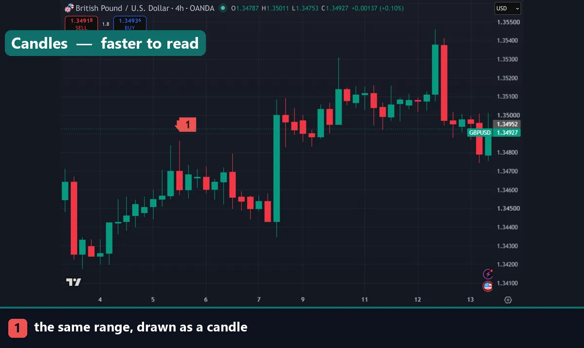
Candlesticks dominate retail forex for two connected reasons.
The first is speed of reading. When you are scanning eight pairs across three timeframes, colour registers faster than tick comparison. Over a session that difference adds up, and it reduces simple misreads.
The second is the pattern vocabulary. Engulfing bars, pin bars, dojis, inside bars and the rest are all defined in terms of body and wick relationships. That vocabulary only exists because the format makes those relationships visible. Almost every price-action method you will read here assumes candles, including our price action trading guide.
There is a third, quieter reason. Almost all educational material, screenshots and indicator documentation uses candles. Choosing bars means translating constantly.
What neither format changes
It is worth being blunt here, because the comparison invites more weight than it deserves. The chart type does not change the market. Support and resistance sit at the same prices. Indicators calculate from the same closes and produce identical values. A backtest returns the same result whichever way you display the data.
This separates bar and candlestick charts from a format like Heikin Ashi, which genuinely alters the numbers being plotted. Our Heikin Ashi strategy guide covers that distinction, and it is an important one: averaged candles show prices that never traded, while bars and candles both show real prices.
How to choose
Pick candles if you trade price-action patterns, scan several instruments, or are still learning to read bars. That covers most forex traders, and it is why candles are the default on almost every platform.
Pick bars if your charts carry heavy overlays, you analyse long histories, or you already read them fluently from another market.
Then leave the choice alone. Switching formats mid-analysis is a small but real source of misreads, because the same bar looks different in each. Set one as your default and build your pattern recognition on it.
Where to go next
Format is the starting point rather than the method. Learn the reads with how to read candlestick charts, then apply them through price action trading. For a format that changes the data rather than the drawing, see the Heikin Ashi strategy guide. Complete rule sets live in our forex currency trading strategies. For further reading, StockCharts covers candlestick charts in the StockCharts ChartSchool, and the open-high-low-close chart article on Wikipedia covers the bar format.
FAQ
What is the difference between a bar chart and a candlestick?
Both plot the open, high, low and close. A bar draws a vertical line with a left tick for the open and a right tick for the close. A candlestick draws the open-to-close range as a coloured body with wicks to the extremes.
Does a candlestick chart show more information?
No. Both formats carry exactly the same four prices per period. Candles present the open-to-close range as a shape and colour, which makes direction and conviction faster to read, without adding data.
Which is better for forex trading?
Candlesticks suit most forex traders, because the pattern vocabulary and nearly all educational material assume them. Bars remain useful on crowded charts and long histories where candle bodies merge together.
Why do futures traders often prefer bar charts?
Convention and clarity. Bars are thin, so they stay readable across long lookbacks and leave room for overlays. Many futures traders also learned on them and read them faster than candles.
Do indicators calculate differently on each format?
No. Indicators read the underlying prices, usually the close, so an RSI or moving average returns identical values whichever chart type you display. Only the drawing changes.
Should I switch between formats?
Better to pick one and stay with it, since the same bar looks different in each and switching invites misreads. Trading involves risk, results are not guaranteed, and past performance is not indicative of future results.

About the author
Written by Dominic Walsh, a Forex trader and MT4/MT5 indicator, Expert Advisor and script developer. Every tool on forexmt4systems.com is tested on live charts before release and ships with ready-to-use compiled MT4 (.ex4) and MT5 (.ex5) files. Learn more about the trader and developer behind this site.
How we build, test and correct every tool: Editorial & Testing Policy. Trading carries risk; see the disclaimer.