
Once you have Bollinger Bands explained properly, a busy chart suddenly makes sense. The three lines wrap price in a volatility envelope, so you can see at a glance when a market is stretched, when it is coiling, and when a fresh move is about to breathe.
This guide gets Bollinger Bands explained from the construction up. So by the end, you will know how the bands are built, read the squeeze that warns of expansion, and use the %b and bandwidth tools that turn the envelope into hard numbers.
Bollinger Bands Explained: The Basics
Bollinger Bands are a volatility envelope built by John Bollinger in the early 1980s. He wrapped a simple idea in a smart wrapper, taking a moving average and surrounding it with two bands that widen and narrow with volatility. So the tool shows both the trend and the mood of a market at once.
The middle line is the heart of the tool. It is a 20-period simple moving average, the same kind of average that maps any trend. So the center band reads direction, exactly as a standalone average would, while the outer bands add the volatility story around it.
The outer bands do the clever part. Each one sits two standard deviations away from the middle average, one above and one below. Because standard deviation measures how spread out recent prices are, the bands stretch wide in a volatile market and pinch tight in a calm one. So the envelope breathes with the market’s energy.
Why Standard Deviation Matters
Standard deviation is just a measure of scatter. When candles are large and prices jump around, the deviation grows and the bands flare out. When candles are small and prices sit close together, the deviation shrinks and the bands close in. So the width of the envelope is a direct picture of current volatility.
The two-deviation setting has a useful property. Under a normal spread of prices, most of the action stays inside the bands, so a tag of the outer edge marks a statistically stretched move. Because roughly nine in ten bars close within the envelope, a push to the band flags an extreme worth noticing. So the edges act as soft, adaptive boundaries rather than fixed levels.
Look at a concrete case. The chart shows EURUSD on the daily timeframe with the standard Bollinger Bands wrapped around price near 1.14. As a calm stretch gives way to a sharp move, the bands flare open and price rides the upper edge for several bars.
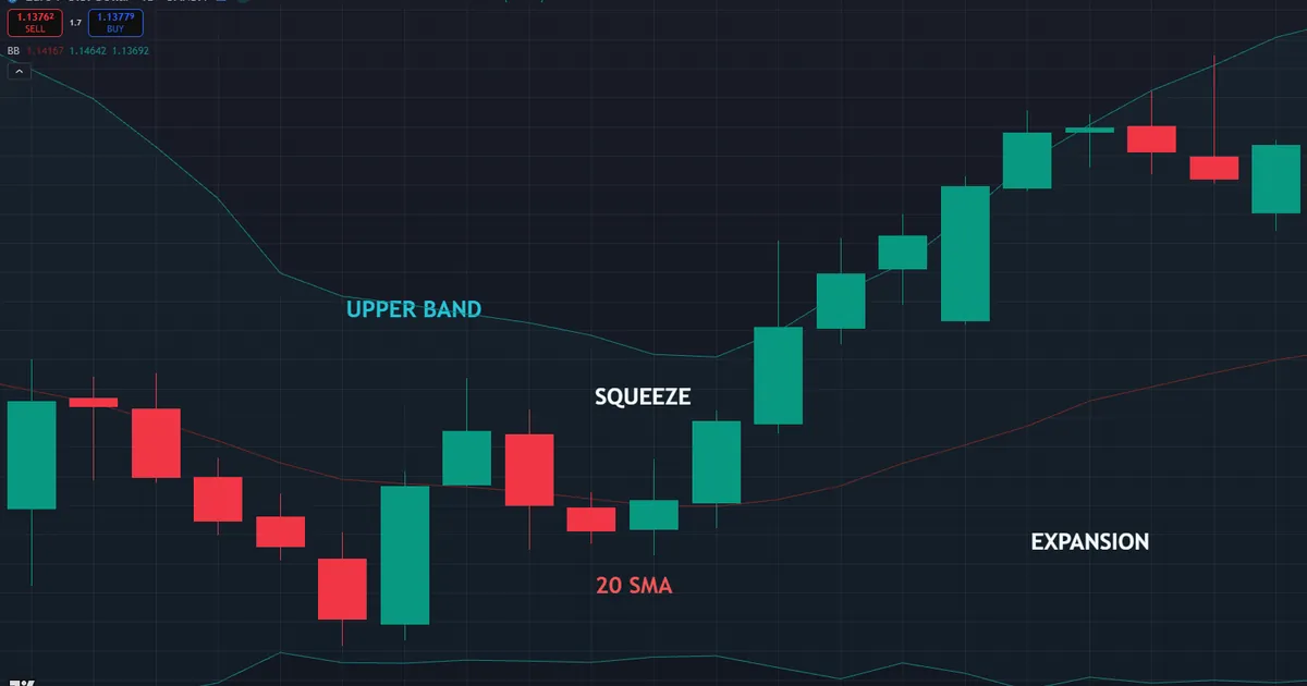
Now trace the shape from left to right. First the bands pinch tight while price coils in a quiet range. Then a breakout fires, the bands flare apart, and price hugs the upper band as the move runs. That flare is volatility waking up, drawn plainly on the chart.
How the Bands Are Built
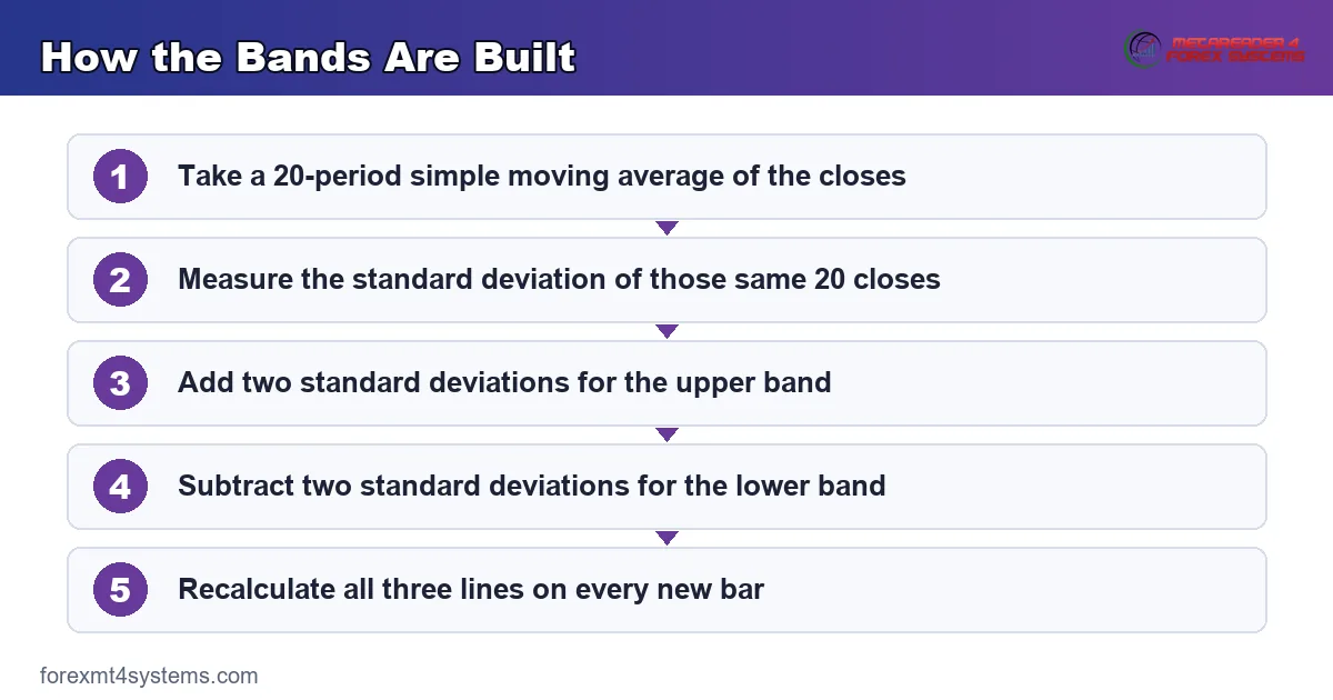
The math is small, so learn the logic once and let the platform do the arithmetic. Three steps turn raw candles into the full envelope.
- The middle band. Take a 20-period simple moving average of the closing prices. This line reads the trend and anchors the whole tool.
- Measure the scatter. Calculate the standard deviation of those same 20 closes, which captures how spread out recent prices are.
- The upper band. Add two standard deviations to the middle line. This edge marks the stretched top of normal movement.
- The lower band. Subtract two standard deviations from the middle line. This edge marks the stretched bottom of normal movement.
- The update. Every new bar recalculates all three lines, so the envelope shifts and breathes in real time.
So the whole tool is a moving average with a volatility jacket wrapped around it. The concept graphic below shows the three lines and how the outer bands flex with the standard deviation.
One detail helps here. The default settings are 20 and 2, meaning a 20-period average and two standard deviations. John Bollinger himself suggested these as a sound starting point, and they still suit most charts. So begin there and change one variable at a time, only with a clear reason.
Reading the Squeeze
The squeeze is the tool’s most famous signal. When volatility drops, the bands pinch together into a narrow neck, and that tight neck warns that energy is building. So a squeeze often precedes a strong directional move, though it never says which way.
Watch the neck, then watch the break. A long, tight squeeze coils the market like a spring, and the eventual expansion tends to run once it starts. Because the squeeze marks low volatility, the move that follows frequently carries real force. So traders treat a squeeze as a heads-up to prepare, not a signal to fire.
Never trade the squeeze direction blindly. The bands measure volatility, not direction, so a squeeze alone cannot pick a side. Instead, wait for price to break out of the neck and confirm with structure or momentum before you commit to the move.
There is a reason the squeeze works so reliably. Volatility tends to cycle between calm and active phases, rather than staying flat forever. Because a long quiet spell rarely lasts, an unusually tight neck loads the odds toward a coming expansion. So the squeeze is less a prediction than a read on where the market sits in its natural rhythm.
Turning the Bands Into Numbers
Two companion tools convert the visual envelope into hard figures. They are %b and bandwidth, and each answers a question the raw bands only hint at.
Start with %b, which locates price inside the envelope. A reading of 1.0 means price sits right on the upper band, and 0.0 means it sits on the lower band. So 0.5 places price on the middle average, and readings above 1 or below 0 flag a close outside the bands entirely.
Then add bandwidth, which measures how wide the envelope is. It expresses the distance between the outer bands as a fraction of the middle line. Because a low bandwidth marks a squeeze and a high one marks expansion, the figure turns the visual pinch into a number you can track and compare.
Bandwidth shines when you compare it over time. A single reading means little, yet a bandwidth sitting at a six-month low screams that a squeeze has arrived. So watch the figure against its own recent history, not against some fixed threshold. Because volatility differs by pair and timeframe, each chart keeps its own normal range for bandwidth.
Using %b and Bandwidth Together
The two tools pair naturally. Bandwidth tells you the state of volatility, while %b tells you where price sits within it. So a low bandwidth plus a %b breaking above 1 signals a fresh expansion pushing through the top of a squeeze.
Build the pairing into a routine. First check bandwidth for a squeeze, then watch %b for the break that follows. Because the two cover volatility and position at once, they sharpen a read the naked bands leave fuzzy. Our free forex volatility calculator gauges the current range so you can size around a volatile break.
How Bollinger Bands Fit a Workflow
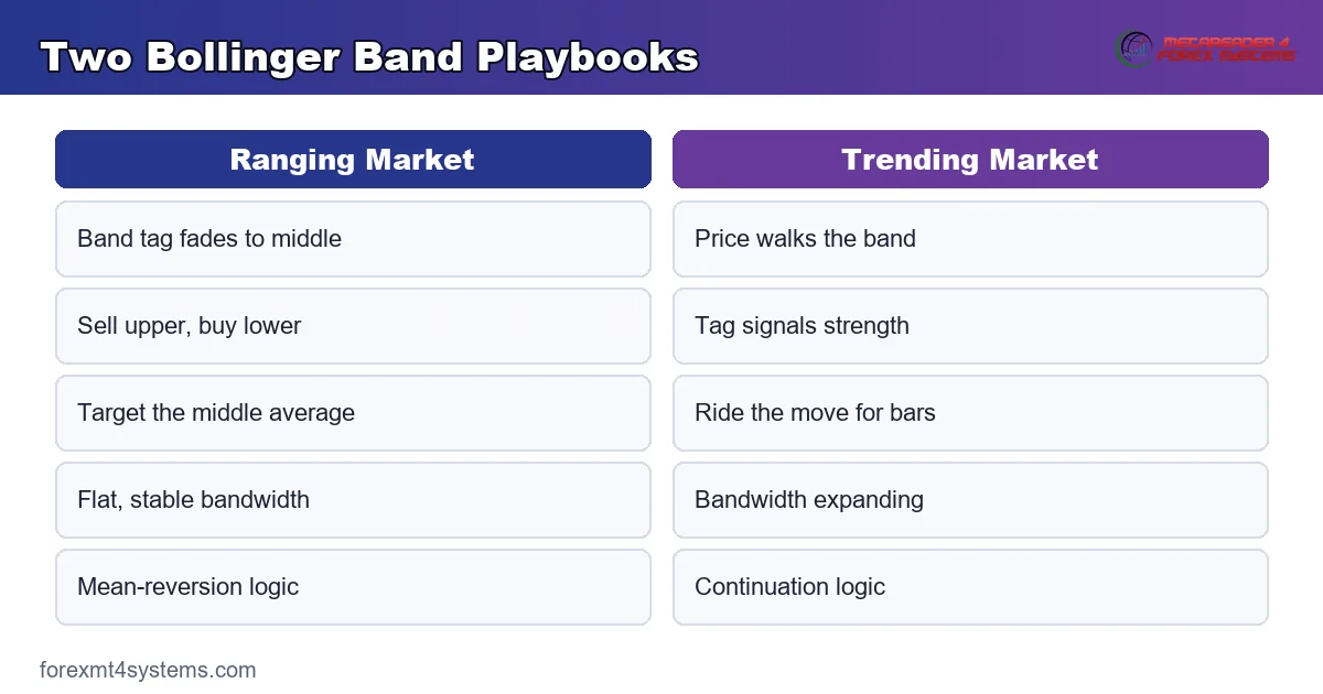
The bands serve two very different playbooks, and confusing them is a classic error. In a range, the edges act as mean-reversion targets, and in a trend, the edges act as continuation zones.
Read the environment first, exactly as you would with any tool. When price chops sideways inside a flat envelope, a tag of the upper band often fades back toward the middle. So range traders sell the upper edge and buy the lower, aiming for the average in between.
The trend playbook flips that logic. In a strong move, price can ride the upper band for many bars without reversing, a pattern Bollinger called walking the bands. So a tag of the edge in a trend is a sign of strength, not a fade signal. Confusing the two playbooks is how band traders get run over.
The middle band decides which playbook applies. When price holds above the middle average, buyers control the tape and the follow plan fits. When price sits below it, sellers lead and the read flips. So a simple rule keeps you honest: let the side of the middle line pick whether you fade an edge or ride it.
Pairing the Bands
The bands never name a direction, so pair them with a directional tool. A trend read or a moving-average slope tells you which playbook applies, and our guide to SMA vs EMA covers that choice. So the average picks the plan while the bands frame the volatility around it.
Volatility partners help too. Because the bands share DNA with pure volatility tools, they read well beside an average true range gauge. Our guide to what is ATR in trading shows how to size a stop for the expansion a squeeze warns about. The bands and channels indicators archive plots the whole family automatically.
Worked Example: A EURUSD Squeeze Break
Picture EURUSD coiling in a tight range on the four-hour chart near 1.135. The Bollinger Bands have pinched into a narrow neck, and bandwidth has dropped to a multi-week low. The market is clearly storing energy.
Now read the setup as a whole. The tight squeeze warns that expansion is near. A push of price above the upper band, with %b clearing 1.0, would flag the break. The chart below marks the squeeze and the breakout candle that clears the upper edge.
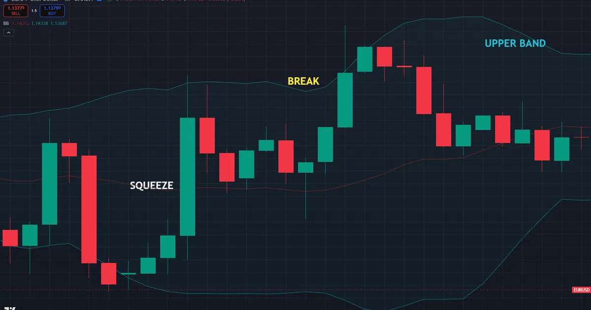
Then build the risk plan around the neck. A stop sits back inside the range, below the middle band near 1.132, where a failed break would return price. Because the squeeze defined a tight base, that stop sits close and the reward-to-risk ratio starts in a healthy place.
Managing the Break
Let the bands guide the trade once it runs. As price walks the upper band, the strength read stays intact and the position holds. If price falls back inside the envelope and closes below the middle average, the expansion has stalled and the reason for the trade is gone.
Watch bandwidth as the move matures. A widening envelope confirms the expansion has real force behind it. Meanwhile a bandwidth that peaks and starts to contract warns the move is tiring, even while price still sits high. So the width of the bands quietly tracks the health of the break from start to finish.
Compare a range trader on the same chart. Someone fading the upper band would have sold right into the breakout and worn the whole move. Because the squeeze flagged a coming expansion, the breakout trader pressed while the fader got caught. So reading the volatility state, not just the price touch, sorted two opposite trades.
Notice how each piece of the tool played its part. Bandwidth flagged the squeeze, %b timed the break, the middle band held the stop, and the band walk managed the exit. Because one envelope covered so many decisions, the plan stayed clean under pressure. So a single well-read tool often beats a screen crowded with competing signals.
Download the complete indicator database
Put these concepts on your charts. One email unlocks the full library of 1,380+ indicators with compiled MT4 and MT5 files, plus my TradingView scripts. No paywall, no spam, unsubscribe any time.
Get free access to my indicator database
One email unlocks 1,380+ free MT4, MT5 and TradingView indicators — the complete library. No single-tool download; you get the whole database.
Common Bollinger Band Mistakes
The tool is simple, yet the same errors repeat across every market. Most come from asking the bands for a direction they never provide, and the fixes follow beneath the graphic.
Fading Every Band Tag
A tag of the upper band is not an automatic sell. In a strong trend, price walks the band for many bars while faders bleed. So confirm the environment first, and only fade the edge when the market is clearly ranging sideways.
Trading the Squeeze Direction Blind
A squeeze warns of a move, yet it never names the side. Guessing the direction of the break is a coin flip. Instead, wait for price to break the neck and confirm with structure or momentum before you pick a side.
Ignoring the Middle Band
The middle average is a signal, not just decoration. Price crossing it often marks the shift between the two playbooks. So track the middle line as a trend filter, and let a close on either side of it steer whether you fade or follow.
Changing Settings Too Soon
Traders often tweak the 20 and 2 defaults before they understand them. Random settings then produce random signals. So learn the standard envelope first, and change one variable at a time only when a clear need appears on your charts.
Forgetting Volatility Cuts Both Ways
Wide bands after a big move can tempt a late entry right at exhaustion. High volatility often marks the end of a run, not the start. So treat a very wide, stretched envelope as a reason for caution rather than a green light to chase.
Bollinger Band Checklist
Run this short list before every entry that leans on the bands. A few seconds here saves hours of regret later. So keep it in view, tick each item honestly, and let a missing check talk you out of a marginal trade.
- Environment identified as either ranging or trending.
- Playbook chosen to match, fade in a range or follow in a trend.
- Squeeze or expansion state read from bandwidth.
- Price position confirmed with %b inside or outside the bands.
- Middle band checked as a trend filter.
- Stop placed beyond the neck or the middle line, sized by volatility.
- Risk fixed as a small percent of the account.
When Bollinger Bands Fail
Study the failure case as hard as the winner. Here is a common one. A trader sees price tag the upper band on EURUSD near 1.15 and sells at once, sure the edge marks a top. The bands look stretched to the limit.
Then the market ignores the plan. Price keeps climbing, walks the upper band bar after bar, and the short sits deep underwater. The chart below shows that band walk, with price riding the upper edge while the fade trade bleeds.
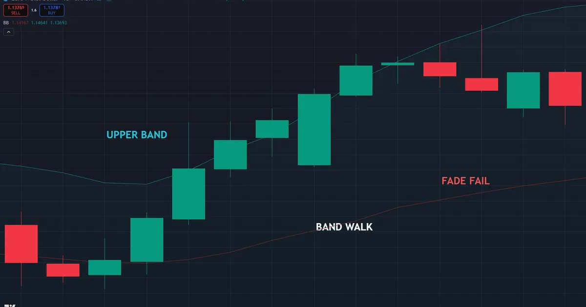
So what went wrong? A band tag is only a fade signal in a range, and this market was trending hard. In a strong move, riding the band is a sign of strength, not exhaustion. Hence the guard that saves an account, which is to read the environment before you fade an edge. A stretched band in a trend means power, not a top.
False Squeeze Breaks
Respect the head fake after a squeeze too. A tight neck can break one way, suck traders in, then reverse sharply the other way. Because the first move sometimes lies, wait for a close beyond the band and confirm with structure. Treat a fast rejection back inside the envelope as a warning that the real break has not happened yet.
Bands Lag the Turn
Be honest about the built-in delay. The middle band is a moving average, so it turns after price, not before. So the envelope confirms a shift rather than predicting it. Treat a fresh expansion as a warning to manage risk, and lean on structure to spot the turn that the lagging bands will only confirm later.
Related Concepts to Study Next
Bollinger Bands connect to a web of sibling tools, and a few ideas deserve your next reading hour. A volatility envelope still needs a stop sized to the range, which is where a pure volatility gauge earns its place beside it. The middle band is itself a moving average, so the choice of average type shapes the read too. Both partners appear in the sections above, ready to round out what the envelope alone shows.
For hands-on tactics, our guide to how to use Bollinger Bands works through live setups step by step, while our free position size calculator turns any stop into a size. Charting speeds the work, yet the logic above still carries the trade. So master the envelope read first on your own, and then let any indicator on the chart simply frame the volatility that you already know exactly how to trade around.
FAQ
What do Bollinger Bands measure?
Bollinger Bands measure volatility around a moving average. The middle line is a 20-period average, and the outer bands sit two standard deviations away. The bands widen when volatility rises and pinch when it falls, so the envelope pictures the market’s energy at a glance.
What is the default Bollinger Band setting?
The standard setting is 20 and 2, meaning a 20-period simple moving average with bands two standard deviations away. John Bollinger suggested these as a sound starting point. They suit most charts across timeframes, so change one variable at a time only when a clear need appears.
What is a Bollinger Band squeeze?
A squeeze is when the bands pinch into a narrow neck as volatility drops. It warns that energy is building and a strong move may follow. The squeeze never names the direction, so wait for a confirmed break before you pick a side. Volatility cycles between calm and active phases, which is why a long, tight neck loads the odds toward expansion.
What is %b in Bollinger Bands?
The %b tool locates price within the envelope. A reading of 1.0 sits on the upper band, 0.0 sits on the lower band, and 0.5 sits on the middle average. Values above 1 or below 0 flag a close outside the bands entirely, which marks a truly stretched move.
Should I buy or sell when price touches a band?
It depends on the environment. In a range, a tag of the upper band often fades toward the middle, so faders sell it. In a trend, price can walk the band, so a tag signals strength instead. Read the market environment first, then choose the matching playbook.
Are Bollinger Bands reliable on their own?
No, the bands measure volatility, not direction, so they work best with a trend or momentum partner. Used alone, they give false fade signals in trends and blind squeeze guesses in ranges. Pair them with a trend or momentum tool, size every position with care, and manage risk on every trade. Results are not guaranteed; past performance is not indicative of future results.
External references
- For background on this concept, see Standard Deviation on Wikipedia.
- For broader market context, see Envelope Channels at Investopedia.

About the author
Written by Dominic Walsh, a Forex trader and MT4/MT5 indicator, Expert Advisor and script developer. Every tool on forexmt4systems.com is tested on live charts before release and ships with ready-to-use compiled MT4 (.ex4) and MT5 (.ex5) files. Learn more about the trader and developer behind this site.
How we build, test and correct every tool: Editorial & Testing Policy. Trading carries risk; see the disclaimer.