
One chart rarely tells the whole story, which is exactly why multi timeframe analysis exists. A single timeframe shows you a slice of the market, yet the trend on that slice can sit inside a much larger move heading the other way.
This guide gets multi timeframe analysis explained as a repeatable routine. So by the end, you will read a higher timeframe for bias, a middle one for structure, and a lower one for a clean entry, all on the very same pair without the usual confusion.
Multi Timeframe Analysis Explained
Multi timeframe analysis means studying the same instrument across two or three timeframes before you trade it. The higher chart sets the direction, and the lower chart refines the timing, so the two work as a team rather than as rivals.
Think about why one chart falls short. A five-minute uptrend looks convincing on its own, yet it may be a small bounce inside a falling daily trend. So a trader who watches only the five-minute chart can buy straight into overhead selling and never see it coming.
The fix is a top-down view. You start wide to learn where the market is heading, then zoom in to find where to act. Because the big picture frames the small one, your entries line up with the larger flow instead of fighting it. That single shift filters out a surprising share of poor trades.
Most traders settle on three timeframes with a roughly four-to-six times gap between them. A common set is the four-hour for bias, the one-hour for structure, and the fifteen-minute for entry. So each chart answers a different question, and together they cover the trend, the setup, and the trigger.
Look at a concrete case. The chart shows EURUSD on the four-hour timeframe near 1.14, holding a clear uptrend with higher highs and higher lows. This is the bias chart, the one that tells you to favor longs before any smaller detail matters.
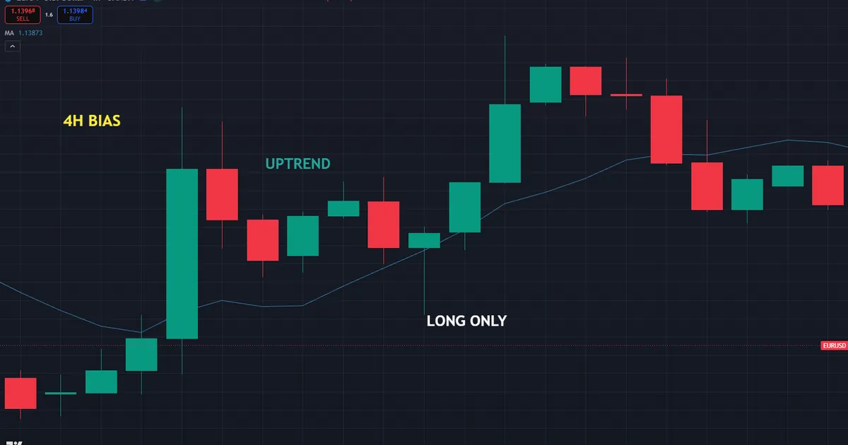
Now trace how that bias guides everything below it. Because the four-hour trend points up, you only hunt for buys on the smaller charts, and you ignore every sell signal they throw at you. So the higher timeframe acts as a filter that keeps the lower ones honest.
Why One Chart Misleads
A single timeframe hides context by its very nature. What looks like a fresh breakout on the five-minute chart may be a small bounce into resistance on the daily one. So the same candle can mean opposite things depending on how far back you zoom.
Think of each chart as a different lens on one market. The wide lens shows the terrain, and the narrow lens shows the next few steps. Because a trader needs both to walk safely, leaning on one lens alone leaves a blind spot. That blind spot is exactly where the surprise losses tend to hide, and the top-down routine exists to close it.
How the Top-Down Method Works
The routine follows a fixed order, and keeping that order stops you from second-guessing a chart. Three steps carry you from the big picture to the trigger.
- Higher timeframe bias. Start on the highest chart and read the trend. Higher highs and higher lows mean up, the reverse means down, and a flat range means stand aside.
- Middle timeframe structure. Drop to the middle chart and map the setup. Look for pullbacks, support and resistance, and the shape of the current swing.
- Lower timeframe entry. Zoom to the lowest chart only for timing. Wait for a trigger, such as a break or a candle pattern, in the direction the higher chart already set.
- Alignment. Trade only when all three charts agree. When they conflict, the honest move is to wait rather than force a setup.
- The gap. Keep a four-to-six times spacing between charts, so each adds real detail rather than repeating the one above it.
So the method reads from wide to narrow every single time. Never build the read from the bottom up, since a small chart cannot frame a big one. The concept graphic below stacks the three charts and shows how the read flows downward.
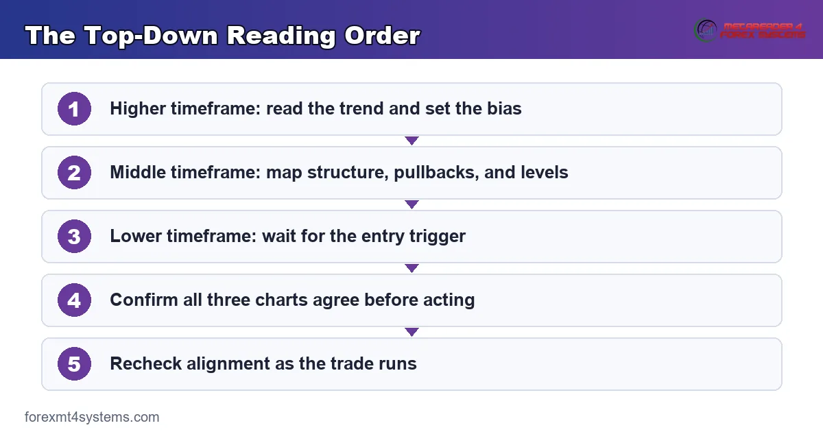
One rule keeps the routine clean. The higher timeframe always takes priority in a disagreement, because it carries more weight and more history. So when the one-hour tempts a buy while the four-hour points firmly down, you skip it. A lower chart never overrules the bias set above it.
Why the Gap Between Charts Matters
The spacing between your timeframes is not random. Charts too close together, such as the fifteen-minute and the thirty-minute, tell nearly the same story, so the second one adds little. Charts too far apart, such as the one-minute and the daily, skip the middle detail that ties them together.
A four-to-six times gap solves both problems. So the four-hour, one-hour, and fifteen-minute set spaces cleanly, and each chart reveals something the others hide. Because the steps are even, the read stays coherent from top to bottom rather than jumping across a gap that hides a swing.
How Multi Timeframe Analysis Fits a Workflow
The method slots into almost any strategy, because it governs when you look rather than what you trade. Most systems improve once a higher timeframe filters their signals.
Start with the bias chart as a gate. Before any indicator or pattern counts, the higher timeframe must agree with the trade. So a moving average, a trend line, or plain price structure on that chart tells you which direction to favor for the whole session. Our guide to moving averages explained shows how a single line can define that higher-timeframe trend at a glance.
Then let the middle chart find the setup. This is where you spot the pullback, the support test, or the range edge that offers a low-risk spot to act. Because the bias is already fixed, you look only for setups that point the right way. The trend indicators archive plots tools that map that structure automatically if you want them.
Now use the lowest chart purely for the trigger. A break of a small level, a candle rejection, or a fresh momentum push gives you the exact moment to enter. Meanwhile the stop can sit tighter here than on a higher chart, since you are timing a precise turn. So the lowest chart improves your entry price without ever changing the plan.
Choosing Your Three Timeframes
Your set depends on how long you hold trades. A scalper might run the fifteen-minute, five-minute, and one-minute charts, while a swing trader might run the daily, four-hour, and one-hour. So the labels change, but the four-to-six times spacing stays the same.
Pick the middle chart as your home base. This is the one you watch most, with the higher chart for context and the lower one for timing. Because your setups live on the middle chart, the other two simply frame and sharpen the decisions you make there. A clear home base keeps the routine from sprawling into too many windows.
Adjust the set as your style shifts, not mid-trade. A trader who moves from swing to intraday work should rebuild the whole trio at once, keeping the even spacing. So change all three charts together rather than swapping one and breaking the gap. Because the ratio between them carries the logic, a mismatched set quietly undoes the very benefit the method is meant to give. Traders who adopt the routine often find their hardest problem was never the entry itself, but the direction they chose to trade in the first place.
Pairing With Indicators
Multi timeframe analysis works well with a small toolkit rather than a cluttered one. A trend read on the higher chart pairs naturally with a momentum read on the lower one, so the two answer different questions. Our guide to how to combine indicators lays out that pairing in detail.
Keep the higher-timeframe tools slow and the lower-timeframe ones fast. So a long moving average frames the bias while a quick oscillator times the entry, and neither steps on the other. Because each tool sits on the chart that suits its speed, the setup stays readable rather than noisy. A directional gauge can confirm the bias is strong, and our guide to what is the ADX indicator shows how.
Worked Example: EURUSD Across H4, H1, and M15
Picture EURUSD holding a clean uptrend on the four-hour chart near 1.14, with a steady run of higher highs and higher lows. This sets a long-only bias, so buys are on the table and sells are off it for now.
Now drop to the one-hour chart for structure. Price has pulled back into a prior support shelf near 1.135, right where the larger uptrend would be expected to resume. So the middle chart has framed a low-risk area to watch for a long. The chart below stacks the three views and marks that pullback zone.

Then zoom to the fifteen-minute chart for the trigger. A small resistance line caps the pullback, and a clean break above it, holding over 1.136, signals buyers stepping back in. Because all three charts now agree, the entry fires with the trend behind it. Our free position size calculator turns the stop below 1.135 into a size in seconds.
Managing the Trade
Let each chart keep its role after the entry. The fifteen-minute chart times any add or partial exit, the one-hour chart tracks the structure, and the four-hour chart confirms the trend still holds. So you always know which chart to consult for which decision.
Watch the bias chart for the real exit signal. While the four-hour keeps printing higher highs, the trend stands and the trade runs. Meanwhile, if that chart breaks its structure with a lower low, the reason for the long is gone regardless of what the small charts show. So the highest chart that started the trade also decides when it ends.
Compare a trader who watched only the fifteen-minute chart. That trader would have seen the same break, yet without the higher context, a sudden four-hour reversal could trap the position. Because the top-down read framed the entry, this trade sat inside a trend rather than against one. So the extra charts, not the trigger itself, gave the setup its edge.
Reading the Confluence
Notice how many factors agreed at that one price. The four-hour trend pointed up, the one-hour pullback reached support, and the fifteen-minute break confirmed the turn. Because three separate reads all pointed the same way, the entry rested on more than a single chart.
So treat that stacked agreement as the real edge. Any one timeframe can mislead, yet three lining up raises the odds that the move continues. When the bias, the structure, and the trigger all agree, the setup is worth taking. Meanwhile a trade backed by only one chart, with the others silent or opposed, is the kind to pass on without regret.
Download the complete indicator database
Put these concepts on your charts. One email unlocks the full library of 1,380+ indicators with compiled MT4 and MT5 files, plus my TradingView scripts. No paywall, no spam, unsubscribe any time.
Get free access to my indicator database
One email unlocks 1,380+ free MT4, MT5 and TradingView indicators — the complete library. No single-tool download; you get the whole database.
Common Multi Timeframe Analysis Mistakes
The routine is simple, yet the same errors repeat across every market. Most come from letting the small chart override the big one, and the fixes follow beneath the graphic.

Letting the Lower Chart Lead
The classic slip is trading a lower-timeframe signal that fights the higher trend. The small chart looks exciting, yet it sits inside a larger move heading the other way. So always check the bias chart first, and drop any lower-timeframe signal that points against it.
Using Too Many Timeframes
Watching five or six charts at once buries you in conflicting signals. More screens rarely mean more clarity. Instead, settle on three with a clean four-to-six times gap, and let the rest go so each chart keeps a clear job.
Choosing Charts Too Close Together
The fifteen-minute and thirty-minute charts tell nearly the same story, so pairing them wastes a slot. Borrowing charts that overlap adds effort without insight. So space your timeframes with a real gap, and make sure each one shows something the others cannot.
Forcing a Trade on Conflict
When the three charts disagree, the honest answer is to wait. Traders often force a setup anyway, hunting action that is not there. Instead, treat conflict as a clear signal to stand aside, and act only once the charts line up in one direction.
Ignoring the Higher-Timeframe Levels
A major level on the four-hour chart can stop a trade cold even when the small chart looks clean. Missing that level leads to entering right into resistance. So mark the higher-timeframe levels first, and let them shape where you take and skip entries below. A break that runs straight into a four-hour ceiling has far less room than one with open space above it.
Multi Timeframe Analysis Checklist
Run this short list before every entry that leans on the top-down method. A few seconds here saves hours of regret later. So keep it in view, tick each item honestly, and let a missing check talk you out of a marginal trade.
- Higher-timeframe bias read and written down before anything else.
- Middle-timeframe structure mapped, with the key levels marked.
- Lower-timeframe trigger defined in advance, not improvised.
- All three charts pointing the same direction.
- Timeframe spacing kept near four to six times between charts.
- Higher-timeframe levels checked so you avoid entering into them.
- Stop and size set from the lower chart while respecting the bias.
When Multi Timeframe Analysis Fails
Study the failure case as hard as the winner. Here is a common one. A trader reads a strong four-hour uptrend on EURUSD near 1.14 and, sure the bias is enough, buys every fifteen-minute dip without checking the one-hour structure in between.
Then the middle chart bites back. The one-hour had already carved a lower high and was rolling into a deeper pullback, so each fifteen-minute dip kept extending against the entry. The chart below shows that gap, with a healthy four-hour trend sitting above a one-hour chart that had quietly turned.

So what went wrong? Skipping the middle chart left a blind spot exactly where the setup lived. Bias alone is not a trade, because it says only which way to lean, not when to act. Hence the guard that saves an account, which is to read all three charts every time. A strong higher trend still needs a healthy middle structure before any lower-chart trigger deserves your money.
Alignment Is Not Permanent
Respect how fast the charts can drift apart. Three timeframes that agree at entry can fall out of line within a few bars as the lower ones turn first. So recheck alignment as the trade runs, and treat a breakdown on the middle chart as an early warning before the higher one confirms it. Our guide to how to use trend lines shows how a simple line flags those turns early.
Keep a Trade Log
Be systematic about which timeframe sets actually suit you. Because your pairs and holding times are unique, a written record beats memory every time. So note the three charts you used and each trade’s outcome, then let the data settle whether your spacing and home base fit your style over the months. A short monthly review of that record usually reveals which timeframe set earns its place and which one just adds noise to an otherwise clean routine.
Related Concepts to Study Next
Multi timeframe analysis connects to a web of trend and structure tools, and a few ideas deserve your next reading hour. Diagonal levels frame the swings on every chart, so the way a trend line marks structure pairs naturally with the top-down read. Combining a slow and a fast tool across timeframes also sharpens the method, which is where a pairing routine earns its place. Both partners deepen the read that stacking charts gives you.
For broader context, the moving average indicators archive frames the higher-timeframe trend through smoothing tools. The pairing and strength themes covered above carry the method further, since a slow trend gauge and a fast momentum tool split neatly across your charts. So master the top-down read first on your own, and then let any tool on the chart simply confirm the direction each timeframe already shows you.
FAQ
What is multi timeframe analysis?
Multi timeframe analysis is the practice of studying one instrument across two or three timeframes before trading it. The higher chart sets the trend bias, the middle chart maps the setup, and the lower chart times the entry. Together they align a trade with the larger move rather than a single slice of it.
Which timeframes should I use?
Most traders use three charts with a four-to-six times gap between them. A swing trader might run the daily, four-hour, and one-hour, while a scalper runs the fifteen-minute, five-minute, and one-minute. Keep the spacing even so each chart adds real detail.
Which timeframe is most important?
The highest timeframe carries the most weight because it holds more history and sets the bias. It always takes priority over a lower chart in a disagreement. So when the charts conflict, favor the higher one and wait for the others to line up.
How many timeframes should I watch?
Three is the common sweet spot, giving you bias, structure, and a trigger without clutter. Watching more charts usually adds conflicting signals rather than clarity. Pick a home base in the middle, with one chart above for context and one below for timing.
Can multi timeframe analysis be used for scalping?
Yes, scalpers apply the same top-down logic on faster charts. They might read the fifteen-minute for bias, the five-minute for structure, and the one-minute for entry. The labels shift lower, but the four-to-six times spacing and the wide-to-narrow order stay the same.
Does multi timeframe analysis remove risk?
No, it improves how a trade aligns with the trend, but no method removes risk. Charts can fall out of alignment quickly, and a strong bias can still reverse. So recheck the charts as the trade runs, and manage risk on every position. Results are not guaranteed; past performance is not indicative of future results.
External references
- For background on this concept, see Top-Down Analysis at Investopedia.
- For broader market context, see Trend Analysis on Wikipedia.

About the author
Written by Dominic Walsh, a Forex trader and MT4/MT5 indicator, Expert Advisor and script developer. Every tool on forexmt4systems.com is tested on live charts before release and ships with ready-to-use compiled MT4 (.ex4) and MT5 (.ex5) files. Learn more about the trader and developer behind this site.
How we build, test and correct every tool: Editorial & Testing Policy. Trading carries risk; see the disclaimer.