
The trend lines vs support and resistance debate confuses many new traders, because both tools mark where price tends to turn. One draws a diagonal edge that slopes with the trend, and the other marks flat levels that sit still. Yet they answer different questions on the same chart.
This guide settles the trend lines vs support and resistance choice with plain rules. So by the end, you will know how each tool is built, what each one reads, and how to stack them for stronger, higher-confidence setups.
Trend Lines vs Support and Resistance: The Core Difference
Both tools mark zones where buyers or sellers stepped in before. There the likeness ends. A trend line is diagonal, so it tracks the pace and slope of a move. A support or resistance level is horizontal, so it marks a fixed price that mattered.
Think about what each edge captures. A trend line rises or falls with the trend, which makes it ideal for framing an ongoing move. A horizontal level stays put, which makes it ideal for marking a price that has rejected before.
Look at a live case. The chart shows GBPUSD on the four-hour timeframe with a rising trend line under the swing lows and a flat resistance level near 1.352 across the recent highs. Price climbs along the diagonal edge while it stalls at the horizontal one.

Diagonal Versus Horizontal
The shape of each edge tells the story. A diagonal line moves with time, so its price shifts on every bar. A horizontal level holds one price no matter how many bars pass.
That difference drives their jobs. Because a trend line slopes, it follows the trend and adapts to it. Because a level stays flat, it marks a memory that price returns to again and again.
Trend Versus Memory
A trend line reads momentum in a sense, since its angle shows how fast price climbs or falls. A steep line signals urgency, while a shallow one signals patience. So the slope itself carries a message about the move.
A horizontal level reads memory instead. Traders remember a price where the market turned, so they place orders there again. That crowd behaviour is why old highs and lows keep mattering long after they form.
The Role Flip That Ties Them Together
One idea links both tools neatly. When price breaks a resistance level and closes above it, that old ceiling often becomes new support. The memory simply switches sides.
Trend lines flip in the same way. A broken rising support line frequently turns into resistance on the retest. So both tools obey the same principle, even though one is flat and one slopes.
Watch for that flip after any clean break. Price returning to the broken edge from the other side offers a tidy, lower-risk entry. Because the level or line already proved it matters, the retest carries real weight.
How Each Tool Is Built
The construction of each edge is simple, so learn it once and reuse it forever. A few rules separate the two, and the rest follows from them.
- Trend line points. Connect two or more higher lows in an uptrend, or two or more lower highs in a downtrend. A third touch then confirms the slope.
- Trend line slope. The angle between the points sets the pace of the move. A steeper angle warns the trend may be running too hot to last.
- Support level. Mark a horizontal price where buyers repeatedly stopped a fall. The more clean touches it holds, the stronger the floor.
- Resistance level. Mark a horizontal price where sellers repeatedly capped a rally. Old resistance often becomes new support once price breaks above it.
- Zone, not a hairline. Treat every level as a small band rather than one exact price, since real reactions cluster around a range.
The concept graphic below lines the two builds up side by side, one sloping and one flat.

Why a Level Is a Zone
Beginners draw a level as a single thin line, then wonder why price overshoots it. Large orders cannot all fill at one exact price. So a level behaves as a small band, and a smart trader marks it that way.
Draw the zone from the wicks to the bodies of the reactions. That band gives price room to breathe while still marking the area that matters. A rigid hairline invites needless stop-outs on normal noise.
Keep the band tight, though, or it loses meaning. A zone that spans half the day’s range tells you nothing useful. So aim for a snug band that hugs the real reactions without swallowing the whole move.
Why a Line Needs Confirmation
A trend line drawn on two points is only a draft. Two points define any straight line, so the slope proves nothing yet. A third clean touch is the market voting that the edge matters.
So treat every fresh line with caution. Draw it lightly, wait for that third reaction, then trust it. Patience here filters out most of the lines that would have failed anyway.
A Side-by-Side Comparison
The table below sums up the trend lines vs support and resistance contrast at a glance. Keep it handy while you learn, and the differences will soon feel automatic.
| Feature | Trend Line | Support and Resistance |
|---|---|---|
| Shape | Diagonal, sloping edge | Horizontal, flat level |
| Price over time | Shifts on every bar | Stays at one price |
| Best market | Trending moves | Ranges and turning points |
| Main read | Direction and pace | Memory and reaction zones |
| Confirmation | Third touch on the slope | Multiple touches at the price |
| Common trade | Bounce or break-and-retest | Fade the zone or trade the break |
Neither column is better in the abstract. The right choice depends on whether the market trends or ranges, so read the context first and let it pick your tool.
What the Two Tools Share
The contrast matters, yet the overlap matters too. Both tools mark where past traders acted, and both offer two ways to trade them. You can fade the edge on a bounce, or trade the break when price closes through.
Both also improve with more touches. A line grows stronger with each clean bounce, and a level grows stronger with each rejection. So the same rule of confirmation applies to whichever edge you draw.
Fitting Both Into a Workflow
The two tools shine brightest together, not apart. Match each one to the market condition first. Then let the pair guide entries with more confidence than either could alone.
In a clean trend, lean on the trend line to stay with the move. In a range, lean on horizontal support and resistance to fade the edges. So the market condition, not habit, should pick your lead tool.
Match the Tool to the Market
A trend line struggles in a flat market, since price wanders across it with no respect. A horizontal level struggles in a strong trend, because price blows through old highs without pausing. So read the condition before you draw.
Ask one question first. Is price making higher highs and higher lows, or is it bouncing between two flat prices? The answer tells you which tool leads and which one supports.
Markets shift between these states over time. A trend cools into a range, and a range breaks into a trend. So revisit the question often, and let your lead tool change as the market changes.
Stacking the Two for Confluence
The real edge appears where the two meet. When a rising trend line reaches a horizontal support zone, both tools point to the same reaction area. That overlap is called confluence, and it beats a single edge every time.
Mark the crossing point in advance. Price approaching that junction gives you an early alert. So set the two edges, note where they cross, then wait for a candle signal at the overlap.
Add a third layer for even stronger confluence. A round number, a prior swing, or a moving average sitting at the same spot raises the odds of a reaction. So the more independent reasons that stack, the more weight the zone carries.
Respecting the Session Clock
Both tools read cleanest inside the London window and the New York morning, roughly 2:00 to 5:00 and 8:00 to 11:00 New York time. Liquidity runs deep then, so reactions carry real weight. Because the Asian session thins out, edges get pierced by moves that mean little.
Timeframes Change the Weight
The chart you choose sets the power of each edge. A trend line on the daily chart carries far more weight than one on the five-minute. Likewise, a level tested across weeks matters more than one tapped over an hour.
So read the big picture first, then zoom in. A higher-timeframe level or line acts as the anchor, while lower-timeframe edges fine-tune the entry. That top-down habit keeps small signals in their proper place.
Worked Example: Confluence on GBPUSD
Picture GBPUSD climbing on the four-hour chart in July. A rising trend line runs under the higher lows, and a flat support zone sits near 1.344 from an old breakout. Both edges converge at the same spot.
Now price pulls back into that junction. Both the diagonal line and the horizontal zone meet near 1.344, and a bullish candle closes right there. Below, the chart marks the confluence entry where the two tools agree.
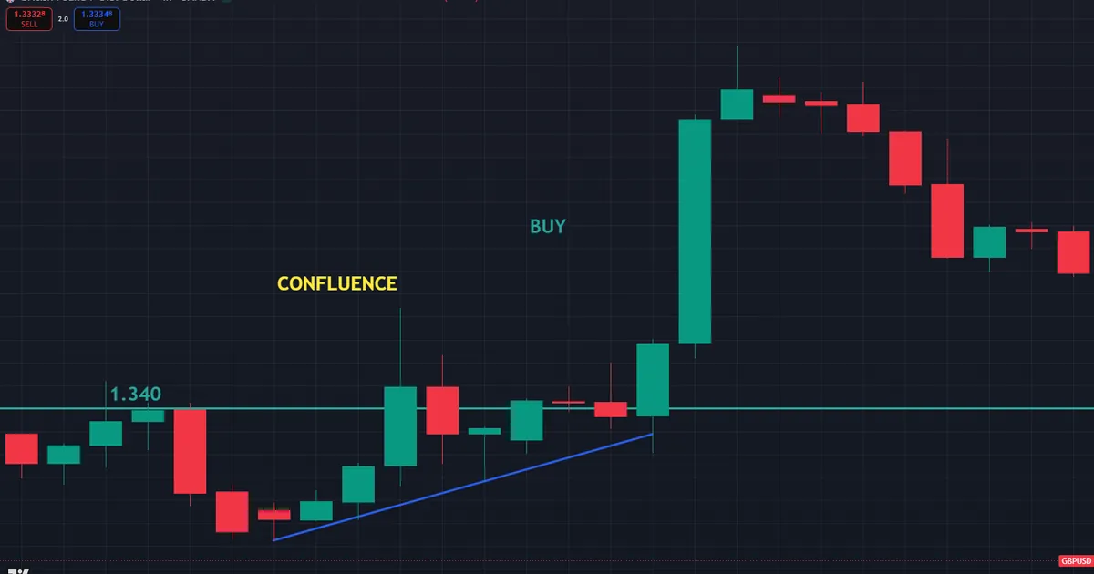
This trade builds from structure. You buy as the candle closes near 1.345, with a stop below both edges around 1.339. That places roughly 60 pips of risk, defended by two reasons rather than one.
Follow-through rewarded the read. Price lifted toward 1.353, where the earlier resistance capped the move. Because two independent edges lined up at entry, the setup carried more weight than a lone line or level would.
Why the Overlap Mattered
Consider what each tool added. The trend line proved the move still climbed in an orderly way. The horizontal zone proved buyers had defended that exact price before. Together they framed a spot where a bounce looked likely.
A trader using only one tool would have seen less. The line alone gave a slope, and the level alone gave a memory. The overlap turned two ordinary signals into one strong decision point.
Managing the Trade After Entry
A clean signal is only half the job. The exit decides the result. So plan the target before the trade goes live, often near the next horizontal resistance.
In this GBPUSD case, the old resistance near 1.353 gave a logical first target. As price neared it, trailing the stop under each new higher low locked in gains. That way both tools kept working after the entry.
What a Single-Tool Trader Missed
Picture two traders at the same chart. One watched only the trend line and saw a routine bounce. The other watched only the level and saw an old floor. Neither noticed that the two edges lined up at the very same price.
The confluence trader saw both. Because two reasons stacked at 1.344, that trader sized the position with more confidence and set a tighter, well-defended stop. So combining the tools turned a fair setup into a strong one.
Download the complete indicator database
Put these concepts on your charts. One email unlocks the full library of 1,380+ indicators with compiled MT4 and MT5 files, plus my TradingView scripts. No paywall, no spam, unsubscribe any time.
Get free access to my indicator database
One email unlocks 1,380+ free MT4, MT5 and TradingView indicators — the complete library. No single-tool download; you get the whole database.
Common Mistakes and How to Fix Them
The tools are simple, yet the same errors repeat on every timeframe. Most trace back to using one tool for a job the other should do. The fixes follow the graphic below.

Trading Trend Lines in a Range
A diagonal line in a flat market fires signal after signal that leads nowhere. Price simply wanders across it. Instead, switch to horizontal support and resistance whenever the trend flattens out.
Trading Levels Against a Strong Trend
Fading a horizontal level inside a powerful trend often means standing in front of a train. Price blows through old highs without pausing. So respect the trend and use the line to stay with it, not against it.
Drawing Levels as Thin Lines
A hairline level invites stop-outs on normal noise. Real reactions cluster around a small band, not one exact price. Instead, mark each level as a zone and give price room to breathe inside it.
Trusting a Two-Point Line
A line with only two touches is a guess. Acting on it early leads to weak entries. So wait for the third clean reaction before you risk money on the slope.
Forgetting the Higher Timeframe
A tidy setup on the five-minute chart means little against the daily picture. The larger timeframe frames every smaller edge. So check the daily trend and its key levels before you trust an intraday signal.
Marking Too Many Edges at Once
Some traders cover a chart in lines and levels until nothing stands out. A crowded chart hides the few edges that truly matter. Instead, keep only the clearest trend line and the two or three levels with the most touches.
Clean charts lead to clean decisions. When every edge on screen earns its place, a reaction there means something. So delete the clutter and trust the survivors.
A Pre-Trade Checklist for Both Tools
Run this short list before every entry. A few seconds of checking saves hours of regret. So slow down, tick each item, and let a failed check keep you out of a marginal trade.
- Higher-timeframe read of both trend and key levels.
- Market condition named as trending or ranging.
- The right tool chosen for that condition.
- Confluence noted where a line meets a level, if present.
- A defined trigger, such as a candle close at the edge.
- Stop distance set just beyond the line, the zone, or both.
- Position size worked out from the stop, not a hunch.
When Each Tool Fails
Study the failure case as hard as the winner. Here is a common one. EURUSD chops sideways on the one-hour chart with no clear trend in place.
A trader forces a rising line under a few lows near 1.135 and treats every touch as a buy. Price pokes above and below the diagonal with no respect, while the real action stays trapped between two flat levels. The chart below shows those false touches inside the range.
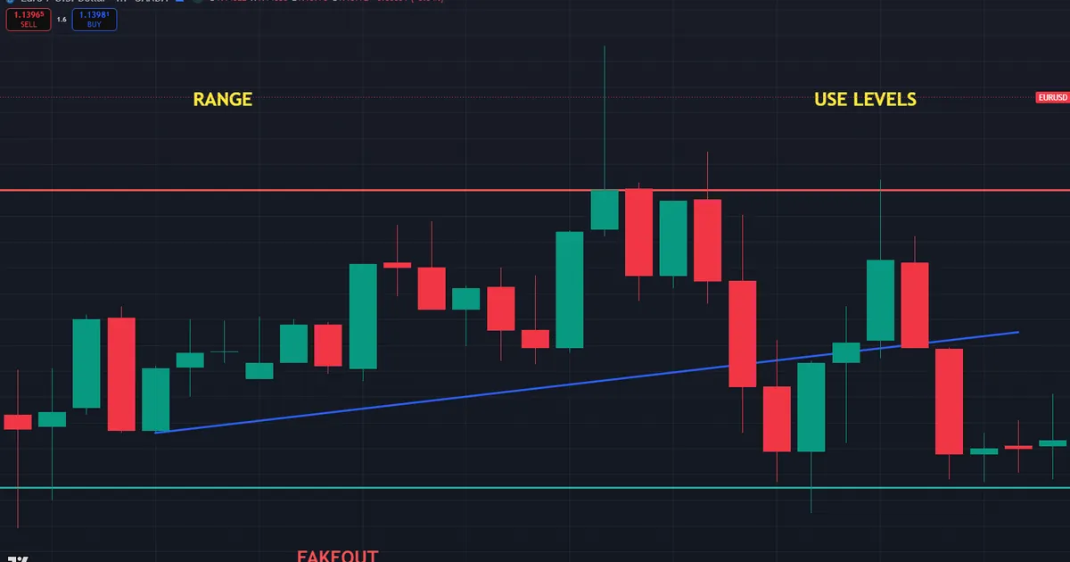
So what went wrong? The trader used a trend tool in a market with no trend. In a flat range, horizontal support and resistance would have marked the true turning points. The diagonal line only added noise.
Then size each trade so a false break costs little. A sensible stop flows from the range, and position size flows from that stop, which our free position size calculator works out in seconds. Because the risk stayed small, a run of fakeouts stung rather than wounded.
Levels Break, and Lines Break
Be honest about both tools. Every level eventually gives way, and every trend line eventually breaks. A break is information, not a betrayal. So treat the first clean close through either edge as a possible shift in control.
False Breaks Trap Both
Be honest about a shared weakness. Price often pierces a line or a level, tempts a breakout trade, then snaps right back. That false break traps traders who chased the first move through the edge.
Guard against it with patience. Wait for a candle to close beyond the edge, not merely a wick. So a quick stab that reverses stays a warning rather than a signal you acted on.
Neither Tool Sees the News
Be honest about a shared blind spot. Both tools read only past price, so neither one sees a rate decision coming. A single news candle can slice through a line and a level in the same second. So check the calendar and step back around major releases.
Related Concepts to Study Next
These two tools connect to a web of sibling ideas, and a few deserve your next reading hour. Start with our step-by-step guide on how to use trend lines to master the diagonal edge. Then dig into the flat side with our explainer on support and resistance.
One more guide widens the view. Because math-derived levels offer yet another way to map turning points, read our walkthrough of how to use pivot points. It pairs neatly with the horizontal zones you draw by hand.
For hands-free charting, the trend indicators archive plots slopes and channels for you, while the support and resistance indicators archive marks the flat zones automatically. Tools speed the work, yet the logic above still carries the trade. So learn the edges first, and let any indicator confirm what you already see.
FAQ
Are trend lines the same as support and resistance?
No, though they are cousins. A trend line is a diagonal edge that slopes with the trend, while support and resistance are horizontal levels at a fixed price. Both mark reaction zones, but they suit different market conditions.
Which should I learn first?
Start with horizontal support and resistance, since flat levels are simpler to spot and mark. Once those feel natural, add trend lines to frame the direction of a move. Then combine the two for confluence.
Can a trend line act as support or resistance?
Yes, that is its whole job. A rising trend line acts as moving support, and a falling one acts as moving resistance. The difference is that the price of that support or resistance shifts with every bar.
What is confluence between the two tools?
Confluence happens where a diagonal trend line meets a horizontal level at the same area. Two independent reasons then point to one reaction zone. That overlap usually marks a stronger setup than either edge alone.
Which tool works better in a range?
Horizontal support and resistance work far better in a range, because price bounces between two flat prices. A trend line struggles there, since a sideways market has no slope to follow. So switch to levels whenever the trend flattens.
Do these tools promise a reaction at the edge?
No tool promises a bounce or a rejection. Levels break and lines break, so always confirm with a candle signal and manage risk. Manage risk on every trade. Results are not guaranteed; past performance is not indicative of future results.
External references
- For background on this concept, see Resistance Line at Corporate Finance Institute.
- For broader market context, see Trend Line on Wikipedia.

About the author
Written by Dominic Walsh, a Forex trader and MT4/MT5 indicator, Expert Advisor and script developer. Every tool on forexmt4systems.com is tested on live charts before release and ships with ready-to-use compiled MT4 (.ex4) and MT5 (.ex5) files. Learn more about the trader and developer behind this site.
How we build, test and correct every tool: Editorial & Testing Policy. Trading carries risk; see the disclaimer.