
Two continuation shapes get mixed up more than any other pair on a forex chart. The flag vs pennant question has one honest answer, and it lives in the boundary lines rather than in the story around them.
A flag runs roughly parallel. A pennant converges. Everything else stays the same, so this guide leads with that single split and then shows what it changes in practice.
Flag vs Pennant: The One Line That Separates Them
Both shapes describe a pause. Price runs hard in one direction, then drifts sideways or slightly against that run while the market catches its breath.
So the pause alone settles nothing. Only the two lines you draw around the drift decide which name the shape earns.
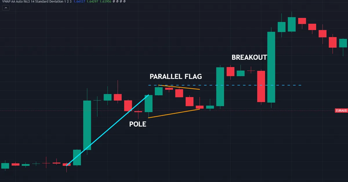
Above sits a bull flag on EURAUD hourly bars, running from 28 to 29 July 2026. Its upper and lower edges hold roughly the same distance apart, and the level to clear sat at 1.64162.
Both Shapes Start With the Same Pole
A pole is a sharp, near-vertical move. Typically it comes from a data release, a session open, or a push through a level that plenty of traders watched.
Without a pole, neither name applies at all. A small channel in the middle of a quiet range is simply a small channel.
That EURAUD pole covered about 0.00798, or roughly eighty pips. The figure matters later, because traders project it from the break to sketch a rough target.
Parallel Boundaries Versus Converging Boundaries
Draw one line across the highs of the drift and another across the lows. If the pair stays about the same distance apart, you have a flag.
If they lean toward each other and the range narrows, you have a pennant. In practice a pennant looks like a small symmetrical triangle perched on the end of a pole.
Nothing else changes between them. Both describe a pause inside a move, and both fail often enough that a close beyond the boundary stays the minimum standard.
How to Draw Each Shape Without Fooling Yourself
Sloppy line drawing creates most of the confusion between these two names. Six steps keep the job honest.
- Find the pole first. Mark a sharp move that covers ground in few bars, then measure its height in points.
- Wait for the drift. The pause should lean against the pole or run flat, never extend it.
- Anchor the upper line. Connect at least two highs inside the pause, using bar extremes rather than closes.
- Anchor the lower line. Connect at least two lows the same way, with no cherry-picking.
- Compare the two slopes. Roughly equal slopes mean a flag; lines leaning together mean a pennant.
- Define invalidation now. Write down the price that would kill the idea before you think about entries.
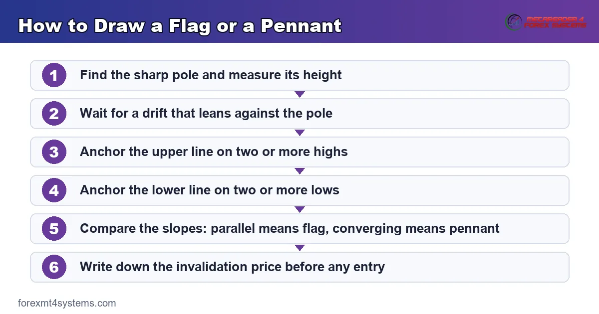
Work down the steps in order every time. Step five decides the name, so skipping it leaves you guessing at the label.
Where Traders Draw the Lines Wrong
Most bad flags come from a line anchored to one convenient wick. Two touches per line is the floor, and three reads far better.
Another common error involves redrawing lines after every new bar. Instead, fix the shape once, then let price argue with it.
How Long the Pause Should Last
A pause that runs longer than the pole starts losing its meaning. The whole idea rests on a brief rest inside a fast move.
Traders often use a rough count of bars for this. Something like five to twenty bars on your working timeframe covers most real cases.
Beyond that the shape drifts into a range or a channel. Our guide to flag pattern meaning walks through that boundary in more depth.
Which Timeframe Should Carry the Drawing
A pause on the five-minute chart often sits inside a single hourly bar. So the same market can show a pennant on one screen and nothing at all on another.
Pick the chart you actually trade, then draw only there. Flicking between timeframes until a shape appears is how traders talk themselves into weak setups.
One lower timeframe still helps for entry timing. Use it to see the break clearly, but let the higher chart own the label and the stop.
What Parallel Versus Converging Implies
Geometry has consequences. A shape that narrows must resolve sooner than a shape that holds its width.
A Pennant Runs Out of Room
Converging lines meet at a point. Price cannot keep oscillating inside a space that shrinks every bar, so a pennant forces a decision quickly.
That tighter cage also gives you a closer invalidation level. Since the range is small, a stop just beyond the opposite line sits nearer to the entry.
Traders like that arithmetic, and the appeal is real. Yet a tight stop also sits inside the noise, which cuts both ways.
A Flag Can Drift for Longer
Parallel lines never meet. A flag can therefore slide along for many more bars without breaking anything.
So flags tend to need more patience and a wider stop. The channel keeps its width, and price can travel from one edge to the other several times.
Neither version deserves a preference on that basis alone. They simply demand different amounts of room and different amounts of waiting.
Why the Two Blur Together on Live Charts
Textbook drawings look clean. Real pauses rarely do, because the highs and lows scatter enough that both readings often fit.
A slight convergence turns a flag into a pennant on one trader’s screen and stays a flag on another’s. Both traders drew defensible lines from the same bars.
Accept that overlap rather than fighting it. The label matters far less than the level you would trade and the level that would prove you wrong.
What Each Shape Shows About Buyers and Sellers
Neither shape signals anything. Both describe a balance of orders that has already played out on the chart in front of you.
The Pole Records an Imbalance
A near-vertical move means one side ran out of willing counterparties. Price had to travel far to find new orders, which is why the bars look so thin.
That imbalance is the only genuinely informative part of either shape. The pause afterwards simply shows whether the imbalance faded or held.
A Shallow Drift Suggests Little Profit Taking
If price barely retraces after a sharp run, few holders wanted out at those prices. A drift covering a third of the pole says more than one covering most of it.
Deep retracements muddy the reading badly. Once the pause gives back the bulk of the pole, you are looking at a reversal argument rather than a pause.
So measure the depth as well as the shape. A shallow flag and a deep flag describe very different situations despite sharing a name.
Converging Lines Show Both Sides Shrinking
In a pennant, sellers keep lowering their offers while buyers keep raising their bids. Neither side pushes hard, and the range tightens as a result.
Such compression cannot last. Something has to give, though the chart never tells you in advance which direction that release takes.
Traders who read compression as a bullish message on its own get caught regularly. A tightening range is a statement about volatility, not about direction.
A Worked Example on the Hourly Chart
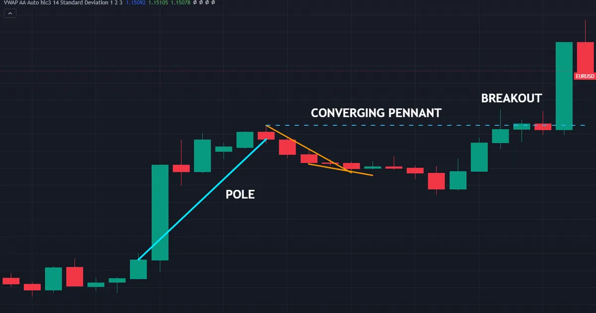
Numbers make the process concrete. Consider the bull pennant that formed on EURUSD hourly bars between 29 and 30 July 2026.
A sharp pole of roughly 0.00707, near seventy pips, ran into a small converging pause. Price then closed above 1.14751 and left the shape behind.
Reading the Shape Before the Break
The upper line fell slightly while the lower line rose. Because both slopes pointed inward, the pause qualified as a pennant rather than a flag.
Volume tools add little here on spot forex, since tick volume only approximates activity. So the lines and the pole carried the whole read.
Entry, Stop and the Projection
Confirmation means an hourly close above the upper line, not a wick through it. Traders who insist on that close accept a worse price for better evidence.
A stop then sits below the lowest point inside the pennant, with a small buffer for spread. Our risk-reward calculator turns that distance into a ratio before you commit anything.
The projection adds the pole height to the break level. Seventy pips added to 1.14751 gives a rough objective near 1.15458.
Why the Projection Is Only a Sketch
A measured move is a projection, never a promise. Price frequently stalls well short of it, and sometimes runs far past it.
Partial exits exist for exactly that reason. Taking some risk off at the halfway mark leaves the rest free to travel without a knot in your stomach.
Treat the figure as a planning tool. It tells you whether the trade is worth taking at all, and nothing more than that.
Where These Shapes Carry the Most Weight
Location does more work than geometry. A pause that forms somewhere meaningful reads very differently from one floating in open space.
Inside an Established Trend
Higher highs and higher lows give a bull flag a reason to exist. The pause then fits a story the chart already told for hours or days.
Drop the same shape into a choppy range and the story disappears. Nothing about the drawing changed, yet the context that made it interesting has gone.
So check the swing structure before you check the lines. Two minutes of scrolling left saves a lot of arguing with yourself later.
Just Past a Level That Mattered
A pole that breaks a well-tested level often stalls right above it. The pause that follows then sits on old resistance turned support.
That location gives the shape a second reason to hold. Buyers defending the broken level and buyers chasing the break want the same thing.
Our guide to support and resistance covers how to mark those levels before the pole arrives rather than afterwards.
Around Session Opens and Data
Sharp poles cluster around the London open, the New York open and scheduled releases. Liquidity shifts fast at those moments, which is exactly what creates the near-vertical move.
The pause that follows often reflects thin books rather than genuine agreement. Treat a pennant built in the first minutes after a release with extra caution.
Waiting for the second hour usually costs little. The shapes that survive that wait tend to look far cleaner anyway.
Download the complete indicator database
Put these concepts on your charts. One email unlocks the full library of 1,380+ indicators with compiled MT4 and MT5 files, plus my TradingView scripts. No paywall, no spam, unsubscribe any time.
Get free access to my indicator database
One email unlocks 1,380+ free MT4, MT5 and TradingView indicators — the complete library. No single-tool download; you get the whole database.
Common Mistakes and Their Fixes
Six errors cause most of the trouble with these two shapes. The panel below sets the parallel case and the converging case side by side.
Naming the Shape Before Finding the Pole
Traders spot a small triangle and call it a pennant. Instead, look left first, because no sharp move means no pennant at all.
Trading the Touch Instead of the Close
A wick through the boundary proves very little. Wait for a close beyond the line on your working timeframe, then act on that evidence.
Forcing the Label When Both Fit
Some pauses genuinely sit between the two definitions. Rather than agonise, mark the break level and the invalidation level, and let the name go.
Ignoring Where the Shape Formed
A pennant in the middle of nowhere carries little weight. Check the trend and the nearest marked level first, then decide whether the shape deserves any attention.
Sizing From Habit Rather Than From the Stop
Pennants create tight stops and flags create wider ones. So the same lot size on both produces very different exposure, which nobody intends.
Skipping the Failure Case Entirely
Both shapes break the wrong way regularly. Our capstone on why chart patterns fail collects the reasons in one place.
Quick Reference: Flag or Pennant
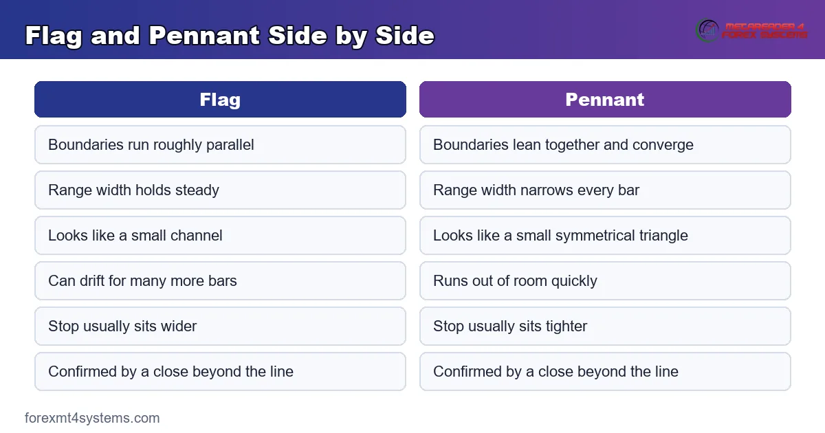
Keep this table beside the chart while the habit settles. Each row separates the two cases cleanly.
| Check | Flag | Pennant |
|---|---|---|
| Prior move | Sharp pole | Sharp pole |
| Upper boundary | Slopes against the pole | Slopes toward the lower line |
| Lower boundary | Roughly parallel to the upper line | Slopes toward the upper line |
| Range width over time | Holds steady | Narrows every bar |
| Typical shape | Small channel | Small symmetrical triangle |
| Time it can last | Longer, since the lines never meet | Shorter, since the lines converge |
| Usual stop distance | Wider | Tighter |
| Confirmation | Close beyond the boundary | Close beyond the boundary |
Read the middle rows first. They settle the name faster than any amount of squinting at the shape.
Turning the Distinction Into a Written Rule
A shape you name differently each week teaches you nothing. Writing the rules down once turns a fuzzy impression into a plain yes or no.
Fix the Convergence Test in Advance
Decide now what counts as converging. Many traders use a simple test: if the range at the end of the pause is under two thirds of the range at the start, call it a pennant.
Any threshold works, provided you apply it the same way every time. Consistency matters far more than the exact number you settle on.
Review the rule every few months against your own notes. If most of your qualifying shapes go nowhere, tighten the test rather than abandoning the idea.
Write the Confirmation Rule Once
Confirmation means a close beyond the boundary on your working timeframe. Put that sentence in your plan, then stop negotiating with it mid-trade.
Some traders add a second condition, such as a retest that holds. Either version works, as long as the choice happens before the shape appears.
Size From the Stop, Not From Habit
A pennant stop might sit twenty pips away while a flag stop sits sixty. Fixed lot sizes therefore triple your exposure without you noticing.
Work the size from the stop distance instead. Our position size calculator handles that arithmetic in a few seconds.
When the Shape Does Not Follow Through
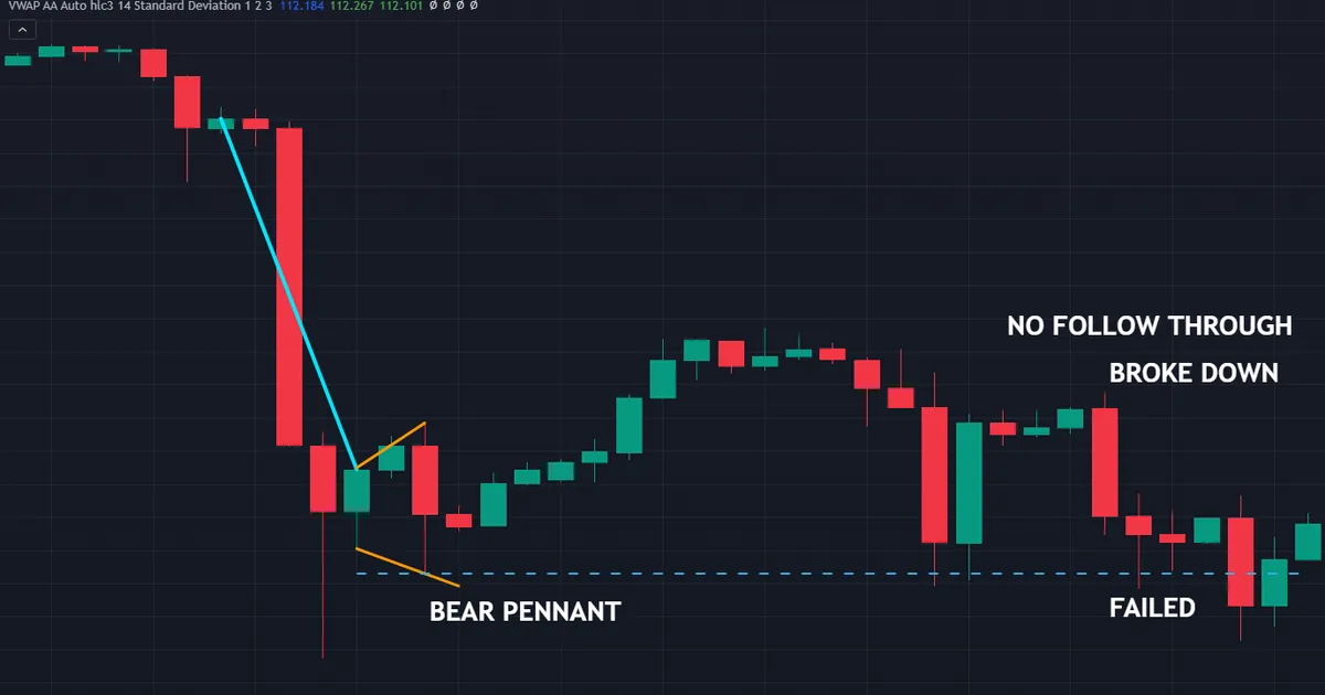
Failures teach more than tidy examples. Below sits a bear pennant on CADJPY hourly bars from 30 July 2026, and it did not deliver the continuation the shape implies.
What Actually Happened
A drop of just over two hundred pips built the pole. Price coiled, hovered above the line for a session, then slipped under 113.259 and closed straight back above it instead of extending lower.
Nothing about the drawing was wrong. The lines converged properly, the pole was sharp, and the break still went nowhere.
Why That Outcome Is Normal
A pause tells you what already happened. It cannot tell you what the next hour brings, because fresh orders arrive after the shape completes.
Sellers who wanted lower prices may have finished. Buyers waiting under the market may have stepped in. Neither group announces itself on the chart.
How to Trade Around That Reality
Define the invalidation before the entry, then size so the loss is dull. A break that fails should cost you a shrug rather than a bad week.
Keep a record of every occurrence too, including the ones that went nowhere. Our free trade journal makes that logging habit easier to sustain.
The Difference Between a Failure and a Mistake
A failed shape is not the same thing as a bad decision. You can draw the lines properly, wait for the close, size correctly, and still lose.
Judge the process rather than the outcome on any single trade. Only a run of thirty or forty entries says anything useful about your rules.
What a Cluster of Failures Tells You
One failure means nothing at all. Five in a row on the same pair and timeframe suggests the market changed character, or your drawing drifted.
Go back through the screenshots when that happens. Usually you will find the poles got shorter, or the pauses got deeper, long before the losses arrived.
Related Guides Worth Reading Next
These two shapes sit inside a wider family of pauses and squeezes. A few neighbouring guides finish the picture.
Start with our overview of triangle pattern types, since a pennant is effectively a small symmetrical triangle. Then read our note on the inside bar, which describes the same pause idea on a single bar.
Traders who want these shapes flagged automatically can browse our pattern recognition indicators archive. Treat any such tool as a spotter, and keep the drawing decisions in your own hands.
FAQ
What is the difference between a flag and a pennant?
The boundary lines. A flag has roughly parallel upper and lower lines, so it looks like a small channel drifting against the prior move. A pennant has lines that converge, so it looks like a small symmetrical triangle. Both need a sharp pole in front of them, and both describe a pause rather than a forecast.
Does the pole have to be vertical?
Not literally. The point is speed relative to normal movement on that chart. A move that covers a lot of ground in few bars qualifies, even if it steps rather than shoots. If the run took twenty slow bars, treat the shape after it as a range instead.
Which one resolves faster?
A pennant usually does, because converging lines leave less and less room with every bar. A flag can drift for much longer, since parallel lines never meet. That difference affects your patience and your stop distance more than anything else.
Can a shape be both at once?
In practice, yes. Slight convergence sits in the eye of the person drawing the lines, so two traders often disagree about the same pause. When that happens, drop the label and focus on the break level and the invalidation level instead.
Should I trade every one I see?
No. A pause only earns attention when it forms somewhere that already mattered, such as a prior level, a clear trend, or a session extreme. A textbook shape floating in mid-range gives you very little to work with.
Do flags and pennants work the same way in forex?
The geometry transfers cleanly, since both shapes describe order flow rather than anything market-specific. Spot forex does add two wrinkles. Tick volume only approximates real activity, so volume confirmation carries less weight than it does on a stock chart. Sessions also matter, because a pole built during the London hours reflects far more participation than one built in a quiet Asian range.
What stops a pause from being a reversal instead?
Depth, mostly. A flag or pennant should give back only part of the pole, and shallow drifts read best. Once price retraces most of the sharp move, the pause has become a fight rather than a rest, and the continuation reading loses its footing. Many traders draw a line at roughly half the pole and stop calling anything deeper a flag.
How reliable are these two shapes?
Nobody can give you an honest number. Published testing of classical chart shapes has produced modest and inconsistent findings once costs and drawing choices enter the picture, and outcomes shift with the market, the period and the exact rules applied. Treat both shapes as a way to frame a level and a stop, then let confirmation and position size do the heavy lifting. Results are not guaranteed; past performance is not indicative of future results.
External references
- For background on this concept, see Pennant Pattern at Corporate Finance Institute.
- For broader market context, see Symmetrical Triangle at StockCharts ChartSchool.

About the author
Written by Dominic Walsh, a Forex trader and MT4/MT5 indicator, Expert Advisor and script developer. Every tool on forexmt4systems.com is tested on live charts before release and ships with ready-to-use compiled MT4 (.ex4) and MT5 (.ex5) files. Learn more about the trader and developer behind this site.
How we build, test and correct every tool: Editorial & Testing Policy. Trading carries risk; see the disclaimer.