
Every pattern guide shows you the textbook example that worked. Almost none of them explain why chart patterns fail so often, which leaves traders blaming themselves for something structural.
This article takes the other side. Three genuine failures anchor it, and the reasons behind them apply to every shape in the catalogue.
Why Chart Patterns Fail: The Short Answer
A pattern is a description of structure that has already formed. It records what buyers and sellers did, and it says nothing about what they will do next.
So the honest question is never whether a shape works. The question is whether the level it frames still matters when the next order arrives.
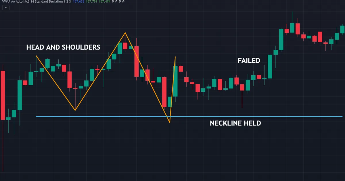
Above sits a head and shoulders on USDJPY hourly bars from 14 to 15 July 2026. Every part formed correctly, with the head at 162.424 and a neckline at 161.931, yet that neckline never gave way and the setup expired quietly.
A Description, Not a Forecast
Textbooks often write that a pattern signals a move. That phrasing does real damage, because it turns a drawing into a prediction.
Better to say what the structure shows. Three peaks with a lower right shoulder show sellers capping each attempt, and that is a fact about the past.
Whether the drop follows depends entirely on orders nobody has placed yet. No amount of careful drawing changes that.
The Neckline That Held
On the USDJPY chart, the height from head to neckline came to 0.494. Traders who projected that distance downward had a target ready before the break.
Then no break arrived. The deepest print after the right shoulder was 161.982, roughly five pips above the line, and price turned back up from there.
Nothing in the drawing was wrong. The structure described a fight that sellers did not go on to win, and anyone who anticipated the break held a position with no trigger behind it.
The Five Reasons, in Order
Failures cluster around five causes. Each one has a fix, and none of the fixes involves finding a better pattern.
- Boundaries come from judgement. Two traders draw different lines on the same bars, so they see different shapes.
- Hindsight selects the winners. The examples you remember are the ones that worked, which distorts your sense of how common that is.
- Context goes missing. A textbook shape in the middle of a range describes very little.
- Costs eat thin edges. Spread, commission and slippage all land before any target does.
- Samples run small. Most published claims about pattern behaviour rest on far too few occurrences.
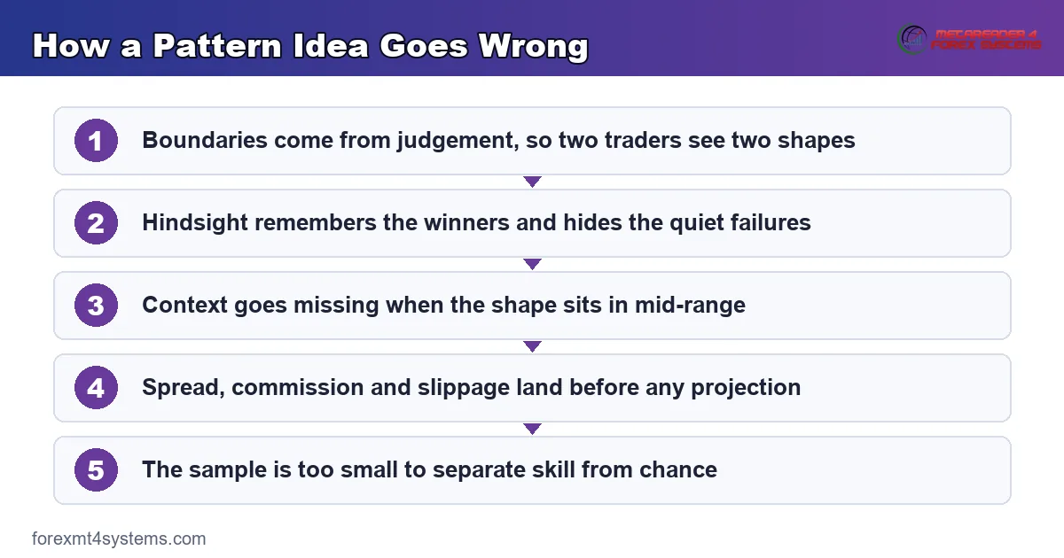
Work through the list in order when a setup disappoints. Usually one of the five explains it without any mystery at all.
Reason One: You Drew the Boundaries
Patterns do not exist in the price data. They exist in the lines you place on top of it.
Two Traders, Two Shapes
Hand the same hundred bars to two analysts. One anchors resistance on wick extremes, the other on closing prices, and their triangles end up different shapes.
Neither of them cheated. Both applied a reasonable convention, and the conventions simply disagree.
Our comparison of rising wedge vs ascending triangle shows how much rides on a single slope decision.
The Slope Problem
Flat resistance almost never sits perfectly flat. Somewhere between horizontal and clearly rising, a triangle becomes a wedge.
Where you draw that boundary decides whether the conventional reading is bullish or bearish. That is an enormous consequence for a judgement call.
The Fix: Write the Tolerance Down
Pick a rule now and record it. Anchor on wicks or on closes, require three touches or two, allow a ceiling to wander by a tenth of the shape’s height.
Any consistent rule beats an inconsistent one. Consistency is what lets your own records mean anything later.
Naming Adds Confidence It Has Not Earned
Putting a name on a structure feels like progress. In truth the label adds nothing the bars did not already contain.
People find shapes in noise very easily, and markets supply plenty of noise. A convincing outline is not evidence that anyone else sees the same thing.
So hold your labels loosely. The level and the invalidation price carry the weight; the name is only shorthand for a conversation.
Reason Two: Hindsight Picks the Winners
Scroll back through any chart and the good examples jump out. That is not an accident of memory.
Why the Failures Disappear
A pattern that worked leaves an obvious mark: a sharp move away from the level. A pattern that failed leaves a shape that blends into the noise around it.
So your eye finds the winners without trying. The losers were never labelled, because nothing happened worth labelling.
The same filter runs through every course, every screenshot and every social media post you have ever seen.
Confirmation Working Quietly
Once you believe a shape works, you notice the cases that agree. The awkward ones get explained away as poorly formed or badly timed.
Ruling out the messy examples afterwards is exactly how a rule stops being testable. The test has to include every occurrence, including the ugly ones.
The Fix: Log Every Occurrence
Screenshot each shape you mark, before the outcome exists. Record the level, the invalidation price and the date.
Then revisit the file monthly. Our free trade journal makes that habit far easier to sustain than a folder of loose images.
Reason Three: Context Goes Missing
A shape only earns attention when it forms somewhere that already mattered. Most of the shapes people trade fail that test before anything else goes wrong.
Consider the bull flag on EURCAD hourly bars between 31 July and 3 August 2026. A clean pole of about 0.00824 ran into a tidy parallel drift, and the breakout level at 1.61908 was never taken on a close.

What Was Missing
The drawing was fine. The pole was sharp, the drift leaned against it, and the boundaries ran parallel as they should.
One bar poked 1.61949 through the ceiling and closed back at 1.61868. That single wick is the whole story: no hourly close ever cleared the level, so the entry never triggered and price rolled over to 1.61506 instead.
What the setup lacked was a reason for anyone else to care. A ceiling matching no level anyone had marked attracts no fresh orders, so the flag ran out of buyers at its own boundary.
Location Beats Geometry
A prior swing high, a session extreme, a level that stopped price twice before: those give a break something to run into or through. Our note on flag vs pennant covers the drawing side, and location does the rest.
Mark your levels before you look for shapes. Doing it the other way round simply places the level wherever the pattern needs it to be.
The Fix: Two Reasons, Not One
Ask for a level and a structure before you commit. If the only argument is the shape, the trade rests on the weakest evidence available.
Trend counts as a second reason too. A continuation shape inside a clear run has something behind it, while the same shape in a flat range has nothing.
Session timing works as a third. Shapes that resolve into the London or New York hours meet far more participation than those resolving into a quiet stretch.
Reason Four: Costs Eat Thin Edges
Every trade starts behind. Spread, commission and slippage all arrive before any projection does.
The Arithmetic Nobody Runs
A two-pip spread against a twenty-pip objective removes a tenth of the move at the outset. On a five-pip scalp target it removes far more.
Slippage on the break adds to that. Fast markets fill you worse than the screen suggested, which is exactly when patterns break.
Any edge thin enough to survive only without costs was never an edge. It was an artefact of a spreadsheet.
Why This Hits Small Timeframes Hardest
Lower timeframes produce more shapes and smaller moves. The cost stays roughly constant while the target shrinks.
So the same rule that looks workable on the four-hour chart can lose money on the five-minute chart. The pattern did not change; the arithmetic did.
The Fix: Size the Target Against the Cost
Compare your typical objective to your typical spread before taking the setup at all. A ratio under ten to one deserves real scepticism.
Then work the position size from the stop distance rather than habit. Our position size calculator handles that in seconds.
Reason Five: The Samples Run Small
Published claims about pattern behaviour rest on surprisingly few occurrences. That matters more than most traders realise.
Thirty Cases Prove Very Little
A run of thirty examples can look convincing and still reflect nothing but chance. Randomness produces streaks all the time.
Split those thirty by market, by timeframe and by drawing convention, and you are left with a handful in each bucket. Conclusions drawn from a handful travel badly.
Testing Many Rules Until One Fits
Try enough variations of a rule and something will look good on past data. That result usually says more about the searching than about the market.
Honest testing fixes the rule first, then runs it once. Everything else is decoration.
Definitions Shift Between Studies
One study requires three touches on each boundary. Another accepts two, and a third measures the shape from closes rather than extremes.
Those choices change which bars qualify, so the results stop being comparable. Comparing two published figures for the same pattern often compares two different patterns.
Ask for the definition before you accept the finding. Without it, the number floats free of anything you could reproduce.
Markets Change Underneath the Test
Spreads narrowed enormously over the past two decades. Execution speeds rose, participation shifted, and the behaviour around obvious levels changed with it.
A result drawn from data twenty years old may describe a market that no longer exists. Recent samples are smaller, which puts you back at the first problem.
The Fix: Treat Every Claim as Provisional
When an article quotes a percentage for a pattern, ask which market, which period and which definition produced it. The answer usually undermines the number.
Our honest look at whether candlestick patterns work applies exactly the same scrutiny to single-bar shapes.
Download the complete indicator database
Put these concepts on your charts. One email unlocks the full library of 1,380+ indicators with compiled MT4 and MT5 files, plus my TradingView scripts. No paywall, no spam, unsubscribe any time.
Get free access to my indicator database
One email unlocks 1,380+ free MT4, MT5 and TradingView indicators — the complete library. No single-tool download; you get the whole database.
Common Mistakes and Their Fixes
Six habits turn ordinary pattern failures into expensive ones. The panel below collects what actually helps.

Entering Before the Close
A wick through a boundary proves an attempt and nothing more. Wait for a close beyond the level on your working timeframe.
Moving the Lines Mid-Trade
Redrawing a boundary to keep a losing position alive is not analysis. Fix the shape once, then let price argue with it.
Trading Every Shape You Find
Patience costs nothing and filters plenty. Take the shapes that sit at levels you marked in advance, and skip the rest without regret.
Treating a Projection as a Target
A measured move is a projection, never a promise. Price frequently stalls short of it, which is precisely why partial exits exist.
Sizing So a Loss Hurts
A structure that fails should cost you a shrug. If a single failure ruins your week, the size was wrong long before the pattern was.
Chasing Complexity After a Loss
Traders often answer a failure by adding ratios and rules. Our overview of the harmonic pattern family shows how far that road runs, and how little the extra precision settles.
What Actually Helps
Four habits do more than any refinement to the shapes themselves. Keep this table where you can see it.
| Habit | What it means in practice | What it removes |
|---|---|---|
| Confirmation on a close | A close beyond the defining level on your chart, never a touch | Entries on wicks and spikes |
| Location that already mattered | A level, a trend or a session extreme marked before the shape formed | Shapes floating in mid-range |
| Invalidation defined first | The price that ends the idea, written down before entry | Moving stops and hopeful holds |
| Size that survives being wrong | Lots worked from stop distance, not from habit | One failure doing lasting damage |
| A log of every occurrence | Screenshots taken before the outcome exists | Hindsight rewriting your record |
None of those five involve a better pattern. All five involve better handling of an ordinary one.
A Third Failure: The Wedge That Broke Upward
The last example runs against the convention rather than fizzling out. Below sits a rising wedge on EURCAD hourly bars from 20 to 21 July 2026.

What Actually Happened
Both boundaries climbed and converged, with the upper line near 1.60881 and the lower line just beneath at 1.60818. Conventional reading calls that bearish.
Price broke upward instead. The hourly close at 1.60898 on 22 July cleared the upper line, so anyone short on the wedge alone met a stop rather than a target.
Watch what came next, though. The advance stalled at 1.60923 within hours, then price slid to 1.60034 by 23 July, so the upside break failed as well.
Why the Convention Is Not a Rule
Rising wedges break upward regularly. The bearish label describes a tendency people have written about, not a mechanism that forces the outcome.
Treating a convention as a rule is how traders end up fighting a trend. The wedge said momentum was fading, and fading momentum still leaves room for one more push.
The Useful Lesson
Define both directions before entry. Write the level that confirms your idea and the level that ends it, then let the chart choose.
A shape that breaks the wrong way still leaves a usable level behind. That reference from the other side is often worth more than the original setup.
Reading the Whole Cluster Honestly
None of this means patterns deserve the bin. It means the claims around them deserve trimming back to what the evidence supports.
What Patterns Are Genuinely Good For
Shapes give you a repeatable way to frame a level, a stop and a size. That framing has real value, since it turns a vague view into a plan you can measure.
They also give traders a shared language. Two people can discuss the same structure quickly, which speeds up any conversation about risk.
What They Cannot Do
No shape tells you what happens next. Anyone offering a reliability figure for a pattern has skipped the definition problem, the sample problem and the cost problem all at once.
Our guide to Elliott wave theory makes the same point about counts, which get revised after the fact more often than most write-ups admit.
Where to Put Your Effort
Time spent on drawing tolerance, logging and sizing pays better than time spent hunting new shapes. The catalogue is already large enough.
Traders who want shapes flagged automatically can browse our pattern recognition indicators archive. Any such tool works as a spotter, and the judgement stays yours.
Related Guides Worth Reading Next
Reading a specific shape alongside this article makes the failure modes concrete. Two starting points work well.
Our full anatomy piece on the head and shoulders pattern covers the structure behind the first failure above. Read it with the neckline example in mind, and the difference between a description and a forecast becomes obvious.
After that, pick one shape and study it for a month. Depth on a single structure beats a shallow tour of twenty, because only depth builds a sample worth reviewing.
Building the Honest View Into a Routine
Knowing why patterns fail changes nothing on its own. A short weekly routine turns the knowledge into behaviour.
Mark Levels Before the Week Starts
Open your charts on Sunday and mark the prior weekly high and low, the round numbers nearby, and the last obvious swing on each pair you follow.
Then look for shapes only near those marks. The order of operations does most of the filtering for you.
Traders who reverse the order end up justifying levels after the fact. That habit quietly removes the value of having levels at all.
Review the Log, Not the Memory
Set aside twenty minutes each month for the screenshots. Sort them by shape, by pair and by whether the location test passed.
Count the quiet failures alongside the obvious ones. Your memory will not do that job, because it never stored the boring cases in the first place.
Change One Thing at a Time
When the review suggests an adjustment, change a single rule and leave the rest alone. Altering three things at once tells you nothing about which one mattered.
Give the change enough occurrences to mean something. Twenty trades is a start, and fifty says considerably more.
Keep the Language Careful
Watch how you describe setups to yourself. Saying a shape shows fading momentum keeps you honest, while saying it signals a reversal quietly commits you to an outcome.
Language shapes expectation, and expectation shapes how long you hold a losing position. Precise wording costs nothing and saves real money.
FAQ
Do chart patterns work at all?
They work as a framing device. A shape gives you a level to trade against, a place to put a stop and a way to size the position. Published testing of classical patterns has produced modest and inconsistent findings once transaction costs and definition choices enter the picture, so treat any confident claim about performance with scepticism.
Why do two traders see different patterns on the same chart?
Because boundaries come from judgement. One trader anchors lines on wick extremes, another on closing prices, and a third requires three touches where the first accepted two. All three conventions are defensible, and they produce different shapes from identical bars.
What is the single biggest cause of pattern failure?
Missing context. A textbook shape that forms in the middle of a range, away from any level anyone marked, gives a break nothing to work with. Location does more for a setup than tidy geometry ever will.
Should I use an indicator to find patterns for me?
As a spotter, yes. Automated tools apply one fixed tolerance to every chart, so they label borderline cases mechanically and miss the context entirely. Let an alert tell you where to look, then open the chart and make the judgement yourself.
How many examples do I need before trusting a pattern?
More than most people collect. Thirty occurrences can look convincing and still reflect chance, and splitting them by market and timeframe leaves very few in each bucket. Keep logging past the point where you feel sure, because that feeling arrives long before the evidence does.
Why do patterns seem to fail more often on small timeframes?
Two reasons stack up. Lower timeframes produce far more shapes, and most of them sit nowhere near a level anyone marked. Costs also stay roughly constant while the objectives shrink, so a spread that barely registers against a hundred-pip move takes a real bite out of a fifteen-pip one.
Does a failed pattern tell me anything useful?
Often, yes. A boundary that failed becomes a level worth watching from the other side, and a cluster of failures on one pair usually signals that the market changed character. Track the failures with the same care you give the successes, then judge your process over a long run rather than any single trade. Results are not guaranteed; past performance is not indicative of future results.
External references
- For background on this concept, see Data Dredging on Wikipedia.
- For broader market context, see False Signal at Investopedia.

About the author
Written by Dominic Walsh, a Forex trader and MT4/MT5 indicator, Expert Advisor and script developer. Every tool on forexmt4systems.com is tested on live charts before release and ships with ready-to-use compiled MT4 (.ex4) and MT5 (.ex5) files. Learn more about the trader and developer behind this site.
How we build, test and correct every tool: Editorial & Testing Policy. Trading carries risk; see the disclaimer.