
The head and shoulders pattern meaning comes down to three pushes at a high, with the middle push standing tallest. Buyers try three times, and the line drawn under the two dips between those peaks holds the whole reading together.
This guide walks through the anatomy first, then the neckline, then the measured move. It also spends real time on the failure case, because plenty of these shapes never break at all.
Head and Shoulders Pattern Meaning in Plain Terms
Picture three peaks in a row. The first and third reach similar heights, while the middle one stands clearly above both.
Two troughs sit between those peaks. A line across the troughs becomes the neckline, and that line carries every decision that follows.
Nothing completes until price closes below the neckline. Until then you hold a stalling advance and little else.
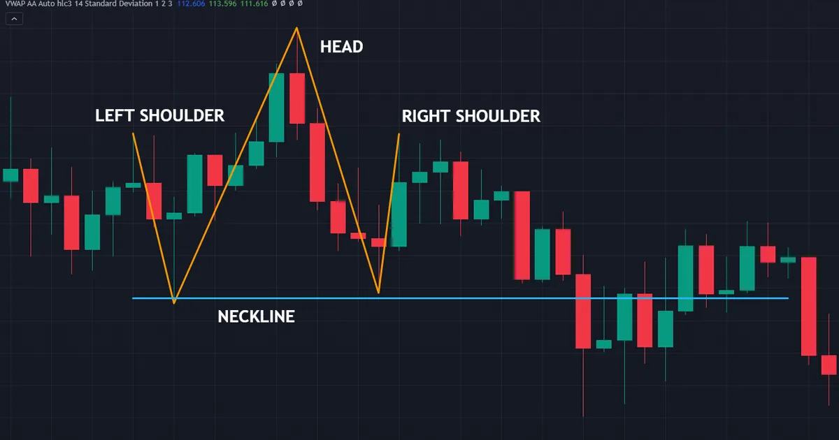
The chart above shows the full shape on AUDJPY weekly bars, with the head at 99.013 and the neckline at 90.685. Left shoulder, head and right shoulder all sit in one view, which is how the structure should look before anyone acts on it.
The Three Peaks
Peak one marks a normal pause in an advance. Price pulls back, then pushes to a new high, and that second push forms the head.
Then comes the third attempt. It stalls near the level of the first peak rather than clearing the head, which is the whole point of the shape.
Shoulders rarely match to the pip. Most traders accept a rough symmetry, and the exact tolerance shifts with the instrument and the timeframe.
The Neckline Under the Two Troughs
Draw a line through the low after the left shoulder and the low after the head. That line defines the level the sellers must take.
Sometimes the two troughs sit at different prices. A gently sloping neckline handles that, though a horizontal line keeps the rules simpler and harder to fudge.
Mark the line before the right shoulder finishes. A neckline drawn afterwards tends to land wherever the trader wanted it to land.
What Has to Come Before the Shape
An advance must lead into the left shoulder. Without one, the formation reverses nothing, and you simply hold three touches of a range ceiling.
Length of that advance changes what the structure means. A months-long rally offers far more to unwind than a two-day push, as our guide to support and resistance explains.
Location matters just as much. Three peaks at a level the market already respected carry weight, while three peaks in open space carry rather less.
What the Structure Says About Supply and Demand
A chart pattern describes something that already happened. It records behaviour rather than forecasting the next move, and reading it that way keeps expectations sane.
Three Failed Attempts, One Story
Each peak represents buyers committing capital. The head shows the largest commitment, since price stretched furthest above the previous high on that push.
Then the third attempt undershoots. Buyers who paid up near the head now hold losing positions, and their patience thins with every bar that goes sideways.
Sellers read the same tape. They watched the level reject price twice, so they lean on it again with tighter stops and larger size.
Where the Orders Sit
Stops from those late buyers cluster under the troughs. That cluster explains why a neckline break sometimes accelerates rather than drifting.
Breakout sellers add to the effect. They enter below the line, and their own stops then rest above it, which feeds any retest that follows.
None of that makes the outcome certain. Order clusters explain the mechanics of a move, though they say nothing about whether one arrives.
Volume and Momentum Context
Equity charts often show volume thinning across the right shoulder. Currency feeds report tick counts rather than traded size, so treat that clue lightly on forex.
Momentum tools give a cleaner read. A head that prints a lower oscillator reading than the left shoulder describes an advance losing force, which many traders note before the neckline matters.
How the Structure Builds, Step by Step
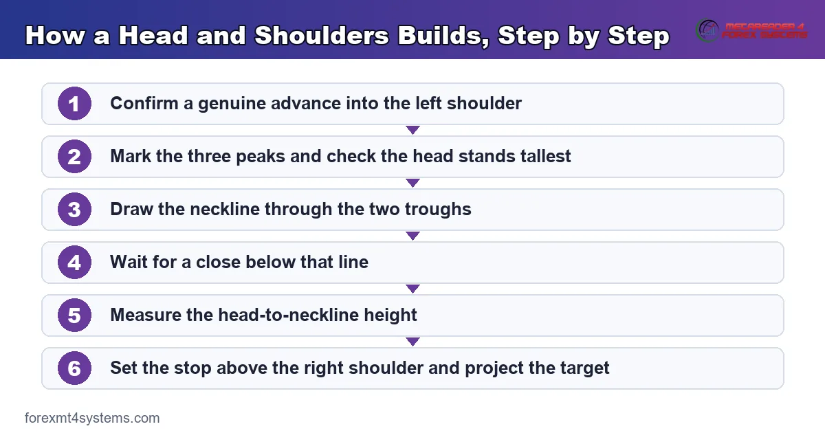
Work through the same sequence every time. Six steps take you from the first peak to a managed position.
- Confirm the prior advance. Check that a genuine uptrend led into the left shoulder.
- Mark the three peaks. Note the price of each, and check the head stands above both shoulders.
- Draw the neckline. Run it through the two troughs, and leave it alone afterwards.
- Wait for a close below. A wick through the line completes nothing at all.
- Measure the height. Take the distance from the head down to the neckline.
- Set the stop and the target. Stop above the right shoulder, target one height below the break.
Step four rejects most candidates. Because price pokes through levels constantly, the close carries the information and the wick rarely does.
Keep that order fixed. Traders who measure the target before the break talk themselves into trades the chart never offered.
Why a Close Below the Neckline Decides
A neckline behaves like any other level. Price tests it, pierces it, and only a settled close tells you which side won.
Wicks Through Versus Closes Below
Intraday liquidity produces wicks constantly. A spike a few pips under the neckline often reverses within the hour and leaves nothing behind.
A close below shifts the balance. Traders who bought either trough now sit underwater, and their exits add to the selling.
So define the close you require in advance. Daily closes suit swing traders, while a four-hour close suits shorter holding periods.
Which Timeframe Supplies the Close
Pick the timeframe that drew the pattern. A weekly formation deserves a weekly close, not a five-minute one.
Dropping to a lower chart for the trigger costs you consistency. It also invites a dozen false breaks in the same month.
How Long to Give the Break
Set a time limit alongside the price stop. A break that stalls for several bars without extending rarely improves with waiting.
Weekly structures need weeks, and intraday ones need hours. Match the patience to the timeframe that drew the shape, then act when the deadline passes.
The Retest After the Break
Price often returns to the neckline once it gives way. Old support then acts as resistance, and many traders prefer that second entry.
Waiting carries a cost. Plenty of these breaks run without any retest, so patience sometimes means missing the move entirely.
Split the difference if that suits you. Take part of the position on the close and part on the retest, then manage both against one stop.
The Measured Move Is a Projection, Not a Promise
The classic target uses the shape’s own dimensions. Measure from the head down to the neckline, then drop that same distance below the break.
Treat the result as a reference point. Price reaches it sometimes and stops well short at other times, which is exactly why partial exits exist.
Working the Numbers on a Daily Chart
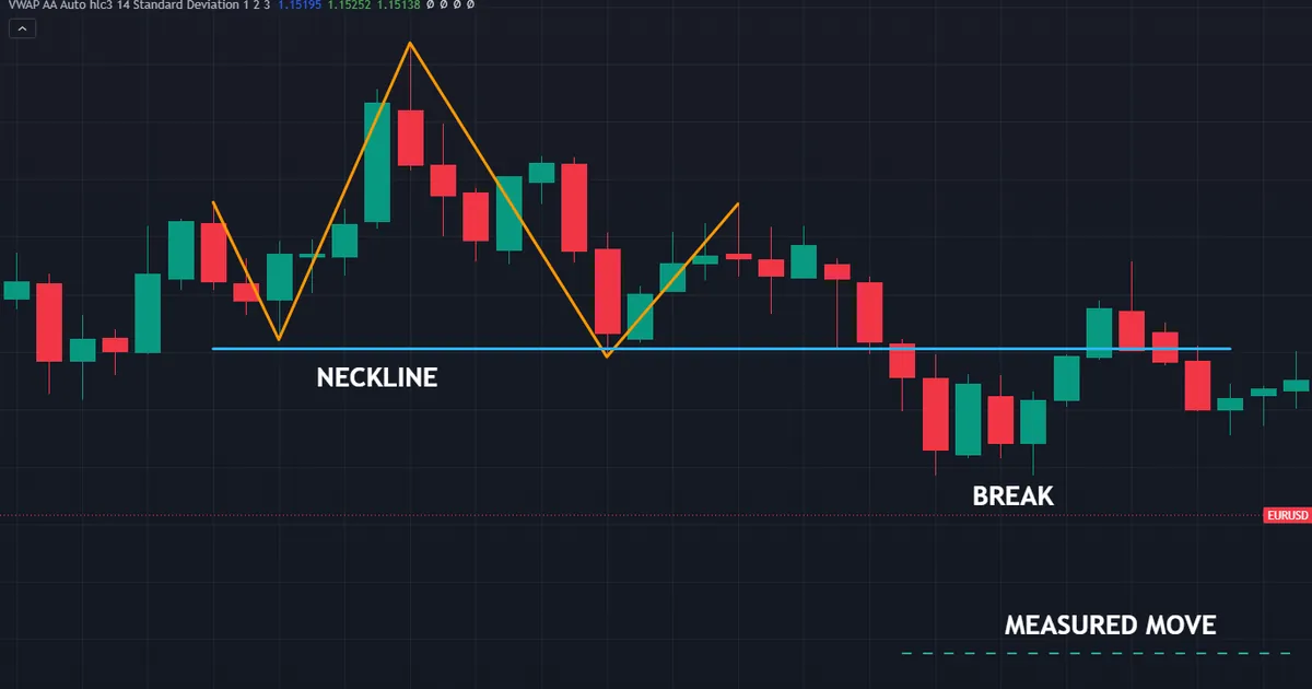
The chart above tracks a completed break on EURUSD daily bars. Its head sits at 1.19188 and the neckline runs at 1.16531.
Subtract one from the other and the height comes to 0.02657, or roughly 266 pips. Project that distance below the neckline and the measured move lands near 1.13874.
Compare the projection with your stop before entering. Our risk reward calculator turns those two distances into a ratio you can accept or reject in seconds.
Why Price Often Stops Short
Levels sit in the way. Old swing lows, round numbers and session extremes all attract profit taking before any projection arrives.
Volatility shapes the outcome too. A 266 pip target asks a great deal of a quiet week and rather less of a fast one.
So mark the obstacles between entry and target first. Then decide which one deserves a partial exit, rather than holding for the full measure by default.
Partial Exits Solve the Problem
Book a slice at the first obstacle. Taking money off the table early makes it far easier to hold the rest through an ordinary pullback.
Trail the remainder behind structure. Each new lower high after the break gives you a fresh reference, and the market sets the pace.
Record where price actually stopped on every attempt. Over enough examples your own log tells you how far these moves tend to travel on your pairs, which beats any general claim.
Reading the Right Shoulder
The right shoulder decides whether the shape deserves a label at all. It also sets your stop, so study it closely.
Height Relative to the Left Shoulder
A right shoulder near the left shoulder’s level reads cleanly. Both attempts failed at a similar price, and the head looks like an exhausted stretch above them.
A right shoulder far below the left one changes the story. Sellers already control the tape, so the neckline may give way before you finish drawing it.
A right shoulder above the head cancels the reading. Three peaks with the tallest on the right describe an advance, not a topping structure.
Time Taken to Build It
Symmetry in time helps, though it rarely arrives neatly. Shoulders of roughly similar duration make the shape easier to trust and easier to explain.
Very fast right shoulders often mark thin sessions. Check which session produced those bars before treating the structure as complete.
The Sloping Neckline Problem
Necklines that slope steeply upward flatter the pattern. They delay the break, and they let a trader claim a completion that a flat line would deny.
Downward-sloping necklines cause the opposite trouble. They trigger early, sometimes on a bar that later reverses hard.
Fix the line once and record it. Screenshots of the chart at the moment you drew it keep your later self honest.
When the Right Shoulder Never Arrives
Sometimes price falls straight from the head through the neckline. No third peak forms, so the label does not apply, whatever the move does next.
Resist the urge to rename the structure afterwards. A break without a right shoulder belongs to a different reading, and forcing the name onto it corrupts your own records.
Wait for the next clean example instead. Missing one trade costs far less than learning the wrong lesson from a mislabelled chart.
Download the complete indicator database
Put these concepts on your charts. One email unlocks the full library of 1,380+ indicators with compiled MT4 and MT5 files, plus my TradingView scripts. No paywall, no spam, unsubscribe any time.
Get free access to my indicator database
One email unlocks 1,380+ free MT4, MT5 and TradingView indicators — the complete library. No single-tool download; you get the whole database.
Managing the Position After the Break
Entry solves half the problem. What happens over the following sessions decides most of the outcome.
Three Ways Traders Enter
The first way sells the close below the neckline at market. It catches every break, and it accepts a wider stop and a worse average price.
The second waits for the retest. It offers a tighter stop and a better fill, though many breaks never come back to offer one.
The third splits the order. Half goes in on the close, half rests as a limit at the neckline, and both halves share a single stop above the right shoulder.
Moving the Stop
Leave the stop alone until the chart gives you something. A first lower high below the neckline offers a natural place to tighten.
Trail behind structure rather than by a fixed distance. Each new lower high supplies a fresh reference, so the market sets the pace instead of a rule.
Avoid moving to breakeven too early. A routine retest of the neckline would stop you out at the exact moment the structure behaves as described.
Sizing the Position
Distance to the stop decides the size, not conviction about the shape. A weekly formation demands a wider stop and therefore a smaller position for identical risk.
Run the numbers before the break rather than during it. Our position size calculator converts a stop distance into lots in a couple of clicks.
Common Head and Shoulders Mistakes and the Fixes
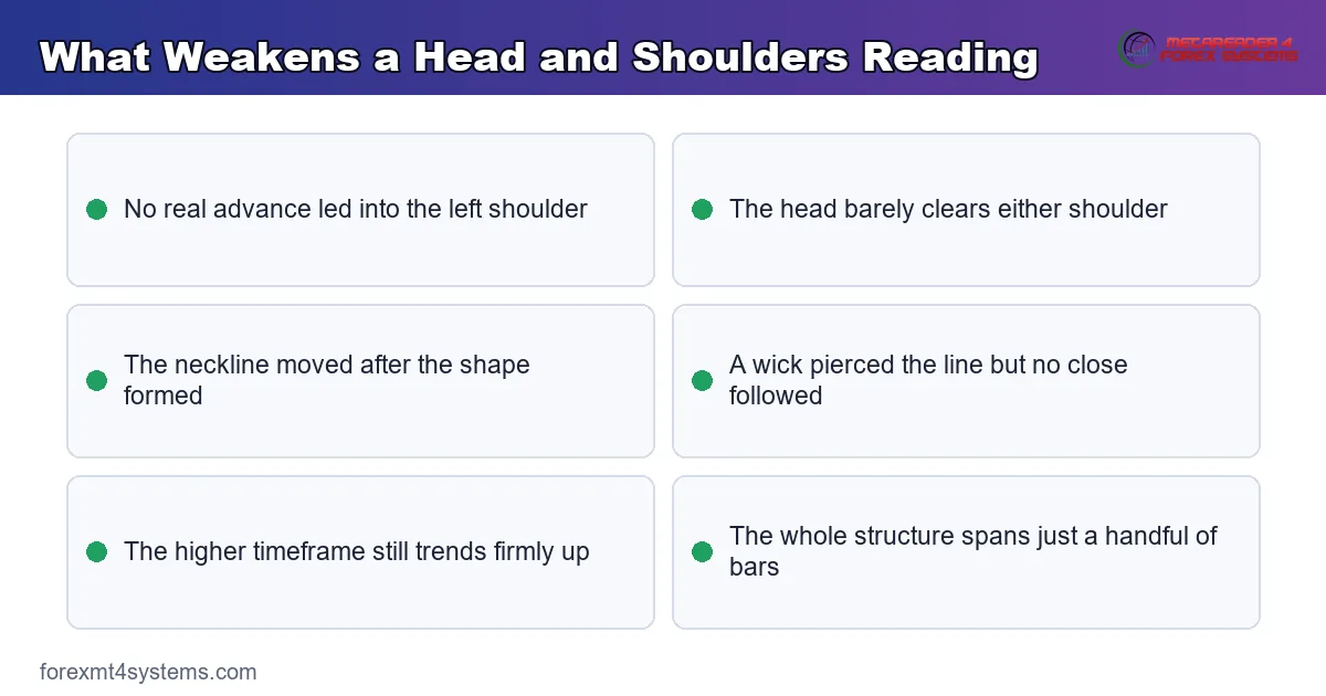
Most losses around this structure trace back to a handful of habits. The panel below collects what weakens a reading before any break arrives.
Selling the Right Shoulder Early
Three peaks alone describe a stalling advance. Short the right shoulder if your plan allows range trading, but call it a range trade rather than a completed pattern.
Redrawing the Neckline Until It Breaks
Sloping the line until a break appears defeats the whole exercise. Anchor it at the two trough lows, then leave it in place.
Demanding Perfect Symmetry
Textbook diagrams show tidy shoulders at matching heights. Live charts rarely oblige, so set a tolerance and apply it the same way every time.
Measuring the Height From the Entry Price
Take the height from the head to the neckline, never from wherever your fill landed. A target measured from the entry means nothing at all.
Ignoring the Higher Timeframe
A four-hour formation inside a powerful weekly uptrend fights the larger flow. Check the bigger chart first, or trade smaller when the two disagree.
Placing the Stop Inside the Shoulder
A stop just under the shoulder high sits inside the noise. Add room above the shoulder, then cut position size so the risk stays constant.
Head and Shoulders Quick Reference
Keep this table beside your chart while the structure becomes familiar. Each row states a condition rather than an outcome.
| Element | What to check | Common practice |
|---|---|---|
| Prior trend | A real advance into the left shoulder | Weeks or months, not days |
| Head | Clearly above both shoulders | No ambiguity about which peak is tallest |
| Shoulders | Roughly similar heights | Tolerance set in advance, applied consistently |
| Neckline | Line through the two troughs | Drawn before the right shoulder completes |
| Trigger | A close below the neckline | Close on the timeframe that drew the shape |
| Stop | Above the right shoulder | Extra room for a stop run |
| Target | Head-to-neckline height below the break | Partial exits at levels along the way |
Notice what the table leaves out. Nothing here suggests how often the shape follows through, because that figure shifts with the market, the period and the definition applied.
When the Head and Shoulders Fails
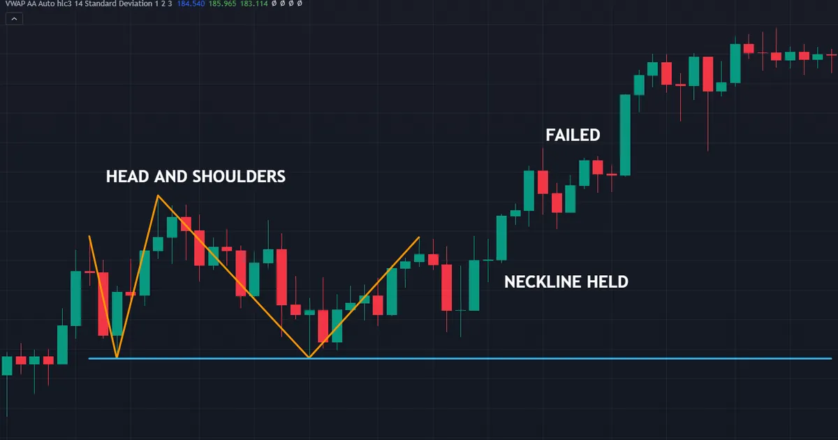
Failed structures teach more than clean ones. The chart below shows a formation on EURJPY weekly bars that never triggered: the neckline at 137.3765 held, and the pattern failed with the head still marked at 148.406.
The Neckline Simply Holds
Without a close below the line there is no trade to take. Traders who sold in anticipation of one become the fuel for the move back up.
That outcome appears constantly on weekly charts. Big timeframes take months to resolve, and impatience during the wait costs more than the eventual break pays.
The Right Shoulder Keeps Climbing
Sometimes the third push clears the head. Buyers who kept coming back finally bring enough size, and the topping read dissolves.
Set your invalidation there rather than arguing with the chart. A close above the head ends the discussion cleanly.
News Overrode the Structure
A rate decision or a surprise data print erases any chart shape. Check the calendar before planning a trade around a level near a scheduled release.
The Break Came on a Wick
Traders who act on a wick through the line take a trade the pattern never offered. Wait for the close, and most of these failures never touch your account.
The Sample Was Too Small
Three or four examples prove nothing about a structure. Log every one you trade, then judge your own record rather than a general claim about the shape.
The Level Never Mattered
Three peaks in open space attract far less business than three peaks at an old ceiling. Check whether price reacted at that price before the shape formed.
Round numbers deserve the same scepticism. A cluster of highs at an obvious figure draws attention on its own, which is not the same as a level with history.
The Shape Formed Against the Session Flow
Breaks during thin Asian hours stall more often than breaks into London or New York. Note which session produced the closing bar, then adjust expectations for the hours ahead.
Related Structures to Study Next
The mirror image sits at market lows. Our how-to on the inverse head and shoulders covers the execution side of the same geometry, from the close above the neckline to the retest.
Two-peak shapes share the logic. The live guide to the double top pattern handles the version with no head at all, and its neckline rules read almost identically.
Price-action traders describe a close relative under a different name. Our comparison of quasimodo versus head and shoulders covers the variant whose left low breaks early.
Candles fill in the detail at each peak. Our round-up of bearish candlestick patterns covers the bars worth marking on the right shoulder.
For tooling, our pattern recognition indicators archive collects the scanners that mark these shapes, while our support and resistance indicators archive covers the level tools that pair with them.
FAQ
What does the head and shoulders pattern mean?
It describes three peaks after an advance, with the middle peak taller than the two beside it. A line under the intervening troughs forms the neckline, and only a close below that line completes the structure.
How close in height do the shoulders need to be?
Roughly similar, though no fixed number applies. Set a tolerance that suits your instrument, write it into your plan, then apply it the same way on every chart rather than judging each case by feel.
Which timeframe suits this pattern best?
Daily and weekly charts produce the cleanest examples, since each peak takes real time to build. Intraday versions appear constantly, yet spreads and noise eat a larger share of the smaller measured move, so treat them with more caution.
Do I need volume to confirm it?
Not on forex, where feeds report tick counts rather than traded size. Momentum readings across the three peaks give a more useful second opinion, and a level with real history matters more than either.
Where should the stop go?
Above the right shoulder, with room for a stop run through the obvious cluster. If you enter on a retest of the neckline instead, a stop above the retest high shortens the distance while still respecting the structure.
How is the target calculated?
Measure from the head down to the neckline, then project that same distance below the break. Treat the number as a projection rather than a destination, and take partial profit at levels along the way.
Does a sloping neckline still count?
Yes, provided you draw it once and keep it. Many real formations produce troughs at slightly different prices, so a gentle slope reflects the chart honestly while a steep one usually flatters it.
What invalidates the pattern?
A close above the head, or a close back above the neckline soon after a break. Either outcome says buyers took the level, so the topping read no longer stands.
Does the head and shoulders work in forex?
It appears regularly on currency charts, especially on daily and weekly bars. No chart shape carries a dependable edge on its own, so pair it with a level that already mattered, a plan for the break and sensible sizing. Keep a log of every one you trade, because your own record teaches you more than any general article can. Results are not guaranteed; past performance is not indicative of future results.
External references
- For background on this concept, see Head and Shoulders Top at StockCharts ChartSchool.
- For broader market context, see Head and Shoulders Pattern at Corporate Finance Institute.

About the author
Written by Dominic Walsh, a Forex trader and MT4/MT5 indicator, Expert Advisor and script developer. Every tool on forexmt4systems.com is tested on live charts before release and ships with ready-to-use compiled MT4 (.ex4) and MT5 (.ex5) files. Learn more about the trader and developer behind this site.
How we build, test and correct every tool: Editorial & Testing Policy. Trading carries risk; see the disclaimer.