
Traders treat fundamental vs technical analysis in forex as a choice of team. Pick a side, learn its language, and dismiss the other one.
That framing wastes years. The two lenses answer different questions, so calling one of them correct is like arguing whether a map beats a weather forecast.
Fundamental vs Technical Analysis in Forex: The Real Difference
One lens asks why a currency should move over months. The other asks where price sits right now, and what that location implies about risk.
Neither question answers the other. A trader who knows the euro carries a policy tailwind still needs a price to buy at, and a stop that says the idea failed.

Above sits an hourly bar on NZDJPY from 30 July 2026. It spanned roughly eight times the recent average range, with a body covering about ninety-seven per cent of that range.
What That One Hour Shows
A bar that wide with almost no wick tells you flow ran hard in one direction. Buyers or sellers took every price on offer for a full hour.
The chart records the move perfectly. It just cannot tell you what caused it, or whether the cause has finished.
Over the following bars, price ran about two more average ranges the same way. So the strong close opened the move rather than completing it.
Two Questions, Not Two Camps
Ask a chartist why that bar formed and you get a shrug, quite reasonably. Ask a macro analyst where to buy and you get a range, not a price.
Each lens has a blind spot the other fills. Treating them as rivals leaves both blind spots open.
So drop the loyalty question. Ask instead which lens answers the problem in front of you.
What Each Lens Answers First
Five questions cover most trading decisions. Notice how cleanly they split.
- Why should this currency move at all? Macro work answers that, through growth, inflation and policy.
- Which side carries the tailwind? Macro again, by comparing two central banks.
- Where do I act? The chart answers that, through levels and structure.
- What proves me wrong? The chart again, because invalidation needs a price.
- When should I carry less risk? The calendar answers that, through scheduled events.

Three of the five belong to the chart. Two belong to the data, and the split barely overlaps.
Run through those five before any trade. The exercise takes a minute and exposes which half of your reasoning is missing.
What the Technical Lens Does Well
Chart work carries a poor reputation in academic circles and an excellent one among working traders. Both views hold some truth.
It Locates
Price sits somewhere relative to its recent history. Levels, ranges and trends describe that position compactly.
Location matters because orders cluster. Stops, limits and option barriers gather near obvious prices, so those prices behave differently from arbitrary ones.
Our guide to support and resistance covers the mechanics of that clustering.
It Defines Risk in Advance
Every chart idea comes with a price that ends it. That single feature makes technical work operationally useful.
Macro views rarely offer that. A view on policy divergence can stay valid while price runs against you for weeks.
So the chart supplies the exit even when the reasoning came from elsewhere. Our note on risk and reward ratios builds on exactly that.
It Compresses History Into Something Usable
Years of trading sit in a single screen. No macro summary condenses that much behaviour so quickly.
A glance shows whether a market trends, ranges or chops. That classification alone rules out half the strategies you might have applied.
Charts also show what did not happen. A level tested four times without breaking says something no data release records.
What the Chart Cannot See
A chart shows the result of decisions, never the reasons behind them. It cannot tell you a rate decision lands on Thursday.
It also treats every bar as equal evidence. A quiet holiday session and a policy day look similar in hindsight, though they carry very different information.
Traders who work from price alone therefore hold positions through events they never checked. That gap costs more than any indicator setting ever will.
What the Fundamental Lens Does Well
Macro work explains drift. It rarely explains the next four hours, and it never supplies an entry.
It Explains Sustained Moves
Currencies trend when capital moves steadily in one direction. Policy divergence, yield gaps and growth differences all push that flow.
Those forces act slowly. They explain a three-month slide far better than any pattern drawn after the fact.
Knowing the driver also tells you when the move should stop. A trend built on rate expectations weakens once those expectations fully price in.
It Warns You About Dates
Scheduled releases arrive with published times. That makes event risk the most predictable risk in trading.
You cannot know the reaction, yet you can know the date. Reducing size before a rate decision costs almost nothing and removes a category of surprise.
Our economic calendar lists those dates with the consensus figure beside each one.
It Ranks Currencies Against Each Other
Forex trades in pairs, so absolute strength means nothing. What counts is one currency measured against another.
Macro work handles that comparison naturally. Two mandates, two inflation paths and two rate expectations produce a ranking a chart cannot show.
That ranking guides pair selection. Trading a strong currency against the weakest available opponent beats trading it against a near-twin.
What the Data Cannot See
Macro work gives no entry price. It also gives no timing, because the market decides when to care about a story.
Positioning stays invisible too. A crowded trade unwinds violently for reasons no release explains, and the data offers no warning at all.
So a correct macro view can still lose money for months. That is not a flaw in the method; it is the method’s honest limit.
Priced In: The Idea Both Camps Need
This one concept dissolves most of the argument. Chart readers and macro readers both need it.
The Market Trades the Gap
Price already reflects the outcome most participants expect. Traders positioned days ago for the number they thought would arrive.
So only the surprise carries force. A result exactly in line with the consensus changes very little, because nobody needs to adjust anything.
That is why the size of a move rarely matches the size of the news. The relevant quantity is the gap between the expectation and the outcome.
Why Good News Can Sink a Currency
Imagine growth data beating the consensus slightly. Traders expected the beat, bought in advance, and now sell into the print.
The currency falls on a strong number. Nothing irrational happened, and nothing about the data was wrong.
Read the reaction as evidence, then. When strength fails to lift a currency, the market tells you that strength already sat in the price.
What Priced In Means for Chart Readers
Technical traders benefit from this idea too. It explains why a clean breakout can fail seconds after a release.
The break occurred on repricing, not on fresh demand at that level. Once the repricing finished, the level lost the flow that carried it.
So check what happened before you trust a break near an event. A chart pattern formed during a repricing carries different information from one formed in a quiet session.
The Macro Trend One Chart Misses
Single-pair charts hide a common problem. A move in one currency shows up across every pair that contains it.
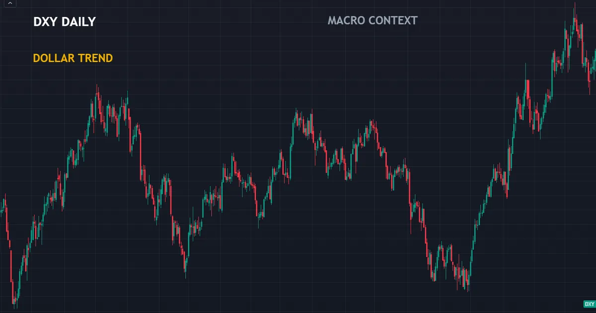
Above sits the dollar index on daily bars. When it trends, a euro chart and a pound chart both bend, though neither currency did anything itself.
Reading the Index Beside the Pair
Open the index and the pair together. If both move, the dollar drove it, and the other currency contributed little.
That distinction changes your trade selection. Trading a dollar story through the pair with the weakest opposing currency beats trading it through a random major.
Relative strength tools compress that comparison. They rank the majors so the driver becomes obvious in one glance.
When the Two Lenses Disagree
Sometimes the macro view says one thing and the chart says another. That disagreement carries information rather than confusion.
Usually it means the market cares about something your macro read left out. Positioning, a shift in theme, or a flow with no headline behind it can all do that.
Respect the chart on timing and the data on direction. When the two clash for weeks, the chart usually wins in the short run.
Download the complete indicator database
Put these concepts on your charts. One email unlocks the full library of 1,380+ indicators with compiled MT4 and MT5 files, plus my TradingView scripts. No paywall, no spam, unsubscribe any time.
Get free access to my indicator database
One email unlocks 1,380+ free MT4, MT5 and TradingView indicators — the complete library. No single-tool download; you get the whole database.
Where the Dichotomy Misleads People
The false choice creates six recognisable errors. The panel below collects them.

Believing One Lens Makes the Other Unnecessary
Pure chart traders still hold positions through rate decisions. Pure macro traders still need a stop somewhere.
Neither camp escapes the other’s domain. They simply choose whether to handle it deliberately or by accident.
Arguing About Which One Works
The question has no clean answer, because the two methods target different horizons. Comparing them means comparing a month to a minute.
Ask instead what each one contributes to your specific decision. That question does have an answer.
Using Macro Views as Entry Signals
A strong policy story tempts traders into buying at any price. Then a routine pullback takes out a stop placed too close, and the story stays intact without them.
Let the data pick the side and the chart pick the price. Reversing those roles produces the worst of both.
Using Charts to Judge Event Risk
No pattern warns you about tomorrow’s inflation print. Volatility measures hint at conditions, though they never list a date.
Check the calendar instead. Our summary of what NFP means in trading shows how one recurring release reshapes a whole week.
Assuming the Market Always Agrees With the Data
Themes rotate. A market obsessed with inflation for two months can switch to growth within a week, leaving your framework behind.
Test the theme against reactions. When a strong inflation print stops moving a currency, the market moved on already.
Adding Complexity Instead of Structure
After a loss, traders often add three indicators and a second macro source. Both additions usually reduce clarity.
Better to fix the split cleanly. Data for direction, chart for location and invalidation, calendar for sizing.
Treating Consensus as a Forecast You Must Beat
Some traders try to out-predict the consensus figure. Professional forecasters do that badly, and you hold worse data than they do.
The consensus serves a different purpose here. It approximates what price already holds, which makes it a reference point rather than a target.
So stop guessing the number. Focus on how your pair reacts to a given size of surprise, because that behaviour repeats and the guess does not.
Which Lens Matters at Which Holding Period
Horizon settles most of the argument quietly. The shorter the hold, the less the data matters.
Minutes to Hours
Over a single session, price action and liquidity dominate. Order flow around known levels drives almost everything you see.
Macro work still earns its place here, though only as a timing filter. Knowing that a release lands at half past one changes when you trade, not which way.
So a scalper needs the calendar and very little else from the data side. One glance a day covers it.
Days to Weeks
At swing horizons the two lenses balance. A policy story has room to express itself, and chart structure still frames the entry.
This is where the split pays most. Direction from the data, location from the chart, and both actually contribute.
It is also where confusion peaks. Traders at this horizon most often let a macro view override a broken chart level.
Months and Longer
Over quarters, macro forces dominate and chart patterns fade into noise. Rate differentials and capital flows set the drift.
Charts still matter for one thing. They tell you where to add, where to trim, and which price would say the story broke.
Position traders therefore read charts sparingly and calendars closely. The ratio simply inverts as the horizon stretches.
A Quick-Reference Comparison
Keep this table in view while you decide which lens to reach for.
| Question | Which lens | What it gives you |
|---|---|---|
| Why should this move happen? | Fundamental | Growth, inflation and policy direction |
| Which currency carries the tailwind? | Fundamental | A comparison of two central banks |
| Where do I enter? | Technical | A level with orders already around it |
| What price proves me wrong? | Technical | An invalidation you can place a stop behind |
| When should I hold less? | Calendar | Scheduled event dates and impact ratings |
| Why did the move stall? | Both | A finished repricing at a known level |
Six rows, and only two of them belong to the data. That ratio surprises people who expected a fair fight.
The ratio also shifts with horizon. Stretch the hold to a quarter and the top two rows carry almost all the weight.
Read the table as a division of labour rather than a scoreboard. Nothing in it says one lens outperforms the other.
Combining the Two Without Making a Mess
Most combinations fail because the roles blur. Keeping them separate solves it.

Give Each Lens One Job
Write the macro view as one sentence naming a currency and a reason. Then never look at it again while choosing an entry.
Let the chart work alone on location. The two inputs meet once, at the moment you decide whether to take the trade.
That separation stops the most common failure. Traders who consult both lenses at every step end up justifying whichever one agrees with the position.
Write the Order Down
Direction first, from the data. Location second, from the chart. Size third, from the stop distance and the week’s events.
Fixing the order removes hindsight. You cannot decide afterwards that the chart was really in charge.
Review Against Both
When a trade fails, ask which lens misread it. Wrong direction points at the macro view; a stop hit before a correct move points at location or size.
That split diagnosis improves faster than a general sense of disappointment. It also stops you rebuilding the half that worked.
Tally the two failure types over a few months. A pile of correct directions with poor entries needs chart work, while the reverse needs reading.
Keep the Written View Short
One sentence for direction. One price for invalidation. One number for size.
Anything longer invites hedging language, and hedged notes cannot be reviewed. A vague view always looks partly right afterwards.
Short notes also survive. You will actually reread three lines a month later, which is the whole point of writing them.
Where This Still Goes Wrong
Even a clean split meets conditions nobody handles well. Three of them recur.
Both Lenses Agree and It Still Loses
Alignment feels convincing and proves nothing. Price visits levels on its way to anywhere, and a stop sits at one of them.
So size for the loss, not for the conviction. Agreement between two methods is not evidence of a better outcome.
The Chart Level Sits Inside Event Risk
A perfect entry level sometimes sits twenty minutes before a rate decision. Taking it means accepting a fill you cannot predict.
Skip it or halve the size. Our guide to how to use fundamental analysis works through that judgement in detail.
The Macro Story Changes Mid-Trade
A central bank speech can invalidate a thesis while your stop stays untouched. The trade remains technically alive and fundamentally dead.
Decide in advance what you do there. Closing early on a broken thesis is a rule, not an improvisation.
Your Two Lenses Are Really One Opinion
Traders often build the macro view after choosing the trade. The reasoning then agrees with the chart because it was reverse-engineered from it.
Write the macro line before you open the chart. That order costs nothing and keeps the second opinion genuinely second.
A useful test exists. If your macro view never contradicts your chart view, one of them is not doing any work.
Related Guides Worth Reading Next
Two directions extend this material. Pick whichever side feels thinner.
For the data side, our walkthrough on how to read the economic calendar turns event risk into something you can plan around. It takes about ten minutes and removes a whole class of surprise.
For the chart side, browse our trend indicators and support and resistance indicators archives. Tools there mark structure automatically, and the judgement stays yours.
FAQ
Which one is better for forex?
Neither, because they answer different questions. Technical work locates price and defines risk. Fundamental work explains why a currency should drift and warns you which dates carry event risk. Most working traders use both, giving each a fixed role rather than blending them.
Can I trade using only charts?
Many people do, though they still meet the calendar whether they read it or not. Holding a position through a rate decision without knowing it happens turns a planned risk into an accident. At minimum, check the week’s scheduled events even if you ignore everything else about the data.
Can I trade using only fundamentals?
It is harder, mainly because macro views supply no entry and no invalidation. Institutions manage that with wide stops, long horizons and large capital. A retail account with leverage usually needs a chart level to define where the idea ends.
Does the efficient market idea mean analysis is pointless?
No, though it does explain why easy edges disappear. If public information already sits in the price, reading a headline faster helps very little. What remains useful is the framing: knowing which currency carries a tailwind, where risk sits on the chart, and which dates deserve smaller positions.
Why did the currency fall on strong data?
Almost always because the strength was already priced in. Traders positioned for the good number days earlier, then took profit when it arrived. The move you see reflects the gap between expectation and outcome, not the quality of the number itself.
How do I start combining the two?
Give each lens one job and write the order down. Take direction from the data, location and invalidation from the chart, and sizing from the stop distance plus the week’s event list. Review every trade by asking which lens misread it, keep those notes for a few months, and judge the process over a long run rather than by any single result. Results are not guaranteed; past performance is not indicative of future results.
External references
- For background on this concept, see Economic Indicator at Investopedia.
- For broader market context, see Fundamental Analysis at Corporate Finance Institute.

About the author
Written by Dominic Walsh, a Forex trader and MT4/MT5 indicator, Expert Advisor and script developer. Every tool on forexmt4systems.com is tested on live charts before release and ships with ready-to-use compiled MT4 (.ex4) and MT5 (.ex5) files. Learn more about the trader and developer behind this site.
How we build, test and correct every tool: Editorial & Testing Policy. Trading carries risk; see the disclaimer.