
Ask ten traders how to use fundamental analysis in forex and you get ten reading lists. Almost none of them finish with a decision you could actually place an order on.
This guide runs the other way round. It starts at the decision, works backwards to the data that changes it, and treats the calendar as a risk tool rather than a crystal ball.
How to Use Fundamental Analysis in Forex Without Making Forecasts
Fundamentals explain why a currency drifts one way over months. Charts show where it trades right now.
So the useful question is never what the euro does next week. The useful question asks which side of the market carries the wind, and what would prove that read wrong.
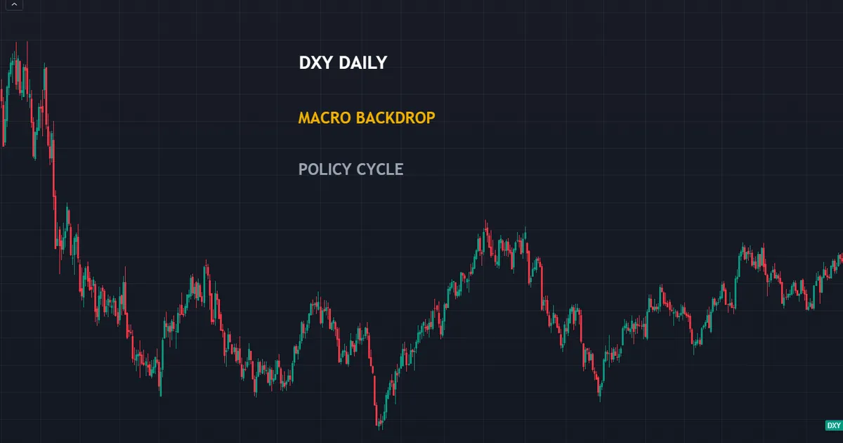
Above sits the dollar index on daily bars. One picture like that carries more context than any single release, because it shows how the market already absorbed months of data.
Note what the chart cannot tell you. It records the result of a policy cycle, not the next print, and nothing on it predicts tomorrow.
What the Dollar Index Shows in the Background
The index tracks the dollar against a basket of major currencies. When it trends hard, single-pair charts mislead, because the move belongs to one leg rather than the pair.
Traders who watch one pair alone miss that entirely. A euro chart falling for three months can describe a dollar story, a euro story, or both at once.
So start wide. Look at the index first, then the pair, then the level you would trade.
Three Questions, Not One Answer
Fundamental work answers three separate questions. Keeping them apart removes most of the confusion.
First, which currency carries the stronger growth and policy backdrop today. Second, what could change that backdrop over the next month. Third, which scheduled events could move price far enough to matter for a stop.
Notice that none of the three asks for a price forecast. Each one shapes risk instead, which makes each one answerable.
Why the Word Analysis Misleads People
The label suggests a calculation with an output. In practice the work produces a lean, a set of conditions, and a list of dates that deserve caution.
Nobody solves a currency. Two skilled analysts can read the same data set and reach opposite conclusions, and both readings can look reasonable afterwards.
So aim lower and gain more. A modest, well-defended lean beats a confident number, because you can trade a lean without pretending to know the future.
The Building Blocks That Carry the Weight
Five inputs carry almost all the weight. Everything else simply refines them.
Growth
Growth data tells you how much room a central bank enjoys. Gross domestic product, purchasing managers’ surveys and retail sales all feed that picture.
Strong growth gives a bank cover to keep policy tight. Weak growth builds the case for cuts, and markets start pricing those cuts long before they land.
Inflation
Inflation decides how urgent the bank’s job feels. Consumer price data sits at the centre of that judgement.
Watch the core measure alongside the headline. Energy swings throw the headline around, while the core reading tracks the trend policymakers actually respond to.
Policy Rates and Expectations
Rates set the return on holding a currency. Yet the level of the rate matters far less than the direction traders expect next.
Interest rate futures carry that expectation every day. A bank that holds rates steady while the market leaned towards a cut can lift its currency without changing a thing.
Our guide to how interest rates affect forex works through that link properly.
Flows, Positioning and Risk Appetite
Money moves for reasons no release captures. Reserve managers rebalance, funds hedge, and exporters convert revenue on a fixed schedule.
Risk appetite matters too. The yen and the franc often firm when equities drop, regardless of what their own data showed that week.
Relative strength tools help here. Our currency strength indicators archive collects tools that rank the majors against each other.
Politics and Government Spending
Elections, budgets and trade policy all shift a currency’s outlook. Markets dislike uncertainty far more than they dislike bad news, so an unresolved vote often weighs heavier than a poor data print.
Government borrowing plans matter as well. Heavy issuance can lift yields and attract foreign buyers, or it can raise doubts about the debt path and push money away.
Both readings appear in commentary at once. Watch which one the bond market accepts, because yields settle the argument faster than opinion columns do.
The Workflow, Step by Step
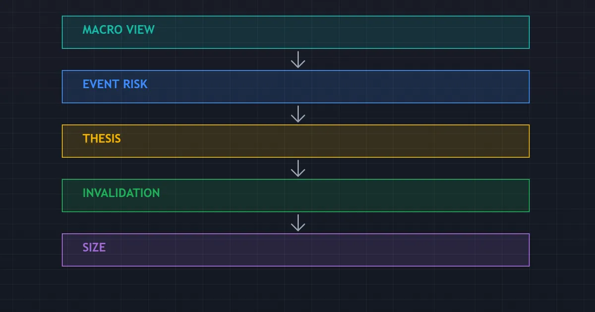
Six steps turn a macro read into something you can size. Run them in order.
- Set the backdrop. Note growth, inflation and policy direction for both currencies in the pair.
- Mark the events. Pull the week’s releases for both currencies and rank them by impact.
- Write the thesis in one line. Name the currency you favour and the single reason behind it.
- Find the level. Let the chart choose the entry, because fundamentals never supply a price.
- Set the invalidation. Decide which data or which price action ends the idea.
- Size for the gap risk. Assume a worse fill than the screen shows around any release.
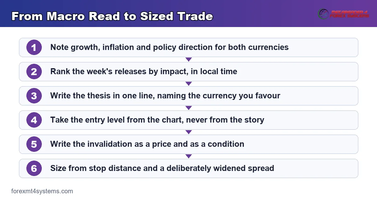
Steps four and five do the heavy lifting. A thesis with no level and no invalidation stays an opinion, and opinions cannot carry a stop.
Keep the whole thing on one page. Our economic calendar covers step two in about a minute.
Priced In: The Idea That Explains Everything Else
Most articles skip this part. It explains more about news reactions than any other single idea in the field.
What Priced In Actually Means
Markets trade expectations, never facts. By the time a number lands, traders already hold the positions they wanted for the number they expected.
So price reacts to the gap between expectation and outcome. A strong print that everyone forecast changes very little, because the buying happened days earlier.
That explains why a currency can fall on good data. The number confirmed the consensus, and the traders who wanted exposure already carried it.
Why Strong Data Can Sink a Currency
Consider a growth figure that beats the consensus by a small margin. Traders expected a beat, positioned for it, then took profit into the print.
The flow that follows runs against the headline. Nothing about that reaction lacks logic, and nothing about it makes the data wrong.
So read the reaction itself. When a currency drops on a good number, the market tells you the good number sat in the price already.
Reading the Expectation, Not the Number
Every calendar row carries a consensus figure. That figure holds the market’s collective guess, and it shifts as the week progresses.
Compare the columns before you form any view at all.
| Column | What it holds | Why it matters |
|---|---|---|
| Previous | The last published reading, sometimes revised later | Sets the trend the market already knows |
| Consensus | The average of surveyed economist forecasts | Approximates what price already reflects |
| Actual | The figure the statistics agency publishes | Moves price only through its gap to consensus |
| Revision | A change applied to an earlier reading | Sometimes matters more than the headline |
Our walkthrough on how to read the economic calendar takes each column apart in detail.
When Almost Nothing Sits in the Price
Occasionally an event arrives that nobody positioned for. A surprise policy statement, an intervention, or a political shock all fall into that group.
Those moves run furthest, because the entire market repositions at once rather than trimming an existing view. They also produce the worst fills of the year.
So the same feature cuts both ways. The largest opportunities and the largest execution problems arrive in exactly the same minutes.
A Worked Example on the Hourly Chart
Theory earns nothing without a chart. Below sits an hourly bar on GBPUSD from 29 July 2026.
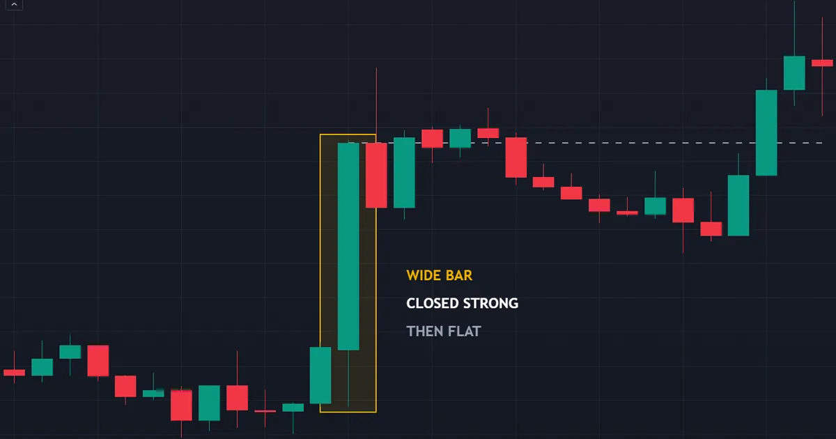
That bar spanned roughly 6.6 times the recent average range. It closed near its extreme, with the body covering about seventy-seven per cent of the range.
What the Bar Showed
A wide bar with a strong close tells you order flow ran one way for a full hour. That counts as genuine information about participation.
It says nothing at all about the hours that follow. The bar records a repricing that already finished by the time you saw it.
What the Next Bars Did
Over the following bars, price netted about 0.14 times the average range. The move simply stopped.
Traders who entered on that close met a market going nowhere. Their read of the bar held up fine; their assumption about follow-through did not.
Such sequences repeat constantly. A repricing often completes inside one bar, because the new information reached every screen at the same moment.
The Practical Lesson
Use the wide bar as information about where risk sits, never as an entry trigger. The range it printed tells you how far price can travel in one bar on that pair.
Then size accordingly. Our position size calculator turns that range into lots within seconds.
Notice also what the flat follow-through implies. The market absorbed the new information within the hour, so the repricing finished before any careful trader could react to it.
That is the practical shape of an efficient market. Screens update together, and the edge rarely sits in reading the number faster than everyone else.
Where does the edge sit, then. Usually in the positioning you held before the event, and in the risk you were willing to carry through it.
Download the complete indicator database
Put these concepts on your charts. One email unlocks the full library of 1,380+ indicators with compiled MT4 and MT5 files, plus my TradingView scripts. No paywall, no spam, unsubscribe any time.
Get free access to my indicator database
One email unlocks 1,380+ free MT4, MT5 and TradingView indicators — the complete library. No single-tool download; you get the whole database.
Common Mistakes and the Fixes
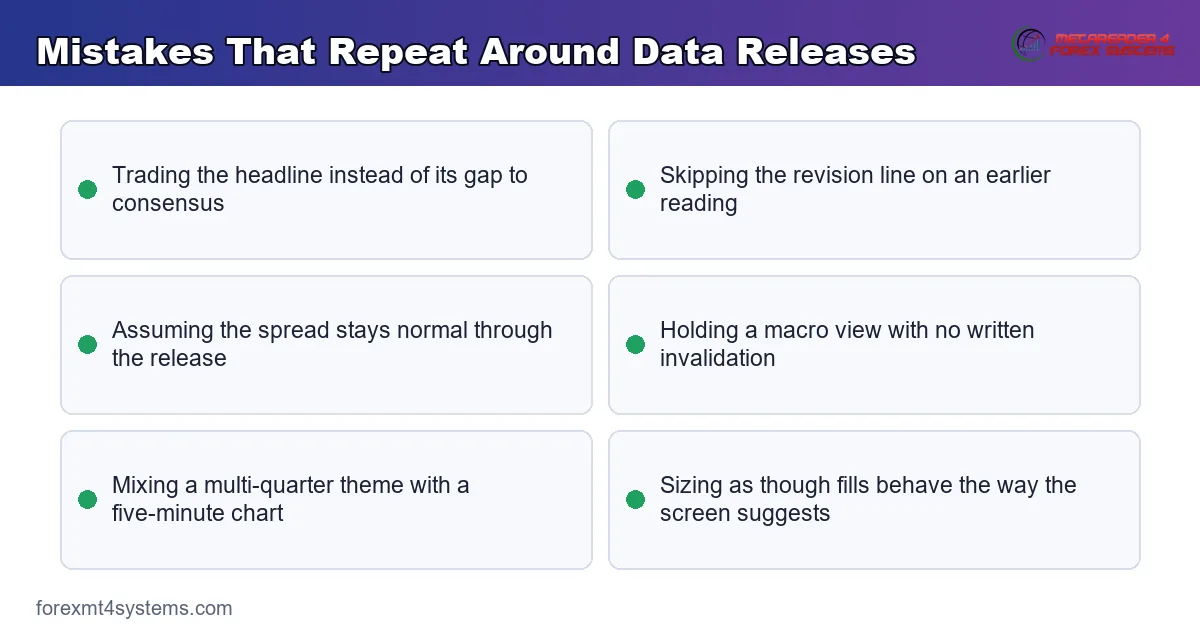
Six habits cause most of the damage. The panel below collects the ones worth fixing first.
Trading the Headline Instead of the Gap
A strong number means nothing on its own. Compare it with the consensus, then judge whether the surprise carried any size.
The fix takes ten seconds. Write the consensus next to your chart before the release, so the comparison happens automatically.
Ignoring the Revision
Statistics agencies revise earlier readings all the time. A soft new print alongside a large upward revision paints a very different picture.
So read the revision line every time. Plenty of sharp reversals trace back to a revision nobody noticed.
Assuming the Spread Stays Normal
Quoted spreads widen sharply around scheduled events. A pair that costs one pip at midday can cost ten for a few seconds after a major release.
Budget for that widening before you commit. Our note on why spreads widen explains the mechanics behind it.
Holding a Macro View With No Invalidation
A view without an exit becomes a belief. Beliefs survive contrary evidence, which makes them expensive on a leveraged account.
Write the invalidation as a price and as a condition. Either the level breaks, or two consecutive prints contradict the story.
Confusing a Slow Story With a Fast One
Policy divergence plays out over quarters. A payrolls surprise plays out over hours.
Match the holding period to the driver. Trading a multi-month theme on a five-minute chart mixes two clocks that never agree.
Sizing as Though Fills Behave Normally
Around releases, orders fill worse than the screen suggests. Stops jump levels, and limits sit untouched while price flies past.
Cut size when event risk sits inside your holding window. Smaller positions survive bad fills; larger ones simply do not.
Choosing Which Pairs Reward the Effort
Fundamentals repay attention unevenly across the board. Some pairs respond cleanly, and others drown the signal in noise.
Pairs With a Clear Policy Gap
Look for two currencies whose central banks point in opposite directions. One bank tightening while the other eases creates a story with months of runway.
Those pairs trend more readily. The flow behind them comes from institutions rebalancing slowly, rather than from traders reacting to a single print.
By contrast, two banks moving in step produce range-bound charts. No amount of macro reading rescues a pair with nothing to separate its two legs.
Where the Noise Wins
Crosses between similar economies rarely reward macro work. Their rate paths track each other, so the differential barely moves across a whole quarter.
Thin, exotic pairs bring the opposite problem. Their stories run strong, yet spreads and gaps eat the move before a retail account collects it.
Start with the majors, then. They carry the deepest liquidity, the clearest policy narratives and the lowest cost per trade.
A Quick-Reference Checklist
Run this list before any trade that carries event risk.
- Growth, inflation and policy direction noted for both currencies, one line each
- Every high-impact release for the week marked, with the local time converted
- Consensus figures read for the events falling inside your holding period
- Entry level taken from the chart, never from the story
- Invalidation written down before the order goes in
- Position size worked from stop distance and a deliberately widened spread
- A note of what would make you flip the view completely
Seven lines, and not one of them needs a forecast.
Where This Goes Wrong in Practice
Even a sound process meets conditions it cannot control. Three of them turn up again and again.
Costs Rise Exactly When You Need Them Low
Liquidity thins in the seconds around a release. Market makers pull quotes, so the cost of entering climbs at the worst possible moment.
Waiting a few minutes usually restores normal pricing. Patience costs nothing here, while a rushed entry costs real money.
The Story Changes Faster Than the Data
A market can spend two months trading inflation, then switch to growth within a single week. The releases keep their schedule; the market’s attention does not.
So test your thesis against the reaction, not against your notes. When good inflation news stops moving a currency, the theme rotated.
A Correct Read Still Loses
You can call the data, the reaction and the direction, then lose on the trade anyway. A stop sits where price visits on its way to your target.
That outcome reflects normal variance rather than a broken process. Judging any method by a single trade produces the wrong conclusion every time, which is why the log matters more than the memory.
The Data Itself Arrives Imperfect
Statistics agencies publish estimates, not measurements. Early readings rest on partial survey responses, and later revisions often move the number materially.
So treat the first print as a draft. Traders who build a whole thesis on one flash estimate rebuild it a month later, usually at a cost.
Your Broker Feed Differs From the Wire
Retail platforms show one aggregated price. Institutions see many, and the gap between them widens exactly when volatility spikes.
Because of that, your chart can print a wick nobody else recorded. Comparing screenshots across brokers after a violent minute shows three different extremes.
Plan around the discrepancy instead of arguing with it. Stops placed a few pips beyond an obvious level get swept by feed noise rather than by real orders.
A Weekly Routine That Fits Around a Job
None of this demands a trading desk. Three short sessions a week cover the whole cycle.
Sunday: Set the Backdrop
Spend fifteen minutes on the currencies you actually trade. Note the last policy move for each, the direction of the next expected move, and the newest inflation reading.
Write it as one line per currency. If the line takes a paragraph, you do not yet hold a view worth trading.
Then mark the week’s high-impact events and convert every time into your own clock. Time-zone errors cause more surprise drawdowns than bad analysis does.
Midweek: Check the Reaction, Not the Number
After the first major release, ask one question. Did the currency move the way the surprise implied.
A muted response tells you the market cares about something else this month. That single observation redirects your attention faster than any commentary.
Adjust the thesis line if the answer surprises you. Leave the position rules alone, because mid-trade edits rarely improve anything.
Weekend: Review the Log
Look back at the ideas you wrote, including those you never traded. Compare each thesis with what the week delivered.
Count how often the direction followed the data and how often it ignored it. That ratio, gathered over months, teaches more than any single post-mortem.
Keep the notes somewhere searchable. A journal beats memory, and memory quietly edits itself towards the trades that worked.
Related Guides Worth Reading Next
Two follow-ups sharpen this material quickly. Pick whichever gap feels widest.
Our comparison of fundamental vs technical analysis settles the question of which lens answers which question. Read it before you try to merge the two.
Then look at what a carry trade means, since it shows a rate story expressed as a position. Pair either one with our note on risk per trade, because sizing decides how long any macro view survives.
FAQ
Do I need fundamental analysis to trade forex?
No, though it fills a gap charts leave open. Technical work tells you where price sits relative to structure. Fundamentals tell you which currency carries a policy tailwind, which explains why some levels break easily and others hold for weeks.
How much time does this take each week?
Around thirty minutes once the routine settles. Ten minutes to note the policy direction for the currencies you trade, ten to mark the week’s releases, and ten to write your one-line thesis with its invalidation. The reading list grows over time, but the weekly routine stays short.
Which releases actually matter?
Rate decisions and the statements around them come first, followed by inflation, then employment, then growth surveys. Below that tier the market usually shrugs. Mark the top three for each currency you hold, and skip the rest unless they feed directly into a decision that week.
Can I trade the release itself?
Some traders do, and it demands far more than a view on the number. Spreads widen, slippage grows, and fills arrive at prices nobody quoted. Treat release trading as its own specialism with its own sizing rules, rather than as an extension of normal charting.
What does priced in mean, in one sentence?
It means the market already moved for the outcome most people expected, so only the surprise carries any force. That single idea explains most of the reactions that look backwards on the chart. Whenever a currency falls on a strong number, start by assuming the strength sat in the price days earlier.
How do I combine a macro view with a chart?
Let the macro view choose the side and let the chart choose the price. Note which currency carries the stronger backdrop, then wait for a level on the chart where you can define risk clearly. Size from the stop distance, keep a record of every idea including the ones you skipped, and review the set monthly rather than trade by trade. Results are not guaranteed; past performance is not indicative of future results.
External references
- For background on this concept, see Monetary Policy Report at the Federal Reserve.
- For broader market context, see Economic Data on Wikipedia.

About the author
Written by Dominic Walsh, a Forex trader and MT4/MT5 indicator, Expert Advisor and script developer. Every tool on forexmt4systems.com is tested on live charts before release and ships with ready-to-use compiled MT4 (.ex4) and MT5 (.ex5) files. Learn more about the trader and developer behind this site.
How we build, test and correct every tool: Editorial & Testing Policy. Trading carries risk; see the disclaimer.