
The best time frame for SMC is not one chart at all. It is a pair of charts doing two separate jobs. One higher chart sets the story, and one lower chart times the entry. After this guide you will pick that pair on purpose. You will read bias on the higher timeframe. Then you will trigger entries on the lower one without guessing.
Smart Money Concepts came from Michael Huddleston, the Inner Circle Trader (ICT). His method leans hard on timeframe layering, so choosing charts at random wastes the whole edge. So think in pairs from the start. A four-hour zone with a five-minute trigger behaves nothing like a daily zone with an hourly trigger, and matching them is the skill this article builds. Get the pair right and the rest of the method suddenly feels simpler, because each chart finally knows its job.
What the Best Time Frame for SMC Looks Like on the Chart
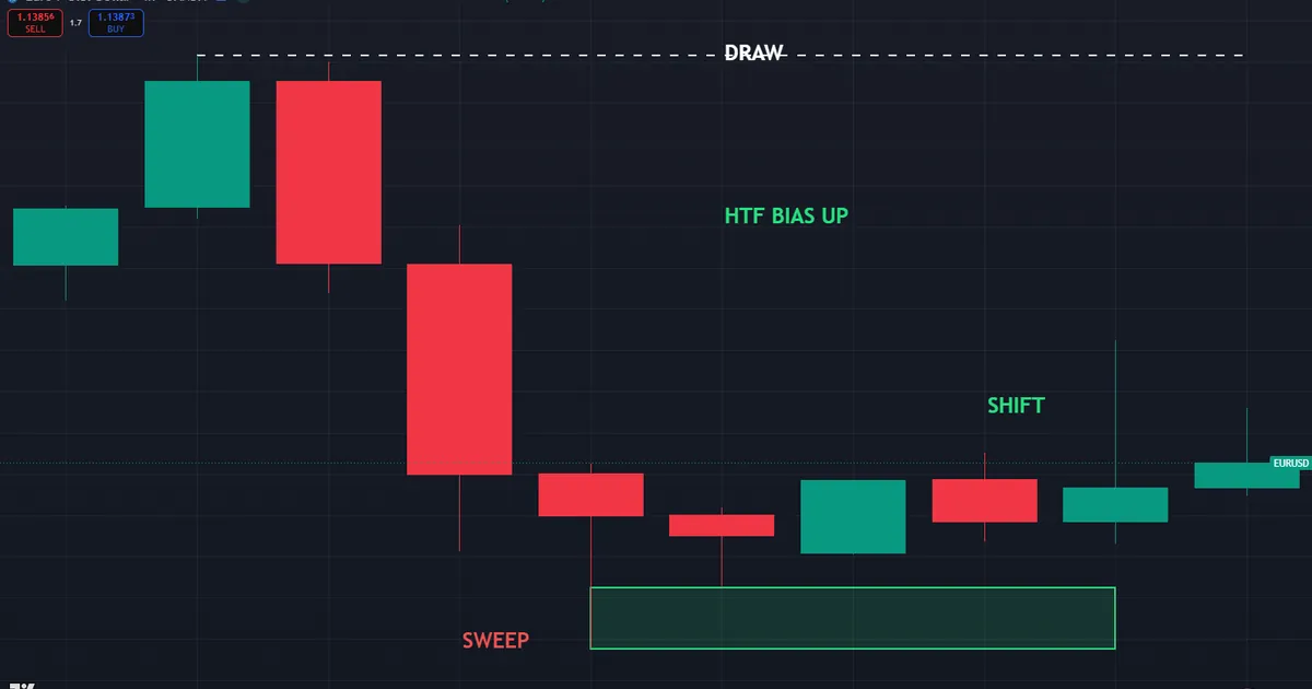
Picture a bias chart and an entry chart side by side. The higher chart marks a clear draw on liquidity, maybe an old high the market wants to reach. Below it, a smaller chart shows the sweep and the shift that let you enter. The example below pairs a four-hour bias with a fifteen-minute entry on a major pair.
Reading the Higher-Timeframe Bias
Start at the top and work down. The four-hour chart runs bullish, with structure breaking higher near a level around 1.1375. Above price sits an old high near 1.14358, and that high holds resting buy-side liquidity. So the draw points up, and every lower-timeframe trade should lean long until the higher chart says otherwise.
Notice how little the bias chart asks of you. It names one direction and one target zone. It does not fire an entry, and it never should. Instead it filters out the short trades that a smaller chart will tempt you into during every pullback.
Hold that read to an honest standard, though. A four-hour break higher does not promise the old high will fall today. Rather, it tilts the odds toward longs and gives the lower chart a clear job. So treat bias as a lean, not a certainty, and let price confirm it before you commit real risk.
Dropping to the Entry Chart
Now switch to the fifteen-minute view of the same pair. Price dips, sweeps a small low near 1.13638, then shifts structure back up near the same 1.1375 area. That shift is your trigger, and it only counts because the four-hour chart already pointed higher. Alone, the fifteen-minute signal means little. Paired with the bias, it becomes a clean entry.
Watch how the two charts talk to each other. The higher one says buy the dips, while the lower one says buy this exact dip, here, now. Because they agree, the trade earns a tight stop and a clear target in one glance. Without that agreement, you would be trading a fifteen-minute shift on hope alone, which is how most rushed entries begin.
The Two Jobs Every Time Frame Pair Must Fill
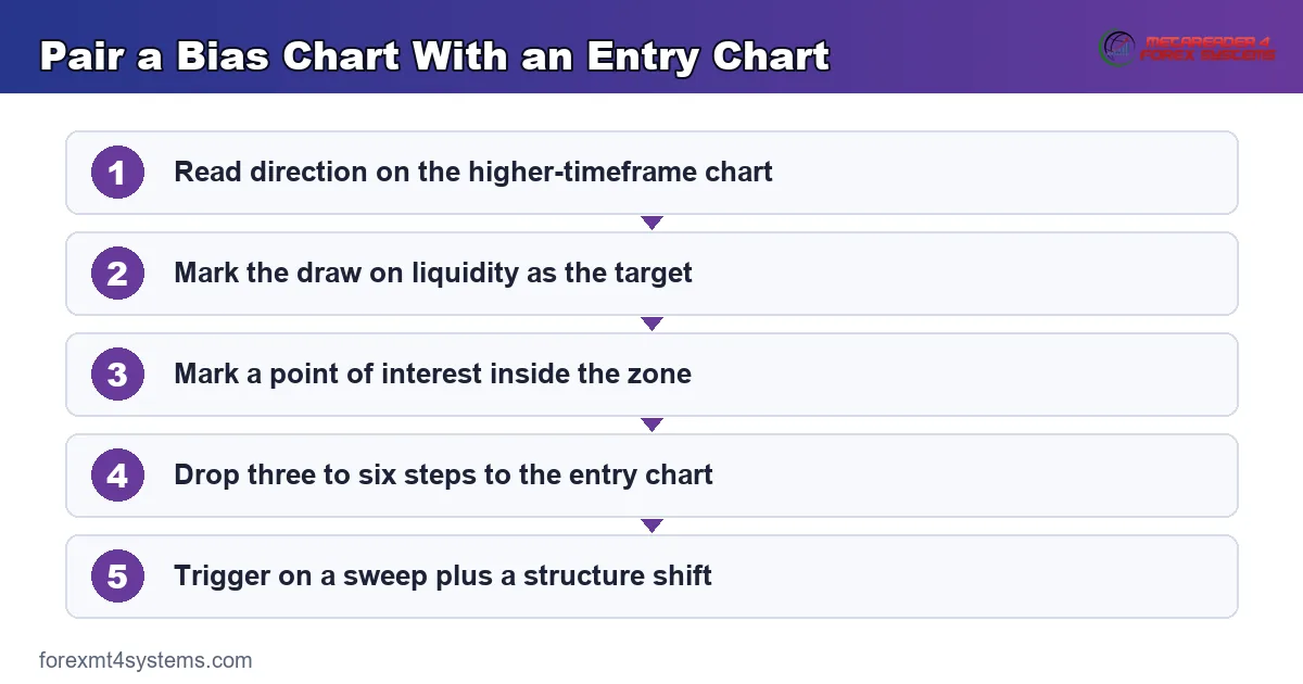
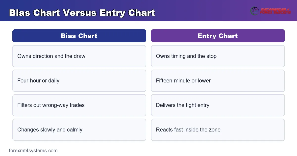
Every pairing splits into two roles, and mixing them is where beginners slip. Direction belongs to the higher chart. Timing belongs to the lower one. Keep those jobs apart and most timeframe confusion simply disappears.
- First, the bias chart names the direction and the draw on liquidity you expect price to reach.
- Next, the bias chart marks a point of interest, such as an order block or a fair value gap.
- Then the entry chart waits inside that zone for a liquidity sweep.
- After the sweep, the entry chart needs a market structure shift in the bias direction.
- Last, the entry chart hands you a tight stop and a defined risk before you click.
Read the list as a handoff. The big chart approves the trade, and the small chart executes it. So neither works well alone, and traders who watch only one usually enter early or size too wide.
Why Bias Lives on the Higher Chart
Higher charts smooth out noise. A single four-hour candle swallows sixteen fifteen-minute candles, so its structure reflects real intent rather than random ticks. Because of that, a broken high on the four-hour chart carries more weight than the same break on a one-minute chart. Trust the larger frame for direction, always.
Why Timing Lives on the Lower Chart
Lower charts give precision the higher chart cannot. A four-hour order block might span forty pips, which makes for a painful stop. Drop to the fifteen-minute chart and the same reaction shows a ten-pip trigger zone. So the small chart tightens the stop, lifts the reward-to-risk ratio, and keeps a good idea from becoming a heavy loss.
There is a limit, though, and beginners often push past it. Go too low and the entry chart fills with noise, where random ticks mimic real sweeps. A one-minute chart under a daily bias can whipsaw you out of a perfectly good trade. So match the entry chart to the bias, keeping it low enough for precision yet high enough to filter the chop.
Where Time Frames Fit the SMC Workflow
Timeframe pairing sits near the top of the SMC routine. First you read the daily or four-hour chart for bias. Then you mark a point of interest inside the right half of the range. After that you drop two or three steps to trigger the entry. The sequence never runs backward.
A quick primer helps here. Our guide to what ICT trading is lays out the full method, while the ICT daily bias walkthrough shows how to set direction before the session opens. Read both and the pairing logic clicks faster.
Order matters more than most beginners expect. Set the bias in the morning, before the market moves you. Then let the entry chart come to you rather than hunting a trade on every candle. Because the bias is fixed early, you avoid the trap of talking yourself into a fresh direction after two red bars. That patience is half the edge in any multi-chart method.
Session Timing in New York Hours
Timing sharpens the plan. Mark the higher-timeframe bias before the London kill zone opens near 2:00 AM New York time. Then hunt entries during London or the New York morning window from 8:30 to 11:00 New York time. The Asian range from 8:00 PM to midnight often drifts, so treat it as reference rather than a trade window. The forex market hours tool maps each window to your local clock.
Common Time Frame Pairings
A few pairings cover most trading styles, so pick one and master it. Swing traders lean on a daily bias with a one-hour or four-hour entry. Intraday traders pair a four-hour bias with a fifteen-minute trigger. Scalpers run an hourly bias into a one-minute or five-minute entry. The rule stays constant across all three: the entry chart should sit three to six steps below the bias chart.
Skip pairings that sit too close together. A one-hour bias with a thirty-minute entry gives almost no extra precision, since the two charts move nearly in step. On charts, the wider set of ICT indicators for MT4 and MT5 can label structure on both frames at once, which keeps the pairing honest.
How Many Charts You Really Need
Two charts cover almost every setup, so resist the urge to add more. A third chart in the middle rarely tells you anything the pair missed. Worse, it invites conflicting reads that freeze you at the moment of entry. So keep the layout lean and let each chart do one job.
Some traders add a single higher chart for context, and that can help. A weekly glance sets the season, while the daily sets the bias and the fifteen-minute times the entry. Still, only two of those charts drive the trade. The weekly stays a backdrop, never a trigger, and it should never pull you out of a valid setup.
How Fractal Structure Repeats Across Time Frames
Structure looks the same at every zoom level, which is why pairing works so cleanly. A four-hour leg has its own high, low, and midpoint. So does each fifteen-minute swing inside it. The patterns nest, and the best entries appear where reads from several charts line up.
Use that nesting on purpose. When the four-hour chart sits in discount and the fifteen-minute leg also sits in discount, the long location doubles up. Both charts call price cheap, so the case for buying grows stronger. When they disagree, the higher chart wins and the lower one only refines your timing.
Reading Two Draws at Once
Every chart carries its own draw on liquidity, and larger draws sit further away. A fifteen-minute entry might aim first at a nearby high a few pips up. The four-hour draw, meanwhile, could rest sixty pips beyond that. Rank them by chart size. The nearer draw offers your first partial, and the higher-timeframe draw offers the runner.
Map both before you enter. Otherwise you risk closing a good trade right before it reaches the real objective. So write down the near target and the far target as part of the plan, then let the trade breathe toward each in turn.
Worked Example: H4 Bias and M15 Entry
Rules feel abstract until you walk a real pair of charts. The sequence below runs a four-hour bias into a fifteen-minute entry, and it goes long off a discount zone.
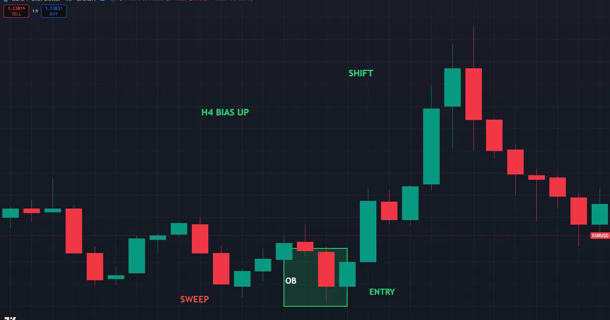
- First, the bias: the four-hour chart broke structure higher, so buy-side liquidity above an old high near 1.14358 became the draw.
- Next, the zone: a four-hour bullish order block sat around 1.1372, deep in discount.
- Then the wait: price drifted down into that block during the London session.
- The sweep: on the fifteen-minute chart, price raided a small low near 1.13638 by a few pips.
- The shift: a fifteen-minute candle displaced up and broke short-term structure near 1.1378.
- Last, the trade: buy the retrace, stop below the sweep near 1.1360, first target the old high at 1.14358.
Why the Pairing Doubles the Reward
Price paid does the quiet work again. A long filled near 1.1378 risks about eighteen pips to the stop, yet the draw at 1.14358 sits roughly fifty-eight pips away. So the reward more than triples the risk before the trade even opens. That math comes straight from pairing the two charts, not from the entry signal alone.
Notice the discipline the pairing enforces. The same fifteen-minute shift printed against a bearish four-hour bias would offer no trade at all, however clean it looked. So the entry chart never overrules the bias chart. It only acts when both charts agree, and that single rule filters out most of the losing setups a lone chart would take.
Consider what happens if you skip the higher chart. You would see a tidy fifteen-minute sweep and shift, and you would buy it. Yet without the four-hour context, you cannot know whether that shift points toward a draw or straight into resistance. The bias chart answers that question for free, long before the entry ever prints.
Managing the Paired Trade
Manage the position with the same two charts that framed it. Many traders bank a partial as price clears the halfway point of the four-hour range, then trail the rest toward the old high. Others exit fully at the first four-hour resistance on quiet days. Choose one plan before entry and write it down, because the pairing hands you levels, not discipline.
Download the complete indicator database
Put these concepts on your charts. One email unlocks the full library of 1,380+ indicators with compiled MT4 and MT5 files, plus my TradingView scripts. No paywall, no spam, unsubscribe any time.
Get free access to my indicator database
One email unlocks 1,380+ free MT4, MT5 and TradingView indicators — the complete library. No single-tool download; you get the whole database.
Common Time Frame Mistakes and Their Fixes
Timeframe errors sink more trades than entry errors, and a handful dominate beginner journals. Each mistake below carries a plain fix you can apply on the very next chart.
- Entering on the bias chart. Fix: the higher chart approves, the lower chart executes.
- Pairing two charts that sit too close. Fix: keep three to six steps between bias and entry.
- Flipping bias on a single lower-timeframe candle. Fix: only a higher-timeframe shift changes direction.
- Chasing every lower-timeframe sweep. Fix: trade only sweeps that sit inside the correct zone.
- Widening the stop to survive a big bias candle. Fix: let the entry chart set the stop instead.
- Watching four charts at once. Fix: one bias chart and one entry chart cover nearly every setup.
One mistake deserves extra weight, since it hides in plain sight. Traders often drift their bias chart down over a session without noticing. A morning read on the four-hour slowly becomes a read on the one-hour, then the fifteen-minute, as impatience creeps in. So write the bias timeframe at the top of your notes and refuse to lower it. That single habit removes a surprising share of avoidable losses.
The second graphic pairs each mistake with its fix for a fast pre-session review.
A Multi-Time Frame Pre-Trade Checklist
Run these six lines before any entry that leans on a timeframe pair. A single failure sends the trade back to the watchlist.
- Bias chart chosen, with direction and draw on liquidity both marked.
- A point of interest sits inside the correct half of the higher-timeframe range.
- Entry chart sits three to six steps below the bias chart.
- Price traded into the zone during London or the New York morning window.
- A sweep plus a structure shift printed on the entry chart.
- The stop sits past the sweep, and the draw offers at least double the risk.
Also score a month of trades against this list. The line you skip most often is your real leak, and fixing one leak beats learning three new setups.
Keep the checklist short on purpose. A wall of rules feels safe, yet it slows you down when a clean setup finally appears. Six lines fit in your head, so you can run them in seconds while price sits in the zone. Speed matters here, because the best entries rarely wait for a long review.
Related SMC Concepts to Study Next
Timeframe pairing connects to several ideas worth learning together. The full routine appears in our step-by-step ICT top-down analysis guide, which formalises the handoff from bias to entry. Session timing then matters just as much, so the ICT kill zones guide shows when each pairing tends to fire. For location inside the range, the premium and discount filter tells you which half of the bias chart to trust.
When a Time Frame Pairing Fails
Strong news breaks every pairing sooner or later. A surprise release can push the entry chart straight through your zone before any shift prints. So the clean sweep you waited for never arrives, and the setup simply skips you. That is a real cost the framework accepts in exchange for better average entries.
Chart selection is the other failure point. Pick a bias chart that is too small and its structure flips with every session, which drags your direction around all day. The chart below shows exactly that trap in action.
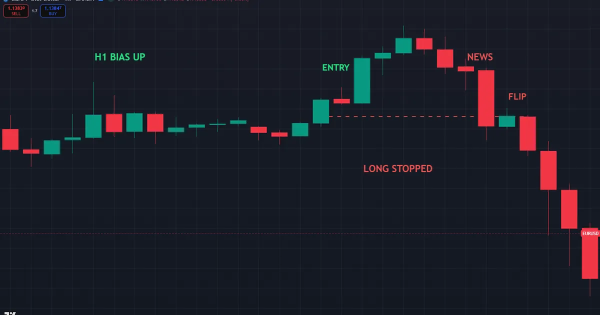
There is a subtler trap too. Sometimes both charts agree, the entry looks perfect, and price still fails to reach the draw. Liquidity can sit closer than you mapped, so the market taps a nearer pool and reverses. That outcome is not a broken method. It is simply the reason you bank a partial at the near target and never bet the whole trade on the far one.
A Failure Walkthrough
One failure repeats more than the rest. A trader uses a one-hour chart for bias and a one-minute chart for entry. The one-hour reads bullish at 8:00, so the trader buys a clean one-minute shift. Yet a news print at 8:30 flips the one-hour structure bearish within two candles, and the long stops out fast below 1.1413. The lesson stays simple: a bias chart that changes hourly cannot anchor a trade. Move the bias up to the four-hour or daily chart, and the same entry logic behaves far more calmly.
FAQ
What is the best time frame for SMC as a beginner?
Most beginners do well with a four-hour bias and a fifteen-minute entry. That pair is slow enough to read clearly, yet precise enough for a tight stop. Trade it for a month before you try faster combinations, because the habits transfer to every other pairing.
Can I trade SMC on a single time frame?
You can, but you lose the main edge. A single chart forces you to guess bias and time entries from the same candles, which usually means entering too early. Two charts split those jobs cleanly, so the paired approach tends to give tighter risk and clearer direction.
How many steps should sit between the two charts?
Aim for three to six steps on the timeframe ladder. A four-hour bias with a fifteen-minute entry works, and so does a daily bias with a one-hour entry. Charts that sit too close move almost in step, so they add little precision to the trade.
Does session timing change my time frame choice?
Timing and timeframe work together rather than compete. Set the higher-timeframe bias before London opens, then look for entries during London or the New York morning. The Asian range usually drifts, so most traders treat it as reference instead of a trade window.
Which time frame sets my stop?
Let the entry chart set the stop every time. It shows the exact sweep low or high your stop should sit beyond, which keeps risk tight. Using the bias chart for stops usually forces a wide stop that ruins the reward-to-risk math.
Do these pairings work outside forex?
The logic applies to any liquid market with clear structure, so traders use it on indices, metals, and crypto. Still, volatility differs across markets, so test each pairing on your instrument first. A fast index may run through a fifteen-minute zone that gold would respect, so the entry chart sometimes needs to shift a step higher or lower. Keep the two-chart principle fixed while you tune the exact pair to the instrument, and let your own journal supply the numbers that matter. Results are not guaranteed; past performance is not indicative of future results.
External references
- For background on this concept, see Multiple Time Frame Analysis at BabyPips Forexpedia.
- For broader market context, see Multiple Time Frame Analysis at Corporate Finance Institute.

About the author
Written by Dominic Walsh, a Forex trader and MT4/MT5 indicator, Expert Advisor and script developer. Every tool on forexmt4systems.com is tested on live charts before release and ships with ready-to-use compiled MT4 (.ex4) and MT5 (.ex5) files. Learn more about the trader and developer behind this site.
How we build, test and correct every tool: Editorial & Testing Policy. Trading carries risk; see the disclaimer.