
The support and resistance vs supply and demand question sits at the heart of how traders mark a chart. Both approaches highlight prices where the market may turn. One draws thin lines and levels, while the other shades wide zones tied to where big orders once sat.
This guide settles the support and resistance vs supply and demand choice with clear rules. So by the end, you will know how each method is built, what order flow each one reflects, and how to blend the line-based view with the zone-based view.
Support and Resistance vs Supply and Demand: The Core Difference
Both methods mark reaction areas on a chart. There the likeness ends. Support and resistance mark levels where price has turned before, drawn as lines or thin bands. Supply and demand mark zones where a sharp move once began, shaded as wider rectangles.
Think of the split as levels versus origins. A support level says price bounced here in the past. A demand zone says a burst of buying started here, which hints that unfilled orders may still wait below.
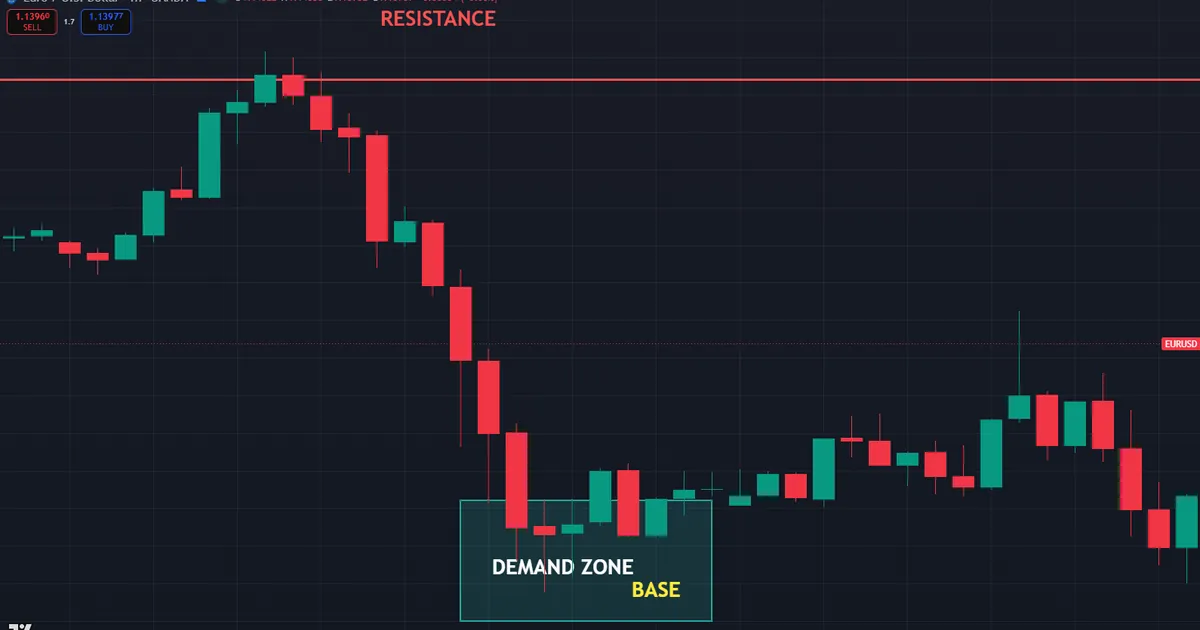
Look at a live case. The chart shows EURUSD on the one-hour timeframe with a horizontal resistance line near 1.148 across two old highs, plus a shaded demand zone near 1.135 where a strong rally launched. Price drifts between the flat line above and the shaded base below.
Lines Versus Zones
The shape of each mark tells the story. Support and resistance often appear as a single line or a slim band at a memorable price. Supply and demand appear as a box that covers the whole base before a big move.
That difference shapes your stops. A thin level invites a tight stop just beyond it. A wide zone asks for a stop beyond the far edge of the box, which usually means a larger but better-placed risk.
The wider stop is not a drawback in itself. A zone-based stop sits behind a whole area of interest, so normal noise rarely reaches it. So you trade fewer units with a wider stop, yet the placement often survives the wobble that a tight level-based stop would not.
Reaction Versus Origin
Support and resistance describe where price reacted. Supply and demand describe where a move originated. So one method looks at turning points, and the other looks at the launchpad of a strong rally or drop.
That focus on origin ties supply and demand to order flow. A demand zone marks a spot where buyers overwhelmed sellers so fast that price rocketed away. Because orders may remain unfilled there, price often reacts when it returns.
A support level rarely carries that same story. It simply tells you price stalled here more than once. So while both marks can sit at the same price, only the zone hints at the imbalance that caused the move.
How Each Method Is Built
The construction of each approach is simple, so learn it once and reuse it forever. A few habits define good levels, and a few rules define good zones.
- Support and resistance lines. Mark a horizontal price where price turned two or more times. More clean touches make a stronger level.
- Level as a band. Draw the level as a slim zone from the wicks to the bodies, since real reactions cluster around a range.
- Demand zone. Find a tight base or a single sharp candle just before a strong rally. Shade a box around that base, from its high to its low.
- Supply zone. Find a tight base just before a strong drop. Shade a box around it, marking where sellers took control.
- Fresh versus tested. A zone touched for the first time reads stronger than one price has already revisited several times.
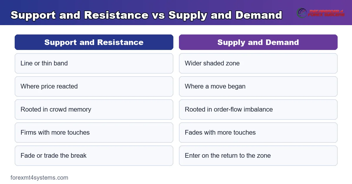
The concept graphic below lines the two builds up side by side, one as a level and one as a zone.
Why a Zone Marks Order Flow
A supply or demand zone is really a footprint of imbalance. When price leaves an area in a hurry, it signals that one side vastly outweighed the other. Large orders that never filled may still rest inside that base.
So price returning to the zone can trigger those leftover orders. Buyers who missed the first rally may wait in the demand zone for a second chance. That pooled interest is why a fresh zone often produces a sharp reaction.
Larger players think this way on purpose. When a fund cannot fill a big order at once, it leaves work resting behind the market. Because that resting interest sits inside the base, a return to the zone can meet real buying rather than a random bounce.
Why a Level Reflects Memory
A support or resistance level works on memory instead. Traders recall a price where the market turned, so they place fresh orders there again. That crowd behaviour keeps old highs and lows relevant long after they form.
Both ideas rest on human behaviour, yet from different angles. A zone reflects the imbalance that drove a fast move. A level reflects the shared memory of a price that mattered. So the two often point to nearby areas for related reasons.
Spotting a Clean Base
A good zone starts with a clean base. Look for a short cluster of small candles just before a sharp move erupts. That tight pause shows a brief balance right before one side took over.
Avoid shading a messy, drawn-out range as a zone. A long sideways stretch holds no clear imbalance. So the tighter and shorter the base, the sharper the demand or supply zone it leaves behind.
A Side-by-Side Comparison
The table below sums up the support and resistance vs supply and demand contrast at a glance. Keep it handy while you learn, and the differences will soon feel automatic.
| Feature | Support and Resistance | Supply and Demand |
|---|---|---|
| Form | Line or thin band | Wider shaded zone |
| Focus | Where price reacted | Where a move originated |
| Root idea | Crowd memory | Order-flow imbalance |
| Stop placement | Just beyond the level | Beyond the far edge of the box |
| Freshness | Stronger with more touches | Stronger on the first return |
| Typical trade | Fade the level or trade the break | Enter on the return to the zone |
Neither column is better in the abstract. Levels give clean, simple references, while zones add the story of who took control. The strongest traders read both together.
Beginners often start with levels for their simplicity. Zones tend to come later, once the order-flow idea clicks. So there is no rush to pick a side, since the two views reinforce each other on the same chart.
The Freshness Rule That Sets Them Apart
One rule truly divides the two methods. A support level often grows stronger with each touch, since every bounce proves buyers defend it. A demand zone often grows weaker with each touch, because the leftover orders get filled and used up.
So treat repeated touches differently. Trust a level that has held many times, yet grow cautious of a zone that price has already revisited twice. The first return to a fresh zone usually offers the cleanest trade.
This split explains a lot of confusion. A trader who treats a demand zone like a support level keeps buying it long after the orders are gone. So knowing which rule applies keeps you from fighting a base that has already done its work.
Fitting Both Into a Workflow
The two methods shine brightest together, not apart. Mark your horizontal levels first for quick, familiar references. Then add supply and demand zones to capture the order-flow story behind the big moves.
Swing traders map zones on the daily and four-hour charts, where bases are clear. Day traders drop to the one-hour and fifteen-minute charts for intraday zones. The drawing habits stay the same, only the timeframe changes.
Line up the timeframes for the best results. A daily demand zone gives the bias, while a one-hour level times the entry inside it. So a higher-timeframe zone paired with a lower-timeframe trigger keeps small signals in their proper place.
Reading the Move Away From a Zone
The strength of a zone shows in how price left it. A slow, grinding exit hints at a weak imbalance. A fast, explosive exit with big candles hints at a strong one, which makes the zone more likely to hold on a return.
So grade each zone by its departure. A base that launched a sharp, multi-candle rally deserves your attention. A base that price crept away from quietly deserves far less trust.
The gap left behind adds another clue. When price rockets away and leaves an unfilled gap or a run of one-sided candles, the imbalance was severe. So a violent, gap-laden exit marks a zone worth watching on the return.
Stacking Levels With Zones
The real edge appears where the two meet. When a horizontal support level sits at the top of a fresh demand zone, both methods point to the same area. That overlap is confluence, and it beats a single mark every time.
Mark the shared area in advance. Price approaching a spot where a level and a zone agree gives you an early alert. So set both, note the overlaps, then wait for a candle signal there.
Confluence also sharpens your exits. A supply zone that lines up with an old resistance level makes a natural target for a long trade. So the same overlap logic that frames an entry can frame a sensible place to bank profit.
Respecting the Session Clock
Both methods read cleanest inside the London window and the New York morning, roughly 2:00 to 5:00 and 8:00 to 11:00 New York time. Deep liquidity then makes reactions meaningful. Because the Asian session thins out, price often drifts through levels and zones on light flow.
Worked Example: A Demand Zone Return on EURUSD
Picture EURUSD on the one-hour chart in July. A tight base near 1.135 launched a sharp rally last week, so you shade a demand zone around it. A horizontal support line from an older low sits at the top of that same box.
Now price pulls back into the area. Both the demand zone and the support line meet near 1.135, and a bullish candle closes off the low. The chart below marks that first return to the zone as the entry trigger.
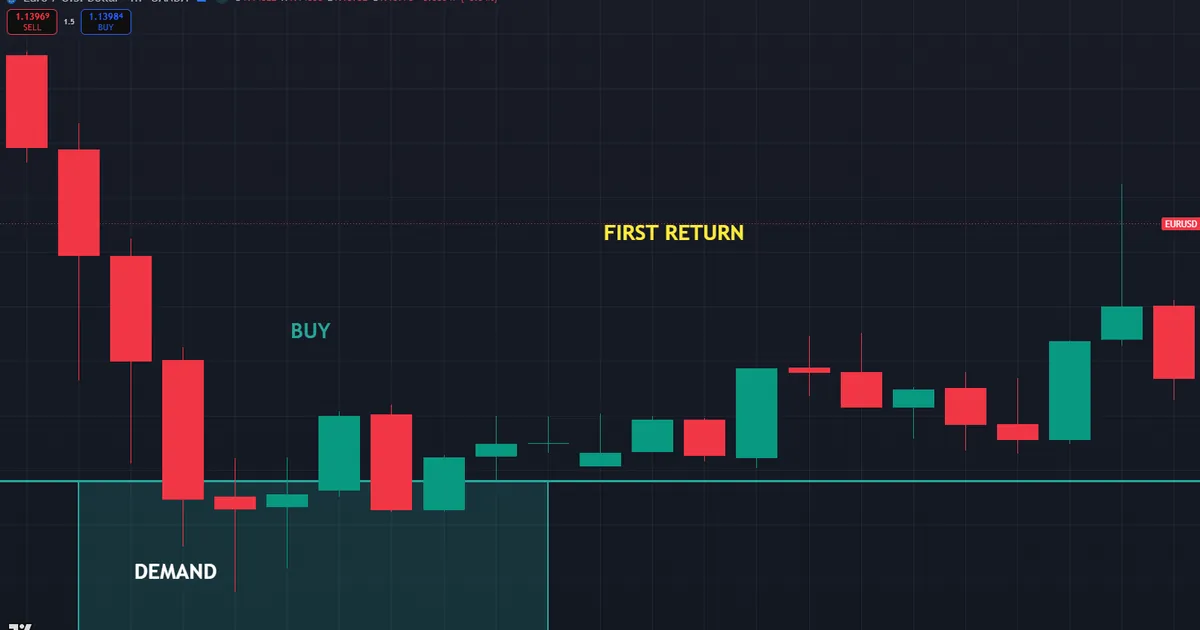
This trade builds from structure. You buy as the candle closes near 1.136, with a stop below the far edge of the zone around 1.132. That places roughly 40 pips of risk, defended by both a zone and a level.
Follow-through rewarded the read. Price rallied back toward 1.145 as the fresh zone held on its first test. Because the base had launched a fast move before, the leftover buying interest showed up again on the return.
The overlap tightened the risk nicely. Since the support line sat at the top of the zone, the reaction began almost as soon as price entered the box. So the stop stayed compact while the reward toward 1.148 stayed generous.
Why the First Return Mattered
Consider the freshness of the zone. Price had not revisited the base since the rally began, so the leftover orders still waited there. That untouched interest is what gave the first return its punch.
A second or third visit would likely read weaker. Each touch fills more of the resting orders, so the imbalance fades. So the timing of the return mattered as much as the price itself.
Contrast that with the support line at the same spot. The line grew a little stronger with the extra touch, since another bounce confirmed the memory. So the two marks reacted to the same return in opposite ways, which is why reading both adds nuance.
Managing the Trade After Entry
A clean signal is only half the job. The exit decides the result. So plan the target before the trade goes live, often at the next supply zone or resistance level above.
In this EURUSD case, an old resistance near 1.148 gave a logical first target. As price climbed, trailing the stop under each new higher low locked in gains. To size the position from the wider zone-based stop, our free position size calculator works out the units in seconds.
Download the complete indicator database
Put these concepts on your charts. One email unlocks the full library of 1,380+ indicators with compiled MT4 and MT5 files, plus my TradingView scripts. No paywall, no spam, unsubscribe any time.
Get free access to my indicator database
One email unlocks 1,380+ free MT4, MT5 and TradingView indicators — the complete library. No single-tool download; you get the whole database.
Common Mistakes and How to Fix Them
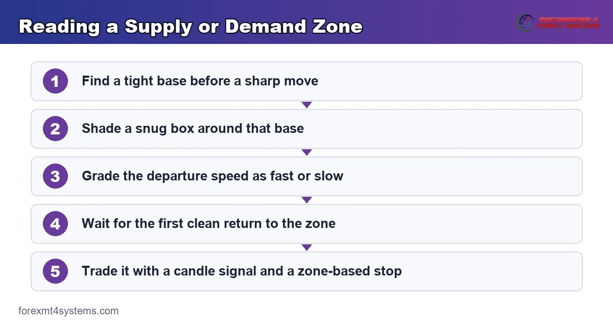
The methods are simple, yet the same errors repeat on every timeframe. Most trace back to confusing a memory level with an order-flow zone. The fixes follow the graphic below.
Trading a Stale Zone
A demand zone loses power once price has tapped it several times. Buying a fourth return often means the leftover orders are already gone. Instead, favour the first clean return to a fresh zone.
Drawing Zones Too Wide
A box that covers half the day’s range marks nothing useful. It simply ensures a touch on almost any pullback. Instead, shade the tight base right before the explosive move, and keep the zone snug.
Treating Levels and Zones as Identical
The two methods follow opposite freshness rules. Reading them the same way leads to bad stop placement and poor timing. So remember that a level firms with touches while a zone fades with them.
Ignoring the Departure Speed
A zone that price crept away from carries little weight. Yet many traders shade every base the same way. Instead, grade each zone by how fast and how far price left it.
Forgetting the Higher Timeframe
A tidy zone on the five-minute chart means little against the daily trend. The larger timeframe frames every smaller mark. So check the daily direction and its key areas before you trust an intraday signal.
A Pre-Trade Checklist for Both Methods
Run this short list before every entry. A few seconds of checking saves hours of regret. So slow down, tick each item, and let a failed check keep you out of a marginal trade.
- Higher-timeframe read of both levels and zones.
- Zone freshness confirmed as a first or second return.
- Departure speed judged as fast and explosive.
- Overlap noted where a level meets a zone.
- A defined trigger, such as a candle close in the area.
- Stop distance set beyond the far edge of the zone.
- Position size worked out from the stop, not a hunch.
When Each Method Fails
Study the failure case as hard as the winner. Here is a common one. EURUSD trends hard lower on the one-hour chart after weak data.
A trader keeps buying an old demand zone near 1.140, sure the base must hold. Price slices straight through it and never looks back. The chart below shows that broken zone with the trend running well past it.
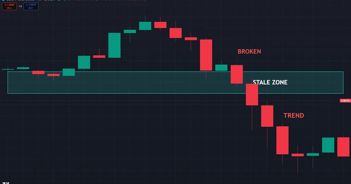
So what went wrong? The trader trusted a stale zone against a strong downtrend. Price had already tapped the base twice, so the leftover buying was gone. In a powerful trend, both zones and levels give way far more easily.
Then size each trade so a broken zone costs little. A sensible stop flows from the structure, and position size flows from that stop. Because the risk stayed small, a broken base stung rather than wounded.
Zones and Levels Both Break
Be honest about both methods. Every level eventually gives way, and every zone eventually gets used up. A break is information, not a betrayal. So treat the first clean close through either mark as a possible shift in control.
Neither Method Sees the News
Be honest about a shared blind spot. Both methods rest on past price, so neither one sees a rate decision coming. A single news candle can blow through a level and a zone in the same second. So check the calendar and step back around major releases.
Related Concepts to Study Next
These two methods connect to a web of sibling ideas, and a few deserve your next reading hour. Start with our full explainer on support and resistance to firm up the line-based view. Then compare the diagonal cousin in our note on trend lines versus support and resistance.
Two more guides widen the picture. Because math-based levels add another layer, read our walkthrough of how to use pivot points. For the order-flow angle, our note on order blocks versus supply and demand shows how institutional footprints relate to plain zones.
For hands-free charting, the support and resistance indicators archive marks the levels for you, while the key level indicators archive gathers the zone tools around them. Tools speed the work, yet the logic above still carries the trade. So learn the marks first, and let any indicator confirm what you already see.
FAQ
Are support and resistance the same as supply and demand?
No, though they overlap. Support and resistance mark levels where price reacted, drawn as lines or thin bands. Supply and demand mark wider zones where a strong move began, tied to order-flow imbalance.
Which should I learn first?
Start with support and resistance, since flat levels are simpler to spot and mark. Once those feel natural, add supply and demand zones for the order-flow story. Then trade the spots where the two agree.
Why does a demand zone weaken with each touch?
A zone works because unfilled orders rest inside it. Each return fills more of those orders, so the imbalance fades. That is why the first clean return to a fresh zone usually reads strongest.
How wide should a supply or demand zone be?
Keep it tight around the base right before the explosive move. A snug box marks the real imbalance, while a wide one ensures a meaningless touch. So shade the small consolidation, not the whole swing.
Can a level and a zone line up?
Yes, and that overlap is powerful. When a horizontal level sits at the edge of a fresh zone, memory and order flow agree on the same area. Those confluence spots often mark the strongest reactions.
Do these methods work in every market?
They work best in ranging or gently moving markets and give way in strong trends. In a powerful move, price cuts through levels and zones alike. Manage risk on every trade. Results are not guaranteed; past performance is not indicative of future results.
External references
- For background on this concept, see Support and Resistance at BabyPips.
- For broader market context, see Demand Curve at Corporate Finance Institute.

About the author
Written by Dominic Walsh, a Forex trader and MT4/MT5 indicator, Expert Advisor and script developer. Every tool on forexmt4systems.com is tested on live charts before release and ships with ready-to-use compiled MT4 (.ex4) and MT5 (.ex5) files. Learn more about the trader and developer behind this site.
How we build, test and correct every tool: Editorial & Testing Policy. Trading carries risk; see the disclaimer.