
A TradingView VIX chart shows one thing: how much movement options traders expect from the S&P 500 over the next 30 days. So it is a stock market gauge first, and a forex tool only by extension. This guide settles three questions. First, where to find the right symbol. Next, how to read its levels and timeframes. Finally, how much it tells a currency trader. We measured it against EURUSD and gold over 299 daily bars, and the honest answer is “some, but less than most people think”.
What the VIX actually is
The VIX is an index published by Cboe. It turns the prices of S&P 500 index options into a single number: the market’s expected volatility for the next 30 days, in annualised percent. Cboe describes the method on its own VIX index page at Cboe, and that page is the primary source for everything below.
Two points matter for chart readers. First, the VIX is not a price of anything you can buy. You cannot place an order on spot VIX. Instead, traders use VIX futures, options and exchange-traded products, and those follow their own curves.
Second, the VIX looks forward, not back. An ATR or a range reading measures what price already did. The VIX, by contrast, measures what option buyers are paying for protection now. Hence the nickname “fear gauge”, but the fear is about S&P 500 options. It does not measure fear of the euro, the yen or gold.
How the number is built
Cboe takes a wide strip of out-of-the-money SPX puts and calls with two expiries around 30 days out. Then it weights each option by its strike and blends the two expiries into a constant 30-day window. In simplified form, the variance for each expiry is:
σ² = (2/T) × Σ (ΔK / K²) × e^(RT) × Q(K) − (1/T) × (F/K0 − 1)²
Here T is time to expiry, K is each strike, Q(K) is the option’s mid price, R is the risk-free rate and F is the forward index level. After that, the result is interpolated to 30 days, square-rooted and multiplied by 100.
You do not need to compute this. Still, one shortcut helps. Because the VIX is annualised, dividing it by about 15.9 (the square root of 252 trading days) gives the implied one-day move of the S&P 500. For example, our last daily close of 14.88 implies a typical daily move of roughly 0.94%. By contrast, the window’s top close of 31.04 implied about 1.96% a day. In short, the market was pricing roughly twice the daily movement at the March peak.
How we tested the TradingView VIX chart
We pulled daily closes for TVC:VIX from 23 July 2025 to 25 September 2026, which gave 299 bars. Next, we pulled daily bars for OANDA:EURUSD and OANDA:XAUUSD over the same window. All seven screenshots came from the TradingView web chart on 28 September 2026.
We measured three things. First, how the VIX closes were spread across levels. Second, how closely daily VIX changes moved with daily EURUSD and gold changes. Third, how wide the EURUSD daily range was on high-VIX days compared with low-VIX days. Our editorial testing policy explains how we capture and check charts. Note that the charts were taken live on 28 September, so the header of each image shows that day’s unfinished bar.
Chart settings we used
The VIX has no inputs of its own, so the “settings” are chart choices. These are the ones we used, and why.
| Setting | Value we used | Why |
|---|---|---|
| Symbol | TVC:VIX | The Cboe spot index as TradingView feeds it |
| Main timeframe | 1D | One close per day; matches our statistics |
| Context timeframe | 1W | Shows the rare large spikes of past years |
| Intraday timeframe | 1h | Shows how a spike builds inside a week |
| Overlay | Moving Average, length 20, source close | Separates a lasting rise from a one-day jump |
| Reference levels | 15, 20, 25 | Where our sample’s closes split into calm and stressed days |
| Comparison chart | OANDA:EURUSD 1D with ATR 14 | Shows realised FX range next to expected equity volatility |
To find the chart, type “VIX” into the TradingView symbol search and pick the entry listed as the Volatility S&P 500 Index from TVC. The TVC:VIX symbol page on TradingView shows the same feed. Avoid futures tickers unless you want a futures contract, because they trade at different levels.
Reading the VIX on a TradingView chart
Start with the daily chart and look at the level, not the colour of the candles. A green VIX candle means expected volatility rose that day. So for equity traders a green VIX day is usually a bad day, which confuses many new readers.
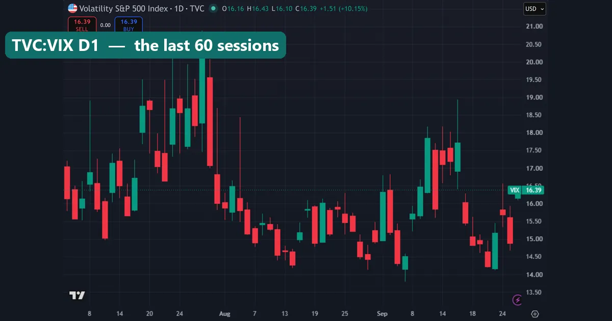
The daily view above covers the last 60 bars. Most closes sit between the 14.00 and 18.00 gridlines. One late-July close pushed just above 20.50, and the index then fell back through August. On 28 September the live bar showed 16.39, up 1.51 points or 10.15%. But on a base near 15, that is only 1.5 points.
Next, switch to one hour.
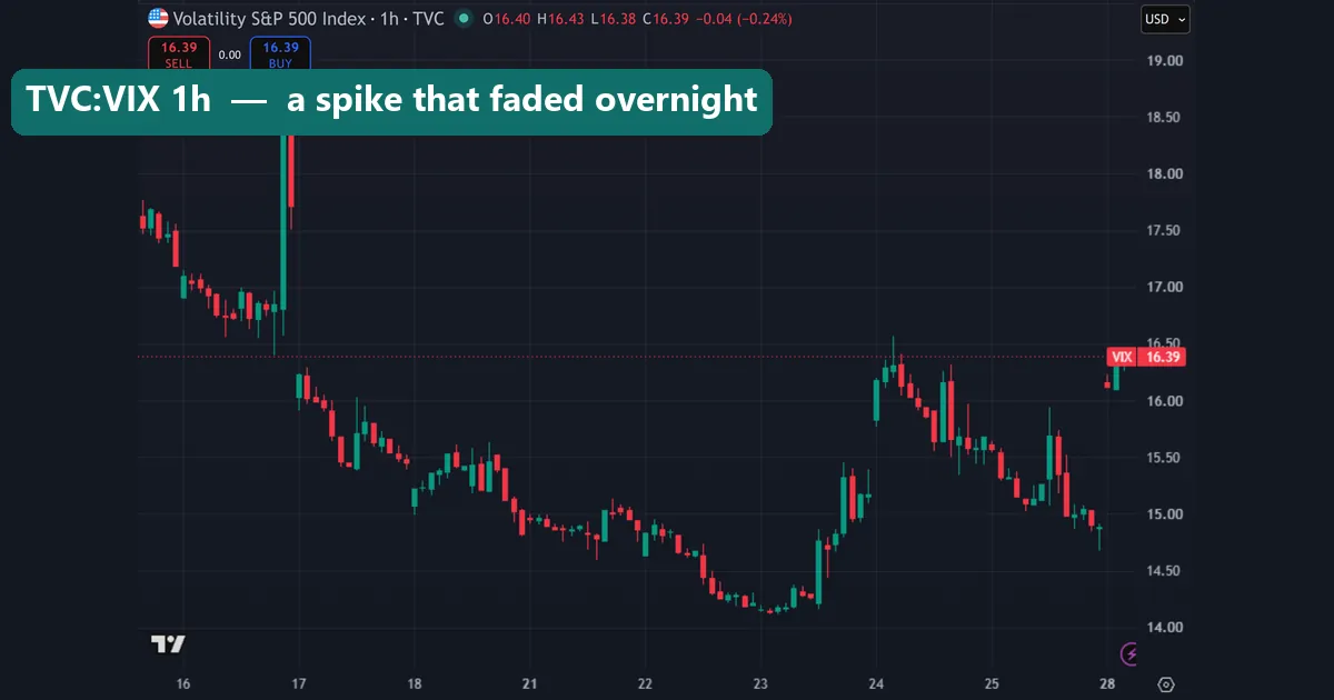
The hourly chart runs from 16 to 28 September. Also, the time axis skips from the 18th to the 21st and from the 25th to the 28th. The index does not print over the weekend, unlike a round-the-clock FX chart. Late on 16 September one hourly candle ran above the 18.50 gridline. Yet by the next session the index had opened back below the 16.50 gridline. For forex, the hourly chart is mainly a way to line up a VIX jump with a news release on your pair.
What the levels meant over 299 days
People quote fixed VIX thresholds, such as “above 20 is fear”. We checked how our sample was actually spread instead.
- Mean close: 17.74. Median close: 16.76. The mean sits above the median because a few spike days pull it up.
- Days closing above 20: 49 of 299, about 16%.
- Days closing above 25: 16, about 5%.
- Days closing below 15: 39, about 13%.
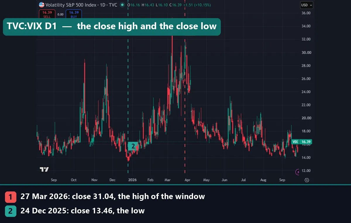
- Highest close: 31.04 on 27 March 2026. Lowest close: 13.46 on 24 December 2025.
So in this window, the “normal” VIX lived between 15 and 20 on most days. A close above 20 was a minority event, and above 25 was rare. That said, these bands belong to this 14-month window only. Earlier years had much larger spikes, as the weekly chart further down shows.
Look again at the first image. Marker 1 sits on the 27 March close of 31.04, the highest close in our data. However, the tallest candle on that chart comes earlier in March, with a wick above the 34.00 gridline. That wick is an intraday high that faded before the close. Marker 2 sits on the 24 December low of 13.46, during the holiday lull.
Worked example: VIX regimes and the EURUSD range
Here is the practical question for a forex trader. Does a high VIX mean a wider EURUSD day? We sorted our days by VIX close and averaged the EURUSD high-to-low range.
| VIX close | Days | Average EURUSD daily range |
|---|---|---|
| Above 20 | 49 | 84.3 pips |
| Below 16 | 90 | 55.4 pips |
The high-VIX days had an average range about 52% wider than the calm days: 84.3 against 55.4 pips. That is a real difference, and it is the most useful thing the VIX offered FX in our test. Our ATR position sizing guide shows how to turn a wider range into a smaller lot.
Direction is another matter. The correlation of daily VIX changes with daily EURUSD changes was r = -0.207 over 291 matched days. Squared, that explains only about 4% of the daily EURUSD movement. The VIX against gold gave r = -0.23 over 292 days, which is similarly weak. In short, the VIX told us something about how big EURUSD days were. It told us very little about which way they went.
Comparing the VIX with EURUSD and gold charts
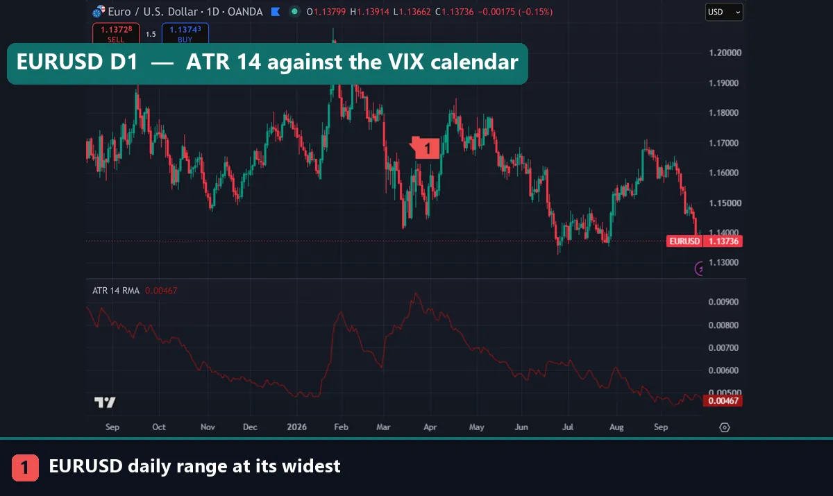
On the EURUSD chart, the ATR(14) pane peaks in late March, above the 0.00900 line, or roughly 90 pips. Marker 1 flags that stretch as the widest daily range of the window. It lines up with the VIX’s top close in late March. But notice the second ATR bump in late January, when EURUSD spiked towards 1.20. The VIX in late January stayed well below its March levels. So the euro had its own volatile spell without the equity gauge flashing. At capture, ATR(14) read 0.00467, or about 47 pips.
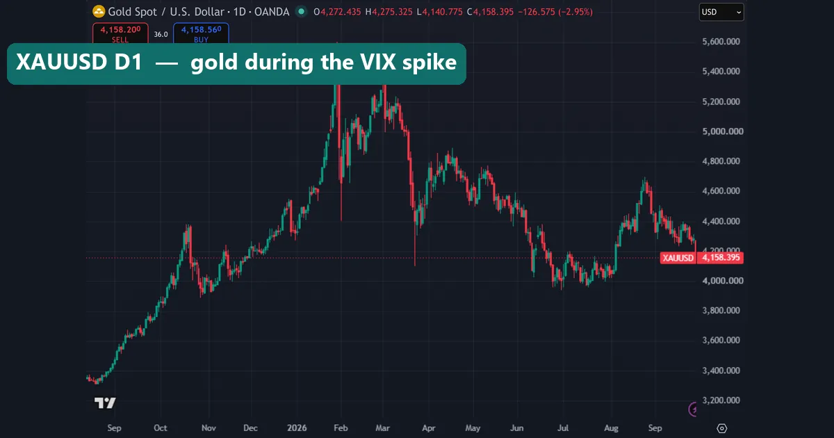
Gold tells a different story. XAUUSD peaked in late January above the 5,400 gridline and again near it in early March. Then it fell hard through March while the VIX climbed to its highs. On 28 September the live gold bar showed 4,158.395, down 2.95%. In this sample, a rising VIX did not lift gold.
Download the complete indicator database
Put these concepts on your charts. One email unlocks the full library of 1,380+ indicators with compiled MT4 and MT5 files, plus my TradingView scripts. No paywall, no spam, unsubscribe any time.
Get free access to my indicator database
One email unlocks 1,380+ free MT4, MT5 and TradingView indicators — the complete library. No single-tool download; you get the whole database.
Where it fails for forex traders
It measures the wrong market. The VIX prices S&P 500 options. A shock that starts in rates, Japan or the euro area can move FX first and equities later, or not at all. For example, the January EURUSD spike above had no matching VIX spike.
It does not give direction. Our correlations were weak, near -0.2 for both EURUSD and gold. That is too loose to base a trade on.
The hours differ. The index does not print through the weekend or around the clock. So a Sunday-evening gap in FX has no VIX reading beside it.
Levels drift between years. Our 15-20-25 bands suit this window. In a calmer or stormier year they would sit elsewhere, so re-measure before you trust a fixed line.
The spot index is not a trade. VIX futures and exchange-traded products follow their own term structure. Therefore a chart of TVC:VIX cannot tell you what a VIX product returned.
The long view: weekly chart and a 20-day average
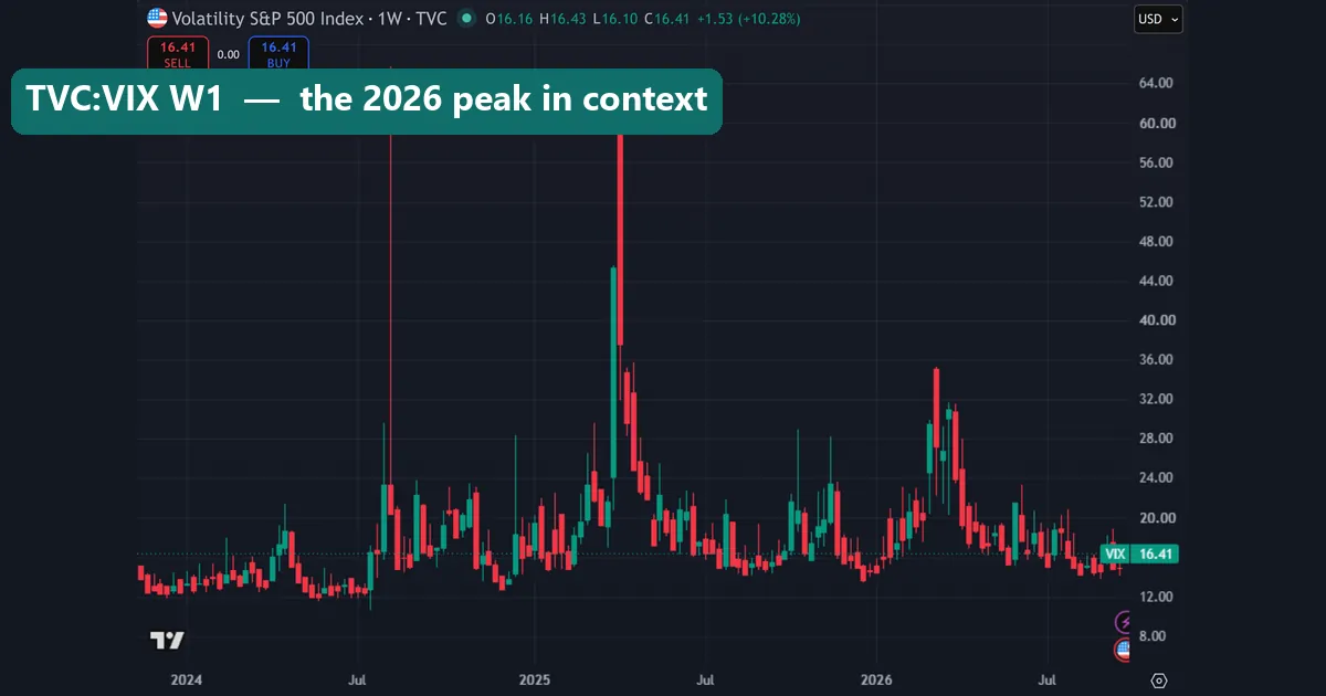
The weekly chart goes back to early 2024. In August 2024 a weekly wick reached above the 64.00 gridline. In April 2025 a weekly candle body reached the 60.00 line. By comparison, the 2026 peak stayed below the 36.00 gridline on the weekly scale. So the March 2026 stress was moderate by recent standards. So “high” depends on the window you look at.
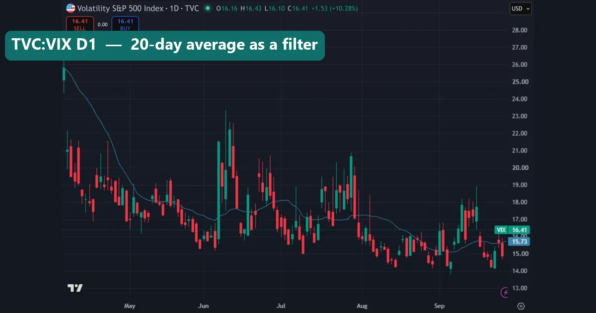
The last chart adds a 20-period moving average of the close. It covers about 120 daily bars, from April to late September. The average falls steeply from above 25 in April, then flattens near 15 to 17 through the summer. At capture it read 15.73, while the live bar sat at 16.41. We use the average as a simple filter. If the VIX closes above its 20-day average for several days, the higher range is lasting. However, a single close above it can fade fast: the June spikes on this chart were back under the average within about a week.
Common mistakes with the VIX chart
- Treating the VIX as a forex signal. Our test found weak links to both EURUSD and gold direction. Use it for size and risk, not for buy or sell calls.
- Reading candle colour as good or bad. A green VIX candle means rising expected volatility. On an equity chart that usually lines up with a falling market.
- Quoting wicks as closes. Our chart’s tallest March wick was higher than the 31.04 top close. Mixing the two overstates the stress.
- Charting a futures ticker by accident. VIX futures trade at different levels from spot VIX. Check that the header says TVC before you read any number.
Where to go next
This guide focused on the chart itself. For the wider picture of how equity fear feeds into currencies, read our guide to the VIX in forex. Then pair it with our explainer on risk-on and risk-off markets and the list of safe haven currencies.
For realised volatility on your own pair, start with what ATR measures and our guide to forex pair volatility. Also, the forex volatility calculator and the risk-on risk-off meter give a quick read without a chart. Next, the guide to currency correlation explains why an r of -0.2 is weak. Finally, high-impact news in forex covers the releases behind many VIX jumps.
For background reading, the VIX article on Wikipedia covers its history. Also, the SEC’s volatility glossary entry at Investor.gov gives a plain definition of volatility.
FAQ: the TradingView VIX chart
What is the VIX symbol on TradingView?
Use TVC:VIX, listed as the Volatility S&P 500 Index; it is the spot index, and it cannot be traded directly.
Can I trade the VIX from the TradingView chart?
No, because spot VIX is an index; traders use VIX futures, options or exchange-traded products, which follow their own prices.
What is a high VIX reading?
In our 299-day sample the index closed above 20 on 49 days and above 25 on 16 days, so above 20 was uncommon and above 25 was rare, although other years sat much higher.
Does a rising VIX mean EURUSD will fall?
Not reliably; daily VIX and EURUSD changes correlated at only r = -0.207 in our test, which is too weak to trade on.
Does the VIX help forex traders at all?
Yes, for sizing: EURUSD averaged 84.3 pips of daily range on days the VIX closed above 20, against 55.4 pips on days it closed below 16.
Why does the hourly VIX chart have gaps?
The index does not print through the weekend or around the clock, so an hourly VIX chart shows breaks that a 24-hour FX chart does not.
Why is the tallest wick higher than the highest close?
A wick is an intraday high that faded before the session ended; in our window the top close was 31.04 on 27 March 2026, while an earlier March wick reached higher.
Can I use the VIX to predict forex prices?
No; in our test it described the size of EURUSD days far better than their direction, so treat it as context for risk, and remember that results are not guaranteed; past performance is not indicative of future results.
Last updated: 28 September 2026.

About the author
Written by Dominic Walsh, a Forex trader and MT4/MT5 indicator, Expert Advisor and script developer. Every tool on forexmt4systems.com is tested on live charts before release and ships with ready-to-use compiled MT4 (.ex4) and MT5 (.ex5) files. Learn more about the trader and developer behind this site.
How we build, test and correct every tool: Editorial & Testing Policy. Trading carries risk; see the disclaimer.