
Currency traders spend their days on price charts. Yet bond yields and forex prices move together often enough that ignoring the bond side leaves a real gap in your reading of the market.
This guide covers the mechanism honestly. It also covers the days when the relationship stops working, because those days arrive more often than most write-ups admit.
How Bond Yields and Forex Markets Connect
A government bond pays fixed amounts on fixed dates. Its yield describes the return an investor earns by paying today’s price for that stream.
So the yield rises whenever the price falls. Nothing about the bond itself changed, only what buyers will pay for it.
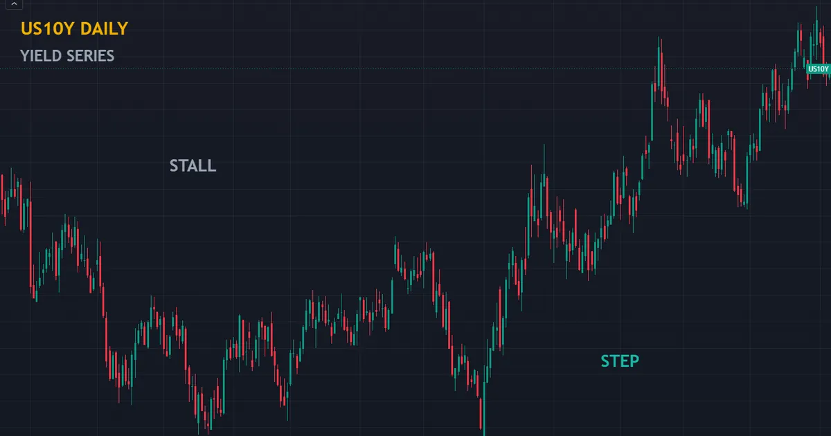
Above sits the US ten-year yield on a daily chart. Notice how it steps, stalls and retraces rather than drifting smoothly, because a yield chart plots the outcome of a live auction.
Price and Yield Move Opposite Ways
Picture a bond paying a fixed coupon each year. If demand pushes its price up, the buyer pays more for the same fixed stream, so the return shrinks.
Weak demand does the reverse. A lower price buys the same coupons, and the return grows.
That inverse link trips people up constantly. A falling yield chart shows a rising bond market, not a collapsing one.
Which Maturity Says What
Maturities carry different messages. Traders who quote a single number usually mean the ten-year, which blends several stories at once.
| Maturity | What it mostly reflects | Why a currency trader cares |
|---|---|---|
| Three-month bill | The policy rate right now | Sets the cost of holding a position overnight |
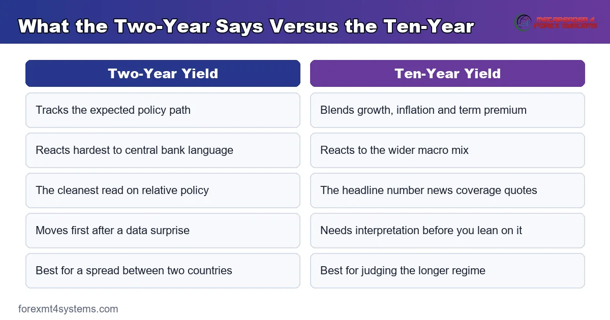
| Two-year note | The expected policy path over two years | The cleanest read on rate expectations |
| Ten-year note | Growth, inflation and term premium combined | The headline number that news coverage quotes |
| Thirty-year bond | Long-run inflation and fiscal credibility | Flags stress that shorter maturities can hide |
Two-year yields react hardest to central bank language. Ten-year yields respond to a wider mix, so a move there needs interpretation before you lean on it.
How a Yield Move Reaches the Currency
The chain runs through capital flows and expectations rather than through any direct link. Five steps describe it.
- New information arrives. A data print, a central bank remark or a fiscal announcement changes what traders expect from policy.
- Bond traders reprice the curve. Short maturities move first, since they sit closest to the policy decision itself.
- The differential against other countries shifts. A domestic yield move only matters relative to what happened elsewhere.
- Capital reallocates towards the better return. Investors and hedgers adjust exposure, and some of that adjustment crosses the currency market.
- The exchange rate settles at a new level. Flow meets the existing order book, and the pair finds a fresh balance.
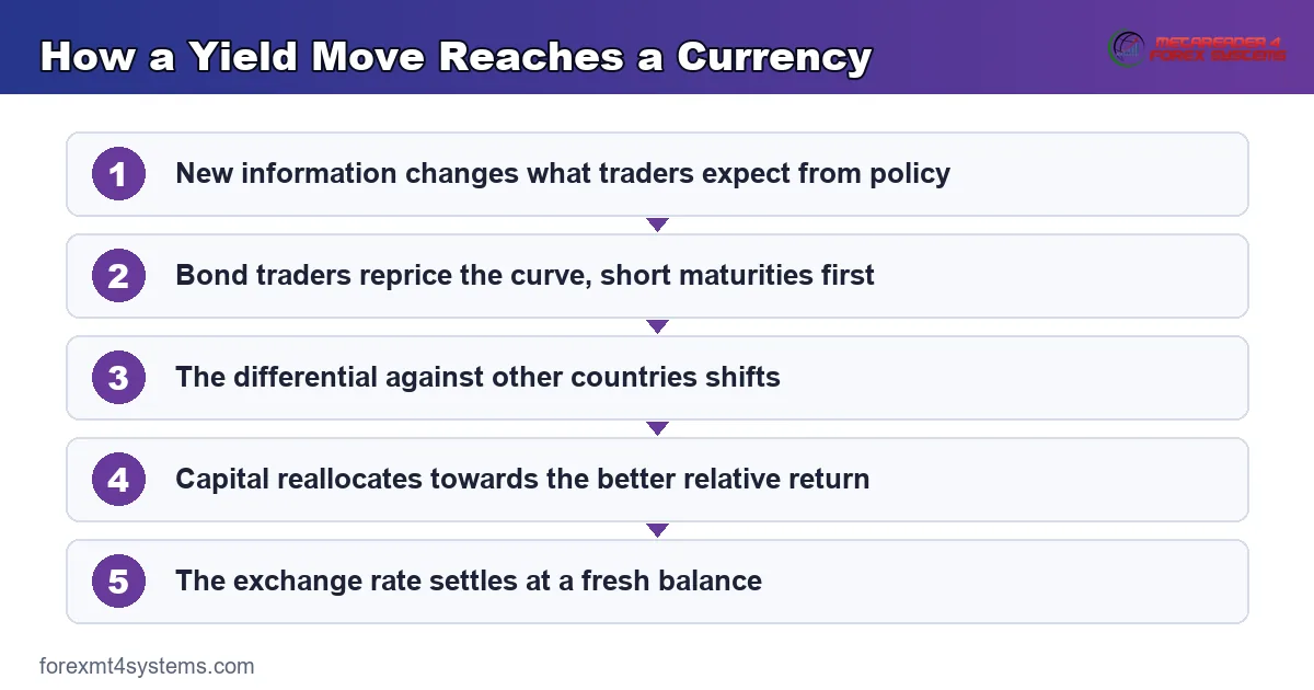
Each step introduces slippage between cause and effect. So a yield move rarely produces a tidy, proportional currency move on the same day.
The Differential Matters, Not the Level
Two Countries, One Spread
A currency pair prices one economy against another. So a single country’s yield tells you almost nothing on its own.
What counts is the gap. If US ten-year yields climb while German yields climb further, the spread narrows and the euro side gains ground.
Traders therefore watch spreads rather than levels. The two-year gap between two countries tracks their relative policy paths more cleanly than either yield alone.
Interest Rate Parity in Theory
Textbooks start with a tidy idea. Two identical investments in different currencies should deliver the same return once you account for the exchange rate.
Covered parity holds well, because arbitrage enforces it. Forward points adjust until hedged returns match, which keeps the forward curve tied to the rate gap.
Uncovered parity makes a bolder claim. It says the high-yield currency should weaken by exactly enough to cancel its yield advantage.
Why the Theory Fails in Practice
Reality disagrees, and it has disagreed for decades. High-yield currencies frequently hold their value or strengthen instead of weakening as predicted.
Researchers call that gap the forward premium puzzle. The carry trade exists precisely because the textbook prediction keeps failing.
None of that makes carry easy. Position risk usually dwarfs the interest earned, and crowded carry trades unwind violently when sentiment turns.
Swap costs deserve care too. Rollover rates track the interbank gap loosely, and each broker sets its own, so run the numbers on our swap calculator before you assume anything.
What “Priced In” Actually Means
This single idea does more work than anything else in macro trading. Most confusion about yields and currencies dissolves once you hold it clearly.
Markets Trade the Expectation
Every yield already contains a forecast. Traders have bought and sold on what they think policy will do next, so the number reflects a view rather than a fact.
A rate cut that everyone anticipates therefore reached the market weeks ago. The announcement merely confirms old news.
Only the surprise portion carries force. Work out what the market expected, then compare that with what actually landed.
Where to Find the Expectation
Interest rate futures imply a path for the policy rate. Short-dated government yields tell a similar story with slightly less precision.
Economist surveys offer a second view. When the two disagree, the market number usually wins, since it reflects money genuinely at risk.
Both sources sit in the public domain. Neither costs anything, and checking one takes about thirty seconds.
Why the Reaction Often Looks Backwards
A central bank raises rates and the currency drops. Newcomers call that irrational, and it usually is not.
The market may have wanted a larger move, or a firmer tone alongside it. Measured against that bar, an ordinary hike counts as a disappointment.
So direction after a release depends on expectation and positioning rather than on the headline. Anyone promising to predict that reaction is selling you something.
Reading the Shape of the Curve
A yield curve plots yields against maturity. Its shape carries information that no single yield holds on its own.
Steep, Flat and Inverted
Longer maturities normally pay more, so the curve slopes upward. Investors want extra return for locking money away for longer.
A flat curve says the market expects little change ahead. An inverted curve, where short yields exceed long ones, says traders expect cuts to arrive.
Inversions have preceded recessions often enough to attract real attention. They have also produced false alarms, so treat the shape as information rather than as a countdown.
What Shape Changes Mean for Currencies
A curve steepening because short yields fall usually points to easing ahead. That combination tends to weigh on the currency.
A curve steepening because long yields rise reads quite differently. Growth optimism supports the currency, while fiscal worry undermines it, and separating those two takes context.
So the shape alone settles nothing. Ask which end moved and why, and the reading becomes usable.
Real Yields Versus Nominal Yields
A headline yield ignores inflation entirely. Strip expected inflation out and you get the real yield, which describes purchasing power rather than currency units.
Why the Distinction Bites
Imagine two countries with identical ten-year yields. One expects mild inflation while the other expects a sharp rise.
An investor comparing the two prefers the first. Its real return looks better despite the matching headline number.
So a nominal yield jump driven purely by inflation fears rarely helps the currency. Sometimes it hurts, since the rise signals a problem rather than an opportunity.
Where to Find the Numbers
Inflation-protected securities give a market-based read on real yields. The gap between a nominal yield and its inflation-protected twin gives the breakeven inflation rate.
Central banks publish the raw series openly. Daily yield data sits in the Federal Reserve’s regular statistical releases, and comparable pages exist for most major economies.
Check the release schedule alongside the data. Our economic calendar flags the inflation and payroll prints that move the curve hardest.
A Worked Example: A Central Bank Day
Nothing clarifies the mechanism like one session. Here runs the sequence on a policy announcement day.
Before the Decision
Check the market-implied path first. Suppose futures point to a quarter-point hike with near-certainty attached.
Then read the two-year yield. It has already climbed to reflect that expectation, so the hike sits in the price before anyone speaks.
Write down what would surprise you. A larger move, a softer statement or a shift in the projections all qualify.
At the Announcement
The bank delivers exactly the expected quarter point. Two-year yields barely twitch, because nothing new arrived.
Then the statement drops a phrase about slowing growth. Two-year yields fall as traders trim the path they expected.
The currency follows within minutes. Spreads widen while that happens, so fills land worse than the screen suggested a moment earlier.
After the Dust Settles
Check the spread against the other leg of your pair. If the foreign two-year held steady, the differential narrowed and the currency direction makes sense.
If both legs moved together, little changed in relative terms. The pair may drift straight back, and the initial reaction told you nothing durable.
What the Example Teaches
Four moments carry the whole lesson. The table below sets them out.
| Moment | What to read | What it tells you |
|---|---|---|
| Before the decision | The market-implied policy path | Where the bar for a surprise sits |
| At the headline | The two-year yield reaction | Whether anything genuinely surprised |
| During the statement | The direction of the two-year move | Which way the expected path shifted |
| An hour later | The two-country yield spread | Whether the move has any substance |
Notice that none of those four steps forecast anything. Each one describes what happened, which is all an honest reading can do.
The Multi-Year Picture
Zoom out and yields behave like slow regime indicators. Decades of decline gave way to a sharp repricing, and currencies felt every stage of it.
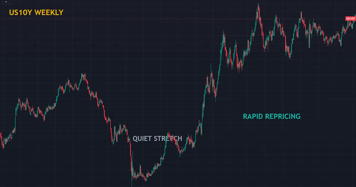
The weekly chart above shows that longer arc. Long quiet stretches alternate with rapid repricings that compress years of adjustment into months.
Those rapid stretches matter most to currency traders. When a curve reprices quickly, the differential moves faster than the currency, and the gap between them creates the trade.
Regime Awareness Beats Prediction
Knowing which regime you sit in changes how you weigh a data print. In a fast repricing phase, small surprises move currencies hard.
In a quiet phase, the same surprise barely registers. So the yield backdrop tells you how much respect the calendar deserves this month.
None of this predicts direction. It sets expectations for volatility, which is a far more honest use of macro information.
Download the complete indicator database
Put these concepts on your charts. One email unlocks the full library of 1,380+ indicators with compiled MT4 and MT5 files, plus my TradingView scripts. No paywall, no spam, unsubscribe any time.
Get free access to my indicator database
One email unlocks 1,380+ free MT4, MT5 and TradingView indicators — the complete library. No single-tool download; you get the whole database.
Common Mistakes and Their Fixes
Six habits turn a genuine relationship into a series of bad trades. The panel below separates what the short end says from what the long end says.
Watching One Country’s Yield Alone
A currency pair needs two sides. Track the spread between the two countries, and the noise from global moves drops away immediately.
Assuming Higher Yields Always Lift a Currency
The reason behind the rise decides the outcome. Yields climbing on strong growth usually help, while yields climbing on fiscal alarm often hurt.
Using the Ten-Year for Policy Reads
The ten-year blends growth, inflation and term premium into one number. For a clean policy read, watch the two-year instead.
Ignoring What the Market Already Expects
Yields move on surprise, never on the expected. A hike everyone anticipates has already reached the curve, so the actual announcement can send the currency the other way.
Treating the Correlation as Fixed
The link between a yield spread and a pair strengthens and weakens across months. Measure it on a rolling basis rather than assuming last year’s relationship survives.
Trading the Yield Chart as a Price Chart
A yield series responds to auctions, index rebalancing and central bank operations. Support and resistance drawn on it carry far less meaning than the same lines on a liquid currency pair.
A Quick Reference Checklist
Six lines cover the practical work. Run them before any yield reading shapes a decision.
| Check | What it means in practice |
|---|---|
| Which two countries | Name both legs of the pair and pull both yield series |
| Which maturity | Two-year for policy, ten-year for the broader story |
| Nominal or real | An inflation-driven rise reads very differently |
| Why yields moved | Growth, policy or fiscal stress all point different ways |
| What the market expected | Only the surprise portion carries any force |
| Is risk sentiment calm | A scare overrides the yield story completely |
None of those six require a subscription. All six require you to slow down for about two minutes.
When the Yield Link Breaks Down
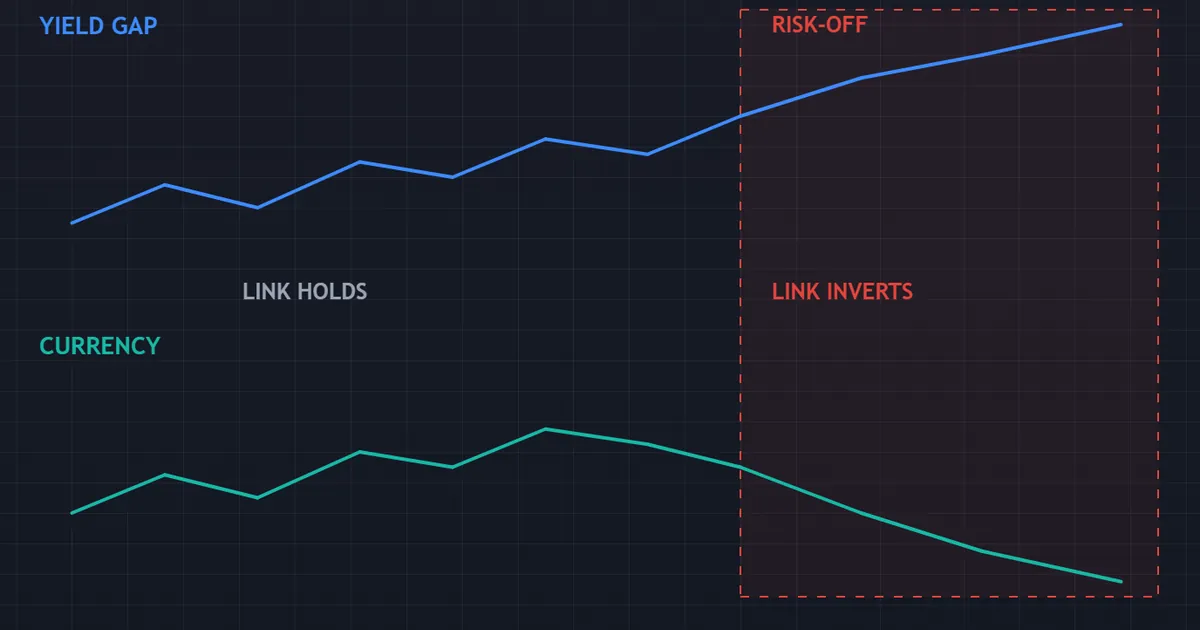
The relationship fails regularly, and it fails in patterns you can recognise. The panel below shows the shape of that failure.
Risk-Off Flips the Sign
During a market scare, investors rush into government bonds for safety. Prices jump, so yields fall sharply.
Normally falling US yields would pressure the dollar. In a genuine panic the opposite happens, because the same fear drives buyers into dollars and dollar assets together.
So the usual mapping inverts exactly when volatility peaks. Traders relying on the yield rule alone get caught on the wrong side at the worst moment.
Havens Follow Their Own Rules
The yen and the franc strengthen in a scare regardless of their yield disadvantage. Both serve as funding currencies, so a risk unwind forces buyers to repurchase them.
Japanese yields spent years pinned by central bank policy. During that period the yen tracked the US yield side almost alone, which made the spread look one-sided.
Policy shifts change those rules without warning. Any relationship resting on a central bank’s current stance lasts exactly as long as the stance does.
Bad Yield Rises Exist
Sometimes yields climb because investors doubt a government’s fiscal path. The currency then falls while yields rise, which reverses the textbook link.
Sterling went through exactly that in late 2022. Gilt yields spiked and the pound dropped at the same time, since the move signalled stress rather than strength.
Emerging markets show this pattern more often. A yield surge there frequently reflects credit worry, and credit worry pushes capital out rather than in.
One question separates the two cases. Ask whether the yield rise came with stronger growth data or with a funding headline, because the answer flips the expected currency direction.
Positioning Overrides Everything Briefly
Crowded trades unwind hard. When enough traders hold the same yield-based view, a modest surprise triggers a rush for the exit.
Those unwinds ignore fundamentals for days at a stretch. Sizing sensibly matters more here than any analysis, so read our note on risk per trade before you scale up a macro idea.
Related Concepts Worth Reading Next
Yields sit inside a wider macro picture. Three neighbouring topics fill it out.
The dollar side deserves its own treatment, so our guide to the dollar index in forex explains what that basket does and does not measure. Read it next if you quote the index without thinking about its euro weight.
On the other side sit the export-driven currencies. Our explainer on commodity currencies covers why some pairs answer to export prices more than to rate spreads.
Data releases drive most yield moves, so our guide to high impact news in forex covers what happens in the minutes around a print. Costs matter there too, and our note on swap in forex explains the overnight side of holding a rate-driven position.
Building Yields Into a Weekly Routine
Macro knowledge changes nothing without a habit. A short weekly pass makes the yield backdrop usable.
Sunday: Pull Two Spreads
Pick the two pairs you trade most. Write down the two-year yield gap and the ten-year yield gap for each.
Then note whether each gap widened or narrowed over the past month. One sentence per pair covers it.
Midweek: Check the Reason
When a spread moves, ask what caused it. Growth data, a policy remark and a fiscal headline all point in different directions.
Write the cause next to the number. That habit stops you treating every yield move as the same kind of event.
Monthly: Measure the Relationship
Once a month, compare how your pair actually tracked its spread. Some months show a tight fit and others show none at all.
Traders who prefer a chart-based view can browse our trend indicators archive for tools that flag regime changes on the pair itself. Any such tool works as a spotter, and the interpretation stays yours.
Keep the Language Careful
Watch how you phrase the relationship to yourself. Saying the spread widened keeps you accurate, while saying yields will lift the currency commits you to a forecast.
Precision costs nothing here. It also stops you holding a losing position because a macro story felt convincing three weeks ago.
FAQ
Do bond yields lead currencies or follow them?
Neither reliably. Both markets react to the same information, and the bond market often reprices first because it sits closer to the policy decision. That head start makes yields a useful reference rather than a leading signal, and the lag varies from minutes to weeks depending on the event.
Which yield should a currency trader watch?
Start with the two-year yield of each country in the pair. It tracks the expected policy path most cleanly, so the two-year spread gives the tightest read on relative monetary direction. Add the ten-year when you want the broader growth and inflation picture, and check the thirty-year when fiscal worries dominate the headlines.
Why does the dollar sometimes rise when US yields fall?
Because risk sentiment overrides the rate story. In a scare, investors buy Treasuries for safety, which pushes yields down, and they buy dollars for the same reason. Both moves come from a single flight to safety, so the usual mapping between yields and the currency inverts.
Can I trade the yield spread directly?
Not as a retail forex trader in any straightforward way. You can express a related view through the currency pair, and some brokers offer bond futures with their own margin rules and contract sizes. Most traders use the spread as background context rather than as a tradable instrument.
What is the forward premium puzzle?
Uncovered interest rate parity predicts that a high-yield currency should weaken by roughly its yield advantage. Decades of data show it frequently does not, and sometimes it strengthens instead. That persistent gap between theory and outcome carries the puzzle name, and it explains why carry trades attract capital despite the theory saying they should not work.
What does an inverted yield curve mean for a currency?
An inversion says the market expects the central bank to cut rates within a couple of years. That expectation usually reaches the currency long before any cut arrives, so the inversion itself rarely triggers a fresh move. Treat it as a description of the expected path rather than as a trade, and remember that inversions have produced false alarms alongside their better-known warnings.
Does the yield relationship work on short timeframes?
Rarely with any consistency. Yield spreads shift slowly compared with intraday currency swings, so an hourly chart mostly reflects order flow and positioning rather than macro repricing. Use the spread to frame a bias over days or weeks, then let structure and risk rules handle the entry. Results are not guaranteed; past performance is not indicative of future results.
External references
- For background on this concept, see Bond Yield at Investopedia.
- For broader market context, see Yield Curve on Wikipedia.
- The comparable daily yield-curve page published by another major-economy central bank is Euro area yield curves at the European Central Bank.

About the author
Written by Dominic Walsh, a Forex trader and MT4/MT5 indicator, Expert Advisor and script developer. Every tool on forexmt4systems.com is tested on live charts before release and ships with ready-to-use compiled MT4 (.ex4) and MT5 (.ex5) files. Learn more about the trader and developer behind this site.
How we build, test and correct every tool: Editorial & Testing Policy. Trading carries risk; see the disclaimer.