
Every economic calendar marks it in red, and desks clear the screen before it lands. So what is CPI in forex, and why does one number from a statistics office move currencies faster than any chart pattern?
CPI stands for the consumer price index. It measures the price of a fixed basket of goods and services, so it tells a central bank whether money keeps its value.
What Is CPI in Forex, in Plain Terms
A statistics agency prices thousands of items every month. Rent, fuel, food, haircuts, insurance premiums: the whole basket rolls into a single index.
Then the agency compares this month with the same month a year earlier. That percentage change becomes the inflation rate everyone quotes.

Above sits an hourly bar on AUDUSD from 29 July 2026. Its range ran roughly 5.76 times the recent average, and its body filled 92 per cent of that range, yet the next bars retraced about 2.71 average ranges.
Notice what the caption avoids. We do not name the headline behind that bar, because one wide candle never proves which release caused it.
Who Publishes the Number
National statistics agencies produce the index, not central banks. That separation matters, because it keeps the measurement independent of the policy that responds to it.
Methods differ across countries. Basket weights, the treatment of housing and the frequency of updates all vary, so cross-country comparisons need care.
Each agency publishes its methodology openly. Reading those notes once explains most of the odd revisions you will meet later.
The Basket and the Percentage
Weights inside the basket matter as much as the prices themselves. Housing carries a heavy weight in most countries, so a rent move drags the whole index with it.
Two figures reach the wires together. Month-on-month shows the latest step, while year-on-year shows the cumulative path over twelve months.
Traders read both. A soft monthly step inside a high annual figure tells a very different story from the front-page number alone.
Headline Versus Core
Headline CPI covers everything in the basket. Core CPI strips out food and energy, the two components that swing hardest for reasons policy cannot touch.
An oil shock lifts headline inflation within weeks. Higher interest rates will not refill a pipeline, so rate setters look straight past that part of the print.
Why Core Guides Policy
Core moves slowly, and that sluggishness makes it useful. It captures the stubborn inflation living inside wages, rents and services.
So officials treat core as the signal and headline as the weather. A hot headline with a soft core often produces a smaller currency move than the front page suggests.
Our guide to hawkish vs dovish language shows how policymakers describe that distinction in public.
Other Inflation Gauges Worth Knowing
CPI leads the pack, yet it shares the stage with several cousins. Each measures price pressure from a slightly different angle.
- PCE price index. The gauge the Federal Reserve prefers, drawn from what households actually buy rather than a fixed basket.
- PPI. Producer prices, measured at the factory gate. Often an early warning for consumer prices a few months later.
- Trimmed mean and median CPI. Variants that discard the wildest components each month rather than a fixed pair of them.
- HICP. The harmonised measure across the euro area, which lets the European Central Bank compare member states directly.
- Wage growth. Not an inflation index at all, yet the closest thing to a leading indicator for services prices.
Watch which gauge a central bank quotes in its own statements. That choice tells you which number will steer its next decision.
When the Print Lands
Most countries publish monthly, on a fixed day, at a fixed time. The United States releases at 08:30 New York time, roughly two weeks after the month ends.
Timing does half the work. A figure landing inside the London and New York overlap meets deep liquidity, while the same figure at a thin hour travels further on far less volume.
- United States. Monthly, mid-month, 08:30 New York time. The most watched inflation print in the market.
- Euro area. A flash estimate near the end of the month, then a final reading roughly two weeks later.
- United Kingdom. Monthly, 07:00 London time, published alongside producer prices.
- Australia and New Zealand. Quarterly headline series, with a monthly Australian indicator running alongside it.
- Japan. Monthly national figures, plus a closely watched Tokyo reading that arrives earlier.
Keep a calendar open rather than a memory. Our economic calendar lists the time, the previous figure and the consensus for each release.
A Word on Time Zones
Every calendar shows a time. Few show yours.
Set the platform clock and the calendar clock to match. Then check both once a month.
Daylight saving breaks this every spring and autumn. Countries switch on different dates, so a release can shift by an hour without warning.
One mistimed release costs more than a year of care. Check the clock, then check it again.
Flash Estimates and Revisions
Some regions publish twice for the same month. A flash estimate arrives first, and the final reading confirms or corrects it a fortnight later.
Flash prints move price hardest. By the time the final version appears, traders have already worked with the early number for two weeks.
Annual reweighting adds another wrinkle. Statistics agencies refresh basket weights, which quietly shifts the series without any change in the underlying prices.
Headline and Core Side by Side
Keep the two definitions apart in your head. The table below sums up the practical difference.
| Feature | Headline CPI | Core CPI |
|---|---|---|
| Coverage | Every item in the basket | The basket minus food and energy |
| Month-to-month behaviour | Jumpy, driven by fuel and fresh food | Smoother, driven by rents and services |
| Policy weight | Secondary, though it shapes public expectations | Primary, since policy can influence it |
| Typical market reaction | Large on the first tick, quick to fade | Smaller on the tick, slower to unwind |
| Best used for | Judging the cost-of-living headline | Judging where interest rates go next |
One release can send the two in opposite directions. When that happens, the currency usually follows core.
The Causal Chain, Step by Step
One chain connects a price index to an exchange rate. Learn it once and most calendar confusion clears up.
- The print lands. A statistics agency publishes the index at a scheduled minute, with no advance leak to the market.
- Traders compare it with consensus. The forecast already sits in the price, so only the gap between forecast and outcome carries new information.
- Rate expectations shift. A hotter print pushes the expected policy path higher, and a cooler print pulls that path lower.
- Yields reprice. Short-dated government bond yields move first, because they track the expected policy path most directly.
- The currency follows the yield. Capital chases the better expected return, so the exchange rate adjusts to the new path.

Every link in that chain can break. The sequence describes a tendency, never a mechanism that forces the next tick.
Priced In: The Idea Most Guides Skip
Markets do not trade the number. They trade the distance between the number and what participants already expected.
What Priced In Actually Means
Forecasters publish a consensus days ahead. Traders position against that consensus, so the expected outcome sits inside the exchange rate before the clock strikes.
A print that matches consensus therefore delivers no new information. Price can drift, wobble and settle right back where it started.
Only the surprise carries weight. That single sentence explains most of the disappointment traders feel after a release they read correctly.
Why a Hot Print Sometimes Sinks the Currency
Textbook logic says hot inflation lifts a currency, because tighter policy usually follows. Reality argues with that far more often than the textbooks admit.
Suppose the market already expects four rate hikes. A print supporting only three hikes counts as a dovish surprise, even though inflation still runs hot.
Position squaring adds noise on top. Crowded trades unwind into the release, which pushes price against the apparent logic for several hours.
Expectations Move First
The largest repricing usually happens before the print, not after. Wage data, producer prices and survey readings all leak the direction early.
So the calendar entry marks a confirmation, not a cause. By release time the market has already spent a week adjusting.
Sizing the Surprise
Not every miss carries equal weight. A tenth of a percentage point on core often outweighs half a point on headline.
Judge the gap against the recent run of misses. A miss larger than anything in six months deserves attention, while a routine wobble rarely does.
Then ask a second question. Does this print change the number of rate moves the market expects, or merely the tone of the commentary?
The Two-Sided Reaction Window
Reactions arrive in stages. The first seconds belong to automated systems reading the wire, and the first minutes belong to whoever positioned ahead of the print.
Real money often trades much later. Funds rebalancing on the back of a genuine change in the rate outlook can take hours or days to finish.
So the useful move sometimes begins after the spike has already died. Patience separates those two crowds neatly.
CPI and the Meeting Calendar
An inflation print matters most in relation to the next policy meeting. Distance in days changes everything.
The Last Print Before a Decision
Rate setters read the same data you do. The final inflation reading before a meeting therefore carries far more weight than one landing the week after.
Mark both dates together. A calendar showing the release and the decision side by side makes the connection obvious.
Blackout Periods
Officials stop speaking publicly for a stretch before each meeting. During that quiet window, data does all the talking.
Expect sharper reactions inside a blackout. Nobody can step out and soften a hot print with a well-timed interview.
When the Print Contradicts the Guidance
Central banks signal their intentions in advance, then the data occasionally disagrees. Those moments produce the largest repricing of all.
Markets must then choose which source to trust. Guidance usually wins in the short run, because officials control the next decision and a statistics agency does not.
A Worked Example on the Charts
Watch how a real reaction develops rather than how a textbook describes one. Both charts here come from ordinary scheduled releases in July 2026.

This hourly bar on CADJPY, dated 30 July 2026, expanded to roughly 13.35 times the recent average range. Its body filled 98 per cent of that span, so one side held control right into the close.
Reading the First Bar
A full body tells you one side dominated the hour. A long wick with a small body tells you the opposite, because price probed and then came back.
Range alone means little. Compare the range with a recent average, and the reading gains context immediately.
What Happened Next
Follow-through decided the outcome, as it usually does. Over the following bars, price travelled about 3.34 average ranges further in the same direction.
So that decisive close did lead somewhere. Even then, traders who chased it paid the widest spread of the day, and that cost lands whichever way price runs next.
Spreads widen around scheduled data for good reasons, and our note on why spreads widen covers the mechanics behind it.
Download the complete indicator database
Put these concepts on your charts. One email unlocks the full library of 1,380+ indicators with compiled MT4 and MT5 files, plus my TradingView scripts. No paywall, no spam, unsubscribe any time.
Get free access to my indicator database
One email unlocks 1,380+ free MT4, MT5 and TradingView indicators — the complete library. No single-tool download; you get the whole database.
Common Mistakes and the Fixes
Five habits turn a readable release into an expensive one. Each has a fix that costs nothing.

Trading the Headline and Ignoring Core
A hot headline driven purely by fuel rarely shifts policy. Read both numbers before forming any view, and weight core more heavily.
Forgetting the Consensus
An inflation rate of three per cent means nothing in isolation. Check the forecast first, then judge the print against it.
Chasing the First Spike
The opening move often reverses inside the hour. Waiting for the bar to close costs you a little edge and removes a lot of guesswork.
Using Normal Position Size
Slippage and gaps arrive together during a release. Cut size or stand aside, and keep your usual risk per trade honest with our note on risk per trade.
Treating One Print as a Trend
Central banks watch a run of readings, not a single month. Track the direction across three prints before you call anything a turn.
Assuming Every Country Reacts Alike
An inflation surprise in a small open economy travels differently from one in a reserve currency. Trade flows and policy credibility both shape the response.
Judge each currency on its own policy setting. A bank near the end of a tightening cycle reacts to a hot print far less than one still deciding.
Quick Reference Checklist
Run this list before every inflation release. It takes about two minutes.
| Check | What to look at | Why it matters |
|---|---|---|
| Release time | The exact minute in your platform time zone | Removes the surprise of an unexpected spike |
| Consensus | The forecast for headline and for core | Only the gap from consensus carries new information |
| Prior reading | Last month’s figure and any revision to it | Direction over three months beats a single print |
| Rate meeting date | How close the next policy decision sits | A print days before a meeting carries extra weight |
| Open exposure | Every position in the affected currency | Correlated pairs move together on one release |
| Spread and size | Current spread against your normal cost | Cost decides whether the trade was ever viable |
Print the table once and keep it beside the platform. Routine beats recall under time pressure.
When the Reaction Stalls
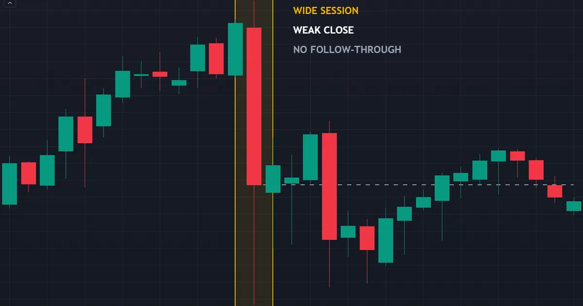
The spike did not hold: the session closed well off its extreme, and the next five sessions added under one more average range, so the move simply stalled. That sentence describes a daily bar on CADJPY from 29 April 2026, and it captures a very common release outcome.
The Numbers Behind It
That session stretched to roughly 5.65 times the recent average daily range. Wide by any standard, and yet its body filled only 52 per cent of the span.
So price travelled a long way and handed back nearly half of it before the close. The next five sessions then added under one more average range, which barely registers against a five-range session.
Why This Shape Repeats
Liquidity thins out around a scheduled release. Market makers widen quotes, resting orders vanish, and a modest amount of flow drags price much further than usual.
Once quotes normalise, that artificial distance closes again. Nothing fundamental changed in the meantime, and the order book simply refilled.
Volatility tools help you separate a real expansion from a liquidity gap, and our volatility indicators archive collects the common ones.
Separating a Fade From a Reversal
A fade and a genuine reversal look identical for the first hour. Distance from the pre-release level separates them.
Price returning to where it started before the print signals a fade. Price stopping halfway and building a fresh range signals something closer to real repricing.
Mark the pre-release price on the chart before the number lands. Without that reference, every retrace looks the same afterwards.
The Practical Response
Give the market thirty to sixty minutes before you judge anything. The level that holds after the dust settles carries far more meaning than the extreme.
Then trade the settled structure, not the memory of the spike. A retest of the pre-release level often offers a cleaner entry than the release itself ever did.
Building the Release Into a Weekly Routine
Theory changes nothing without a habit attached. A short routine does the real work.
Sunday: Mark the Week
Open the calendar and mark every inflation print for the currencies you follow. Note each time in your own platform clock, not the publisher’s.
Then flag any position that would sit open across those minutes. Deciding in advance beats deciding under pressure.
Release Day: Decide Before, Not During
Write the plan an hour ahead. Reduce size, close early, or stand aside entirely, then commit to one of the three.
Avoid the fourth option, which means improvising while the quote flickers. That path produces the trades people describe later with real embarrassment.
Keep It to One Page
A long log dies within a month. A short one survives.
Note four things per release. The forecast, the print, the first-hour range and the settled level.
Nothing else earns its space. Four fields fit on a single line.
Afterwards: Log the Reaction
Record the consensus, the print, the first-hour range and where price finally settled. Twenty of those records teach more than any article.
Patterns emerge quickly. You will notice which pairs fade their spikes and which ones genuinely trend on a surprise.
Related Ideas Worth Reading
Inflation data never operates alone. Three neighbouring topics complete the picture.
Start with the mechanism itself, because our deep dive on how inflation affects forex follows the chain from price pressure through to the exchange rate. Then read our guide to central bank rate decisions, since the meeting turns the data into policy.
Finish with the labour market. Our explainer on what NFP means in trading covers the other monthly release that shapes rate expectations.
FAQ
What does CPI stand for in forex trading?
CPI stands for the consumer price index. A statistics agency prices a fixed basket of goods and services each month, then reports the change against the prior month and against the same month a year earlier. Traders watch it because inflation drives interest rate policy, and rate expectations drive currencies.
Is core CPI more important than headline CPI?
For policy, generally yes. Core strips out food and energy, the two components that jump for reasons monetary policy cannot influence. Rate setters therefore anchor on core when they judge underlying price pressure. Headline still matters for household expectations, and a large gap between the two often becomes the story itself.
Does a high CPI print always strengthen a currency?
No, and that assumption costs traders real money. A hot print lifts a currency only when it pushes the expected policy path above what the market had already assumed. If traders expected something even hotter, the same print reads as dovish and the currency can fall. Context decides direction, never the number alone.
How long does a CPI reaction usually last?
It varies enormously. Some releases produce a spike that fades within the hour, while others start a repricing that runs for weeks. The durable moves tend to follow prints that genuinely change the expected number of rate moves. Spikes that fade usually reflect thin liquidity rather than any shift in expectations.
Should beginners trade the CPI release?
Most beginners get more from watching than from participating. Spreads widen, slippage lands on entries and exits alike, and fills at your requested price never come with any assurance. Reading twenty releases without a position teaches the reaction pattern cheaply, and the market publishes another one every month.
Which currencies react most to inflation data?
The currency of the country publishing the print reacts first and hardest. Beyond that, pairs sharing that currency move together, so several open positions can double your real exposure. Commodity currencies also react to fuel-driven headline prints, since energy prices feed their export revenue. Track your correlated exposure before the release, review your results across many months rather than any single event, and size accordingly. Results are not guaranteed; past performance is not indicative of future results.
External references
- For background on this concept, see Consumer Price Index at Investopedia.
- For broader market context, see Price Stability at the European Central Bank.
- The fixed-basket construction of a consumer price index is explained in Consumer price indices, a brief guide at the Office for National Statistics.

About the author
Written by Dominic Walsh, a Forex trader and MT4/MT5 indicator, Expert Advisor and script developer. Every tool on forexmt4systems.com is tested on live charts before release and ships with ready-to-use compiled MT4 (.ex4) and MT5 (.ex5) files. Learn more about the trader and developer behind this site.
How we build, test and correct every tool: Editorial & Testing Policy. Trading carries risk; see the disclaimer.