
Every forex course eventually shows the chart where crude oil and a currency pair move as mirror images. Forex commodity correlations look compelling in that snapshot, and they behave far less reliably once you widen the window.
This guide covers the genuine mechanism behind the link. It also covers why the numbers decay, invert and cluster together exactly when you least want them to.
What Forex Commodity Correlations Actually Measure
A correlation coefficient scores how two markets moved together over one chosen span. It says nothing about why, and nothing about what comes next.
The figure runs from minus one to plus one. Plus one means the two moved in lockstep, minus one means they moved in exact opposition, and zero means no linear relationship showed up at all.

Above sits crude oil on a daily chart, the driver side of most commodity currency stories. Notice how it trends hard, reverses sharply and spends long stretches going nowhere.
The Coefficient in Plain Terms
Most platforms use the Pearson coefficient. It measures how closely a straight line fits the scatter of two series plotted against each other.
Three choices shape every number you see. The window length, the data frequency and the start date all move the result, sometimes dramatically.
So two articles can quote different figures for the same link and both stay correct. They simply measured different things and called both a correlation.
Returns Versus Levels
Here sits a trap that catches even careful hands. Correlating raw price levels of two trending series produces a large number almost automatically.
Any two series that drift upward over a decade will correlate strongly. The result shows shared drift rather than any real tie.
Correlating percentage changes fixes most of that. Always check which method produced a figure before you rely on it.
What the Number Cannot Tell You
A coefficient carries no direction of causation. Oil could drive the currency, the currency could drive oil, or a third factor could drive both.
It also says nothing about magnitude. Two series can correlate almost perfectly while one moves ten times as far as the other.
Finally, it describes the past window only. Nothing in the maths promises the next window will look the same.
The Real Mechanism: Terms of Trade
Strip away the folklore and one economic idea does most of the work. Terms of trade compares what a country earns for its exports against what it pays for its imports.
- An export price rises. Crude, iron ore, copper or dairy moves higher on the world market.
- National income improves. The exporting country earns more for the same physical volume of shipments.
- Domestic demand and inflation firm up. Higher export earnings feed through into wages, tax receipts and spending.
- Rate expectations adjust. A central bank facing firmer demand can hold policy tighter than it otherwise would.
- Capital responds to the new outlook. Investors reprice the currency on the changed growth and rate picture, not on the barrel price itself.
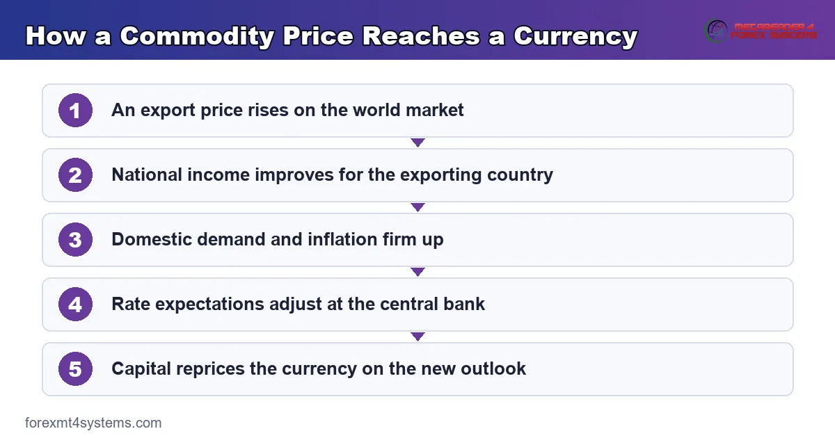
Notice how indirect that chain runs. Four steps sit between the price print and the exchange rate, and each one can stall or reverse.
Why the Flow Story Is Weaker Than It Sounds
Many traders picture exporters converting foreign earnings into local currency. Some of that happens, and it counts for far less than people think.
Large exporters hedge their currency risk months ahead. So a price move today reaches the forex market late, and only in part.
State-owned producers complicate it further. Several large exporters route earnings through state funds that hold foreign assets on purpose, rather than bringing them home.
The Classic Pairings and What Sits Behind Them
Six relationships come up repeatedly. Each rests on a real export lean, and each holds up worse than the textbook version claims.
| Commodity | Currency usually linked | What actually drives the link |
|---|---|---|
| Crude oil | Canadian dollar | Energy dominates Canadian export value, mostly shipped south |
| Crude oil and gas | Norwegian krone | Petroleum dominates exports, though the krone trades thinly |
| Iron ore and coal | Australian dollar | Bulk exports concentrated on a single dominant buyer |
| Dairy | New Zealand dollar | Milk products lead a small and concentrated export base |
| Copper | Chilean peso | Copper accounts for a large share of export earnings |
| Gold and platinum | South African rand | Precious metals lead exports, alongside heavy risk sensitivity |
Read that table as a starting hypothesis. Every row needs a check against fresh data before it shapes a trade.
What Moves the Commodity Side
The link has two ends. Most traders study the currency end and skip the other one.
Supply Shocks Come First
A strike, a storm or an output cut can lift a price fast. None of those events say much about the wider world economy.
So a jump from a supply shock rarely helps the seller’s currency much. The extra income lands, and the growth story stays flat.
Demand Shifts Say More
A rise driven by strong world demand carries a bigger message. It hints that trade is picking up, which lifts risk appetite too.
Those moves tend to reach currencies harder. Both ends of the link then point the same way at once.
Why the Cause Matters
Two price rises of the same size can mean opposite things. One came from a broken pipeline, the other from strong orders in Asia.
Only the second says much about growth. Ask which one you have in front of you before you draw a currency view from it.
A Rough Guide to the Two Cases
The table below sorts the two. Use it as a first pass, then check the news that caused the move.
| What caused the price move | Typical signs | What it usually means for the currency |
|---|---|---|
| Supply shock | One producer, one region, one headline | Weak read-across, since the growth story has not changed |
| Demand shift | Several commodities move the same way | Stronger read-across, since world trade is shifting |
| Dollar move | Every dollar-priced market moves at once | No real link, because one driver is moving both sides |
| Fund flows | Sharp move with no news behind it | Short-lived, and it often reverses within days |
A Worked Example: Crude and an Oil-Sensitive Pair
Theory settles once you run a real pairing through it. Crude oil and the Mexican peso make a useful test case, partly because the folklore around them overshoots.

Mind the Quoting Convention
The pair quotes dollars per peso in reverse, with the dollar as the base currency. So a stronger peso shows up as a falling chart, not a rising one.
That convention flips the sign of every correlation you calculate. Rising crude supporting the peso appears as a negative relationship against the pair.
Half the confusion around commodity correlations traces back to this point. Always write down which way each series moves before interpreting a sign.
What the Chart Above Shows
The daily chart shows a pair with plenty of its own character. Long trending stretches appear, alongside sharp reversals that owe nothing to the energy market.
Compare it against the crude chart earlier and the mismatch stands out. Some swings line up neatly, and plenty of others go their own way.
The Honest Reading
Mexico still exports crude, and its share of export earnings has fallen substantially over the past two decades. Manufacturing now dominates the trade picture instead.
Meanwhile the peso attracts carry flows because Mexican rates sit well above US rates. Those flows respond to global risk appetite far more than to any barrel price.
So the oil label understates what actually moves the pair. Treat it as one input among several rather than as the explanation.
Download the complete indicator database
Put these concepts on your charts. One email unlocks the full library of 1,380+ indicators with compiled MT4 and MT5 files, plus my TradingView scripts. No paywall, no spam, unsubscribe any time.
Get free access to my indicator database
One email unlocks 1,380+ free MT4, MT5 and TradingView indicators — the complete library. No single-tool download; you get the whole database.
Common Mistakes and Their Fixes
Six habits turn a rough guideline into a costly assumption. The panel below contrasts the tidy version with what a rolling measurement really shows.

Quoting a Coefficient as a Constant
No correlation holds still. Run yours on a rolling window and watch the number wander, then plan for the range rather than the mean.
Ignoring the Common Driver
Most commodities price in dollars, so a dollar move shifts commodity prices and currency pairs at once. That shared driver makes the two look linked when neither one moves the other.
Doubling Up on the Same Trade
Two linked trades carry one risk, not two. Check your open exposure on our forex correlation matrix before adding a second pair that tracks the first.
Trading the Commodity Chart Instead of the Pair
A crude breakout tells you about crude. Any read-across to a currency runs through several slow steps, so trade the market you actually studied.
Forgetting That Signs Flip
Links flip for months at a stretch, above all when two central banks pull apart. Check the sign each month rather than each year.
Sizing as Though Diversification Exists
Linked trades stack risk quietly. Work each position from its own stop distance using our position size calculator, then cut total risk when the pairs move as one.
A Quick Reference Checklist
Six lines cover the practical work. None of them takes more than a minute.
| Check | What it means in practice |
|---|---|
| Which window | Twenty days and two hundred days give different answers |
| Returns or levels | Level correlations on trending series overstate the link |
| Which way does the pair quote | A reversed base currency flips every sign you calculate |
| Is the dollar the real driver | A shared driver creates correlation without causation |
| How concentrated are the exports | The mechanism needs genuine export dependence behind it |
| What is my total correlated exposure | Three correlated positions behave like one oversized one |
Run the list before adding a second position, not afterwards. The order matters more than the content.
Correlation Is Not Causation
This phrase gets repeated so often that it stops registering. The panel below makes the failure modes concrete.

Relationships Decay
A link that held for two years can fade to nothing over the next six months. Trade patterns shift, and central banks pull apart.
Nothing announces the decay. You find it by measuring often, which is the whole case for a rolling window.
So treat any figure you read as a snapshot with a date on it. Without that date it carries almost no information.
Signs Invert
A flip in sign catches traders out more than a slow fade does. An export currency can fall on rising export prices when the rise points to world price trouble.
A split between central banks does the same thing. If one bank tightens hard while the other holds, the rate story swamps the export story.
Neither case makes the older link fake. It just stopped being the main force for a while.
Crises Cluster Everything
Stress does something specific to correlation. Traders close books at once, so markets that rarely agree start moving as one.
Risk currencies fall, havens rise and commodities drop, all at once. Anyone counting on a real spread of risk finds it gone just when it mattered.
Drawdowns build fastest during those windows. Our note on drawdown in trading covers what that clustering does to an account curve.
Spurious Links Look Convincing
Test enough pairings and some will line up beautifully by chance. With enough pairings tried, a few will line up by luck alone.
Ask for the mechanism before you accept the number. If nobody can name the chain of cause, the link probably has none.
Liquidity Changes the Picture
Not every export currency trades the same way. The size of a market shapes how hard a price move lands on it.
Thin Markets Move Further
The krone and the rand trade in far smaller size than the euro or the yen. A modest flow can push them a long way.
So one commodity move can look strong on one pair and mild on another. Depth of the market explains a good part of that gap.
Costs Rise With Thinness
Spreads widen on the smaller names, and they widen further outside London hours. A link you spotted on a chart may not survive the cost of trading it.
Check the spread before you build a plan around a thin cross. Plenty of apparent edges vanish once that cost lands on top.
Weekends and Holidays Add Gaps
Commodity markets and forex markets keep different hours. A move that lands while one of them sits shut arrives as a gap when it opens.
Those gaps fill stops at prices you did not choose. Size the trade so a gap costs you a normal loss rather than an outsized one.
A Simple Way to Test a Link Yourself
You do not need a stats package for this. A free spreadsheet and ten minutes will do the whole job.
Pull the Two Series
Get daily closes for both markets over the same dates. Line them up in two columns, then drop any date that only one of them has.
Gaps break the maths quietly. One market may trade on a day the other does not, so trim both lists to shared dates first.
Turn Prices Into Changes
Add a third column for the daily percent change of the first market. Add a fourth for the second one.
Now use those two change columns, never the raw prices. This one step strips out most of the false links people report.
Run the Number on Two Windows
Ask your sheet for the link between the two change columns. Do it once over the last twenty days, then again over the last two hundred.
Compare the two answers. A wide gap tells you the link shifts with the window, which is the whole point of the test.
Repeat It Each Month
Save the sheet and add a fresh row each month. After a year you own a record of how much the link drifts.
That record beats any figure you read online. Yours covers the markets you trade, over the dates you traded them.
What the Two Windows Tell You
Four outcomes cover most cases. The table sorts them.
| Short window | Long window | What to take from it |
|---|---|---|
| Strong, same sign | Strong, same sign | A steady link, so watch your total risk closely |
| Weak | Strong | The link has faded lately, so trust it less |
| Strong | Weak | A short burst, and it may not last the month |
| Opposite signs | Opposite signs | Something has flipped, so find out what before you act |
Related Concepts Worth Reading Next
Correlation sits inside a wider macro picture. Three neighbouring topics complete it.
The currencies themselves deserve a closer look, so our explainer on commodity currencies covers which economies qualify and why the label stays rough. Read it alongside this piece and the export-concentration argument becomes concrete.
Rate differentials frequently overpower the commodity story, which our guide to bond yields and forex covers in detail. The dollar leg matters too, and our piece on the dollar index in forex explains the common driver behind many apparent commodity links.
On the execution side, correlated positions demand tighter sizing. Our guide to position sizing covers how to shrink exposure when your open trades stop behaving independently.
Building Correlation Checks Into a Routine
Knowledge changes nothing without a habit attached. A short monthly pass keeps your assumptions current.
Monthly: Recalculate, Do Not Recall
Pull a fresh rolling correlation for every pairing you rely on. Use two windows, one short and one long, then compare them.
Write both numbers down with the date. Six months of that record tells you more than any article about how stable your assumptions really are.
Weekly: Check Your Own Book
Look at your open positions rather than at theory. Three pairs sharing a currency leg usually behave as one position with three sets of costs.
Cut the smallest one when that happens. Trimming an overlap costs less than discovering it during a drawdown.
Before Any New Position
Ask what the new trade adds. If it moves with something you already hold, it adds size rather than safety.
Automated strength readings help here. Our currency strength indicators archive collects tools that flag when several pairs express the same underlying view.
Keep the Language Careful
Watch how you describe the relationship to yourself. Saying the two series moved together last quarter keeps you honest, while saying oil drives the currency commits you to a claim the data may not support.
That precision costs nothing. It also stops you holding a losing position because a story about barrels once sounded persuasive.
FAQ
Which currencies correlate most with commodities?
The Canadian dollar, the Norwegian krone, the Australian dollar and the New Zealand dollar come up most among liquid currencies, alongside the Chilean peso and the South African rand in emerging markets. Each link rests on genuine export concentration rather than on tradition. Strength of the relationship varies by period, so measure it yourself rather than accepting a published figure.
How strong are these correlations in practice?
Strong enough to notice and far too unstable to trade mechanically. The same pairing can measure tightly on a two-hundred-day window and near zero on a twenty-day one, and the sign itself inverts during policy divergence. Quoting a single coefficient without naming the window and the period tells you almost nothing useful.
Does oil really drive the Canadian dollar?
Energy dominates Canadian export value, so the mechanism genuinely exists. What varies is how much of the pair’s movement it explains at any given moment. Rate expectations between the Bank of Canada and the Federal Reserve frequently matter more, and the shared dollar leg creates apparent correlation on top of the real one.
Why do correlations break during a crisis?
Because liquidation ignores fundamentals. When traders reduce risk quickly, they sell whatever they hold rather than whatever the analysis suggests. Assets that normally go their own way then move as one block, which strips out the spread of risk just when an account needs it most.
Should I use correlation to find trades or to manage risk?
Risk management, overwhelmingly. As a trade-finding tool it lags, decays and inverts without warning. As a risk tool it answers a question with real value: whether the four positions on your screen express one view or four, and whether your total exposure sits where you think it does.
Do these links work on an intraday chart?
Rarely with any use. Over an hour or two, order flow and headlines dominate both markets, and the slow chain from export prices through to growth has no time to act. Treat the link as a backdrop over weeks, then let structure on the pair itself handle the entry and the exit.
Which one leads, the commodity or the currency?
Neither leads on a fixed schedule. Both markets react to the same news, and the order changes with the event. On a supply headline the commodity usually moves first, while on a growth or rate headline the currency can lead instead. Because that order keeps shifting, using one as a timing signal for the other tends to disappoint.
How often should I recheck my correlation assumptions?
Monthly works well for most traders, with a quick check before adding any position that shares a currency leg with an existing one. Use a rolling window rather than a fixed historical period, and record the figures over time so you can see the drift. Judge the process across many trades rather than any single one. Results are not guaranteed; past performance is not indicative of future results.
External references
- For background on this concept, see Correlation Coefficient at Investopedia.
- For broader market context, see Correlation Does Not Imply Causation on Wikipedia.

About the author
Written by Dominic Walsh, a Forex trader and MT4/MT5 indicator, Expert Advisor and script developer. Every tool on forexmt4systems.com is tested on live charts before release and ships with ready-to-use compiled MT4 (.ex4) and MT5 (.ex5) files. Learn more about the trader and developer behind this site.
How we build, test and correct every tool: Editorial & Testing Policy. Trading carries risk; see the disclaimer.