
Every month a panel of purchasing managers answers a short questionnaire, and the result lands on the economic calendar as a single number. So what is PMI in forex, and why does a survey move a currency at all?
Here is the short version. The number arrives before the official statistics, it reads cleanly against one dividing line, and it changes what traders expect from the central bank.
What Is PMI in Forex?
PMI stands for Purchasing Managers’ Index. Survey firms poll the people who buy materials and services for their companies, then turn those answers into a single index.
Purchasing managers sit close to demand. They commit to orders weeks before the output shows up in any official series, so their answers describe the economy ahead of the hard data.
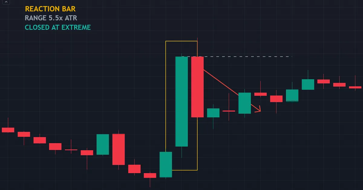
Above sits an hourly reaction bar on NZDUSD at 18:00 on 29 July 2026. Its range covered about five and a half times the recent average, the body filled 86 percent of that range, and the close sat right at the top of it.
The Fifty Line Does the Work
A PMI is a diffusion index rather than an average. Respondents say whether each activity improved, held steady or worsened against last month, so the index counts answers instead of measuring output.
That construction puts the dividing line at fifty. Above fifty, more firms report improvement than deterioration. Below fifty, the balance tips the other way.
One clean threshold is why the release reads so fast. Nobody needs context to know which side of neutral a print landed on.
The Five Components Behind the Headline
One headline number hides five separate answers. Traders who look inside it often reach a different conclusion from those who stop at the front page.
- New orders. The most forward-looking piece of the survey. Orders taken this month become output next month, so a slide here tends to lead the headline lower.
- Output. What firms actually produced. This one tracks the recent past rather than the coming quarter.
- Employment. Hiring intentions across the sector. Central banks watch it closely, which gives it the clearest link to interest rates.
- Supplier delivery times. Longer waits normally signal strain on supply, and the formula treats slower deliveries as evidence of firmer demand.
- Stocks of purchases. Inventory sitting with the buyer. Rising stocks can mean confidence, or they can mean orders that never turned into sales.
A headline beat built on longer delivery times reads very differently from one built on new orders. So the components decide how long a reaction lasts.
Level and Change Say Different Things
Here is the part most guides skip. The level answers one question, and the month-on-month change answers a completely different one.
A fall from fifty-eight to fifty-two still reports expansion. Growth continued; it simply slowed. Meanwhile a rise from forty-four to forty-eight still reports contraction, even though the trend improved.
Markets frequently react to the change rather than the level. Momentum feeds rate expectations, so a sharp slowdown inside expansion territory can hit a currency harder than a flat reading below fifty.
How the Survey Becomes a Number
The path from questionnaire to price is short. Five steps cover the whole journey.
- The panel answers. Several hundred to several thousand purchasing managers report on new orders, output, employment, supplier delivery times and stocks of purchases.
- Answers become shares. Each question yields a percentage reporting better conditions, a percentage reporting no change and a percentage reporting worse conditions.
- The diffusion formula runs. The share reporting better, plus half the share reporting no change, produces an index between zero and one hundred.
- Sub-indices combine. The five components carry fixed weights, and together they form the headline composite.
- The headline meets the estimate. Traders compare the print with the consensus forecast, then reprice what the central bank is likely to do next.
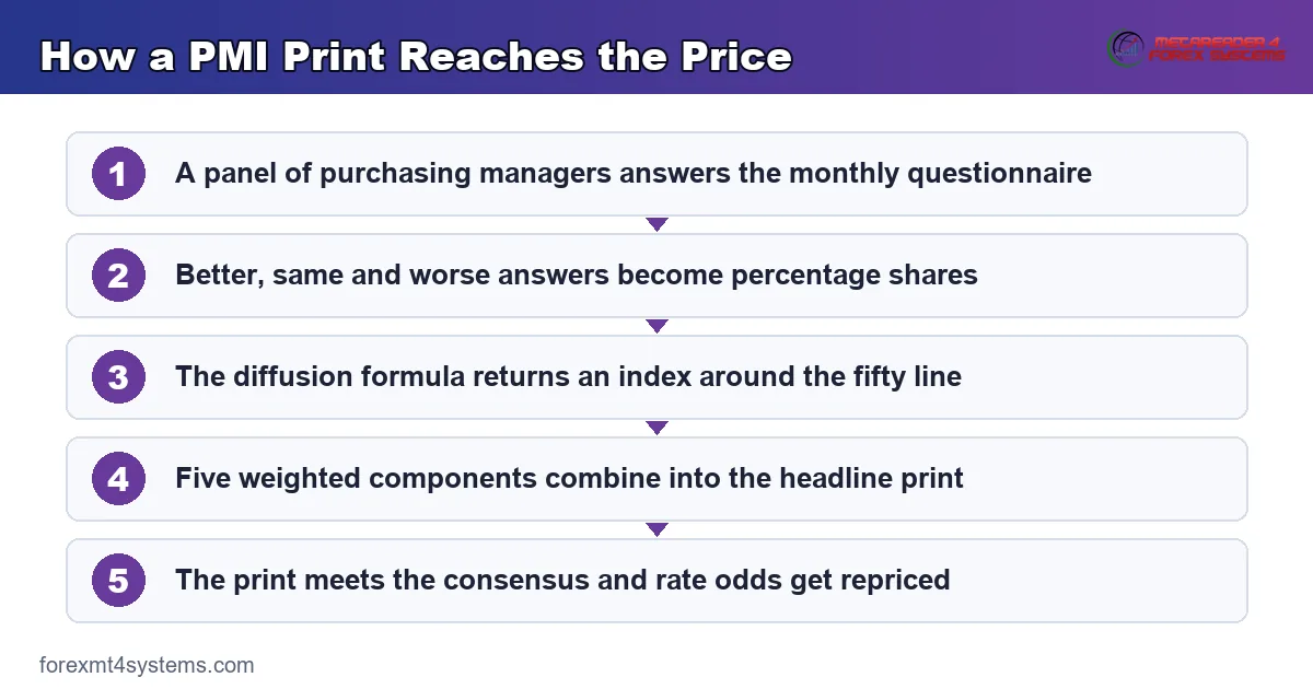
Notice what the last step does. The number alone decides nothing, because the gap between the print and the expectation carries all of the information.
Who Publishes It, and Why It Lands Early
Survey firms publish national PMIs for dozens of countries. In the United States the Institute for Supply Management runs its own long-standing manufacturing and services versions alongside them.
Timing explains the attention. Flash estimates for the euro area and the United Kingdom arrive around the third week of the month, well ahead of quarterly output figures.
Because the questionnaire asks about this month rather than last quarter, the index behaves as a leading indicator. That head start is exactly why a survey outranks some hard data on the calendar.
Which Releases Traders Actually Watch
Dozens of countries publish surveys every month. Only a handful reliably shift a currency.
The Regular Names
- ISM manufacturing and ISM services. The American pair, published by the Institute for Supply Management, with the services reading carrying the larger slice of the economy.
- Euro area flash composites. Released around the third week of the month, with separate German and French readings landing minutes earlier.
- United Kingdom flash readings. Manufacturing, services and a composite, watched mainly for the services line.
- Chinese manufacturing surveys. One official series and one private series, both feeding demand expectations for commodity-linked currencies.
- Australian and Japanese composites. Smaller reactions as a rule, though they matter whenever the rate story on that currency is already live.
Services usually outrank manufacturing in developed economies. Manufacturing is the older and more famous series, yet services carry a far bigger share of output.
Check the release order as well. German and French flash prints land before the euro area composite, so a good deal of the reaction happens before the composite even arrives.
Why a Survey Moves the Price
Currencies do not respond to growth directly. They respond to what growth implies for interest rates.
A soft reading raises the odds of a cut, or trims the odds of a hike. Traders adjust those odds within seconds, and the currency follows the adjustment rather than the survey itself.
From Survey to Rate Odds
The chain has four links. A survey shifts the growth outlook, growth shifts the inflation outlook, that shifts the expected policy path, and the currency follows the path.
Any link can break. A soft survey next to hot inflation leaves a central bank stuck, and the currency then reacts to whichever half the market cares about more that week.
So one print produces different reactions in different months. Nothing about the number changed; the question the market wanted answered changed.
Priced In Explains Most Reactions
This is the single most useful idea in fundamentals, and most articles leave it out. Price already reflects the expected outcome before the release lands.
So a weak number can leave a currency flat if everyone expected weakness. Equally, a small surprise against a strongly held consensus can produce a violent move.
Read the consensus first, then the print. Our guide to reading the economic calendar shows where the forecast column sits and how to use it.
Direction Is Frequently Counter-Intuitive
Traders expect a strong number to lift the currency. Sometimes it does, and plenty of times it does not.
Positioning gets in the way. When the market already leans heavily one direction, a confirming print can trigger profit-taking instead of continuation.
Risk appetite complicates the picture further. A strong reading from a commodity-linked economy sometimes lifts the whole risk complex rather than that one currency.
Nobody publishes a reliable map from print to direction. Anyone offering one has skipped the positioning question entirely.
A Reaction Bar, Read Honestly
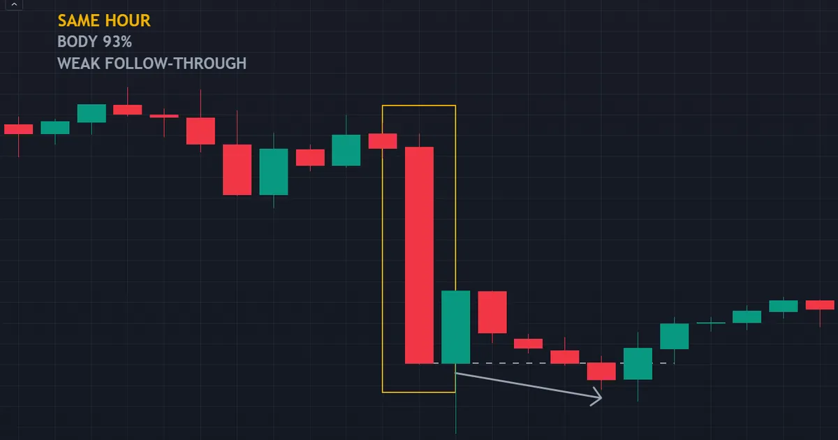
Below sits a second hourly reaction bar on USDCAD, taken from the same hour as the first chart. Two pairs, one moment, and two rather different outcomes afterwards.
What the Bar Shows
Its range stretched to roughly five and a half times the recent average. The body filled 93 percent of that range, and the close landed right at the bottom of it.
That combination describes one-way trade. One side took every price on offer, and nobody pushed back inside the hour.
Follow-through is where the two charts split. NZDUSD closed up and then handed back about two average ranges, while USDCAD closed down and kept sliding, though by only four-tenths of one.
So the bar itself told you nothing about what came next. Two mirror-image shapes produced completely different hours after the close.
What the Bar Hides
Screenshots never show the spread. During those seconds the quote widened well beyond its normal band, so a fill sat some distance from the price on screen.
The chart also hides the orders that never filled. Queues form, instant-execution accounts meet requotes, and slippage decides the rest.
A tradable-looking bar and a tradable trade are two different things. Our note on why spreads widen covers that cost side properly.
Download the complete indicator database
Put these concepts on your charts. One email unlocks the full library of 1,380+ indicators with compiled MT4 and MT5 files, plus my TradingView scripts. No paywall, no spam, unsubscribe any time.
Get free access to my indicator database
One email unlocks 1,380+ free MT4, MT5 and TradingView indicators — the complete library. No single-tool download; you get the whole database.
Common Mistakes and the Fixes
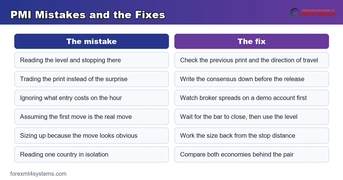
Six habits cause most of the damage on survey days. The panel below pairs each one with its correction.
Treating the Level as the Whole Story
A reading of forty-nine sounds bad, and fifty-one sounds fine. Neither tells you much in isolation.
Check the previous print and the consensus before forming a view. Direction of travel usually carries more weight than the absolute number.
Trading the Print Instead of the Surprise
A figure matters only against what the market expected. A strong number that matched the forecast rarely moves anything at all.
So write the consensus down before the release. Then you can measure the surprise instead of guessing at it afterwards.
Ignoring the Cost of Entry
Costs balloon in the seconds around a release. A pair that normally quotes under a pip can widen several times over.
Watch your broker’s behaviour on a demo account first. Our breakdown of the spread in forex explains what you actually pay.
Assuming the First Move Is the Real Move
Initial impulses reverse frequently. A bar that looks decisive at the close sometimes hands most of it back within the hour.
Our deep-dive on the forex news spike takes that pattern apart stage by stage.
Sizing Up Because the Move Looks Obvious
Conviction and position size should stay independent of each other. Release days widen the range, so an unchanged lot size carries more risk than usual.
Work the size back from the stop distance instead. Our position size calculator handles that arithmetic in seconds.
Reading One Country in Isolation
A currency quote has two sides. A soft euro area survey means little when the American data softened more.
Compare the two economies behind the pair. Relative surprise drives an exchange rate, never one side on its own.
Quick Reference for Survey Days
Keep this table beside the calendar. It covers the readings you will meet most often.
| What you see | What it means | What it does not mean |
|---|---|---|
| Print above fifty | More firms report improvement than deterioration | That growth is fast, or that the currency must rise |
| Print below fifty | More firms report deterioration than improvement | That a recession has already started |
| A fall while still above fifty | Growth continued, but at a slower pace | That output shrank during the month |
| A rise while still below fifty | The contraction eased | That the economy returned to growth |
| Print matches the consensus | The outcome already sat in the price | That the release was unimportant |
| Wide gap to the consensus | Expectations have to move somewhere | That the direction of the move is predictable |
When the Reaction Fades
Sometimes the spike simply does not hold. Below, a bar closed well off its low, and the next five bars recovered about six-tenths of an average range back upward.
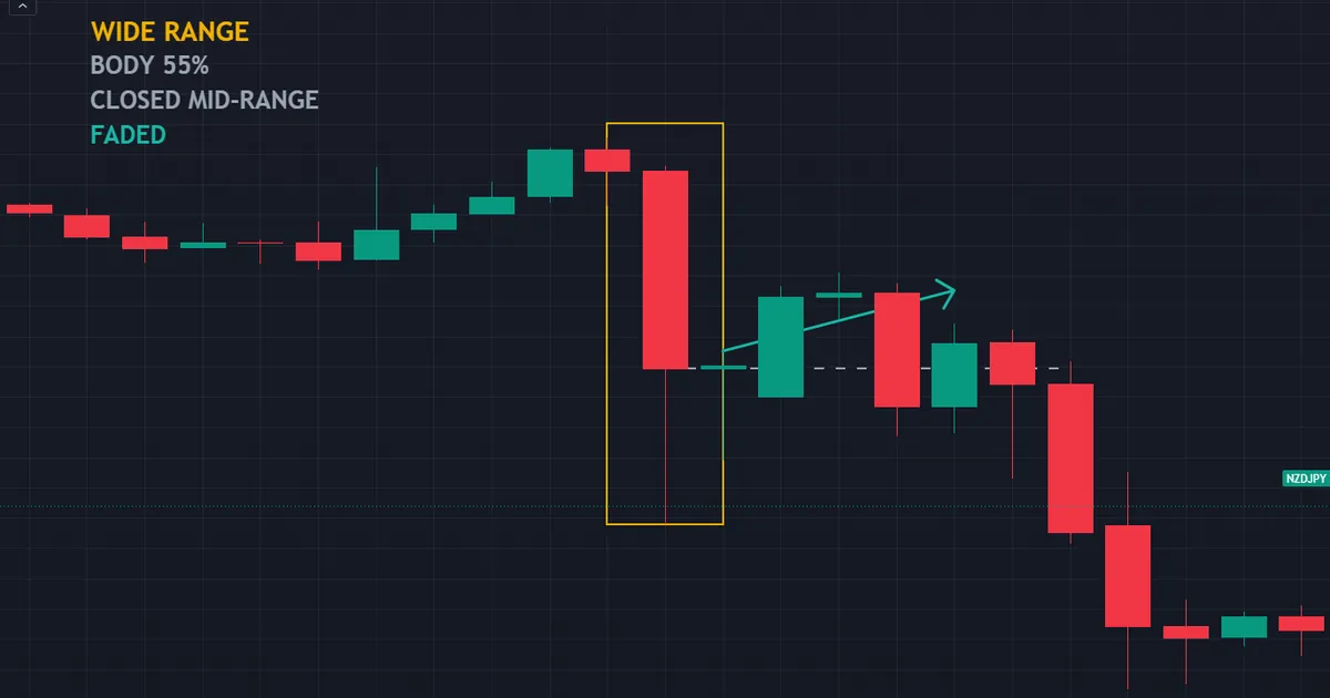
That describes a four-hour bar on NZDJPY at 13:00 on 30 July 2026. Its range ran to roughly nine times the average, yet the body filled only 55 percent of it.
The Tell Sat in the Close
Compare it with the two earlier examples. Both closed at their extremes with bodies above 85 percent, which is what a one-way hour looks like.
This one closed near the middle instead. Buyers and sellers both showed up inside the same bar, so the impulse met pushback while it was still forming.
A wide range with a small body is a fight, not a verdict. Treat the close as information, and treat the extreme as noise.
Why Reversals Happen So Often
Three ordinary forces push back against a first move. None of them requires a conspiracy.
Short-term money takes profit within minutes. Stops beyond the prior range get swept, which adds fuel that vanishes the moment it runs out.
Then the second reading arrives. Analysts dig into the components, and a headline beat with weak new orders reads very differently an hour later.
Reading a Fade Before It Finishes
Nobody knows in the moment. You can, though, watch the things that usually travel with a fade.
Watch the tail building on the far side of the bar. A long wick forming against the impulse means somebody keeps taking the other side.
Watch the related pairs too. When a dollar-driven move fails to show up across the other dollar pairs, the story looks thinner than it first appeared.
Watch the clock as well. Moves starting near a session close often unwind, simply because the traders who started them go home.
What to Do With That
Waiting costs nothing. A trader who acts on the close of the first bar knows more than one who acts inside it.
Set the invalidation price before entry rather than after. Our guide to using a stop loss covers placement when ranges expand.
Related Reading and Tools
Survey days sit inside a wider fundamentals routine. Three companions make that routine easier to run.
Start with the schedule. Our free economic calendar lists release times and the consensus for each country.
Then learn the ratings. Our guide to high impact news in forex explains what earns the top label, and why that label is only a rough guide.
Finally, measure the range. Our volatility indicators archive collects tools that track how far a market travels on an ordinary day, which is the baseline every release bar sits against.
What the Survey Cannot Tell You
Every indicator has a boundary. Knowing where this one stops saves a lot of wasted analysis.
It Carries No Magnitude
A diffusion index counts direction, not size. Ten firms reporting a tiny improvement outweigh two firms reporting a collapse, because each response counts once.
So a survey can look healthy while output falls. Pair it with the hard numbers rather than treating it as a substitute for them.
It Measures Sentiment as Well as Activity
Purchasing managers answer as people. Headlines, elections and general mood colour the responses, especially in the expectations components.
That sensitivity cuts both ways. Sentiment turns before activity does, which is useful, and sentiment also overshoots, which is not.
It Says Nothing About the Other Currency
Every quote prices one economy against another. A firm American survey next to an even firmer European one leaves the dollar on the back foot.
So track the surprise on both sides. Our currency strength meter gives a quick read on which side of a quote is doing the work.
Building It Into a Routine
Knowledge changes nothing without a habit attached. A short monthly loop turns this into behaviour.
Before the Release
Note the consensus, the previous print and the release time. Then decide in advance whether you intend to trade it at all.
Most traders benefit from sitting out the first bar. Watching costs nothing, and it builds a record you can review later.
After the Release
Record the print, the surprise and how the market responded. Add the spread you saw and the fill you actually received.
Ten of those records teach more than any article. Patterns in your own market and your own broker matter more than general rules.
FAQ
What counts as a good PMI number?
Anything above fifty reports expansion, and anything below reports contraction. Beyond that, context does the work. A print of fifty-two after fifty-eight signals a marked slowdown, while fifty-two after forty-nine signals a recovery. Compare the level, the previous print and the consensus together, because any one of them alone can mislead you.
Which PMI matters most for forex?
Rank them by how much they shift rate expectations, not by the label on the calendar. In practice the American ISM services and manufacturing surveys, the euro area flash composites and the United Kingdom flash readings draw the widest reactions. Currency traders also watch Chinese manufacturing surveys closely, since they feed straight into demand for commodity-linked currencies.
Does a strong PMI lift the currency?
Not reliably. A strong print raises the odds of tighter policy, which usually supports a currency, yet positioning frequently overrides that logic. When traders already hold a large long position into the release, a confirming number can trigger profit-taking and a fall. Direction depends on what was priced in beforehand.
What is the difference between flash and final PMI?
The flash estimate arrives first, built from roughly the first three-quarters of survey responses. The final version arrives a week or so later with the full panel included. Flash releases move markets more, simply because they carry new information. Revisions between the two are usually small, though a large one occasionally gets a reaction of its own.
Can I trade a PMI release directly?
You can, and it is harder than it looks. Spreads widen sharply, slippage grows, and a stop can fill far from where you placed it. Nothing about the release makes a fill certain at your chosen price. Many traders prefer to wait for the first bar to close and then work with the level it leaves behind.
Why do two pairs react so differently to the same release?
Because a release lands on a market, not on a chart. Positioning, liquidity and the local rate story all differ from pair to pair. The two hourly bars above came from the same hour. One closed up and then gave back about two average ranges, while the other closed down and drifted only four-tenths of one further. Same event, mirrored shapes, different outcomes.
Should I hold a position through a survey release?
That depends on your stop distance and your size, not on your view. Ranges expand around a release, so a stop that suits a quiet afternoon can sit well inside the noise. Many traders either cut the size beforehand or step aside and re-enter afterwards. Prop firm rules sometimes settle the question for you, since several firms restrict trading through scheduled releases.
How does PMI differ from GDP?
GDP measures output after the fact, quarter by quarter. PMI asks businesses about this month, and it lands within days of the month ending, so it leads rather than confirms. Use the survey for direction of travel and the output figures for scale. Neither one predicts an exchange rate, and both matter mainly through the rate expectations they move. Results are not guaranteed; past performance is not indicative of future results.
External references
- For background on this concept, see Purchasing Managers’ Index on Wikipedia.
- For broader market context, see Purchasing Managers’ Index at Investopedia.

About the author
Written by Dominic Walsh, a Forex trader and MT4/MT5 indicator, Expert Advisor and script developer. Every tool on forexmt4systems.com is tested on live charts before release and ships with ready-to-use compiled MT4 (.ex4) and MT5 (.ex5) files. Learn more about the trader and developer behind this site.
How we build, test and correct every tool: Editorial & Testing Policy. Trading carries risk; see the disclaimer.