
Peaks and troughs are the turning points of a price chart: a peak is a swing high and a trough is a swing low. This guide settles three things. First, how to define them with a fixed rule instead of by eye. Next, how to read the sequence of higher highs and lower lows they form. Last, what 3,712 measured swings on 23 daily forex pairs say about how much that sequence predicts. The short answer is less than most traders expect.
What peaks and troughs are
A peak is a bar whose high stands above the bars around it. A trough is the mirror: a bar whose low sits under its neighbours. Price moves between them in legs. So a chart is a chain of peaks, troughs and the legs that join them.
The labels only mean something in pairs. A peak above the last peak is a higher high. A peak below it is a lower high. In the same way, troughs become higher lows or lower lows. Dow Theory built its trend definition on this idea, and the Dow Theory lesson at StockCharts ChartSchool covers the history.
In short, an uptrend is a run of higher highs and higher lows. A downtrend is lower highs and lower lows. Anything else is mixed. Most of what traders call market structure in forex is this sequence with new names on top.
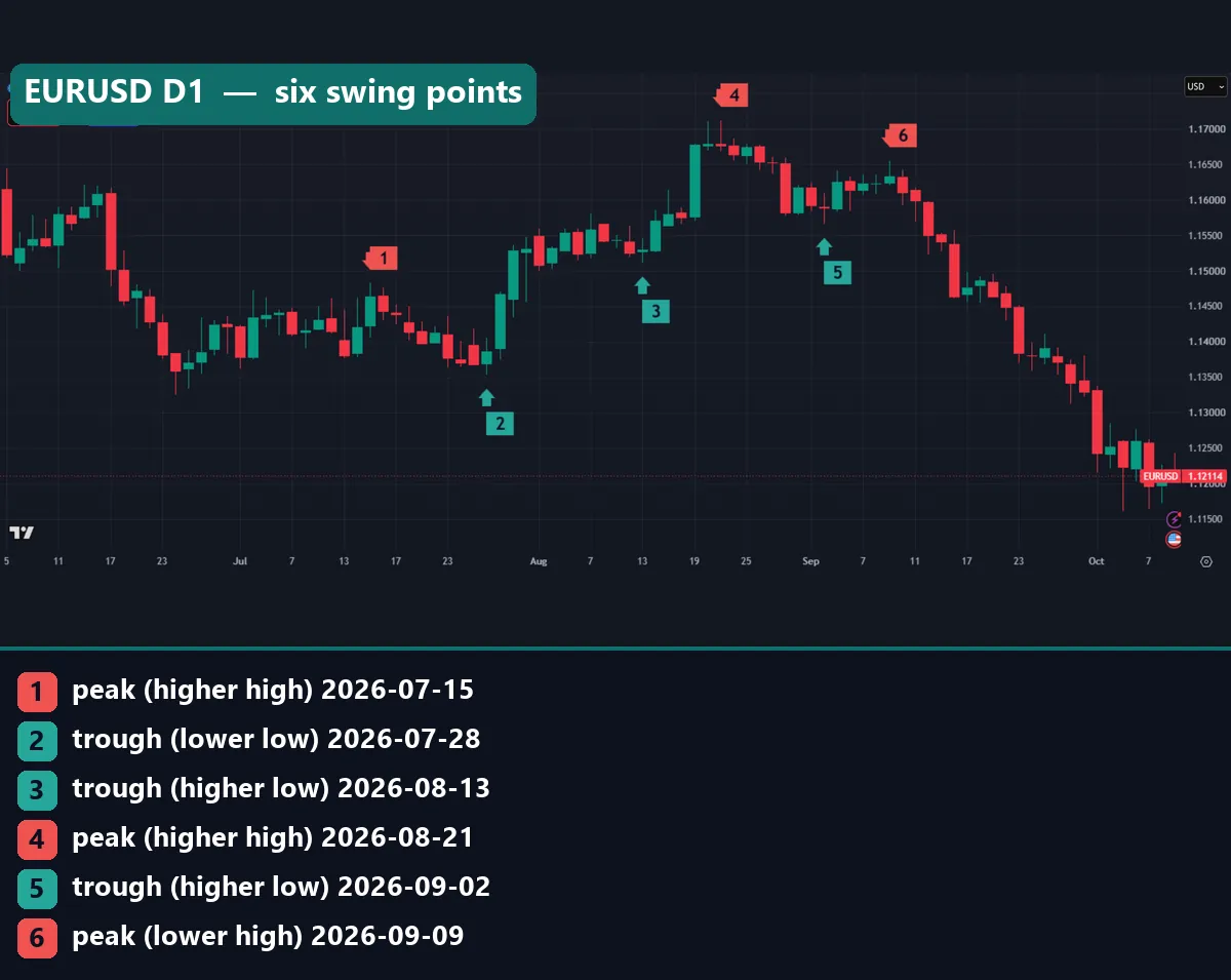
The EURUSD chart above shows six points our rule picked. The legend under it names each one.
How the rule finds a peak or a trough
Eyes are bad judges of swings. Two people will mark the same chart in different places. So we used a fixed rule. It is the same family as the Williams fractals indicator, only wider.
A bar is a peak when its high is the highest high of 11 bars: itself, the 5 bars before it and the 5 bars after it. A bar is a trough when its low is the lowest low of the same 11-bar window. In code form:
peak at bar i:   High[i] = max(High[i-5] .. High[i+5])
trough at bar i: Low[i]  = min(Low[i-5]  .. Low[i+5])
higher high:     High[this peak] > High[previous peak]
higher low:      Low[this trough] > Low[previous trough]
leg size:        |end price - start price| / ATR(14)
Bill Williams used 2 bars on each side, which gives a 5-bar pattern. The Williams fractal page in TradingView’s help center explains that version. Our wider window ignores small wiggles.
Notice the “+5” in the rule. A peak cannot be confirmed until five more bars close. That delay is the price of a clean definition, and it matters a lot later. The ZigZag formula guide shows the same trade-off with depth and deviation settings.
How we tested peaks and troughs
We ran the rule on MT4 terminal history from MetaTrader 4, build 1471, on a Capital Point Trading account. The data covered 23 forex pairs on the daily chart, from 12 June 2018 to 24 August 2026. They range from EURUSD and GBPUSD to crosses such as GBPJPY and NZDCHF.
For every pair we listed each peak and trough. Then we measured each leg between a peak and the next trough, or a trough and the next peak, in units of the 14-day ATR. Last, we counted what came after each higher high.
The chart examples come from a TradingView web chart with OANDA daily data, captured on 9 October 2026. They show EURUSD, GBPUSD, USDJPY, GBPJPY, AUDUSD and gold (XAUUSD). We applied the same 5-bar rule to those bars, and every price we quote below is a bar high or low from that data. Our method is described in our editorial testing policy.
Settings that change the result
Every swing tool hides a few choices. Change one and the peaks move. The table lists the inputs in our rule and what each one does.
| Input | Our value | What it changes |
|---|---|---|
| Bars on each side | 5 | Wider means fewer, bigger swings and a longer delay before confirmation |
| Window size | 11 bars | Follows from the line above: 5 + 1 + 5 |
| Price used | High for peaks, low for troughs | Using closes gives fewer wick-driven swings |
| Comparison point | The last confirmed peak or trough | Decides whether a point is “higher” or “lower” |
| Leg unit | ATR(14) at the end of the leg | Lets you compare a gold leg with a EURUSD leg |
| Forced alternation | Off | With it off, two troughs can print in a row |
The last row needs a word. Many ZigZag tools force peak, trough, peak, trough. Ours does not. As a result, two troughs can print back to back when the bounce between them never becomes the highest bar of its window. Our EURUSD chart shows exactly that, and it is honest about what the market did.
Reading peaks and troughs on a chart
Read the labels left to right as a sentence. On GBPUSD below, the sentence reads: higher high, higher low, higher high, higher low, lower high, lower low.
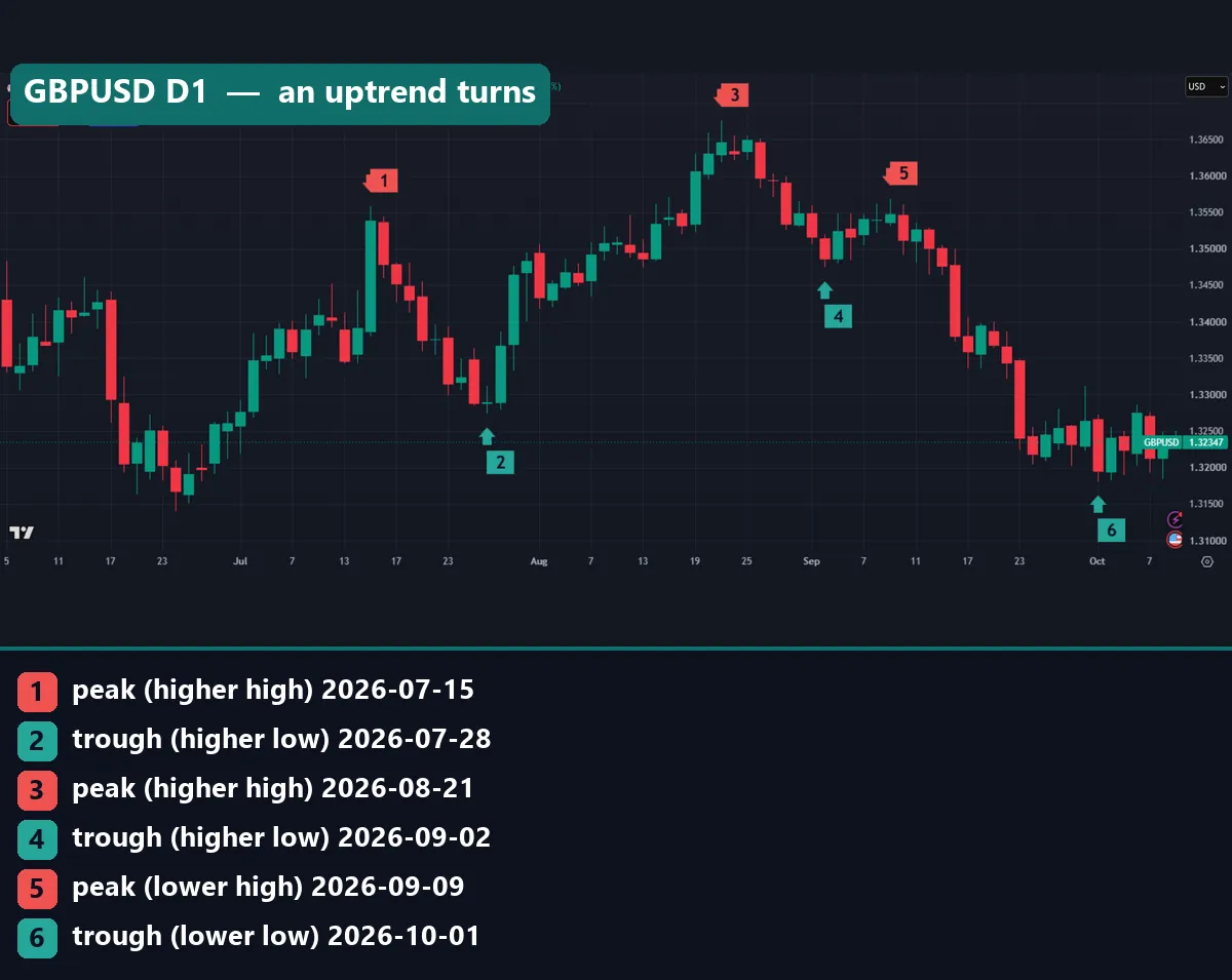
That is a textbook turn. The first four points form an uptrend. Then the peak on 9 September fails to clear the August peak. Finally the trough on 1 October breaks under the 2 September trough. So the lower high warned first, and the lower low confirmed the change.
Still, the warning came late. The lower high needed five more daily closes before our rule could label it. By then, price had already started falling. That delay is normal for any swing rule, and it explains why the break of structure versus change of character debate never ends.
USDJPY tells a messier story. Its labels read lower high, higher low, higher high, lower low, lower high, higher low. No two neighbours agree.
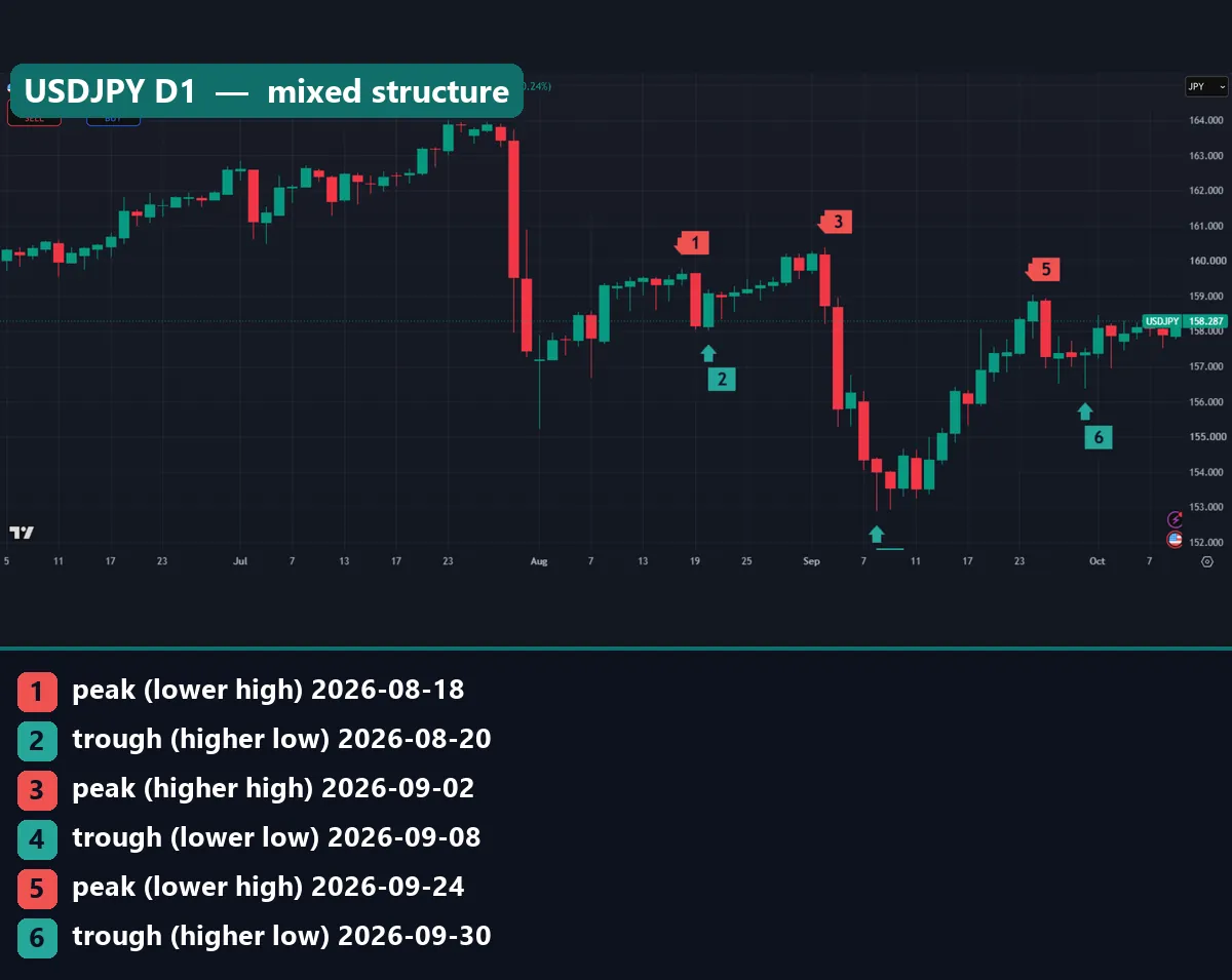
That pattern is what range trading looks like through this lens. Highs and lows take turns. A trend reader should step aside here. Meanwhile, a range reader can use the swing points as the edges. Our support and resistance lesson covers that second approach.
A worked example on GBPUSD
Here are the six GBPUSD points from the chart above, with the exact bar prices. All prices are OANDA daily highs and lows.
| Date | Point | Price | Leg from the last point |
|---|---|---|---|
| 15 July 2026 | Peak (higher high) | 1.35582 | Start |
| 28 July 2026 | Trough (higher low) | 1.32735 | 284.7 pips down |
| 21 August 2026 | Peak (higher high) | 1.36758 | 402.3 pips up |
| 2 September 2026 | Trough (higher low) | 1.34746 | 201.2 pips down |
| 9 September 2026 | Peak (lower high) | 1.35680 | 93.4 pips up |
| 1 October 2026 | Trough (lower low) | 1.31808 | 387.2 pips down |
First, look at the legs, not just the labels. The up legs shrank from 402.3 pips to 93.4 pips. Meanwhile, the down legs grew from 201.2 pips to 387.2 pips. So the trend was losing force before any label turned.
Next, check the key level. The trough at 1.34746 was the line that defined the uptrend. Once price closed below it, the higher-low chain was broken. However, a trader who waited for our rule to confirm the 1 October trough waited five more bars beyond that.
Finally, this is a reading of structure, not a trade. Any entry built on it needs its own test, with spread and swap included.
What 3,712 legs on 23 pairs showed
One chart proves little. So we counted every swing on all 23 pairs over eight years. The chart below shows our measurement.
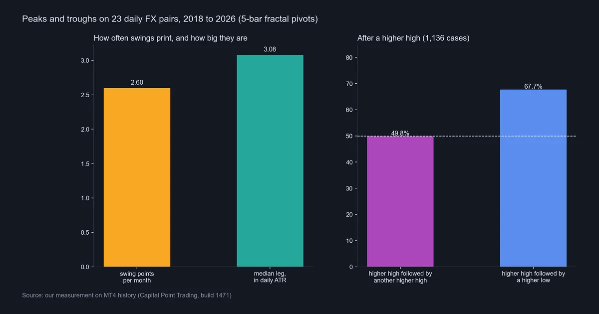
First, swings are rarer than they look. With 5 bars on each side, the median pair printed 2.6 swing points per month.
Second, legs are large. The median leg between a peak and a trough measured 3.08 daily ATRs, across 3,712 legs. In other words, a typical swing covers about three average days of range. That is a useful yardstick for a stop-loss distance based on ATR, and the average true range article on Wikipedia covers the ATR formula.
Third, a higher high predicts very little about the next peak. After 1,136 higher highs, the next peak was higher again only 49.8% of the time. That is a coin flip. So “the trend makes higher highs” is a description of the past, not a forecast.
The trough side looked better. After a higher high, the next trough held above the last one in 67.7% of the cases we could score. That is the one lean in the data. Still, we did not measure the same figure after a lower high, so we cannot say how much of it is trend and how much is the long-run drift of these pairs.
Gold: peaks and troughs in dollars
Gold runs the same rule on a more volatile market. We quote it in US dollars, not pips.

The peak on 25 August 2026 hit $4,697.11. Then the trough on 2 September came in at $4,282.63, a drop of $414.48 in six trading days. That trough was still a higher low, so the uptrend label survived.
After that, the chart breaks the neat pattern. Three troughs print in a row: 2 September, 16 September at $4,235.17, and 28 September at $4,110.87. No peak sits between them, because no bounce became the highest bar of its 11-bar window. As a result, the rule says “lower low, lower low” without ever naming a lower high. That is a real limit of the method, and the next sections cover it.
Download the complete indicator database
Put these concepts on your charts. One email unlocks the full library of 1,380+ indicators with compiled MT4 and MT5 files, plus my TradingView scripts. No paywall, no spam, unsubscribe any time.
Get free access to my indicator database
One email unlocks 1,380+ free MT4, MT5 and TradingView indicators — the complete library. No single-tool download; you get the whole database.
Where it fails: limits of peaks and troughs
The method has five clear weak spots. Each one showed up in our charts or our counts.
- Late confirmation. A 5-bar rule needs five more closes. On the daily chart, that is a full trading week after the turn.
- No forecast on its own. A higher high was followed by another one 49.8% of the time. The label alone is not an edge.
- Back-to-back points. Without forced alternation, troughs can stack up, as on gold and EURUSD. Forcing alternation hides this but invents a peak the rule never found.
- Tiny breaks count. On GBPJPY, the last lower low beat the one before by just 21.5 pips. The rule treats that the same as a deep break.
- Window choice is arbitrary. Change 5 bars to 2 and the chart fills with fractals. Change it to 10 and whole legs vanish. There is no correct number.
So treat the sequence as context. It tells you which side the recent swings favoured. It does not tell you what happens next. Our guide to whether a Semafor signal repaints shows the same delay problem on a popular indicator.
A clean downtrend next to a messy one
GBPJPY shows the sequence at its cleanest. Every label reads lower: lower high, lower low, three times over.
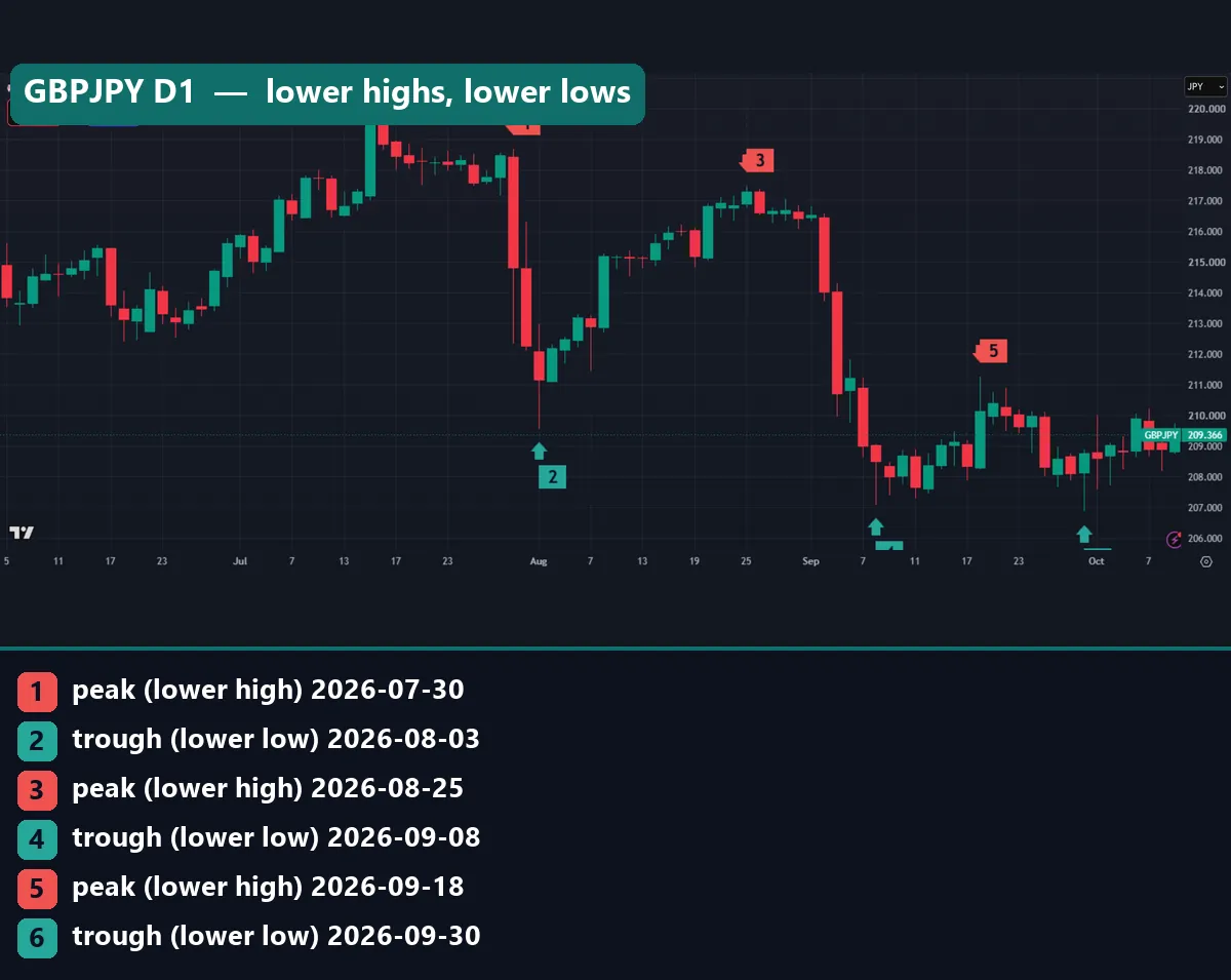
The peaks fell from 218.688 on 30 July to 217.478 on 25 August, then to 211.284 on 18 September. The troughs went from 209.575 to 207.100 to 206.885. However, look at the final step. The drop from the 18 September peak to the 30 September trough measured 439.9 pips, yet the new low cleared the old one by only 21.5 pips. In short, the label says downtrend while the chart is flattening.
AUDUSD is the opposite case. Its six points read lower low, lower high, higher low, higher low, higher high, lower low.
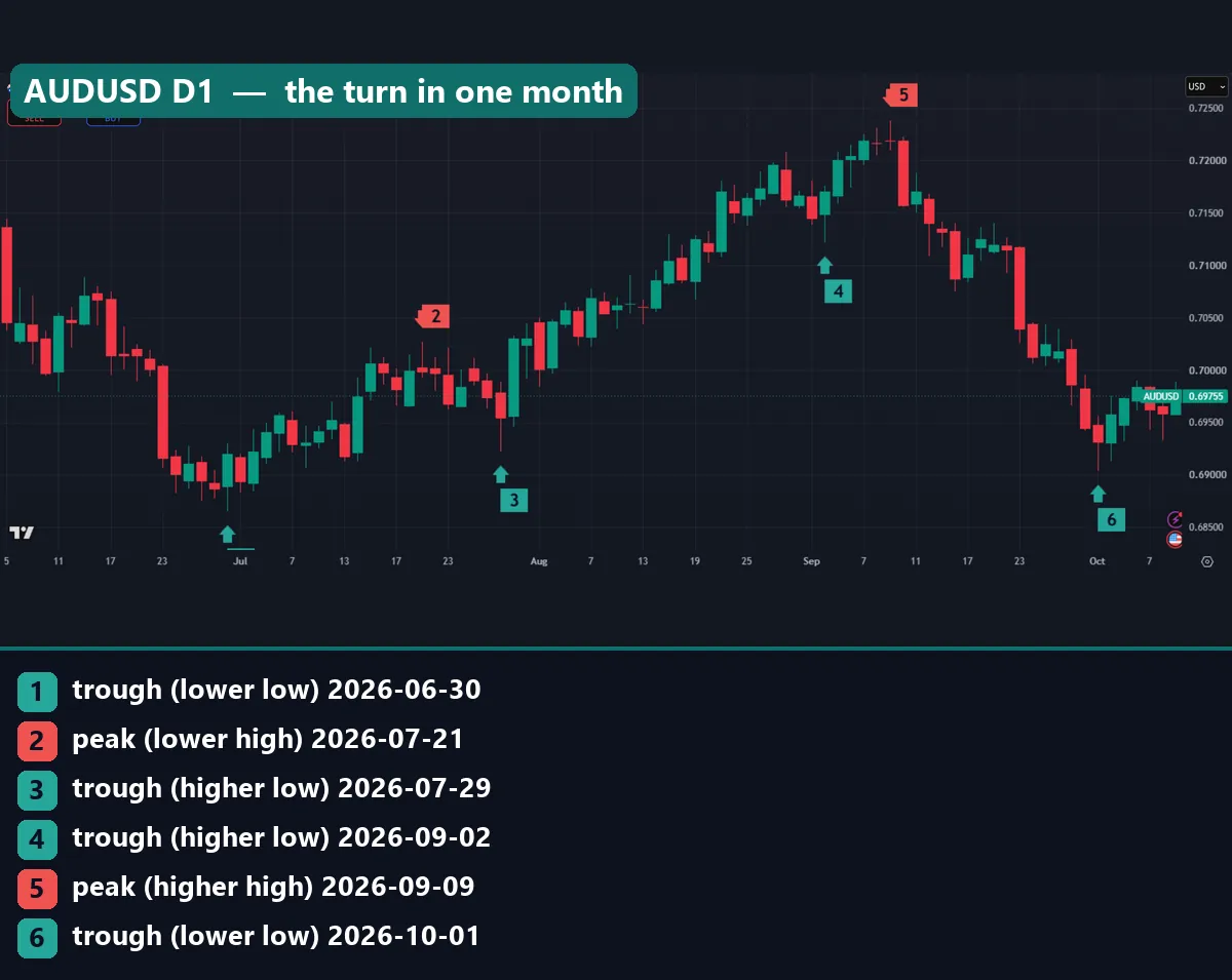
Here two troughs print in a row again, on 29 July and 2 September. Then a higher high on 9 September at 0.72380 was followed by a lower low on 1 October at 0.69040. That last trough sits under the 29 July low of 0.69222. So the whole summer rise gave way inside one month.
Common mistakes with peaks and troughs
- Marking swings by eye. Then the chart says whatever you hoped. Pick a bar count and stick to it, or use a tool such as our higher high lower low indicator that applies one rule every time.
- Trading the label on the last bar. The newest peak is not confirmed yet. It can still be beaten in the next five bars, and then it was never a peak.
- Ignoring leg size. A lower low by a few pips is not the same as a deep break. Measure legs in ATR so you can compare them.
- Mixing timeframes. A daily higher low can sit inside an hourly downtrend. Name the timeframe every time you name a swing.
Where to go next
Peaks and troughs connect to several topics on this site. These are the best next reads:
- The trend line lesson joins two peaks or two troughs into a line.
- The double top pattern is two peaks at about the same height.
- The guide to swing trading forex builds trades around these legs.
- For a ready-made marker in MT4, the fractal indicator marks 5-bar swing points.
For primary sources, the iFractals function in the MQL4 reference shows how MetaTrader 4 exposes fractal swing points to code.
FAQ: peaks and troughs
What is the difference between a peak and a trough?
A peak is a swing high, a bar with a higher high than the bars around it. A trough is a swing low, a bar with a lower low than its neighbours. Price travels between them in legs.
How many bars make a peak?
There is no fixed number. Williams fractals use 2 bars on each side. We used 5 on each side, so a peak is the highest high of 11 bars. A wider window gives fewer swings and a longer delay.
Do higher highs mean the trend will continue?
Not on their own. In our test on 23 daily pairs, a higher high was followed by another higher high 49.8% of the time, across 1,136 cases. That is close to a coin flip.
Why does my swing indicator move its marks?
Because a swing point needs future bars to confirm it. Until those bars close, a new high can replace the old one. Any tool that marks the latest bar instantly is guessing.
How big is a typical swing on the daily chart?
Across 3,712 legs on 23 pairs, the median leg between a peak and a trough was 3.08 times the 14-day ATR. So a typical swing covers about three average days of range.
Can two troughs appear without a peak between them?
Yes, with a rule that does not force alternation. Our gold chart shows three troughs in a row in September 2026. The bounces between them were never the highest bar of their window.
Which timeframe is best for peaks and troughs?
The rule works the same on any timeframe, but the meaning changes. Daily swings describe weeks of movement. Hourly swings describe days. Read the higher timeframe first so you know which way the bigger legs point.
Can I trade peaks and troughs on their own?
Our counts found only a small lean, on the trough side, and we did not test entries, stops or costs. Treat the sequence as context for a tested plan; results are not guaranteed; past performance is not indicative of future results.
Last updated: 9 October 2026.

About the author
Written by Dominic Walsh, a Forex trader and MT4/MT5 indicator, Expert Advisor and script developer. Every tool on forexmt4systems.com is tested on live charts before release and ships with ready-to-use compiled MT4 (.ex4) and MT5 (.ex5) files. Learn more about the trader and developer behind this site.
How we build, test and correct every tool: Editorial & Testing Policy. Trading carries risk; see the disclaimer.