
Japanese candlestick charting techniques are more than a list of shapes to memorise, and this guide is about the part most lists skip. A hammer or a tweezer top means little on its own. What changes the odds is where it forms, whether the next candle confirms it, which timeframe it sits on, and whether it touches a level that other traders watch. We tested the first of those ideas on 37,748 daily candles from 23 forex pairs. The answer was mixed. Location helped tweezers and the shooting star by a few points, but it did nothing for engulfing candles, and the star patterns did worse at extremes on small samples.
What Japanese candlestick charting techniques are
A candlestick shows four prices for one period: open, high, low and close. The body covers the open to the close, and the wicks mark the high and the low. Rice traders in Japan used it long before Western traders did.
The person who changed that was Steve Nison. His book Japanese Candlestick Charting Techniques first came out in 1991, as the candlestick chart article on Wikipedia records. You can read about his later work on the About Steve Nison page at Candlecharts.com. We do not reproduce his text here. Instead, we test a few of the ideas on our own data.
So in this guide, a “technique” means a way of reading a pattern, not the pattern itself. The pattern rules live in our Japanese candlestick cheat sheet, with one rule and one result per pattern. If the basics are new to you, start with the guide to reading candlestick charts first.
How the techniques work: shape, place, proof, timeframe
Every candlestick reading has four layers. First comes the shape, which is a set of size tests on the body and the wicks. Then comes the place on the chart. Next is proof, meaning a later candle that agrees. Last is the timeframe, because a daily candle and a 15-minute candle carry very different weight.
Location is the easiest layer to test, so we made it exact. A bullish pattern counts as “at an extreme” when its candle makes the lowest low of the last 20 bars:
at_low = low[0] == lowest(low, 20)
For a bearish pattern, the candle must make the highest high of the last 20 bars:
at_high = high[0] == highest(high, 20)
That is the same line a 20-period Donchian Channel draws. TradingView’s Donchian Channels help page explains the study, and you can plot it in MetaTrader with our Donchian channel indicator.
Then we need a test for “it worked”. We call it follow-through. For a bullish pattern, the close three bars later sits above the pattern’s close. For a bearish pattern, it sits below. In short, the market has to move the way the pattern points.
How we tested location and follow-through
We read daily history straight from the site owner’s MetaTrader 4 terminal, Capital Point Trading, build 1471. The sample covers 23 FX pairs from 12 June 2018 to 24 August 2026, or 37,748 daily candles. Next, a script tagged every candle that matched one of eight pattern rules. Then it split each pattern by location.
A base rate matters here. Across all 37,748 candles, the close three days later was higher 51.6% of the time. So a bullish pattern has to beat 51.6%, and a bearish one has to beat 48.4%. Anything near those numbers is close to noise.
For the multi-timeframe check, we also used M15 history for EURUSD, GBPUSD, USDJPY and XAUUSD from July 2025 to August 2026. Finally, the chart images come from the TradingView web chart with OANDA prices, captured on 1 October 2026. Our full method is on the editorial testing policy page.
The parameters we used
Each number below is a choice. Change it and the counts change too, so treat our settings as one reasonable version, not the only one.
| Parameter | Our value | What it controls |
|---|---|---|
| Location lookback | 20 bars | The candle must set the 20-bar high or low to count as “at an extreme” |
| Donchian Channel length | 20 | Draws the same 20-bar high and low on the chart |
| Follow-through horizon | 3 bars | How far ahead we compare the close |
| ATR period | 14 | The volatility yardstick for size tests |
| Tweezer tolerance | 0.05 ATR | How close the two highs or lows must be |
| Pin bar wick | 2/3 of range | The long wick’s minimum share, with range above 0.5 ATR |
| Trend before a hanging man | 10 bars, in ATR units | “Strong” means an advance of 2 ATR or more |
The ATR yardstick keeps the rules fair across pairs. You can plot the same measure with our ATR indicator.
Reading location on a chart
Start with the second image. It shows GBPUSD on the daily chart with two pin bars. Marker 1 is a bearish pin bar on 17 August 2026, and marker 2 is a bullish pin bar on 27 August. Neither one followed through over three days. Also, notice where they sit. The first formed partway up a rally, and price pushed higher within days. The shape was right, but the place was ordinary.
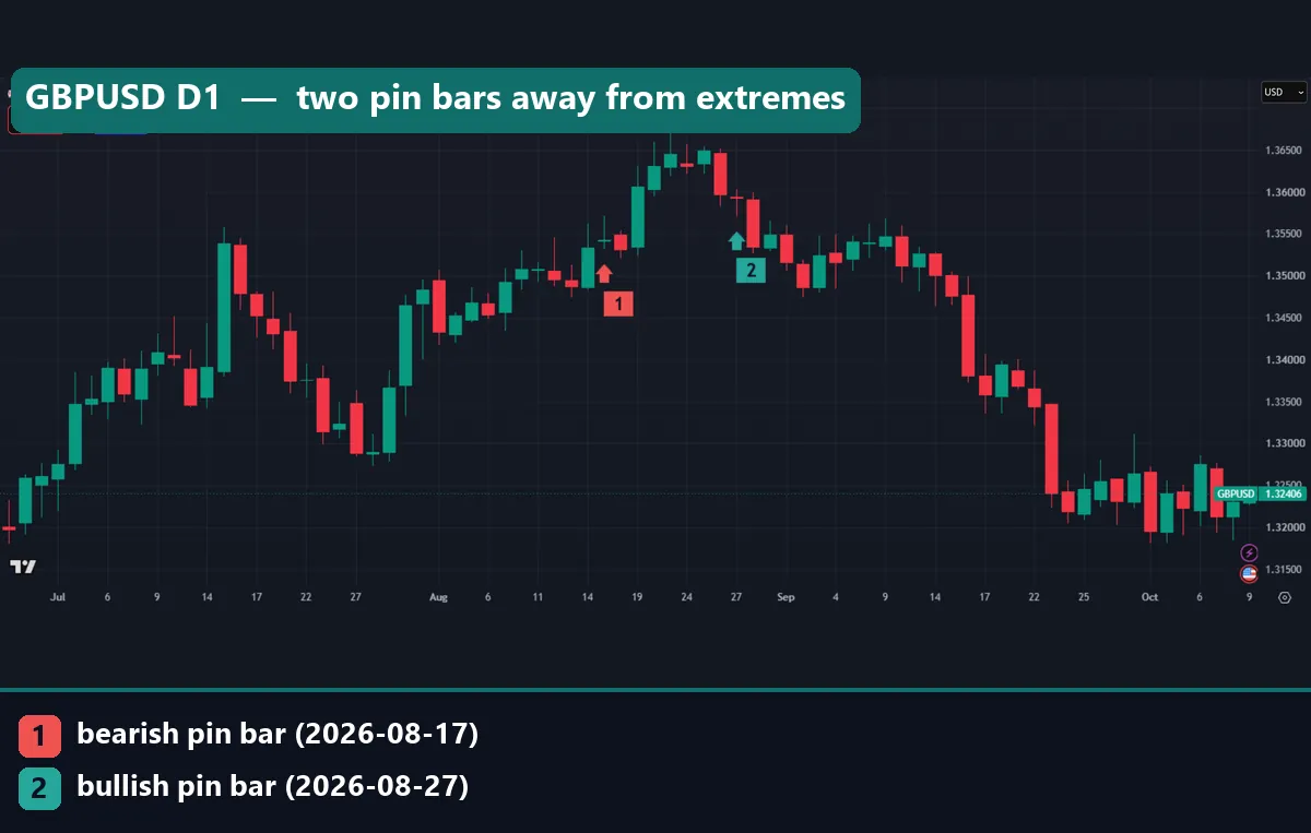
That fits our wider count. Across the daily sample, bullish pin bars followed through 50.7% of the time at three days, against the 51.6% base. Bearish pin bars managed 45.7%, against a 48.4% base. In other words, the pin bar shape alone did not beat a random candle. Our pin bar meaning page covers the shape itself.
Now compare the third image. It shows XAUUSD with a 20-period Donchian Channel. Marker 1 sits under a tweezer bottom on 29 September 2026. The candle’s low was 4,113.485, and the lower band read 4,110.870. So this pattern formed right at the 20-day low, which is the location our test rewards.
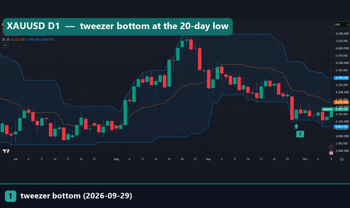
Still, we could not score this one. The image was taken two sessions later, so the three-day outcome did not exist yet. That is the honest state of any live example.
Worked example: the EURUSD tweezer top of 21 August 2026
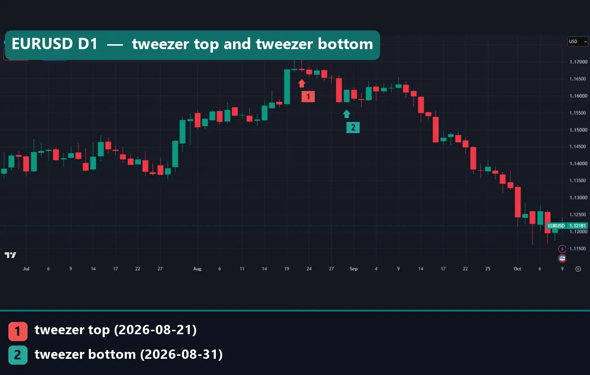
The first image at the top of this page shows a cleaner case. On 20 August 2026, EURUSD made a high of 1.17105 and closed at 1.16785, a small up candle. On 21 August, it made a high of 1.17116 and closed lower, at 1.16766. The two highs sat 1.1 pips apart, so they match well inside our 0.05 ATR tolerance.
Next, check location. The sixth image, further down, adds the Donchian Channel. The upper band runs flat along those two highs, so the pattern formed at the 20-day high. That puts it in our better group.
Then check proof. The close three bars later sat below 1.16766, so the pattern followed through by our rule. After that, the decline went much further. By 1 October, the daily low on the chart reached 1.12653.
However, one tweezer top cannot explain a slide of more than 400 pips. It only marked a spot where buyers failed twice at the same price.
For contrast, marker 2 in the first image is a tweezer bottom on 31 August, with a low of 1.15782. It also followed through at three bars. But it did not sit at a 20-day low, because the lower band was far below. So in our data it belongs to the weaker group, even though it worked this time.
Confirmation and trend context
Confirmation means waiting for the next candle to agree before you act. The fourth image shows why. It is USDJPY on the daily chart. Marker 2 is a tweezer top on 31 August 2026, with a high of 160.201 and a close of 159.74. It followed through, and the chart then shows a sharp fall toward 153.
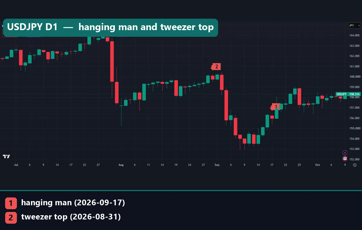
Marker 1 is a hanging man on 17 September. It came after a rally off the lows, which is the textbook setting. Yet it failed. Over the next week, price climbed to about 159 instead. In our daily sample, a hanging man after a mild advance closed lower three days later 51.0% of the time (n=730). After a strong advance of 2 ATR or more, it was 51.5% (n=262). So a strong prior trend barely changed the result. Our hanging man candlestick page has the full rule.
So confirmation mainly filters out patterns the next candle rejects. It costs some entry price, but it avoids the clearest failures.
What location changed in our measurement
The fifth image is our own chart, drawn from the MT4 data. It compares each pattern at a 20-day extreme with the same pattern anywhere else.
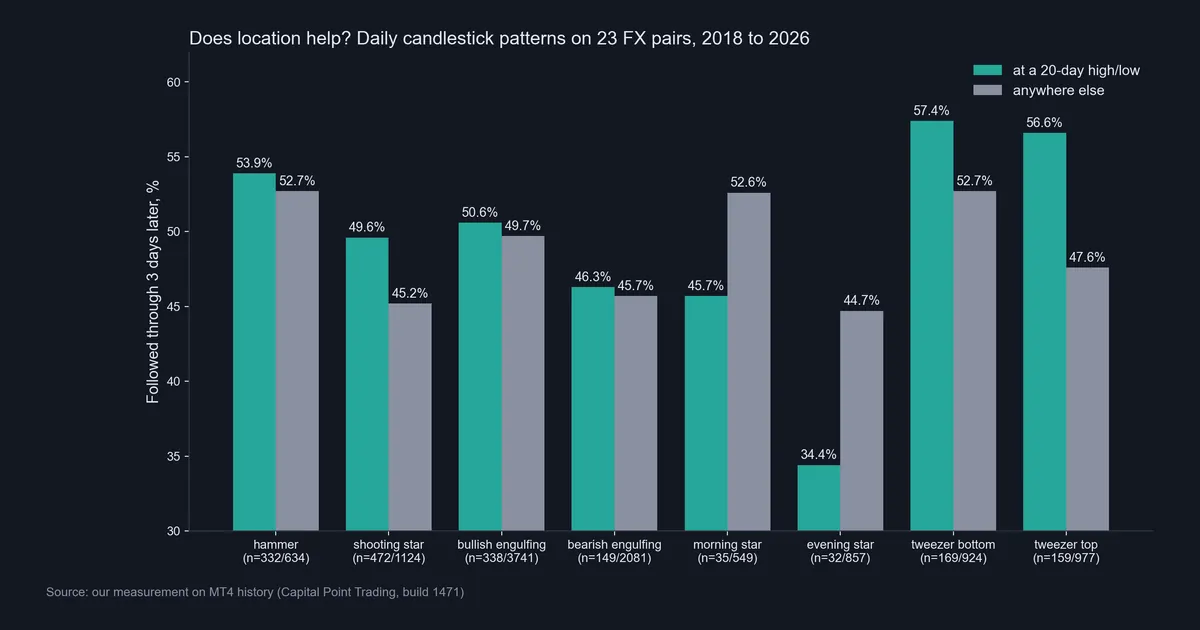
- Tweezer top: 56.6% at a 20-day high (n=159) against 47.6% elsewhere (n=977). This was the largest gain.
- Tweezer bottom: 57.4% at a 20-day low (n=169) against 52.7% elsewhere (n=924).
- Shooting star: 49.6% at a high (n=472) against 45.2% elsewhere (n=1,124).
- Hammer: 53.9% (n=332) against 52.7% (n=634), a small gap.
- Engulfing: bullish 50.6% against 49.7%, bearish 46.3% against 45.7%. Location barely mattered.
- Stars: the morning star fell to 45.7% at a low (n=35), and the evening star to 34.4% at a high (n=32).
The star samples are small, so treat them as a warning, not a finding. Even so, they cut against the usual advice. For the full tweezer rule, see our tweezer tops and bottoms page.
Get the indicator library
If you would rather have the patterns marked for you, our library includes candlestick pattern indicators for MT4 and MT5. One email unlocks the compiled files.
Download the complete indicator database
Put these concepts on your charts. One email unlocks the full library of 1,380+ indicators with compiled MT4 and MT5 files, plus my TradingView scripts. No paywall, no spam, unsubscribe any time.
Get free access to my indicator database
One email unlocks 1,380+ free MT4, MT5 and TradingView indicators — the complete library. No single-tool download; you get the whole database.
Where it fails
First, the edge is small. A tweezer top at a 20-day high followed through 56.6% of the time, against a 48.4% base. That is a real gap, yet it still means more than four in ten failed. Also, follow-through ignores the size of the move and the cost of the trade.
Second, the samples shrink fast. Only 159 tweezer tops met the location rule in eight years across 23 pairs. Split them again by pair or by year, and the numbers turn into noise.
Third, the rules are ours. A different tolerance, lookback or horizon would give different counts.
Fourth, location did not help every pattern. Engulfing candles gained under one point. The stars did worse at extremes, though on very small samples.
Finally, lower timeframes erase most of the effect. On M15 data for four symbols, tweezer bottoms followed through 50.0% after four bars (n=2,347), and tweezer tops 50.6% (n=2,753). That is a coin toss.
Multi-timeframe context: daily against hourly
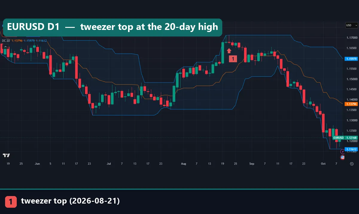
The sixth image repeats the EURUSD daily chart from June to October 2026, now with a 20-period Donchian Channel. Marker 1 sits below the 21 August tweezer top, with its arrow pointing up at the candle. The upper band runs flat along that high for weeks, which is what “at an extreme” looks like.
Now look at the seventh image. It shows GBPUSD on the hourly chart. Marker 1 is a tweezer top at 03:00 UTC on 30 September 2026, with a high of 1.32348. It formed inside a quiet, flat cluster of candles, not at any clear high. Within a few hours, price traded above 1.3300. So the pattern failed, and the setting explains why it carried little weight.
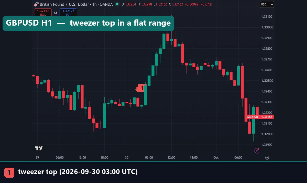
That is the practical point of multi-timeframe analysis. Read the daily chart first to find the levels. Then use the lower chart only to time an entry near those levels. A lone hourly pattern in the middle of a range tells you very little.
Combining candles with support and resistance
A 20-day high is one kind of resistance, and a 20-day low is one kind of support. That is why our location test works as a stand-in for the wider idea. Horizontal levels, prior swing points and round numbers all play the same role. Our support and resistance explained page covers how to draw them.
The working method is simple. First, mark the levels before you look for patterns. Next, ignore patterns that form far from any level. Then, when a pattern does form at a level, wait for the next candle to agree. In short, the level gives the reason and the candle gives the timing.
We did not test hand-drawn levels, so the 20-day rule is our only tested proxy. The candlestick patterns at support and resistance page shows more chart cases.
Common mistakes with Japanese candlestick charting techniques
- Trading the shape anywhere. Our pin bars mid-move did no better than a random candle. Check location first.
- Trusting the textbook favourites. Morning and evening stars did worse at extremes in our data. The samples were small, yet that is still no reason to rank them first.
- Reading hourly patterns like daily ones. On M15, tweezers sat near 50%. So lower-timeframe patterns need a higher-timeframe level behind them.
- Skipping the base rate. A bearish pattern at 49% sounds weak but nearly matches the 48.4% base. Always compare a number with what a random candle did.
Our page on whether candlestick patterns work covers the same question from a wider angle.
Where to go next
For the pattern rules, keep the cheat sheet open beside your chart. For three-candle patterns, our evening star candlestick chart guide tests one pattern in depth. If you trade intraday, read candlestick day trading before you lean on hourly patterns.
For automatic marking, try the Japanese candlestick patterns indicator with a Donchian Channel beside it.
For outside reading, StockCharts has a clear introduction to candlestick charts at StockCharts ChartSchool.
FAQ: Japanese candlestick charting techniques
Who introduced Japanese candlestick charting to Western traders?
Steve Nison did, with his book Japanese Candlestick Charting Techniques, first published in 1991. Japanese rice traders had used the format long before that.
Does the location of a candlestick pattern matter?
For some patterns, yes. In our daily data, tweezer tops at a 20-day high followed through 56.6% of the time against 47.6% elsewhere. Engulfing candles barely changed.
How do I find a 20-day high or low on my chart?
Add a Donchian Channel with length 20. The upper line is the 20-bar high and the lower line is the 20-bar low, so a pattern touching a band is at an extreme.
What does confirmation mean for a candlestick pattern?
It means waiting for the next candle to move in the pattern’s direction before you act. Then you skip patterns the market rejects at once, though you give up some entry price.
Are morning and evening stars reliable at extremes?
Not in our data. At a 20-day extreme the evening star followed through 34.4% of the time (n=32) and the morning star 45.7% (n=35). Both samples are small.
Do candlestick patterns work on 15-minute charts?
Barely, on their own. On M15 data for four symbols, tweezers followed through about 50% of the time after four bars, which is close to a coin toss.
Which timeframe should I use for candlestick techniques?
Use the daily chart to find levels and patterns that carry weight. Then, if you need a finer entry, drop to a lower chart, but only near those daily levels.
Can candlestick techniques be used without other tools?
They can, but location and a support or resistance level made the biggest difference in our tests, so we pair them. Even then, results are not guaranteed; past performance is not indicative of future results.
Last updated: 1 October 2026.

About the author
Written by Dominic Walsh, a Forex trader and MT4/MT5 indicator, Expert Advisor and script developer. Every tool on forexmt4systems.com is tested on live charts before release and ships with ready-to-use compiled MT4 (.ex4) and MT5 (.ex5) files. Learn more about the trader and developer behind this site.
How we build, test and correct every tool: Editorial & Testing Policy. Trading carries risk; see the disclaimer.