
PO3 is the ICT name for the “power of three”: the idea that a daily candle forms in three phases. ICT calls them accumulation, manipulation and distribution. This guide tests the claim at the heart of it. Does a typical day fake one way before it runs the other way? We measured 2,170 New York trading days on 15-minute bars across nine markets to find out. The short answer: the shape turns up often, but most of it would turn up even if PO3 did not exist.
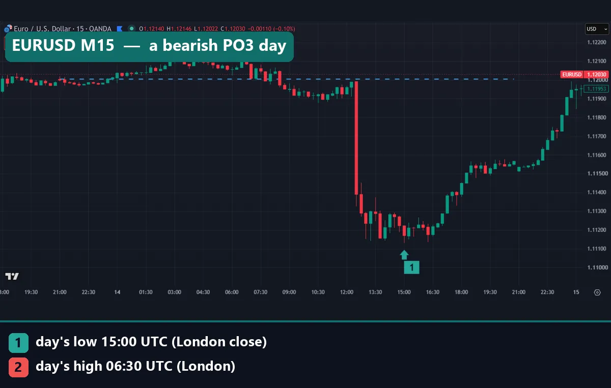
What PO3 means: accumulation, manipulation, distribution
The power of three is a teaching of the Inner Circle Trader, or ICT. Our primer on what ICT trading is covers the basics. PO3 splits each candle into three jobs.
- Accumulation: a quiet range near the open, where large players build positions in ICT’s story.
- Manipulation: a fast move against the day’s real direction that trips stops.
- Distribution: the true expansion, which runs into the close.
So a bullish day reads open, low, high, close, and a bearish day reads open, high, low, close. ICT calls the early fake move the Judas swing. Our page on accumulation, manipulation and distribution covers the terms in depth. Our guide to ICT daily profiles shows the trade plans built on top.
How PO3 should work in theory
The idea borrows from Richard Wyckoff’s market cycle: accumulation, markup, distribution, markdown. Wyckoff also described a “spring”, a brief break below a range that traps sellers before a rise. The Wyckoff method tutorial at StockCharts ChartSchool lays out those phases. ICT squeezes the cycle into one candle and ties each phase to a time window.
In the usual timetable, Asia holds the quiet range and London delivers the fake move. New York then runs the real move. So a bullish day should put its low in London, under the open, and its high in New York.
A test needs numbers, so we turned the fake move into a ratio. For an up day:
fake-move depth = (open - low) / ADR14
ADR14 is the average daily range of the last 14 days. A down day uses (high – open) instead. We call a fake move meaningful when the depth reaches 0.20, a fifth of a normal day. We also logged which killzone held the day’s low and high.
How we tested PO3
We measured price paths, not trades. So this page has no profit figures and nothing to adjust for spread, swap or commission. The method follows our editorial testing policy.
- Data: M15 history from MetaTrader 4, build 1471, on the Capital Point Trading server.
- Markets: EURUSD, GBPUSD, USDJPY, USDCHF, USDCAD, AUDUSD, AUDCAD, NZDCAD and gold (XAUUSD, in dollars).
- Window: 1 June 2025 to 26 August 2026 at the widest. AUDUSD and USDJPY only start on 25 March 2026.
- Day: 17:00 to 17:00 New York time, with US daylight time applied.
- Sample: 2,170 New York trading days, of which 1,259 closed up and 910 closed down.
- Charts: TradingView web chart, OANDA data, M15, captured on 15 October 2026 for 13 and 14 October, with the time axis in UTC.
Nine markets over about a year is a modest sample. Dollar pairs dominate it, so one dollar move can show up in several markets on the same day. Our note on backtest sample size explains why that matters.
PO3 settings and parameters
PO3 has no inputs like an oscillator. Still, every test of it rests on a few choices, and each one moves the “fake move”.
| Parameter | Our setting | Common alternative |
|---|---|---|
| Day boundary | 17:00 New York open | Midnight New York open |
| Bar size | M15 | M5 or H1 |
| Meaningful fake move | 20% of the 14-day average daily range | Any wick past the open |
| Asian killzone | 20:00 to 00:00 New York (00:00 to 04:00 UTC) | Varies by teacher |
| London killzone | 02:00 to 05:00 New York (06:00 to 09:00 UTC) | Varies by teacher |
| New York killzone | 07:00 to 10:00 New York (11:00 to 14:00 UTC) | Varies by teacher |
| London close | 10:00 to 12:00 New York (14:00 to 16:00 UTC) | Varies by teacher |
The UTC times hold during US daylight time, so add one hour in US winter. Per NIST’s daylight saving time rules, US clocks change in March and November. The ICT midnight open is the main rival reference. Our ICT kill zones guide covers the windows in detail.
Reading PO3 on a chart
On our captures, the dashed blue line marks the 17:00 New York open. In October that falls at 21:00 UTC. Marker 1 shows where the day’s low formed and marker 2 the high, and the legend names the killzone. Ask three questions: which side of the line did price test first, how far, and when?
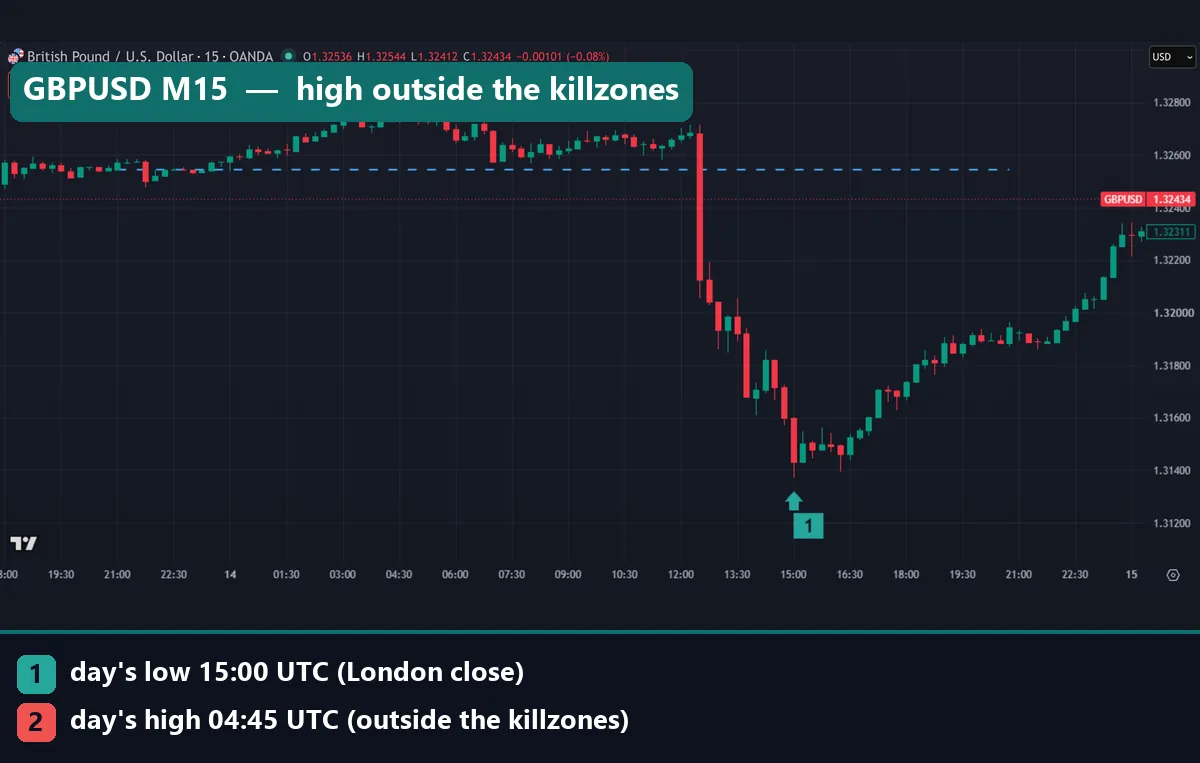
GBPUSD on 14 October fits the bearish template at first glance. It opened at 1.32545 and rose 20.8 pips to 1.32753 by 04:45 UTC. Then it fell to 1.3137 at 15:00 UTC. But the high came in the gap between the Asian and London windows, outside every killzone.
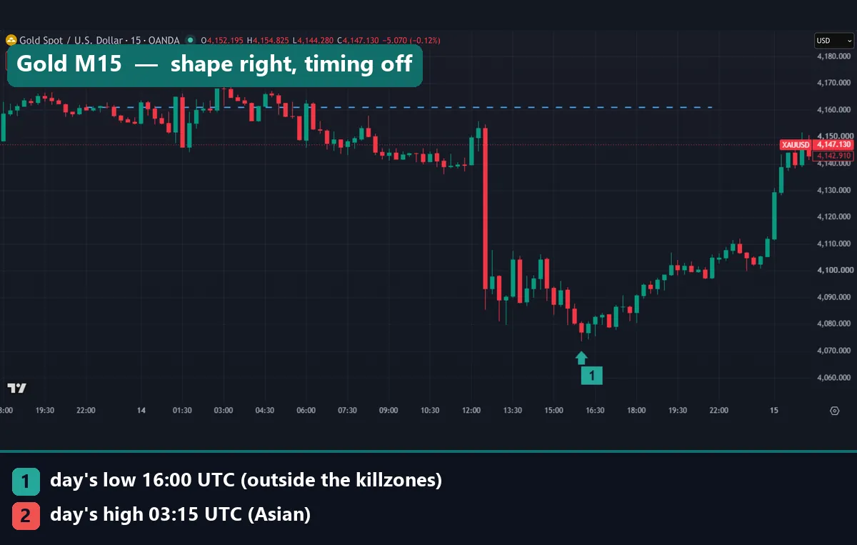
Gold opened the same day at $4,161.08, on a first bar at 22:00 UTC after its daily break. Its high of $4,170.49 came at 03:15 UTC in Asia, just $9.41 above the open. Then the low of $4,073.545 formed at 16:00 UTC, just after the London close window. So the shape matched PO3, while the timing missed two of its windows.
Worked example: EURUSD on 14 October 2026
The chart at the top shows this New York day on M15. It began at 21:00 UTC on 13 October. Here it is in numbers, from our chart marks.
- Open: 1.12003 at 21:00 UTC.
- Asian window low: 1.11982, so price also traded 2.1 pips under the open.
- High: 1.12114 at 06:30 UTC, inside the London killzone, 11.1 pips above the open.
- Low: 1.11129 at 15:00 UTC, inside the London close window.
- Close: 1.11566, which sits 43.7 pips under the open.
Through a PO3 lens, this looks like a clean bearish day. The Asian hours drifted around the open as accumulation. London pushed 11.1 pips above it as the fake move. Then one long candle just after 12:00 UTC broke lower, and price found its low at 15:00.
Now the honest reading. The fake move was small: 11.1 pips against a 98.5-pip day. Price also traded under the open in Asia. So anyone hunting a bullish PO3 at 05:00 UTC had a “fake move” too. The close at 1.11566 sat exactly halfway between the open and the low, so the day gave back half its fall. Only hindsight turns this chart into a neat three-phase story.
What 2,170 trading days showed
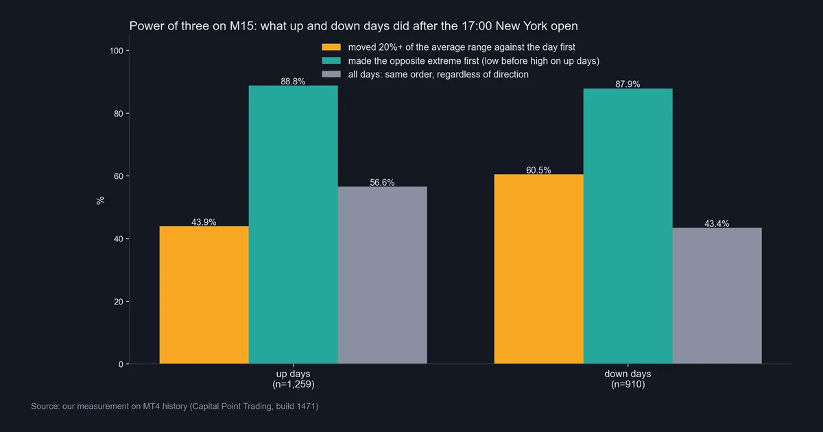
The chart above holds the main result. On up days the low came before the high 88.8% of the time. On down days the high came before the low 87.9% of the time. At a glance, that looks like strong support for PO3.
The fake-move test tells a different story. Only 43.9% of up days first moved 20% of the average range below the open. Their median dip was 18.6%. Down days did better: 60.5% first rose that far above the open, with a median rise of 24.0%.
Timing missed too. ICT places the bullish fake move in London. Yet only 10.6% of up-day lows formed there, below London’s 12.5% share of the clock. Most up-day lows, 60.8%, formed outside all four killzones. Down days leaned another way, with 26.9% of their highs in Asia. That window holds 16.7% of the clock.
Ignore one figure. Almost every up day (94.4%) traded under its open at some point. On down days, 99.8% traded above it. That means nothing, because the first 15-minute bar nearly always trades on both sides of its own open. We also cannot explain why down days fit better. More days closed up than down here, and the period itself may explain the gap.
Why the 88.8% figure is mostly mechanical
Think about what an up day is. It closes above its open, so its last hours tend to trade near the top of its range. That pushes the high late and leaves the low earlier. The order follows from the close, not from a plan.
Across all days, the low came first 56.6% of the time and the high 43.4%. Split by direction, the gap widens to 88.8% and 87.9%, because direction sorts the order. Even a pure random walk tends to set its extremes near the start or end of a window. The arcsine laws article on Wikipedia gives the maths. So a coin-flip market also produces a high “low before high” figure.
We did not simulate a random-walk baseline here. So we cannot say how much of the 88.8% is real excess. Still, the headline number is not evidence of a fake-move phase on its own. The 20%-of-range test is the fairer check, and up days failed it more often than they passed it.
A day with no fake move: USDJPY
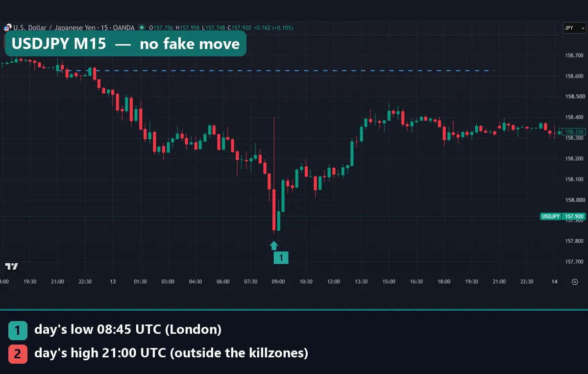
USDJPY opened its 13 October day at 158.625. Its high, 158.686, came in the first bar, just 6.1 pips above the open. From there it fell to 157.832 at 08:45 UTC, inside the London killzone. Then it closed at 158.318, back up 48.6 of the 79.3 pips it had lost.
There was no quiet range and no fake rally. The day sold off from the first bar, and London held the end of the drop, not a trap. A trader waiting for the London fake move waited for a setup that never came.
Download the complete indicator database
Put these concepts on your charts. One email unlocks the full library of 1,380+ indicators with compiled MT4 and MT5 files, plus my TradingView scripts. No paywall, no spam, unsubscribe any time.
Get free access to my indicator database
One email unlocks 1,380+ free MT4, MT5 and TradingView indicators — the complete library. No single-tool download; you get the whole database.
Where it fails
PO3 fails first on timing. You only know which leg was the fake one after the day closes. In real time, every dip under the open looks like the fake move until it keeps going.
It also fails on the windows that carry the theory. In the same data, the day’s high formed outside all four killzones on 45.5% of days. The low did so on 57.6% of days. Yet the killzones cover 50% of the clock. So they held a little more than their share of highs, and less than their share of lows.
Then there is correlation. On 14 October, EURUSD, GBPUSD and gold fell and USDCHF rose on the same candle just after 12:00 UTC. That gives four PO3-looking days, but one dollar move. When one candle moves four markets, check the forex news release times before you read intent into it.
Last, the word “manipulation” claims intent that no retail chart can show. A chart shows price, not who traded or why, as our page on stop hunting in forex explains. And if you move the open from 17:00 to midnight New York, a “fake move” can vanish or appear.
Two up days: USDCHF and AUDUSD
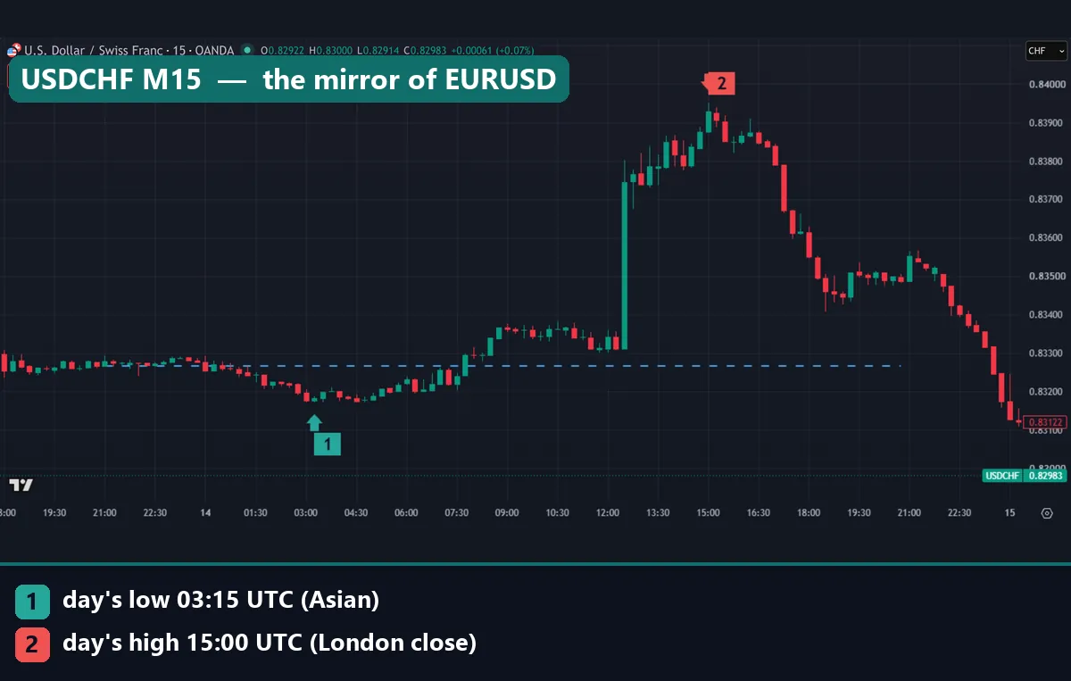
USDCHF on 14 October is the mirror of the EURUSD day. It opened at 0.83266 and dipped to 0.83172 at 03:15 UTC, in Asia. Then it peaked at 0.83952 at 15:00 UTC, in the London close window. The same candle that sank EURUSD lifted USDCHF. Two charts, one move.
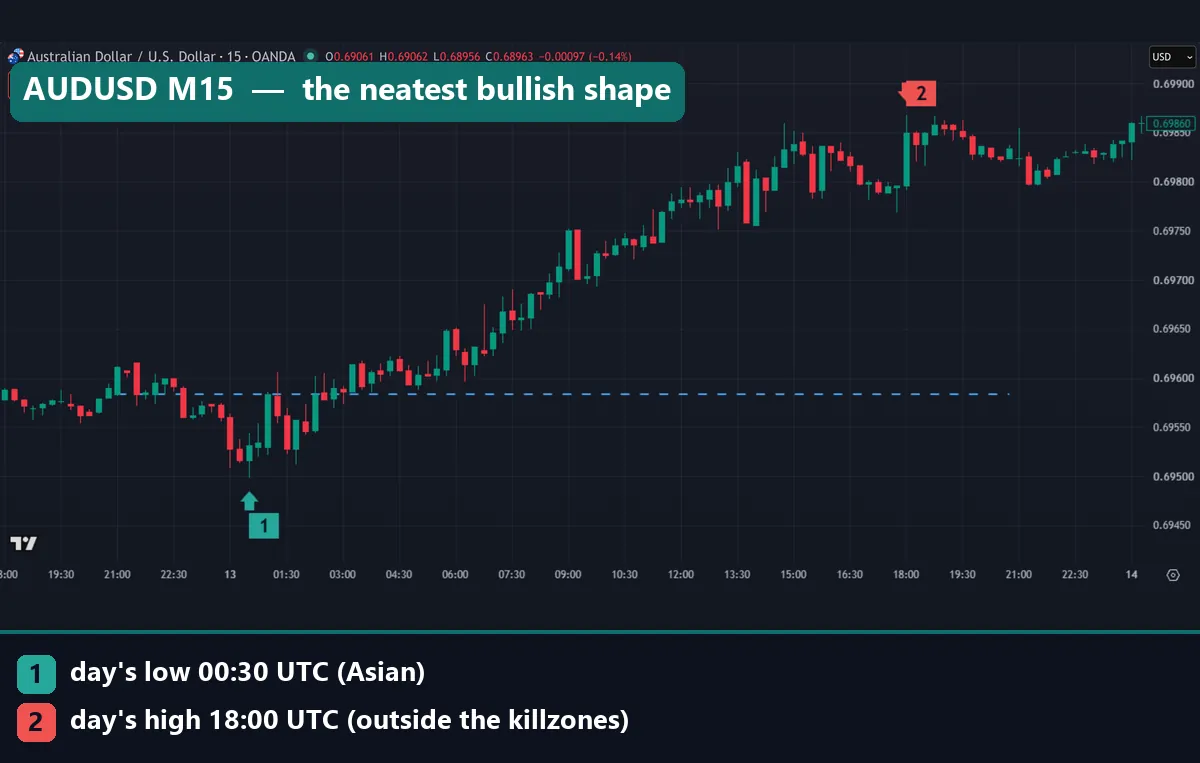
AUDUSD on 13 October is the neatest bullish shape in our set. It opened at 0.69584 and dipped 8.6 pips to 0.69498 at 00:30 UTC. Then it climbed most of the day, to 0.69868 at 18:00 UTC. Yet the low formed in Asia, not London, and the high came outside every killzone. Even the textbook-looking day broke the textbook timetable.
Common mistakes with PO3
Four errors come up again and again.
- Taking any dip under the open as proof. Nearly every day trades on both sides of its open, so use a size threshold.
- Treating the 88.8% figure as an edge. Most of it comes from what an up day is, and it says nothing about how a day will close.
- Counting related pairs as separate proof. EURUSD, GBPUSD and USDCHF often print the same day in different colours. One dollar move is one data point.
- Mixing day boundaries and clocks. Pick the 17:00 or the midnight open and keep it. Then check the daylight-time shift, or your killzone boxes slide by an hour.
Where to go next
Treat PO3 as a bias, not a signal. Our page on ICT daily bias shows how traders pick a direction before the session. Our ICT power of three guide from accumulation to expansion walks through more charts. The ICT Power of 3 indicator page covers a ready-made tool.
For timing, see our overview of forex trading sessions. The BIS Triennial Survey of FX markets is the main census of where currency trading happens. Before you build rules on any of this, read our note on curve fitting in trading.
FAQ about PO3
What does PO3 stand for in trading?
PO3 stands for the power of three, an ICT concept. It splits a candle into a quiet range, a fake move, then the real move into the close.
Does PO3 work on forex?
The shape shows up often, but mostly for mechanical reasons. In our M15 test, only 43.9% of up days first fell 20% of the average range below the open.
What time does the PO3 day start?
We used 17:00 New York, the usual forex day boundary. Many ICT traders use the midnight New York open instead.
Which session should hold the fake move?
The textbook says London. In our data, only 10.6% of up-day lows formed in the London killzone. Most, 60.8%, formed outside all four.
Is PO3 the same as the Judas swing?
No. The Judas swing is the fake move inside the day. PO3 is the whole frame around it, from the quiet range before to the real move after.
Can I use PO3 on other timeframes?
ICT applies it to weekly and intraday candles too, but we tested only the daily candle. The mechanical bias applies to any candle: one that closes up tends to put its low first.
Do I need an indicator to trade PO3?
No. A line at the 17:00 New York open and four killzone boxes are enough.
Is PO3 a reliable way to trade?
Not on its own. Treat it as a way to describe a day. Then test any rule you build on it with out-of-sample data. As with any method, results are not guaranteed; past performance is not indicative of future results.
Last updated: 15 October 2026.

About the author
Written by Dominic Walsh, a Forex trader and MT4/MT5 indicator, Expert Advisor and script developer. Every tool on forexmt4systems.com is tested on live charts before release and ships with ready-to-use compiled MT4 (.ex4) and MT5 (.ex5) files. Learn more about the trader and developer behind this site.
How we build, test and correct every tool: Editorial & Testing Policy. Trading carries risk; see the disclaimer.