
High resistance liquidity is the ICT name for a price path so crowded with recent trading that a move through it tends to stall. This guide settles three things. First, what the term means and how it differs from its opposite. Second, how we turned it into a number you can measure. Third, what 3,761 real cases on nine markets said about it, including the cases where it was plainly wrong.
What high resistance liquidity means
Every price band the market traded through recently holds business. Some traders still sit in positions from it. Others left limit orders there, or stops just beyond it. So price has to work through all of that before it can move on.
High resistance liquidity describes a path that is full of this business. In the ICT framework it is the opposite of a low resistance liquidity run, where the path is thin and price can travel fast. A high resistance path is the slow, choppy route. Price can still cross it. However, it usually needs more time, more volume, or a news push to do so.
The idea is a wider cousin of support and resistance. A support line is one price, while this is a whole corridor. Our support and resistance explainer covers the single-level version.
High resistance vs low resistance liquidity
The two terms describe the same question from opposite ends. Is the road to the next target clear, or is it blocked?
- Low resistance: price moved through the band once, quickly, and rarely came back. Few orders remain, so the next move can be fast.
- High resistance: price ranged inside the band for hours or days. Many orders remain, so the next move tends to grind.
Both reads point at the same kind of target. That target is usually a pool of stops above an old high or below an old low, which the ICT school calls buy-side and sell-side liquidity. The pool is the destination. The resistance read is about the road. In short, a trader using this idea asks two things: where is the draw on liquidity, and how crowded is the path to it?
How high resistance liquidity works as a measurement
ICT teaching judges the idea by eye, so two traders can disagree. We built a simple proxy instead. To be clear, this is our measurement, not an official ICT formula.
First, we fix a check time each day. Then we take the previous-day high and the previous-day low, but only the ones still ahead of price. The corridor is the band between the current price and that level. Next, we look back over the prior two days of M15 bars and count how many of them overlap the corridor.
congestion = bars overlapping the corridor / all bars in the prior two days
A value near 0 means price barely visited that band. A value of 1 means every bar in the lookback touched it. That is the high resistance case.
Distance matters too. A raw pip distance means different things on EURUSD and on gold, so we divide the corridor by four times the average M15 bar range. That gives roughly one hour of normal travel per unit.
distance in hours = corridor / (4 x average M15 range)
The average range here plays the same role as the average true range: it turns price distance into a measure of how far the market usually moves.
How we tested it
We ran the measurement on MetaTrader 4 history from the Capital Point Trading terminal, build 1471. The data was M15 bars for nine symbols: AUDCAD, AUDUSD, EURUSD, GBPUSD, NZDCAD, USDCAD, USDCHF, USDJPY and XAUUSD. The window ran from 2 June 2025 to 26 August 2026. That produced 3,761 cases, where one case is one previous-day level still ahead of price at the check time.
The check time was server 10:00. MT4 server time is UTC+3 in summer and UTC+2 in winter, so that is 07:00 UTC in summer. A case counted as “reached” if price traded through the level later that same server day.
Then we split the cases by distance. Inside each distance bucket, we compared the least congested third with the most congested third. That way, congestion is never mixed up with plain distance.
For the chart examples, we used the TradingView web chart with OANDA data, captured on 5 October 2026. Those examples come from 29 September to 5 October 2026 and use the same rule at 07:00 UTC. On those charts, the congestion figure uses the chart’s own bars (H1 or M15). Our full method sits in our editorial testing policy.
The parameters we used
Change any of these and the figures will move.
| Parameter | Our value | Why |
|---|---|---|
| Check time | Server 10:00 (07:00 UTC in summer) | Early in the London morning, before most of the day’s range forms |
| Target levels | Previous-day high and low, if still ahead of price | The most common ICT draw for intraday traders |
| Corridor | Band between price at check time and the level | The road price must travel |
| Congestion lookback | Prior two days of M15 bars | Recent enough that orders may still rest there |
| Distance unit | Corridor / (4 x average M15 range) | About one hour of normal travel |
| Distance buckets | Under 1 hour, 1 to 2 hours, 2 to 4 hours | Keeps near and far targets apart |
| Comparison | Least vs most congested third, per bucket | Isolates the effect of a crowded path |
| Outcome | Level traded through the same server day | A simple yes or no |
Note the limit: the outcome says whether price got there, not what it did next.
Reading high resistance liquidity on a chart
You do not need our formula to see the idea. Mark the previous-day high and low. Then ask how many recent candles sit between price and each level.
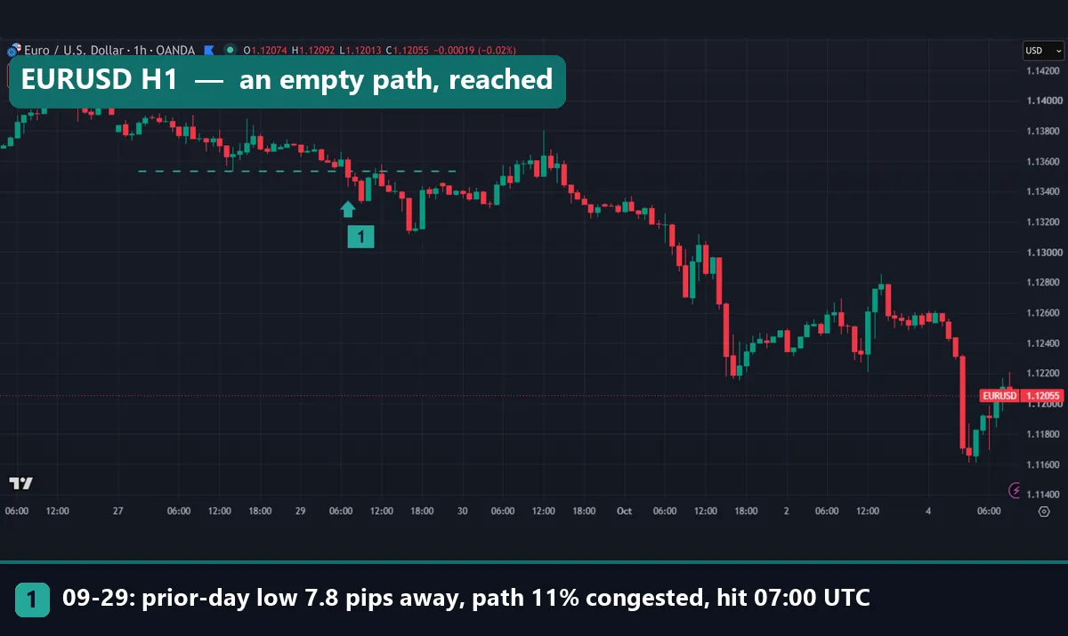
The EURUSD H1 chart above shows the low resistance case. On 29 September 2026 at 07:00 UTC, price sat at 1.1361. The previous-day low at 1.13532 was only 7.8 pips away, and congestion on the path was just 11%. Price traded through it in the very first hour, at 07:00 UTC. Short and empty paths like this one are the easy cases.
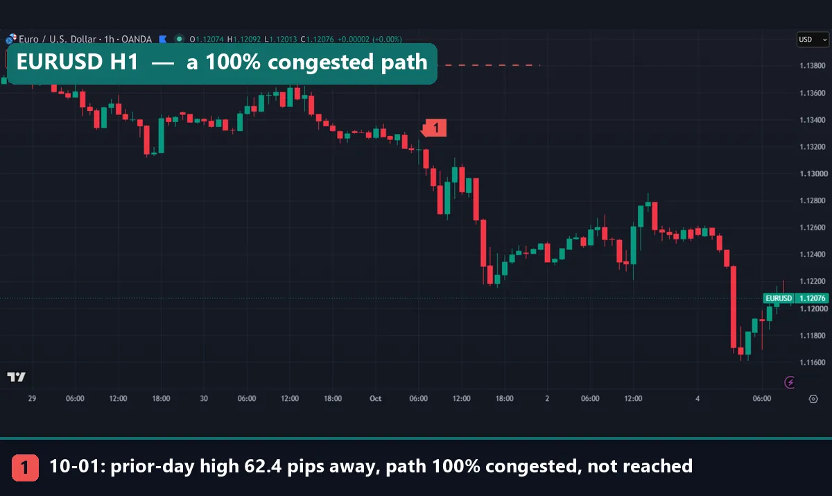
Now compare the high resistance case. On 1 October 2026 at 07:00 UTC, EURUSD traded at 1.1318. The previous-day high at 1.13804 was 62.4 pips above. Every bar in the prior two days overlapped that corridor, so congestion was 100%. The level was not reached that day. Instead, price fell away from it, as the chart shows.
Still, a full corridor did not cause the drop. It only said the road up was busy and long. Read it as a filter on targets, not as a sell signal.
Worked example: GBPUSD on 2 October 2026
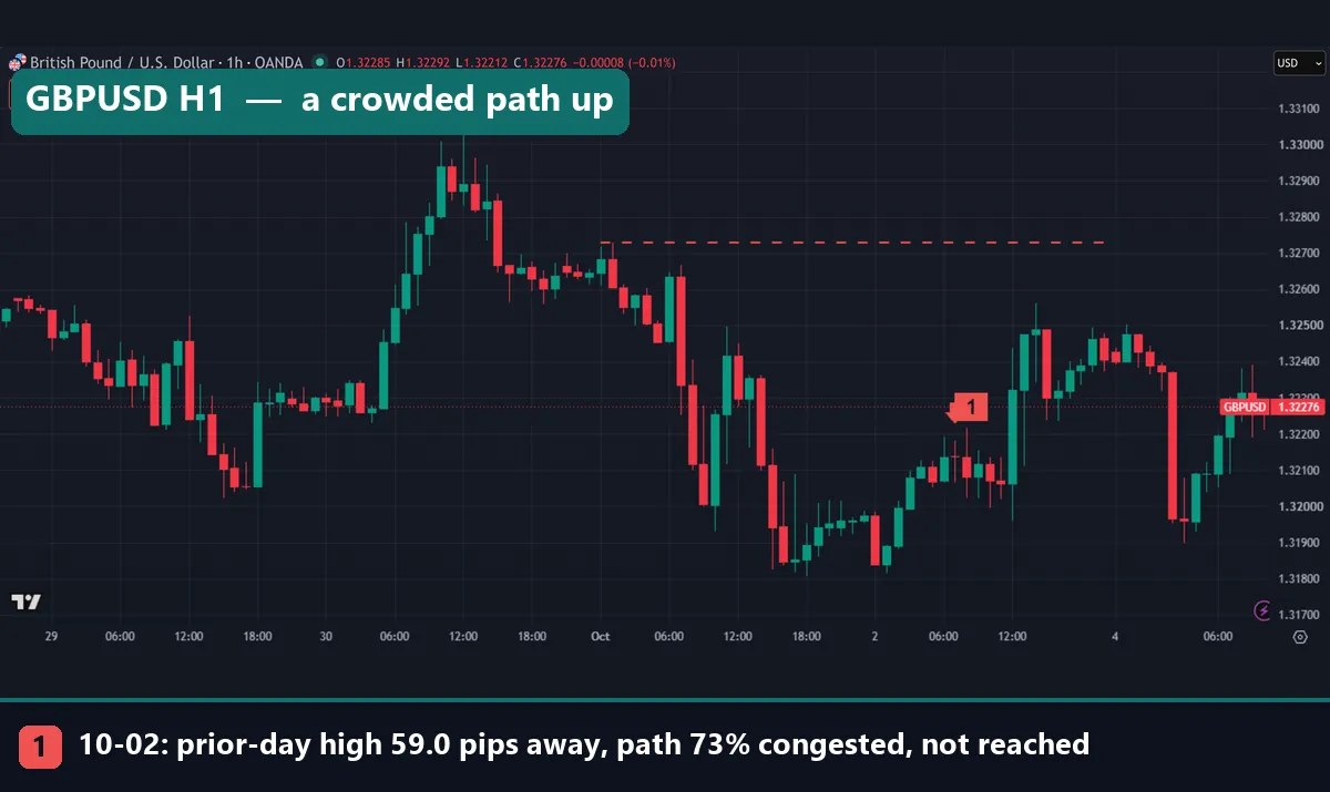
Let us go back to the GBPUSD H1 chart at the top of this page. At 07:00 UTC on 2 October 2026, price was 1.32138. Two previous-day levels were still ahead.
- The high at 1.32728 sat 59.0 pips above. On the H1 bars, congestion on that path read 73%. On M15 bars, the figure was 66%.
- The low at 1.31808 sat 33.0 pips below. Congestion on that path read only 29% on H1, and 26% on M15.
By our read, the high was the harder target and the low the easier one. In fact, neither level traded that day. So the read only ranks two targets against each other. It says nothing certain about either.
Now compare our full sample. Suppose both levels sat in the one to two hour bucket. In that bucket, price reached the target on 33.2% of the least congested paths (437 cases). It reached 21.6% of the most congested ones (435 cases). So even the “easy” low would miss more often than it would hit. That base rate is worth more than any single chart.
For a wider view of how often price takes previous-day levels at all, see our liquidity sweep example. On EURUSD, price took the previous-day high on 45.5% of 297 days we measured, and the low on 52.2%.
What 3,761 cases showed
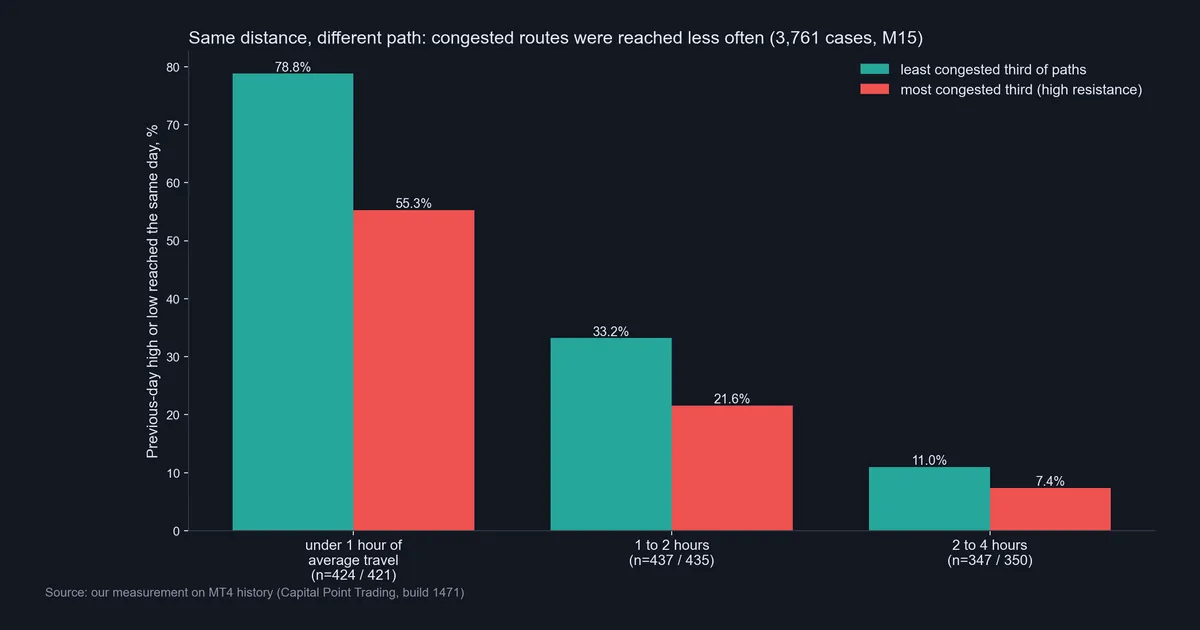
- Under 1 hour away: 78.8% reached on light paths (424 cases) vs 55.3% on crowded paths (421 cases).
- 1 to 2 hours away: 33.2% (437 cases) vs 21.6% (435 cases).
- 2 to 4 hours away: 11.0% (347 cases) vs 7.4% (350 cases).
Two things stand out. First, price reached targets on busy paths less often in every bucket. The gap was largest for near targets, at 23.5 percentage points. Second, distance mattered far more than congestion. Price reached only 11.0% of light paths two to four hours away. That is well below busy paths under one hour away, at 55.3%.
In short, distance is the main filter. Congestion is a second, smaller one that nudges the odds.
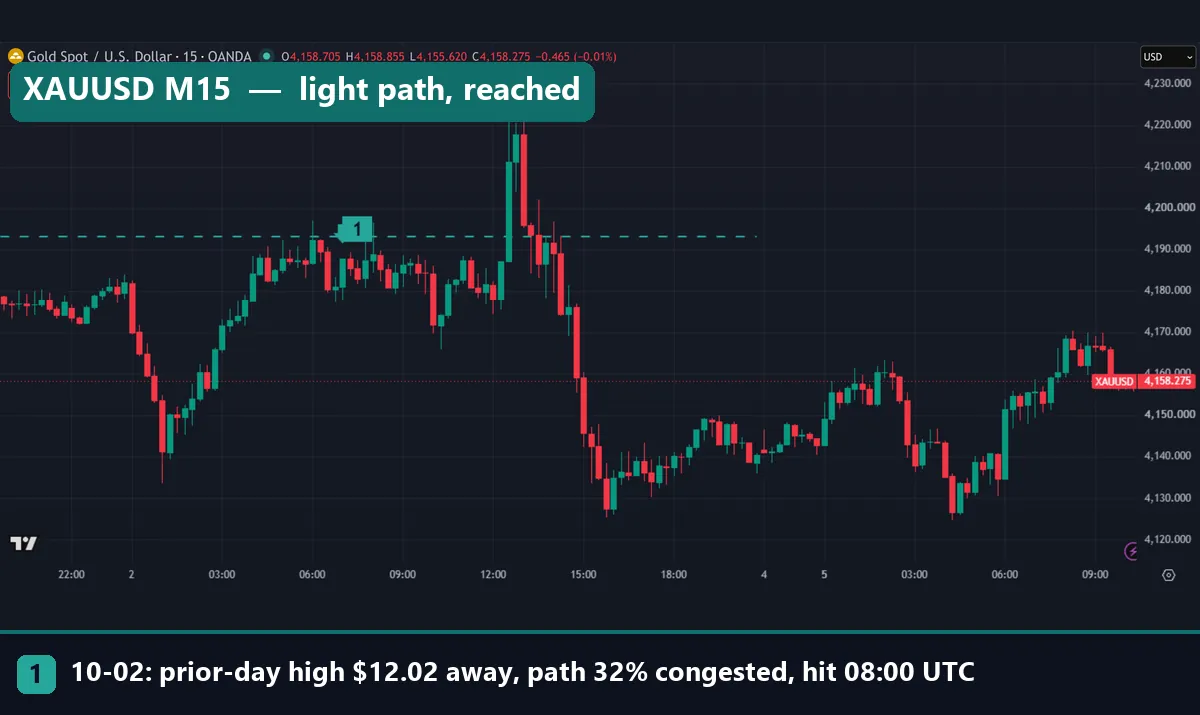
The gold chart shows a case that fits the pattern. On 2 October 2026 at 07:00 UTC, XAUUSD traded at 4,181.08. The previous-day high at 4,193.09 was $12.02 away. Congestion on that path read only 32% on M15 bars. Price reached it at 08:00 UTC, then spiked above $4,220.
Download the complete indicator database
Put these concepts on your charts. One email unlocks the full library of 1,380+ indicators with compiled MT4 and MT5 files, plus my TradingView scripts. No paywall, no spam, unsubscribe any time.
Get free access to my indicator database
One email unlocks 1,380+ free MT4, MT5 and TradingView indicators — the complete library. No single-tool download; you get the whole database.
Where it fails
First, price still crosses busy paths often. It reached near targets on the busiest paths 55.3% of the time. That is more often than not. So a high resistance read is no reason to assume a level is safe.
Second, news ignores congestion. A data release can cross two days of trading in minutes, and our measurement has no news filter.
Third, the proxy is ours. Some ICT traders would add older structure, fair value gaps or round numbers, which our two-day count leaves out. Also, nine symbols over about 15 months is one period; another could differ.
Fourth, being right about “reached” says nothing about a trade. We did not test entries, stops, spreads or exits. As a result, none of these figures tell you whether a strategy built on them would make money.
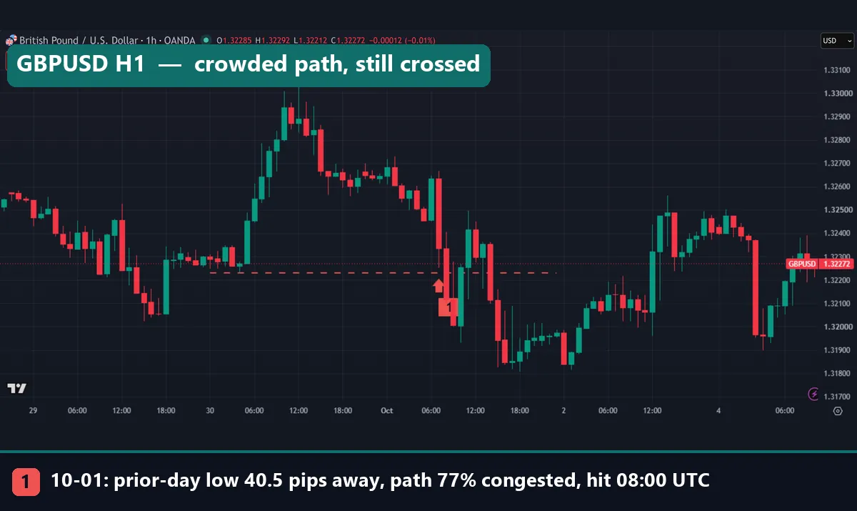
This GBPUSD H1 chart is a clear miss. On 1 October 2026 at 07:00 UTC, price sat at 1.32635. The previous-day low at 1.3223 was 40.5 pips below, and congestion on the path read 77%. By our read, it was a hard target. Yet price traded through it at 08:00 UTC, one hour later.
A weak example and one more miss
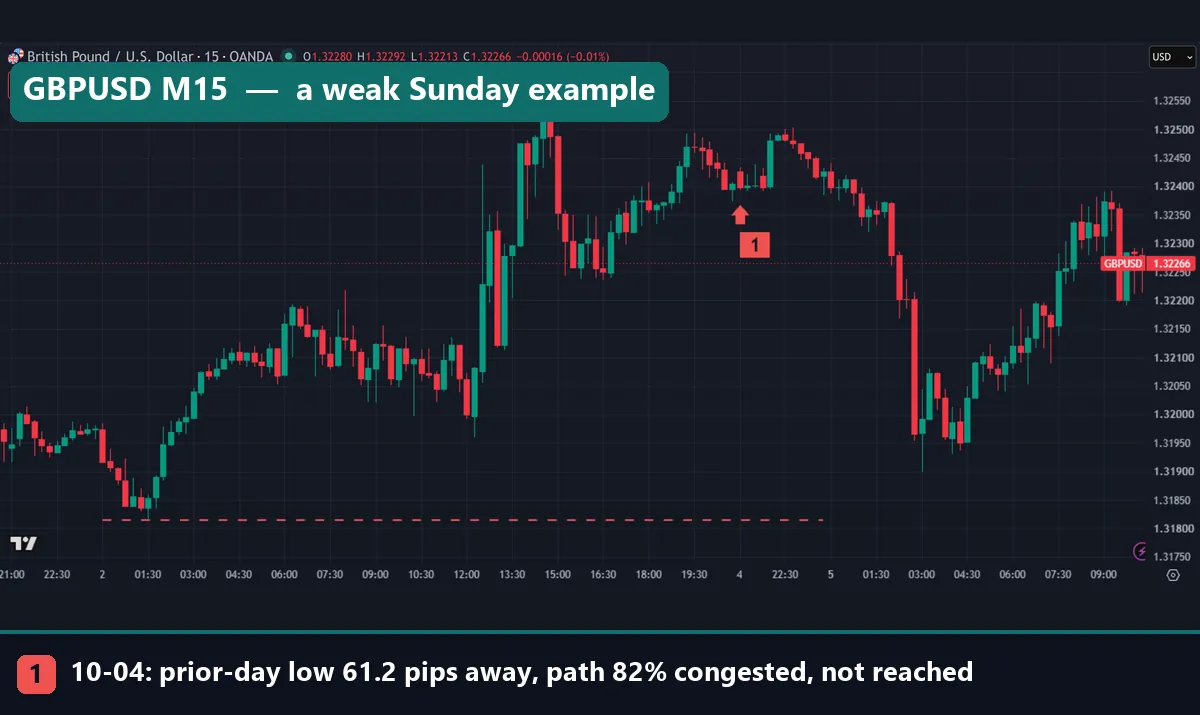
The last GBPUSD M15 chart looks like a success but is weak evidence. At 21:00 UTC on Sunday 4 October, price was 1.32427. The previous-day low at 1.31815 was 61.2 pips away and 82% congested. It was not reached that server day. However, that “day” was only the first few hours after the weekly open. The chart does show price staying above the line into the next morning. Still, one quiet Sunday evening proves very little.
Gold gave one more miss. On 2 October, its previous-day low was $41.81 away and 82% congested. Price reached it anyway, at 15:15 UTC.
Common mistakes
These four errors come up most often when traders use this idea.
- Treating congestion as a signal. A crowded path up does not mean sell. It only means a long target up is less likely to be hit soon. You still need a reason to enter.
- Ignoring distance. Our data shows distance moves the odds far more than congestion does. A light path four hours away is still a long shot. Check the distance first, in units of normal travel, such as hours or ATR-based distance.
- Counting by eye on the wrong timeframe. Our H1 and M15 readings differed for the same case (73% vs 66% on GBPUSD). Pick one timeframe and stay with it, or your reads will drift.
- Mixing up the pool and the path. A liquidity void is an empty path. A pool of stops is a target. A congested corridor is neither: it is the busy ground in between.
Where to go next
Start with the sister guide on low resistance liquidity, since the two ideas only make sense together. Then read our broader liquidity in trading guide and the step-by-step page on how to find liquidity on a chart. For background, see our introduction to ICT trading and the page on internal and external range liquidity.
For outside reading, the support and resistance article at StockCharts ChartSchool covers why busy price zones slow the market. The consolidation entry at BabyPips defines the sideways trading that creates crowded paths. For the economics, see market liquidity on Wikipedia. If you want to code the previous-day levels yourself, the iHigh function in the MQL5 reference returns the high of any past bar, including yesterday’s daily bar.
FAQ: high resistance liquidity
What is high resistance liquidity in simple terms?
It is a stretch of price that the market traded through many times recently, so many orders still sit inside it and a move through it tends to slow down.
Is high resistance liquidity the opposite of low resistance liquidity?
Yes. Low resistance liquidity is a thin, empty path where price moves fast, while high resistance liquidity is a crowded path where price tends to grind.
How did you measure congestion?
We counted the share of the prior two days of M15 bars that overlapped the band between price and the target level, which is our own proxy and not an official ICT formula.
Does a crowded path stop price from reaching a level?
No. In our sample, near targets on the most crowded paths were still reached 55.3% of the time (421 cases), compared with 78.8% on the lightest paths (424 cases).
Which matters more, distance or congestion?
Distance mattered more in our data: price reached only 11.0% of light paths two to four hours away, well below busy paths under one hour away.
Which markets did you test?
We tested AUDCAD, AUDUSD, EURUSD, GBPUSD, NZDCAD, USDCAD, USDCHF, USDJPY and XAUUSD on M15 MT4 data from 2 June 2025 to 26 August 2026.
Can I use high resistance liquidity as an entry signal?
We would not, because our test only measured whether price reached a level, not whether a trade around it made money after spreads and stops.
Will these figures hold in the future?
They describe one period and nine symbols, so they may change in other conditions; results are not guaranteed; past performance is not indicative of future results.
Last updated: 5 October 2026.

About the author
Written by Dominic Walsh, a Forex trader and MT4/MT5 indicator, Expert Advisor and script developer. Every tool on forexmt4systems.com is tested on live charts before release and ships with ready-to-use compiled MT4 (.ex4) and MT5 (.ex5) files. Learn more about the trader and developer behind this site.
How we build, test and correct every tool: Editorial & Testing Policy. Trading carries risk; see the disclaimer.