
A megaphone pattern is a run of swings where each new peak sits higher and each new trough sits lower, so the price range widens like the bell of a megaphone. This guide settles three things. First, what the shape is and how to find it with a fixed rule. Next, what 663 of them did next on 23 daily currency pairs. Finally, why we found no sign that the shape tells you which way price will go.
What a megaphone pattern is
The pattern goes by three names. Older chart books call it a broadening formation or a broadening top. Traders on social media call it a megaphone. All three describe the same thing: two lines that move apart instead of together.
So the upper line rises because the second peak beats the first. Meanwhile the lower line falls because the second trough undercuts the first. That makes it the reverse of a symmetrical triangle, where the swings shrink toward a point. It also differs from a wedge, where both lines slope the same way.
The usual story says the market has lost its consensus. That story sounds fine, but it is a description, not a forecast. The broadening top entry on Wikipedia gives the classic textbook view, which treats the shape as a sign of a top. Our currency data does not back that view.
How the broadening shape forms
A megaphone needs four turning points: two peaks and two troughs, in any order, as long as they alternate. Each one is a pivot: a bar whose high or low stands out from its neighbours. If you have used Williams fractals, the idea is the same.
Then the test is simple. Call the first peak P1 and the second P2. Call the first trough T1 and the second T2. The shape counts as a megaphone only if both conditions hold:
P2 > P1   and   T2 < T1
growth = (P2 - T2) - (P1 - T1)
The growth figure tells you how much wider the second swing is than the first. Still, it says nothing about direction. That detail matters later, because many charted megaphones are really a trend with one odd swing in it.
One more point: a pivot only exists after the bars that follow it. So you cannot see a megaphone until a few bars after its last turning point. Our guide on whether Semafor signals repaint covers the same lag.
How we tested the megaphone pattern
We ran one fixed rule over MetaTrader 4 history from Capital Point Trading, MetaTrader 4, build 1471. The data covered 23 currency pairs on the daily chart, from 12 June 2018 to 24 August 2026.
For each megaphone, we waited until the last pivot was confirmed. Then we watched the next 10 daily bars. We logged which came first: a close above the higher peak, a close below the lower trough, or neither. We also measured how far price moved over those 10 days, in units of ATR. Then we compared it with the same measure on any day.
We did not place trades. So these figures are outcomes of a rule, before spread, swap and commission. For the chart examples, we used the TradingView web chart with OANDA data. We took the shots on 9 October 2026 on EURUSD, GBPUSD, USDJPY and AUDUSD daily charts, plus XAUUSD and GBPJPY hourly charts. The purple lines join the peaks and troughs our rule found. Our method follows the editorial testing policy.
Detection settings we used
Every number in the table below shapes what counts as a megaphone. Change one and you get a different sample. Keep that in mind with anyone’s statistics, ours included.
| Setting | Our value | What it does |
|---|---|---|
| Pivot size | 3 bars | A swing high or low needs 3 bars after it before it counts |
| Pivot order | Alternating | Peak, trough, peak, trough (or the reverse), never two peaks in a row |
| Pivots needed | 4 in a row | Two peaks and two troughs |
| Maximum span | 60 bars | All four pivots must fit inside 60 daily bars |
| Shape test | P2 above P1 and T2 below T1 | Both lines must spread apart |
| Signal bar | 3 bars after the last pivot | The first bar where the rule can see the full shape |
| Outcome window | 10 daily bars | How long we waited for a close outside the shape |
| Breakout test | Daily close, not a wick | A close above the higher peak or below the lower trough |
A shorter pivot size finds more megaphones, but most are noise. A longer one finds fewer, and later.
Reading a megaphone on a daily chart
Start with the four points, not the lines. Mark the two peaks and the two troughs. Then check that the second peak is higher and the second trough lower. For the basics of placing those lines, see how to use trend lines.
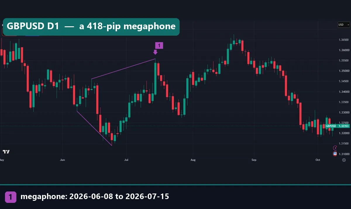
The GBPUSD daily chart shows a clean case. The first trough came on 8 June 2026 at 1.3306. Next, a peak followed on 15 June at 1.3461. Then price fell to 1.31402 on 24 June, below the first trough. Finally, it rallied to 1.35582 on 15 July, above the first peak.
The first swing spanned 155 pips. However, the full shape spanned 418 pips from the lower trough to the higher peak. After the signal, price dropped back toward the middle of the range and stayed there. That is the most common result in our sample.
A lopsided megaphone on gold
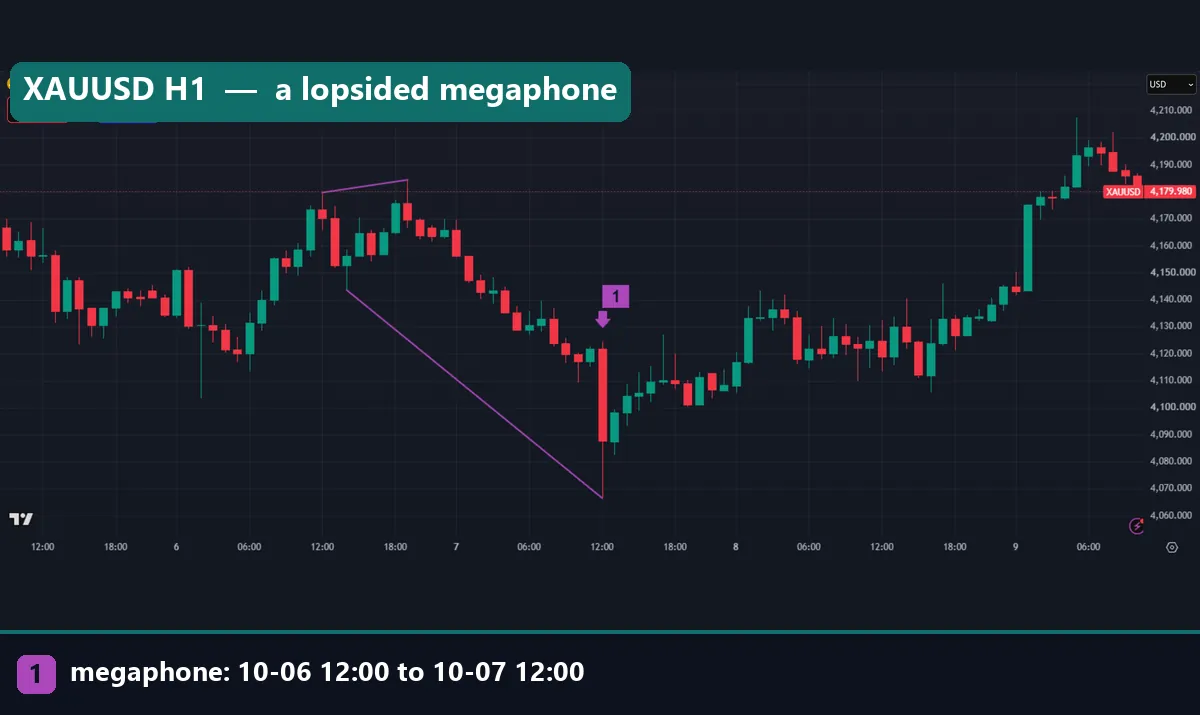
Now look at the gold hourly chart, which shows a lopsided case. The first peak printed at 4,179.685 at 12:00 UTC on 6 October. The trough came two hours later at 4,143.585. Then the second peak, at 19:00 UTC, beat the first by only $4.70. Meanwhile the second trough, at 12:00 UTC on 7 October, sat $77.05 below the first, at 4,066.535.
So the rule says megaphone, but your eye says downtrend with one marginal new high. Before you treat a shape as two-sided, check how much each line actually moved.
Worked example: EURUSD in July and August 2026
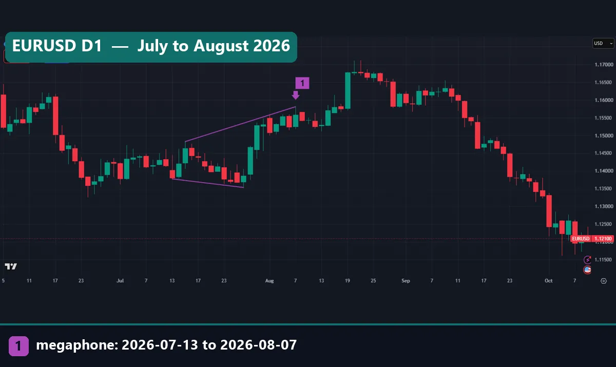
The opening EURUSD daily chart gives clean numbers. Here are the four pivots our rule found, all from the TradingView OANDA data:
- First trough: 13 July 2026 at 1.13775
- First peak: 15 July 2026 at 1.14824
- Second trough: 28 July 2026 at 1.13532
- Second peak: 7 August 2026 at 1.15808
First, check the shape. The second peak is higher, by 98.4 pips. The second trough is lower, by 24.3 pips. So both conditions hold. Next, measure the growth. The first swing spanned 104.9 pips, from 1.13775 to 1.14824. In contrast, the full shape spans 227.6 pips, from 1.13532 to 1.15808. That gives a growth of 122.7 pips.
Notice where most of that growth came from. The upper line rose four times further than the lower line fell. So this megaphone is mostly a rally with one shallow dip.
Then comes the outcome. The rule could only see the shape 3 bars after the 7 August peak. After that, the chart shows the large green candle of 19 August closing well above 1.15808. So by our count, this one closed above the top first.
That said, look at the rest of the chart. By early October, EURUSD traded near 1.121, far below the lower line. The pattern itself said nothing about that later fall.
What 663 megaphones did next
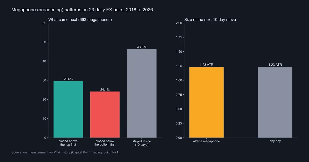
Across 23 daily pairs, our rule found 663 megaphones. In 196 of them (29.6%), price closed above the higher peak first, within 10 days. Then in 160 (24.1%), it closed below the lower trough first. In the remaining 307 (46.3%), price stayed inside the shape for all 10 days.
So the most likely outcome was nothing at all. Among the 356 cases that did break, 55% went up. However, that gap is small, and we did not test it on a separate period. We would not call it an edge.
The second panel matters more. The median absolute move over the next 10 days was 1.23 ATR after a megaphone. It was also 1.23 ATR on any day. So megaphones did not lead to bigger moves than usual either. For a refresher on the unit, see what ATR means in trading.
A megaphone that stayed inside: USDJPY
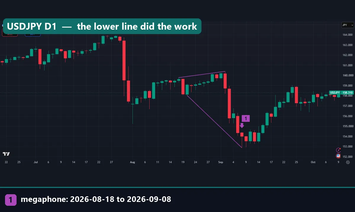
The USDJPY daily chart shows how the middle outcome looks. The first peak came on 18 August 2026 at 159.78. Then the first trough followed on 20 August at 158.029. Next, the second peak, on 2 September, reached 160.394. Finally, the second trough came on 8 September at 152.888, after a steep drop.
Here the lower line did all the work: it fell 514.1 pips, while the upper line rose only 61.4 pips. After the signal, price bounced. In the chart, it climbed back toward 156 and never closed below 152.888 in the following days. Nor did it reach the upper line in time.
Download the complete indicator database
Put these concepts on your charts. One email unlocks the full library of 1,380+ indicators with compiled MT4 and MT5 files, plus my TradingView scripts. No paywall, no spam, unsubscribe any time.
Get free access to my indicator database
One email unlocks 1,380+ free MT4, MT5 and TradingView indicators — the complete library. No single-tool download; you get the whole database.
Where it fails: limits of the megaphone pattern
The plain answer is that it fails as a direction signal. Our sample split 29.6% up, 24.1% down and 46.3% neither. Also, the next 10 days moved exactly as far as on an average day.
Second, the definition is loose. A pivot size of 3, a span of 60 bars, and a close rule all change the sample.
Third, many detected megaphones are trends in disguise. The gold and USDJPY examples above both show one line doing nearly all the moving. In those cases, the “broadening” label hides a plain downtrend.
Fourth, the shape is late. You only see it once the last pivot is confirmed, and by then the widest swing is behind you.
Finally, wide shapes mean wide stops. A stop beyond the outer line of a 418-pip megaphone is a large risk for a small account. Our ATR stop-loss distance guide shows a more measured way to size that risk. Also, every figure here comes before spread, swap and commission.
Two more cases: GBPJPY hourly and AUDUSD daily
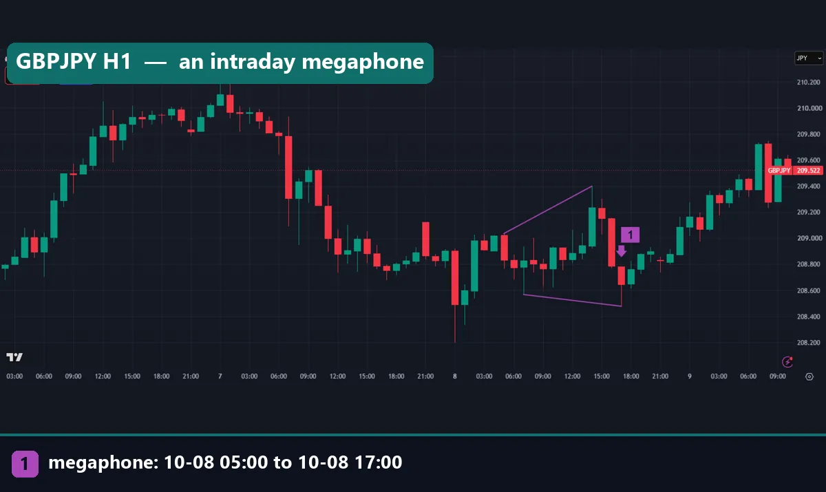
The GBPJPY hourly chart shows a small megaphone inside one day. The first peak printed at 209.036 at 05:00 UTC on 8 October 2026. Then the first trough came at 208.568 at 07:00 UTC. Next, the second peak reached 209.4 at 14:00 UTC. The second trough followed at 208.478 at 17:00 UTC. The first swing spanned 46.8 pips. The full shape spanned 92.2 pips.
Our study covers daily bars only. Price rose above the upper line by the next morning, on 9 October. But on a pattern this small, real costs take a far larger share of any move.
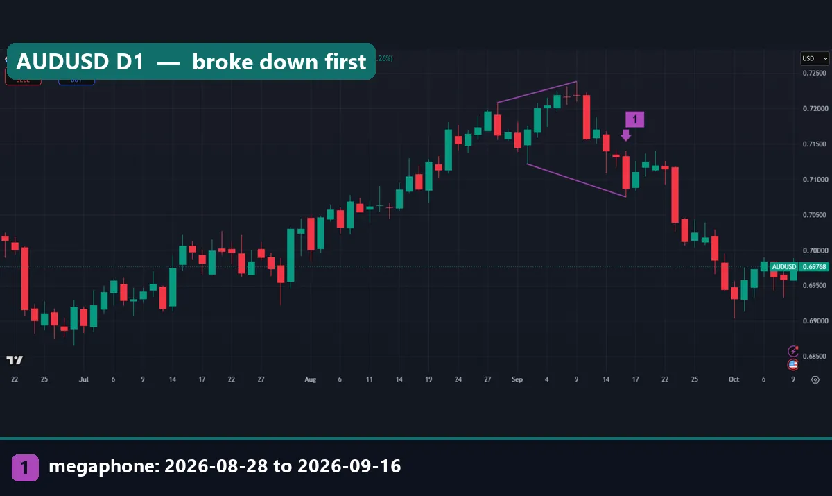
The AUDUSD daily chart shows the opposite result. The first peak came on 28 August 2026 at 0.72082. Then the trough on 2 September reached 0.71216. Next, the second peak on 9 September hit 0.7238. After that, the second trough on 16 September fell to 0.70751.
The first swing spanned 86.6 pips, and the full shape spanned 162.9 pips. In the chart, the large red candle of 23 September closed below the lower line. So this one broke down first. Next to the EURUSD case: same shape, opposite outcome.
Common mistakes with the megaphone pattern
We see four errors again and again.
- Drawing lines before checking points. Instead, confirm four alternating pivots first. Otherwise you draw a megaphone that your rule would reject.
- Treating it as a reversal signal. Textbooks link the shape to tops. But our data showed breaks in both directions at similar rates. Read our page on why chart patterns fail before you trade any pattern as a forecast.
- Ignoring which line moved. Measure how far each line traveled. If one line did nearly all the work, you are looking at a trend, so treat it as one.
- Using a wick as the break. A daily close beyond the line is a cleaner test, and it is the one we used.
Where to go next
If you want to find pivots by rule rather than by eye, start with the ZigZag formula. Then compare that with the bar-based fractal method.
For related shapes, read about the rising wedge versus the ascending triangle and the head and shoulders pattern. Next, for target setting, see measured move targets. And for levels in general, see support and resistance explained. Our guide to forex pair volatility adds useful context.
Outside our site, Thomas Bulkowski’s broadening tops page on ThePatternSite covers the stock-market history of the shape. Also, the broadening formation entry on BabyPips gives a short forex definition. Finally, see the chart patterns section of StockCharts ChartSchool.
FAQ about the megaphone pattern
Is a megaphone pattern bullish or bearish?
Neither, in our data. Across 663 daily cases, 29.6% closed above the top first and 24.1% closed below the bottom first, while 46.3% stayed inside for 10 days.
Is a megaphone the same as a broadening formation?
Yes. Megaphone, broadening formation and broadening top all describe swings that widen, with higher peaks and lower troughs.
How many swing points does a megaphone need?
Four: two peaks and two troughs, alternating. The second peak must sit above the first, and the second trough below the first.
Does a megaphone lead to bigger moves?
Not in our test. The median 10-day move after a megaphone was 1.23 ATR, the same as on any day.
What timeframe works best for megaphones?
We measured outcomes on daily charts only. Hourly megaphones exist, as the GBPJPY and gold charts show, but we have no hourly statistics, and costs weigh more on small shapes.
How do I confirm a break of a megaphone?
Use a candle close beyond the outer line, not a wick. Our study counted the first daily close above the higher peak or below the lower trough.
How is a megaphone different from a symmetrical triangle?
A triangle has swings that shrink toward a point. A megaphone has swings that grow, so its lines spread apart instead of meeting.
Can I trade a megaphone pattern on its own?
We found no directional edge in the shape, so it is weak as a stand-alone signal. Treat it as a note that the range has widened, size your risk to that width, and remember that results are not guaranteed; past performance is not indicative of future results.
Last updated: 9 October 2026.

About the author
Written by Dominic Walsh, a Forex trader and MT4/MT5 indicator, Expert Advisor and script developer. Every tool on forexmt4systems.com is tested on live charts before release and ships with ready-to-use compiled MT4 (.ex4) and MT5 (.ex5) files. Learn more about the trader and developer behind this site.
How we build, test and correct every tool: Editorial & Testing Policy. Trading carries risk; see the disclaimer.